Timmons NY
— Designed by Matt Willey

mattwilly.co.uk — A spread from the 2015 Walking New York issue of New York Magazine.
Nº01 mattwilly.co.uk — A spread from the 2015 Walking New York issue of New York Magazine.

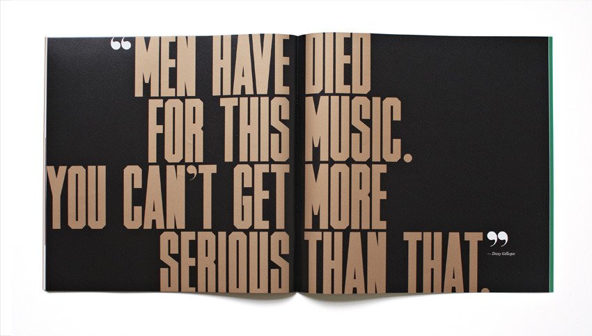
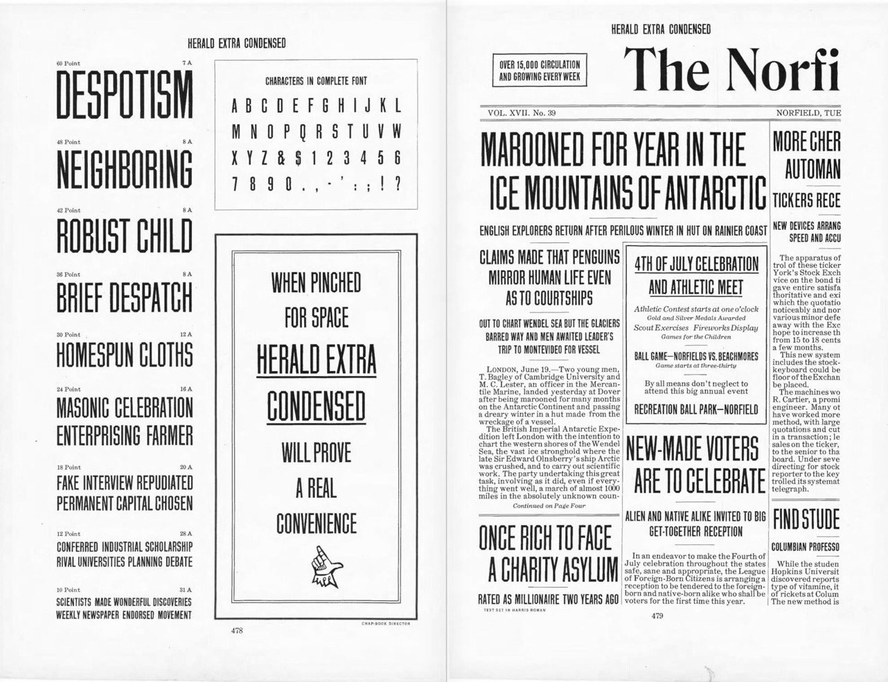
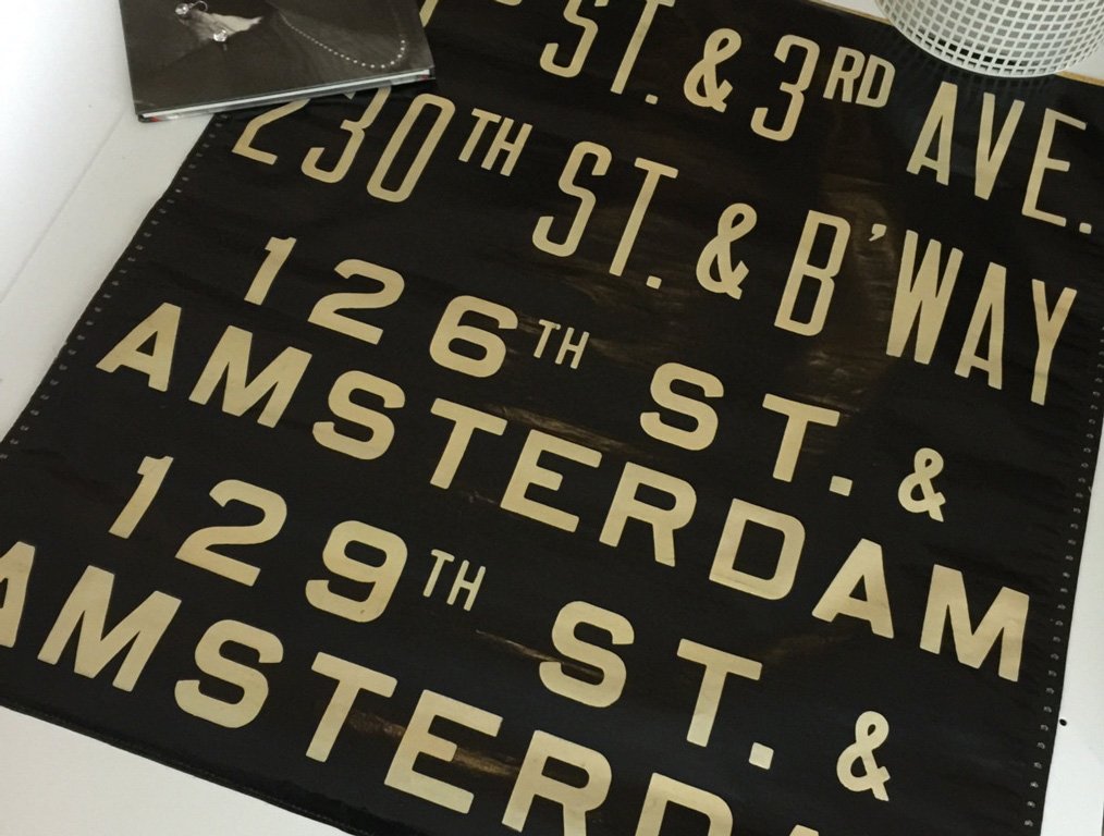
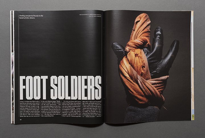
Timmons NY is a bold, condensed display face that is most defined by its chamfered corners. The aesthetic is both athletic and authoritative, evoking the designs of newspaper headline typefaces from the late 1800’s.

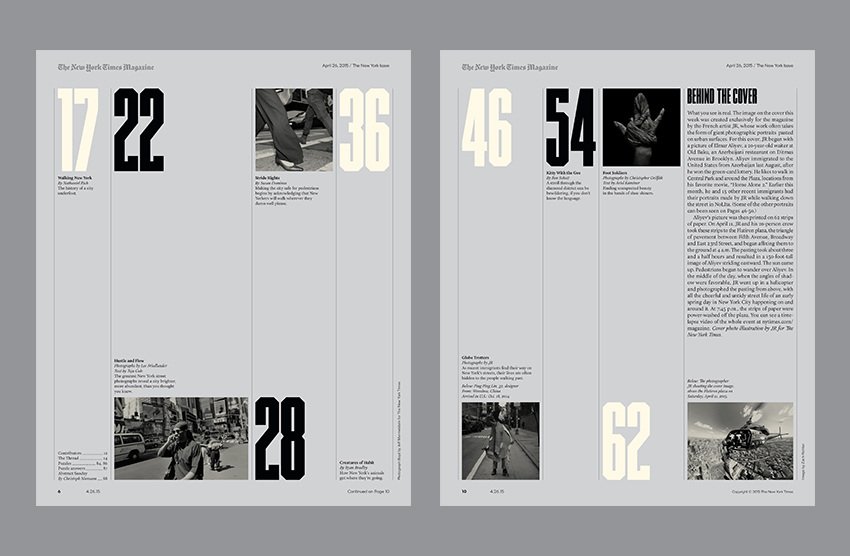
Timmons was designed by Matt Willey for use in the Walking New York issue of of the New York Times Magazine in 2015[1]. It’s that specific use case that reveals the unique character of the typeface compared to other incisive headline fonts—its surprisingly sophisticated editorial design flair[3]. While many typefaces in this style are brutish and loud, Timmons NY projects an elegant side through the inclusion of thoughtful alternates to heavier characters and rounded quotation marks and apostrophes which soften the blocky characters and almost recast the entire face in a knowing, tongue-in-cheek light. Willey knows what this style of typeface is typically used for and by inserting an almost Didone-style set of alternate punctuation he demands that this unconventional typeface style be treated as an equal in the editorial space. Timmons was donated to the BuyFontsSaveLives campaign, and all sales proceeds go to cancer charities.

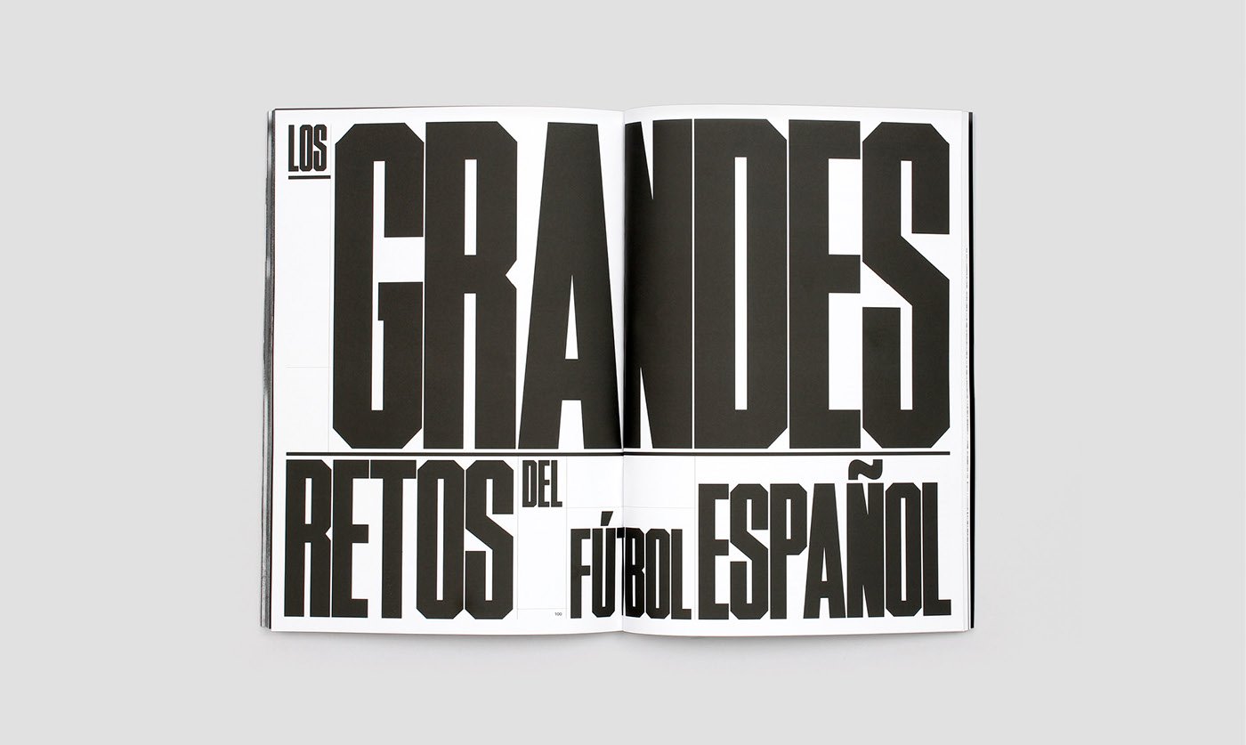
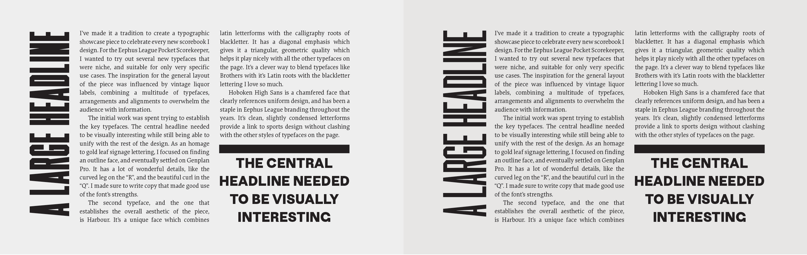
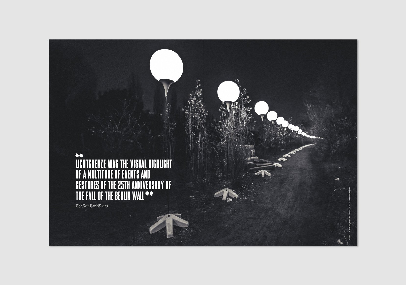
Timmons NY contains numerous alternate characters which alter the voice of the font in ways that range from subtle to dramatic. These alternates allow the designer a lot of flexibility in how the typeface projects itself and give an extended life to what is ultimately a single weight display face. It thrives in stark, high contrast situations where the thick, rigid simplicity of the letterforms can take on a monolithic quality.

mattwilly.co.uk — A spread from the Jazz FM, showing off Timmons NY’s didone quotation marks. Designed by Matt Willey.
Nº03 mattwilly.co.uk — A spread from the Jazz FM, showing off Timmons NY’s didone quotation marks. Designed by Matt Willey.
Nº04 mattwilly.co.uk — A spread from the 2015 Walking New York issue of New York Magazine.


behance.net — Palco23’s printed magazine, designed by Àxel & Alba Durana.
Nº05 behance.netPalco23’s printed magazine, designed by Àxel & Alba Durana.

Historic Influences

The most obvious influence on Timmons NY are the incised headline typefaces that were popular in the 1870’s[6]. I couldn’t tell you how this style found a home in newspapers other than to guess it has something to do with how narrow the letterformes could be, thereby allowing for more characters in a cramped space. Willey pulled from other sources as well, most notably transportation typefaces similar to what you would have seen on a train or subway roll in the early 1900s[8]. These screen-printed rolls used an eclectic medley of lettering styles, and though chamfered faces were not a particularly common style used, the letterforms were often condensed and squared off. Willey emphasizes this influence in the specimens he made for Timmons NY which mimic the typography and language on those signs, and obviously with the typeface being used in an issue of the New York Times Magazine focusing on getting around the city, the reference is apt.

Nº06 archive.org — A specimen for Herald Extra Condensed from the 1923 American Type Founders Specimen Book & Catalogue, an example of the incised newspaper fonts that Timmons NY is based on.
etsy.com — A street sign using a chamfered type style.
Nº07 etsy.com — A street sign using a chamfered type style.

Another possible influence was street and industrial signage from the early 20th century[7]. Chamfered, highly condensed faces were commonly used on porcelain-coated signs to mark street names, parking notices and warn of safety hazards. The cold, mechanical nature of the type style gives a detached and authoritarian voice in these use cases.

Nº08 etsy.com — An example of subway roll typography with its mixture of widths and squared-off letterforms.

Timmons NY’s strengths

I don’t know a graphic designer who uses hyper-condensed faces as often and as well as Matt Willey (seriously, check out his portfolio, I’ll be here when you get back), so it makes perfect sense that he’d design one of his own. Despite the simplicity of its construction, Timmons NY has a lot of unique character for a typefaces that is composed entirely of straight lines and sharp angles. The numerals are almost playful[10], with strokes ending at different heights along the axis (note how the “2” and the “5” end above and below the line established by the “3” and the “9”). While you could characterize the lack of consistency as a flaw I think it plays to the historic revival nature of the typeface. It feels personalized — that each character, while following the same basic rules, was allowed some freedom in order to achieve the best example of that letter or number at the expense of absolute consistency. The font is more charsmatic as a result.

platevault.com — A 1915 porcelain License plate from Pennsylvania.
Nº09 platevault.com — A 1915 porcelain License plate from Pennsylvania.
Nº10 Timmons NY numerals, which are oozing character and show many similarities to those found on vintage porcelain license plates.
behance.net — Timmons NY used as line and shape in addition to text in the Palco23 publication, designed by Àxel & Alba Durana.
Nº11 behance.net — Timmons NY used as line and shape in addition to text in the Palco23 publication, designed by Àxel & Alba Durana.

An interesting source of comparison for the Timmons NY numerals is early 1900’s porcelain license plates[9]. You can see a number of clear similarities between some of the numbers, such as the “5” that feels almost top heavy, like it’s lifting its skirt out of a puddle, and raised midline of the “8”.

Nº12 Timmons NY used to great effect in The Ringer’s 2017 NBA Draft guide. Timmons shines at 3 different scales in this design and leverages the history of chamfered faces in athletic uniform design.

The bold voice of Timmons NY could translate across a variety of genres. The bold, compact and clean letterforms would have easily found their way into the tool-belt of an art director like Lou Dorfsman in the 1980s for use in advertisements in place of ITC Machine. The chamfered edges mean Timmons could be deployed in sports design work because of the similarities to the typefaces seen on old uniform numbers[12]. The transportation analogies we’ve already covered, allowing the font to feel at home in signage or more industrial aesthetics. It’s rare to see a single-weight, all-caps typeface that is this bold be this stylistically flexible.

At large sizes, Timmons NY is an imposing presence that manages to not come off as cold or sterile, due in part to the minor inconsistencies and eccentricities mentioned above. Words set in Timmons NY take on a similar visual grey as a solid field or linear element would, and you can play on that in your compositions, using Timmons as a graphic element to anchors the weight of a design in addition to a legible piece of text. The phrase “block of text” has rarely been more appropriate. Axel and Alba Durana used this to great effect on the cover of a Palco23 cover from 2016[11], letting the compact letterforms take on the compositional responsibility of solid shapes while still playing off individual letterforms by stacking the last two lines of text in alignment with the “I” in Económica.

Example contrasting the “blocked” quality of Timmons NY to Herald Gothic.
Nº13 Example contrasting the “blocked” quality of Timmons NY to Herald Gothic.
Timmons NY default “N” compared to the alternate, which has a more consistent visual weight compared to the rest of the typeface.
Nº14 Timmons NY default “N” compared to the alternate, which has a more consistent visual weight compared to the rest of the typeface.

When compared to its closest cousin, Herald Gothic[13], the unique qualities of Timmons NY become clear. The individual characters “fill the box” much more fully, and the counters and negative space are slighter. The end result is a text line that reads almost as a solid shape, which can be used to your advantage in a design. In the example above, a thick horizontal rule is being used to set off a pull quote. Because of its bulkier design, Timmons NY visually ties much more closely to the rule, and the design feels more unified as a result.

Quirks and eccentricities

Even as a display face, Timmons NY has a high minimum point size before it becomes garbled and illegible. This face is meant to be shown in large sizes, which limits its versatility. The characters are drawn with a lot of heft to them, leaving narrow counters that can blur and vanish if not given the proper scale. The default “N” in particular is sensitive to scale and because of the angle and penetration of the negative space that gives it its shape it can feel heavier than the other characters. If you are finding that letter to be distractingly heavy, swap in the alternate, which has more open space[14].

Nº15 David Löwe — A spread using custom quotation marks for DVD packaging for the Lichtgrenze/Mauerstücke BBC special.

Another detail that must be noted is that while the alternate, Didone-esque apostrophes and quotation marks lend a unique sophistication to the typeface, there are some irregularities in how they are drawn. This becomes evident at extremely large sizes (my eyes starts to pick it up at 300pt when viewing from my laptop) which with any other typeface might not be a common use case, but as we’ve discussed, the appeal of Timmons lies at these large sizes. Some designers have cleverly gotten around this limitation, such as when David Löwe drew his own set of supple quotation orbs for a set of DVD packaging documenting an art installation[15]. The lack of any lowercase letterforms is also something to note again here in this section of the review.

- FRJ