Untitled Sans
— Designed by Kris Sowersby

Poster series released by Klim as promotion for the release of the Untitled family of typefaces.
Nº01 Poster series released by Klim as promotion for the release of the Untitled family of typefaces.

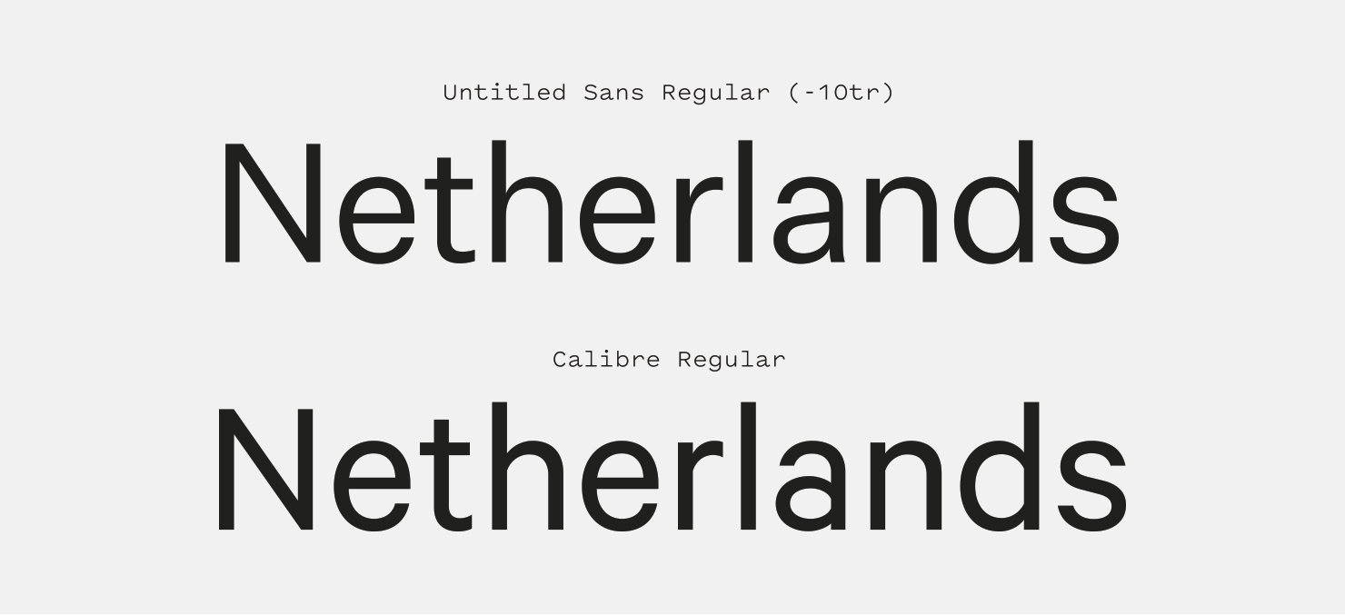
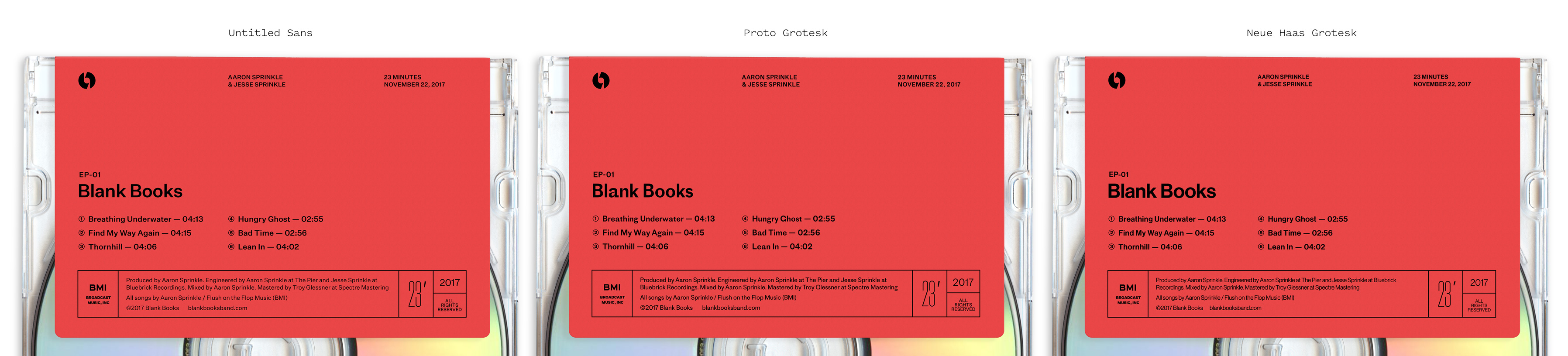
When I first saw Untitled Sans, I wasn’t sure what to think. My love of Klim typefaces is no secret, but I couldn’t understand the need for a new “plain” set of typefaces to exist. Was non-descriptness a quality I’d ever looked for in a typeface? I wasn’t sure.

The typeface didn’t come into my attention again until one of my co-workers, Andrew Johnson, showed me some comps for a mobile application idea he was working on that used Untitled Sans. As I collaborated with him on it and got to get a feel for the typeface, I started to understand what he and other designers I knew were seeing in it. It wasn’t just “plain” in a “default” or “basic” sense, but in a way that felt functional and refreshing.

Seeing Kris Sowersby’s talk at Typographics in 2017 and his marketing campaign for the typeface further endeared me to it. The typeface and its creator had a sense of humor about its unassuming presence, which was a nice change after seeing the lavish mini-sites foundries craft for their new releases. Untitled Sans’s promotional materials are a humorous mix of minimalism and excess—an instagram account filled with images of every glyph in the family, an entire website that responsively scales the title of the font as you resize the page.

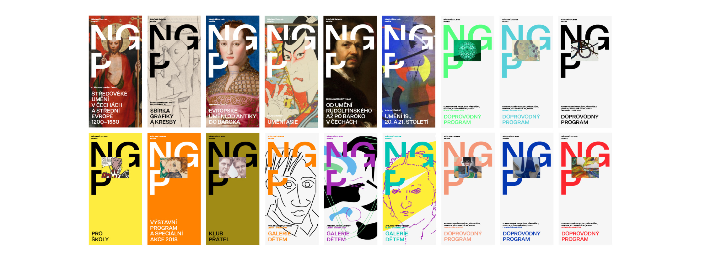
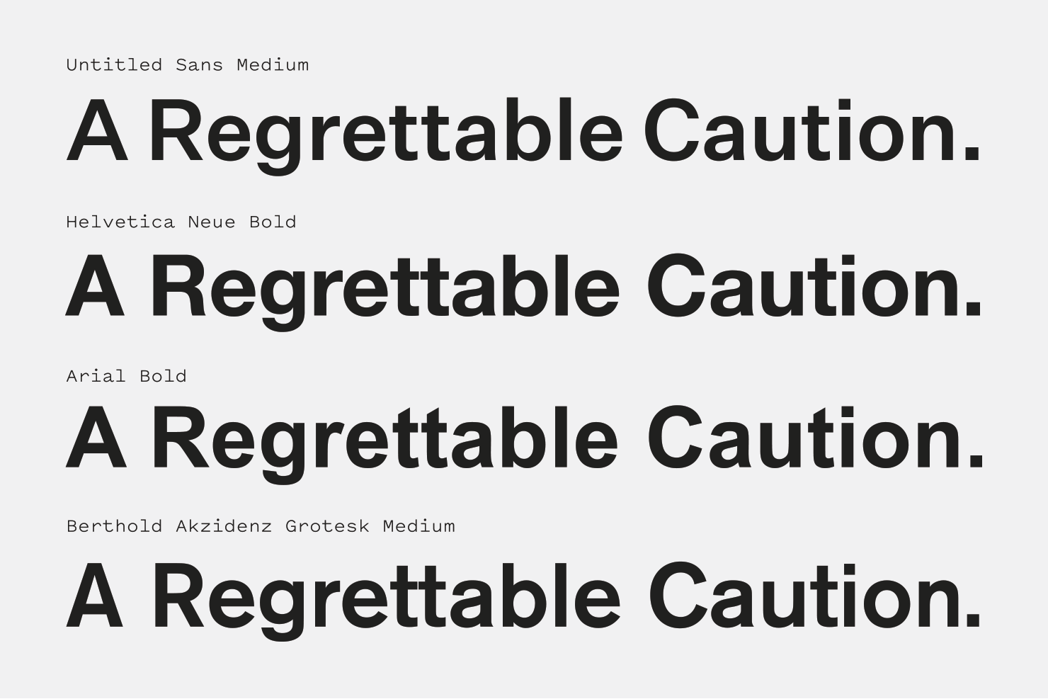
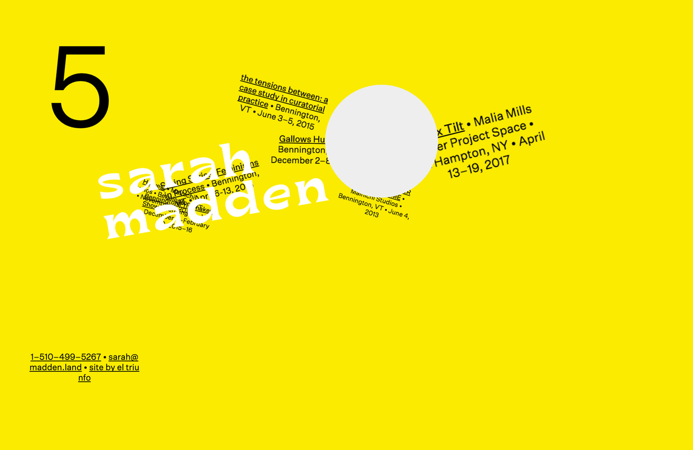
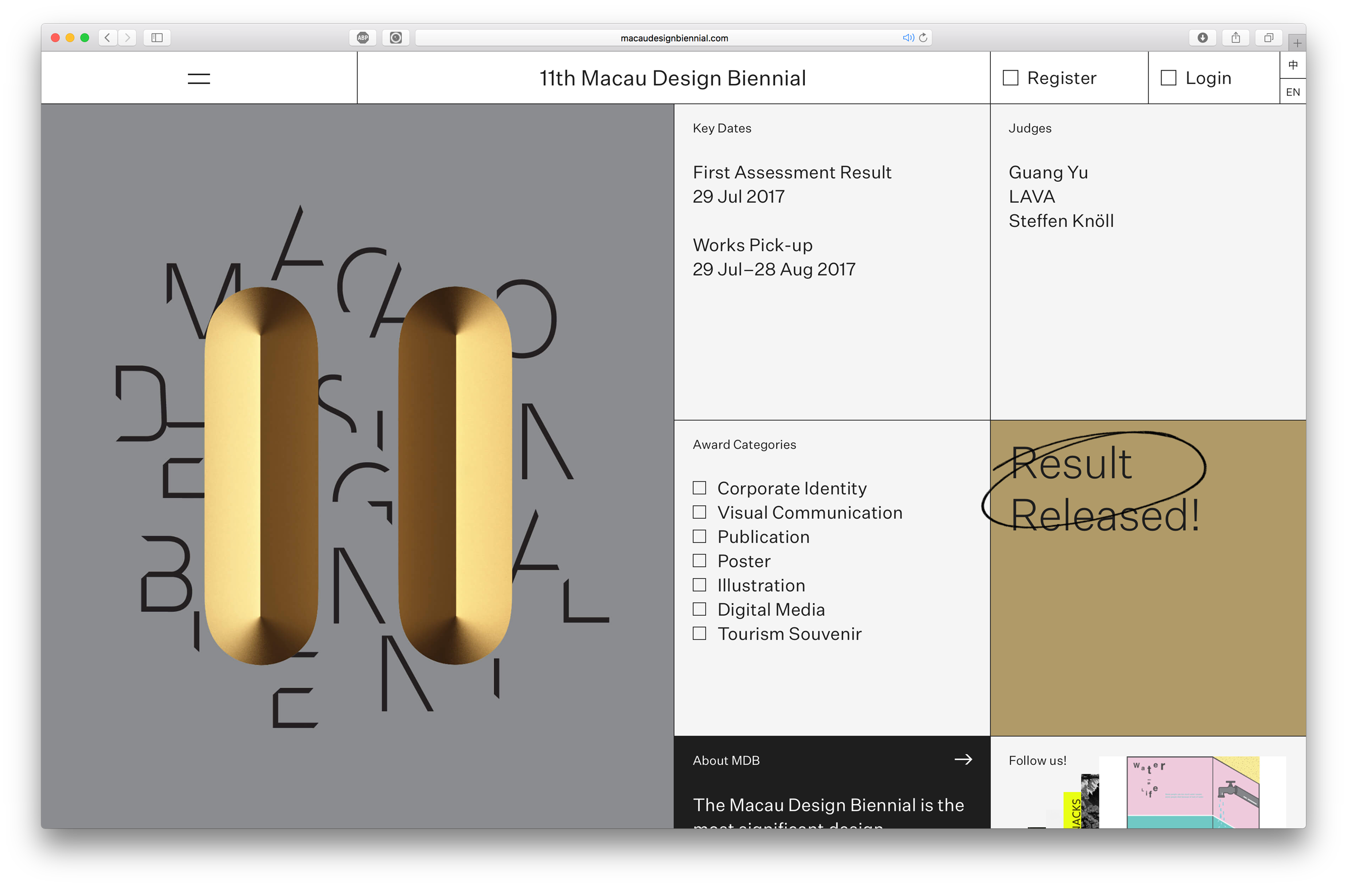
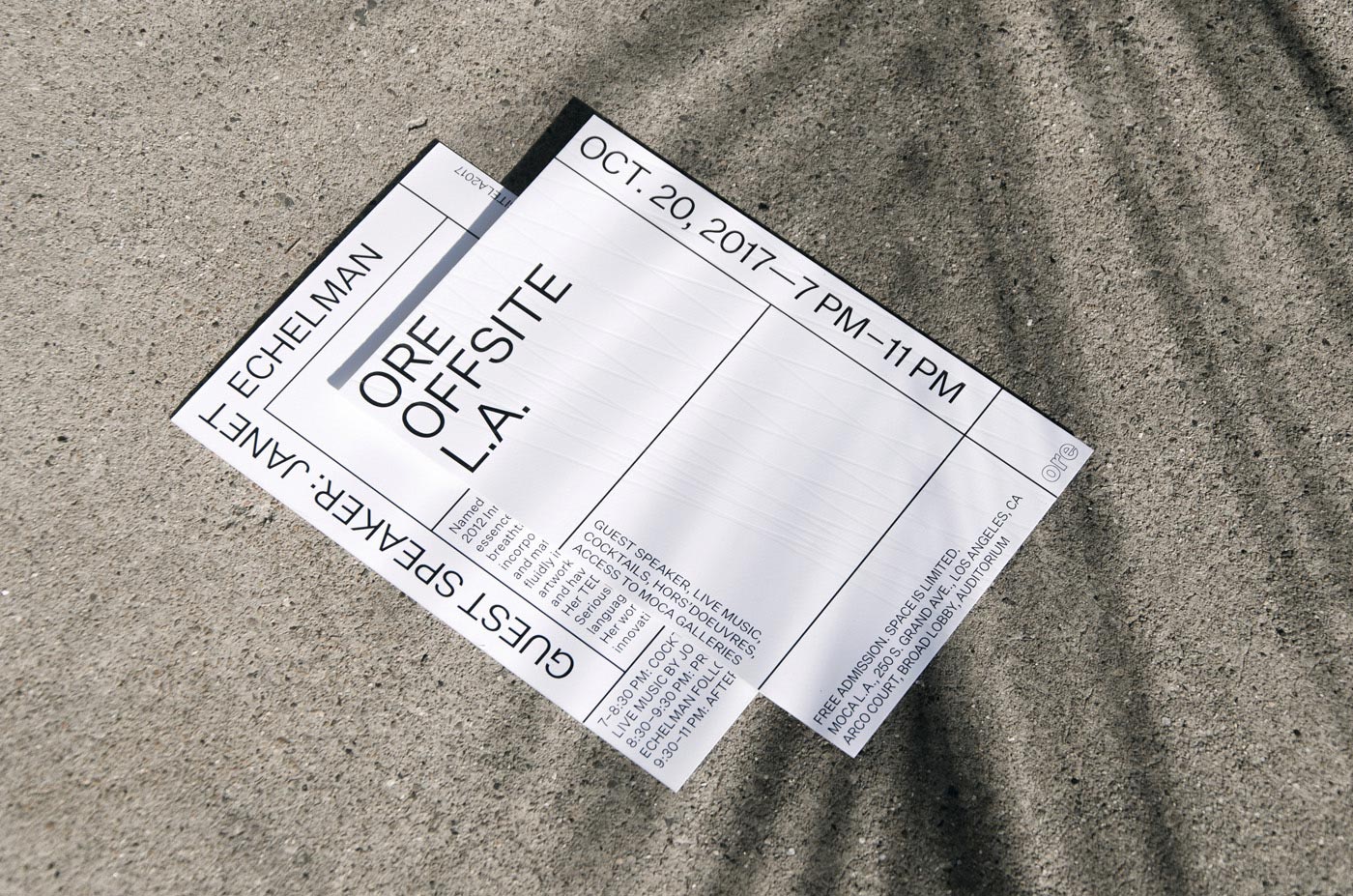
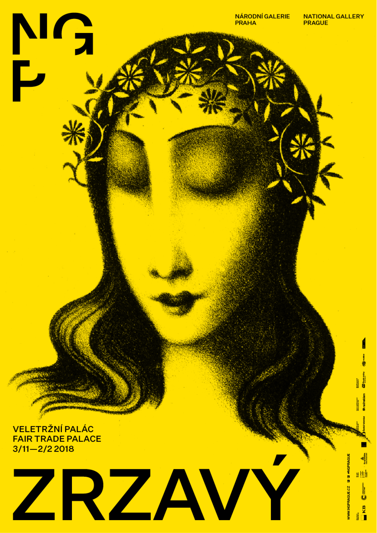
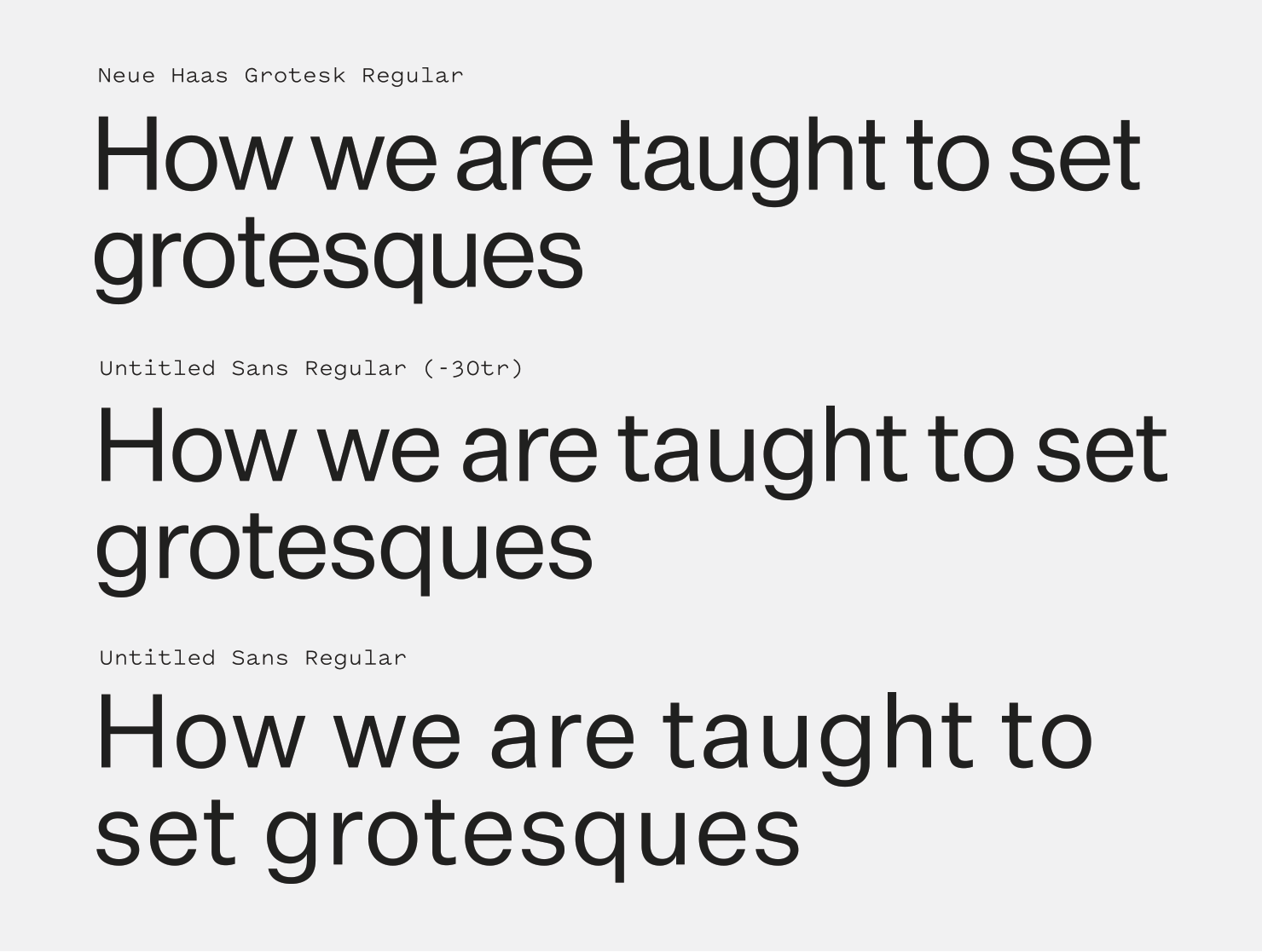
It’s going to be difficult to review a typeface that’s making an effort to be average, but I’ll try my best. Untitled Sans is clean, unobtrusive and beautiful in its very specific way, and I’ve become quite fond of it over the past year. It’s serving me well on this site, where I use it for most of the headings as well as the body text for the “Notable Characters” section. What better choice of font for a site that reviews typefaces than one that’s specifically trying to remain incognito? Let’s dive in before I forget what it looks like.

najbrt.cz — Branding for the National Gallery Prague, designed by Studio Najbrt, 2018.
Nº02 najbrt.cz — Branding for the National Gallery Prague, designed by Studio Najbrt, 2018.

Design Details

Typefaces can start in a myriad of ways: sometimes they are formal explorations, sometimes they are revivals or interpretations of work that came before it, and sometimes they are conceptual. Untitled Sans is the last, with the concept being the creation of a typeface that isn’t “challenging” but is still “enormously useful,” to use Sowersby’s words.

What does a “generic” sans-serif look like? There are typefaces we have prescribed this label to over the years, but they likely weren’t created with the intent of NOT feeling special or unique. Helvetica has long been the “default” sans many designers go to, but its design is far from basic. The same applies to system defaults like Arial. Untitled Sans doesn’t want to be recognized, and aims to give designers some sense of relief in being able to choose a typeface that simply does its job without fuss while giving designers a wide range of weights to choose from, an option not available in most system-based default typefaces.

Nº03 Untitled Sans (top) compared to Calibre (bottom). You can see some similarities in proportion between the two, but Calibre is rounder and more cheerful than its predecessor.
Untitled Sans sculpture, created as a part of the family’s marketing campaign. The over-the-top production of the most mundane glyph in the typeface fits the tone of the family.
Nº04 Untitled Sans sculpture, created as a part of the family’s marketing campaign. The over-the-top production of the most mundane glyph in the typeface fits the tone of the family.

When Sowersby speaks about creating Untitled Sans, he talks about wanting to take himself out of the design. I find this fascinating, because I see so much of him in it. After working with Untitled Sans for the first time, I declared, “this looks like Calibre with the volume turned to zero.” When you look at the two typefaces side by side[3], I’m not sure I was far off! Untitled Sans has a wider base, but otherwise it’s easy to picture Untitled Sans as the rather dull cousin to Calibre’s cheerful grotesque-geometric fusion.

Nº05 Untitled Sans alongside several “basic” sans-serif families. You can see how sparse and skeletal it appears, even compared to bare-bones basic designs like Arial. Funny how you can drive a truck through all these “au” pairings.
unpaid-intern.com — Untitled Sans is the perfect choice for this set of t-shirts meant to parody of the toxic work environments of many design agencies.
Nº06 unpaid-intern.com — Untitled Sans is the perfect choice for this set of t-shirts meant to parody of the toxic work environments of many design agencies.

When compared to other “basic” grotesque sans you can see just how unordinary a lot of the designs we take for granted are[5]. Untitled Sans closely follows rules set by designs like Helvetica, with its crisp 90° terminals on the “C,” “r” and “s” which lend it a mechanical precision. Untitled Sans widens the aperture on the “C” and makes the radius on the curve at the bottom of the stem of the “t” longer to remove the “squared off” feeling the Helvetica version has. The leg on the “R” is straight, which harkens back to Akzidenz Grotesk and serves as a good example of some of the stylistic flair we now perceive as basic in our staple sans that can actually get significantly more stripped back.

The iconic teardrop shape of the “a” (a lovely carry-over from designs like Akzidenz Grotesk) loses that pinch at the top right that lends the glyph so much personality, and the spur is pulled in until it’s barely noticeable. Arial, long the default “default” sans in our digital world, has details like the sliced stem toppers on the “t” which were added to aid legibility and they feel positively raucous in this lineup. All of these modifications Untitled Sans feel like they are walking the typeface back from having a point of view about legibility or style—all in service to the overarching concept of the typeface. How often does a typeface design make us question our definitions of what is and isn’t “basic” in a typeface? What is the baseline?

Nº07 typografika-politika.tumblr.com — Typografika Politika piece dedicated to Flávia Nalon. Designed by Erik Brandt.

Given the tongue-in cheek, maximal-minimalism nature of Klim’s promotion of the typeface, one would be forgiven for hesitating to take the typeface and its concept too seriously. But it feels like an honest attempt to me, and an interesting endeavor that led to a result that dances around many familiar designs yet remains infuriatingly unrecognizable.

Untitled Sans compared to Proto Grotesk and Neue Haas Grotesk for a cd packaging concept.
Nº08 Untitled Sans compared to Proto Grotesk and Neue Haas Grotesk for a cd packaging concept.
najbrt.cz — Branding for the National Gallery Prague, designed by Studio Najbrt, 2018. Untitled’s stoicism fits well within the stark aesthetic of the brand.
Nº09 najbrt.cz — Branding for the National Gallery Prague, designed by Studio Najbrt, 2018. Untitled’s stoicism fits well within the stark aesthetic of the brand.

Untitled Sans strengths

I’ve described Untitled Sans as beautiful, and I want to try to explain why. The aforementioned “relief” that comes from choosing a typeface without stylistic distinction is something I’ve experienced myself. Typefaces say something when you use them, and there’s something refreshing about using a typeface that explicitly does not want to say anything.

In some cases, that becomes an aesthetic necessity. I was designing conceptual packaging for an EP release for the band Blank Books[8], and wanted to use a sticker label that laid along the back and wrapped around the “spine” of the CD case. Because a sticker is, by design, an imposed element instead of one that feels intrinsic to the presentation, I wanted it to have a neutral, almost narrator-like voice. When it was set in Proto Grotesk, the sans used elsewhere in the design, it felt more like an extension of the design, and the sticker treatment felt flashy instead of utilitarian.

Nº10 klim.co.nz — Communication Tower project, by Holt Design.

When I switched the typeface to Untitled Sans, I got the detached voice I wanted. Even something like Helvetica or Akzidenz Grotesk would come into this situation with a lot of baggage from a conceptual standpoint, and would make the simple presentation feel modernist or minimalist instead of utilitarian. They also have quite a bit of visual flair that was both distracting to the design (think about how distinctive the “a” is in Helvetica) and could hurt legibility at the smaller sizes needed for the small type. Untitled Sans lends the design the straightforward, neutral tone I wanted it to have while also being completely functional and a pleasure to read.

I’ve also found that Untitled Sans’ neutral tone makes it an excellent substrate when the typesetting in a composition is serving a conceptual purpose, as it is in the Communication Tower project, by Holt[10]. The sparseness of the typeface allows for type as figurative representation without the typeface itself getting in the way. A straightforward typeface for a straightforward idea.

madden.land — Untitled Sans plays the straight man against a bright yellow and the exuberant bb-book typeface. Designed by El Triunfo, 2017.
Nº11 madden.land — Untitled Sans plays the straight man against a bright yellow and the exuberant bb-book typeface. Designed by El Triunfo, 2017.
Nº12 macaudesignbiennial.com — Macau Design Biennial site, in the Mondrian-gridded aesthetic that’s seen a resurgence in brutalist design circles over the past few years. Designed by K2 Digital
alexandernussbaumer.com — Gallery Guide Vienna, the in-use that earned me my gold medal in typeface identification.
Nº13 alexandernussbaumer.com — Gallery Guide Vienna, the in-use that earned me my gold medal in typeface identification.

It’s impossible to talk about Untitled Sans and not talk about Brutalism. Untitled Sans’s release was perfectly timed to hop aboard the resurgence of punk styling that’s been branded as “brutalism” by designers—design whose goal is to be stripped down of unnecessary adornment with a focus on communication. It’s a tricky term to use in graphic design because the definition is murky—many designers think “flat+ugly=brutal” which is a perversion of the term’s origins in both the graphic design and architecture disciplines. Regardless of what flavor of Brutalism you subscribe to, Untitled Sans is the perfect match to the aesthetic. It’s already been adopted by many brutalist website designs[12], paired with simple graphic elements and minimal adornment to create straightforward and “honest” presentations of information.

Nº14 7d8.co — Design for Ore’s offsite, using a sparse, Mondrian-esque division of space. Designed by 7D8, 2018.
najbrt.cz — Branding for the National Gallery Prague, designed by Studio Najbrt, 2018. You’ll notice a trend of using intense, saturated yellow to punch up the plainness of Untitled Sans.
Nº15 najbrt.cz — Branding for the National Gallery Prague, designed by Studio Najbrt, 2018. You’ll notice a trend of using intense, saturated yellow to punch up the plainness of Untitled Sans.

Of Untitled Sans’ weights, Medium is my favorite. It has enough heft to have a strong presence and can pass for a Bold, but it’s not bulky or brash. It’s controlled and confident, and I think it shows off the best of the letterform designs. Studio Najbrt makes wonderful use of it in perhaps the most energetic designs I’ve seen that use Untitled Sans—their work for the National Gallery of Prague[15]. You can see how strong and graphic Untitled Sans reads here in all-caps. There are not curved legs or other adornments to give any flash here, it’s all business and the simple letterform structure simply says “well, here it is” and allows you to focus on the art and the blunt presentation.

Nº16 bamlondon.com — A spread from Loud and Quiet, where Untitled’s sparseness feels almost insulting. Designed by B.A.M.
klim.co.nz — Project 6: Clelland Road, by Holt Design, pairs ghosted imagery with the skeletal Regular weight of Untitled Sans.
Nº17 klim.co.nz — Project 6: Clelland Road, by Holt Design, pairs ghosted imagery with the skeletal Regular weight of Untitled Sans.

In its Regular and Light weights, Untitled Sans becomes a skeletal representation of an alphabet that is almost mocking in its plainness. I’ve become a fan of using it for bite-sized reading experiences, like the Notable Glyphs section of this site. Another in-use I’ve found that makes use of Untitled’s unique presence is Holt’s Clelland Road Project[17]. The cover layers photographs of the same tree many months apart, lending the image an apparitional quality that’s reflected by the gaunt type.

Nº18 paulbelford.com — Untitled Sans can pass as a heavyset, overly-serious doppelgänger to classic grotesques in its heaviest weights, which is a fitting look for this Science Council branding, designed by Paul Belford.
exposure2017.massey.ac.nz — Many designers try to compensate for Untitled Sans’ loose letter-spacing by tracking it in, but that can lead to collisions, like the “rt” here. Designed by Luke Hoban.
Nº19 exposure2017.massey.ac.nz — Many designers try to compensate for Untitled Sans’ loose letter-spacing by tracking it in, but that can lead to collisions, like the “rt” here. Designed by Luke Hoban.

Quirks and eccentricities

In contrast, at its heavier weights Untitled Sans does a humorless job of imitating the classic grotesques—like a recently retired athlete stuffing themselves in a suit to walk through the motions of doing an early-morning broadcast[18]. Without the little special touches, it just comes off a bit dead inside. It never feels like it wears the weight confidently, to my eye, so I avoid the thicker end of the scale with this family.

Nº20 Untitled Sans’ (middle & bottom) letter-spacing compared to Neue Haas Grotesk. There will be temptation to use negative tracking to tighten things up, but you will likely run into awkward pairings, like the “ta” in the middle example.

Untitled Sans has very loose letter-spacing, which can cause it to feel “floaty” at headline sizes. When I use it in headlines on this site I bring in the letter-spacing quite a bit, but it’s not a foolproof solution. Collisions can happen, particularly with the “rt” combination, which you’ll see from time to time on this site, and in other in-use like the Exposure Exhibition site for the Massey University College of Creative Arts[19].

Untitled Sans has a modest set of weights compared to many of Sowersby’s releases, so you might end up in a situation where what’s available is just a little too light or too heavy for your needs. I’ve found this happening more than once, and I suppose it’s a good litmus test for the concept this design is driving towards—if you strive for juuuust the right behavior from your type, you are likely in for a world of hurt with Untitled Sans. The same applies to the letter-spacing—the spacing is loose because the point of the typeface is to be as un-designed as possible, and designing it to be precision-close in the way we’d set Helvetica defeats the purpose.

This is a difficult typeface to recommend, because I think the decision to use a typeface with this kind of conceptual framework has to come from oneself. Are you willing to give yourself over to the idea of a typeface? Most days, I am far too stubborn to bargain with this benign, boring little experiment, but the times when it has done right by me, I’m not sure anything else could have properly replaced it. I have found it to be freeing to use as a starting point—forcing myself to focus my attentions anywhere but the typefaces I’m using. Go give the trial a spin and see if you come out of it with the same love/hate relationship.

- FRJ