Eames Century Modern
— Designed by Erik van Blokland, Andy Cruz & Ken Barber

eames.houseind.com — A spread from the House Industries specimen book for Eames Century Modern.
Nº01 eames.houseind.com — A spread from the House Industries specimen book for Eames Century Modern.

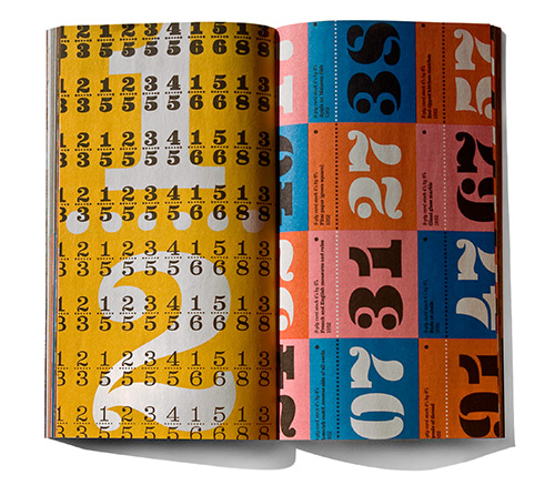
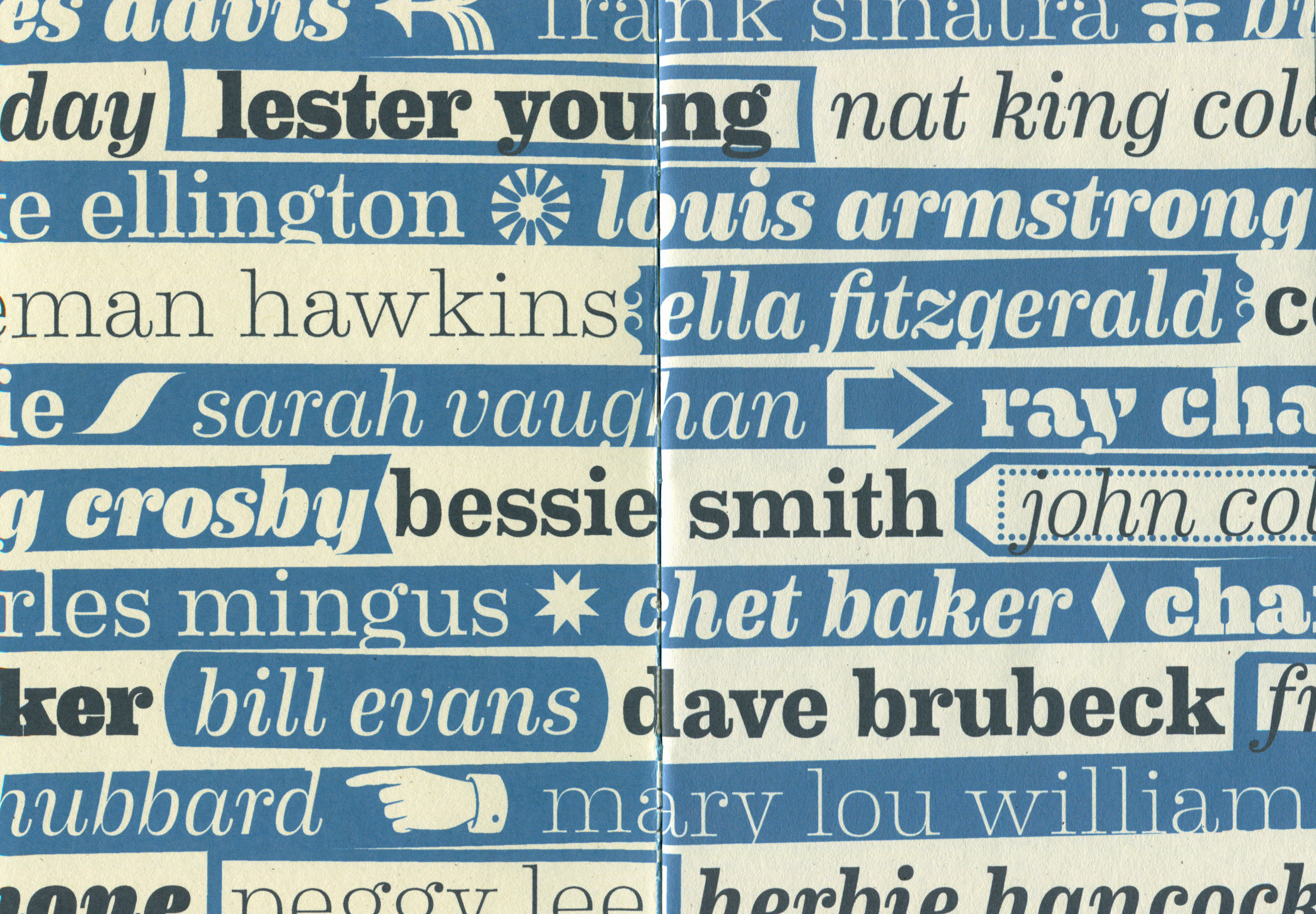
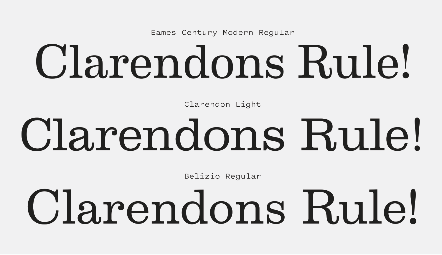
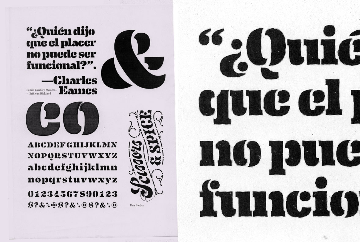
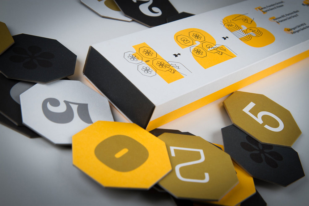
Eames Century Modern is a beautiful typeface that blends two major genres of serif: the Clarendon and the Scotch. It’s an exuberant design, full of warmth and oddball design details. It shares the same character of the famous couple from which it derives its name, and because of that it is a monumental task to find in-use examples of this font that aren’t either showcase specimens for the font itself, or works related to Charles and Ray Eames.

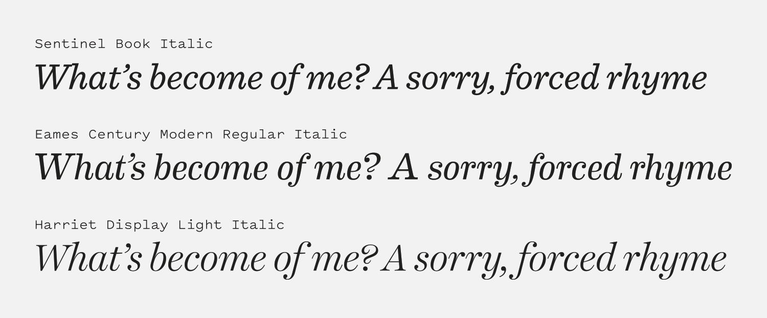
Designs that are this overflowing with personality risk limiting their potential use-cases, but you shouldn’t confuse Eames’ bright personality for shallowness. This is a comically robust family, with 18 weights, multiple number sets and a set of borders to boot. If you need something to really lean into the retro stylings of the mid 20th-century, Eames has you covered. But it’s also capable of a more restrained presence—this font can do more than playful if you ask it to.

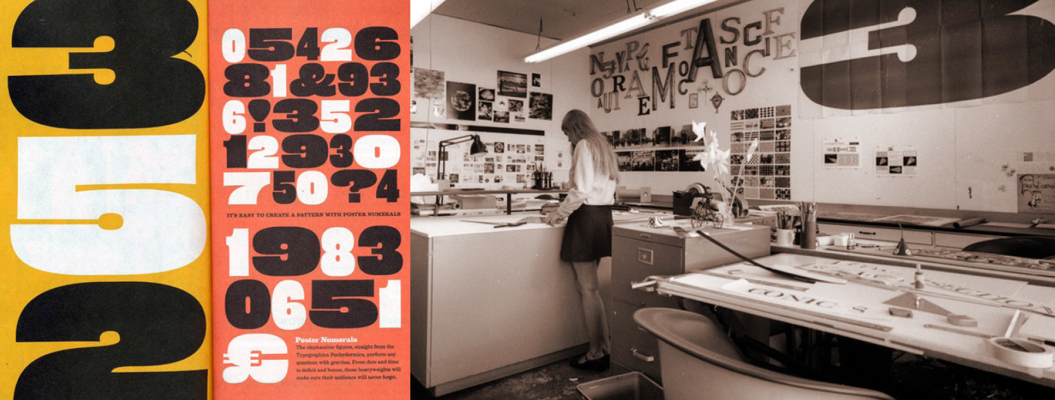
Eames is drawn with a “flex” to its strokes—the flat sides of serifs bend inward, giving the illusion that they’ve been pressed into paper. This subtle imperfection across the family softens the massive slab serifs and prevents the design from feeling imposing in its boldest weights. Those heavy weights, the stencil, and the special number sets are graphic and crisp, aching to be used with bright, punchy colors. This is a typeface that makes you smile, and I think it says a lot about how much fun Eames is to use that there are so many projects out there that only exist to give designers an excuse to play with it. We’ll look at some of those as well as more “practical” uses of Eames Century Modern in this review.

behance.net — Eames Century Modern specimen by Nina Tsur.
Nº02 behance.net — Eames Century Modern specimen by Nina Tsur.
Nº03 commons.wikimedia.org — Richard & Miller’s Ionic Nº2, a great example of the Ionic/Clarendon styles that predate Eames Century Modern. From Printing type specimens, c. 1921.
flickr.com — Clarendon typefaces have always found happy homes alongside bright colors and illustrations. Hungary postage stamp: Puli dog, c. 1967.
Nº04 flickr.com — Clarendon typefaces have always found happy homes alongside bright colors and illustrations. Hungary postage stamp: Puli dog, c. 1967.

Historic Inspiration

House’s mini-site for Eames Century modern is full of images of various Eames-related piece of typography that influenced the creation of the typeface. Thick Antique slab-serifs[6], Didone italics and Clarendons all make appearances, and you can see bits of their influence throughout Eames Century Modern. The typeface is first and foremost a Clarendon: a slab serif with smooth brackets (this style was also referred to as “Ionic” at varying points throughout history). William Caslon’s Double Pica Ionic in 1842 was the first true representation of this style, and in 1845 the name “Clarendon” was registered as a trademark by the Fann Street Foundry (the first typeface to ever fall under copyright protection!). Nevertheless, the name and the style was swallowed up by most other type makers and spread from the UK to the US and abroad. Clarendons serve as the middle point between the bold voice of an Antique and the more fragile state of a Roman serif. Richard & Miller’s Ionic № 2 is an excellent example[3] and it’s clear to see Eames is following the same path.

Nº05 Eames Century Modern (top) compared to Two Clarendons, Clarendon (middle) and Belizio (bottom).
pinterest.com — Ticket designs by the Eames for a Herman Miller show which use several varieties of Clarendons.
Nº06 pinterest.com — Ticket designs by the Eames for a Herman Miller show which use several varieties of Clarendons.

Clarendons are wide-set, have slab serifs that grow thicker as their weight increases, and tend to have details like ball terminals that give them an interesting interplay between squares and circles. Eames toes closer to Roman-style traits than Clarendon or Belizio, as you can see the in more relaxed presence it has compared to the others with their flat edges[5]. Eames has greater thick-to-thin contrast (most noticable in the exclmation point!) and a narrower stance, which puts more emphasis on its ball terminal details (look at the “a” and “r”) and the aforementioned “flex” in its straight lines give it a worn-in feeling.

Eames certainly feels more “of a time” compared to its cohorts, having the perspective to look back at aesthetic trends across typeface usage from the era it’s trying to emulate and emphasize ideas pulled from multiple genres. Another detail that will become important in its italics is how pronounced the curling tail on the “a” is. It’s tucked in tighter to the body of the glyph but extends higher up, and doesn’t terminate flatly parallel with the baseline as the other designs do. This is a tease at the other major influence on Eames Century Modern: Scotch serifs.

Nº07 Eames Century Modern’s italics (middle) compared to Sentinel (top) and Harriet Display (bottom).
eames.houseind.com — The Eames Cover numerals were inspired by lettering Ray Eames created for Arts & Architecture magazine.
Nº08 eames.houseind.com — The Eames Cover numerals were inspired by lettering Ray Eames created for Arts & Architecture magazine.

Clarendons are not a genre that often includes italics, historically, which is why if you have a copy of Clarendon on your machine there probably aren’t italics to go along with the Roman. Because of this, and Eames’ cross-genre approach, designers Erik Van Blokland, Andy Cruz and Ken Barber make heavy reference of Scotch Serif italics for Eames. In the example below, Eames (middle) is contrasted against Sentinel, a lovely Ionic-ish revival (top) and Harriet, a Scotch (bottom)[7]. All three have ball terminals and a ribbon-like design that nearly threads each character together. Eames falls right in the middle between the slab sensibilities of Sentinel and the frail, ornate features in Harriet Display. Eames is ornate in its own right with the thicker vertical strokes and greater contrast again emphasizing the ball terminals and subtle additions like the spur on the “b” and the curve on the top left of the “t” adding more noise to the design. This is not a design anyone would call “concise,” but it is lovingly expressive and an interesting melding of two classic genres.

In addition to the base family, Eames Century Modern has two variations of Stencil designs, and four weights of numerals, which range from bulbous to spindly. The first numeral set is a set of Poster numerals which take inspiration from several massive-scale examples the Eames had in their office[9]. These numerals are cartoonish, playful and expressive. They takes the spirit of the family and translate it into an even more boisterous place without ever feeling out of control. The Cover numerals are based off lettering that Ray Eames created for two Arts & Architecture covers in the mid 1940’s[8]. These skeletal, jagged designs are a marked contrast to the bulbous forms in the circus set, but they share the same mid-century sensibility and playful spirit.

Nº09 eames.houseind.com — The Eames Poster numeral sets were based on “circus” lettering, and several large-scale prints of similar designs hung in their office.
stevehaslip.com — A modified Eames Stencil is use in branding for Chalk Gyms, showcasing that delicious “a.”
Nº10 stevehaslip.com — A modified Eames Stencil is use in branding for Chalk Gyms, showcasing that delicious “a.”

Eames Century Modern’s strengths

Eames Century Modern is the kind of typeface that’s going to offer you about one thousand different ways to tackle a narrow set of problems. It’s difficult to calm its joyous spirit, and the work that I feel uses it most effectively is the work that leans into what Eames does well. Each permeation of the Eames family has a subtle twist on its overall theme, and one of the weights that has proven particularly valuable to designers is the Stencil.

Nº11 behance.netComunicas magazine makes frequent use of Eames, especially the Stencil weight, whose graphic quality plays well against the illustrations used in this spread. Design by Paula Mastrangelo.

Many stencil fonts feel rigidly modular in a cold way, the stenciling effect stripping away contours and warm away from the letterforms. Eames Century Modern rather brilliantly sidesteps this by using the curves of the letterforms to guide the segmentation, resulting in a much more natural-feeling modulation of the glyphs. You can find the method used in some vintage slab-serif stencil sets, particularly in the numerals[13] (look for the “2” and the “7” in the example below). The Eames Century Modern Stencil “a” blows me away every time I see it[10]. It’s such a curvaceous design that is amplified by the stenciling effect, not hindered. The Stencil weight manages to carry over the ball terminals on the “c” as well, another great showcase for how the Stencil uses graphic shapes to create a solution that’s inviting and personable even as it’s fragmented.

26plus-zeichen.de — Studies of Eames Century Modern’s Stencil weight by Jakob Runge.
Nº12 26plus-zeichen.de — Studies of Eames Century Modern’s Stencil weight by Jakob Runge.
Nº13 etsystudio.com — These vintage stencils have beautifully segmented numerals (bottom of the pile).
behance.net — Packaging for Memory 2015, designed by Aljaž Vesel Ljubljana, Anja Delbello and Špela Gazvoda.
Nº14 behance.net — Packaging for Memory 2015, designed by Aljaž Vesel Ljubljana, Anja Delbello and Špela Gazvoda.

As previously mentioned, Eames Century Modern is well-suited to be used alongside bright colors. It’s expressive enough to not get overwhelmed by punchy surroundings.When combined with colors that are evocative of the mid-century (teals, yellows and oranges) Eames can hammer home that historic references without being kitschy, as seen in the Taschen covers for Advertising from the Mad Men Era[15] and the packaging for Memory 2015 [14].

Nº15 taschen.com — Eames is used alongside mid-century colors and photography to immediately set the tone for the content of Advertising from the Mad Men Era.
kifferkeegan.com — Eames is well served by the choppy motion work used in CC’s motion graphics.
Nº16 kifferkeegan.com — Eames is well served by the choppy motion work used in CC’s motion graphics.

Comedy Central paired Eames with Brandon Grotesque for their rebranding in 2012 and made excellent use of the font’s strong personality. When pushed to its boldest weights, Eames is gregarious and outspoken, daring you not to smile[17]. The brand makes use of the lighter weights as well, particularly alongside subtle motion work that hammers home the playful tone of the font[16]. Eames fits the tone of the network by being an exuberant take on a well-known typographic genre, instead of being “cute” from the ground up and groundlessly cartoonish.

Nº17 kifferkeegan.com — Eames’ expressive and charming heavier weights are put to good use in branding for Comedy Central.
didacballester.com — Eames used simply on the cover of Gabinet de curiositats, design by Dídac Ballester.
Nº18 didacballester.com — Eames used simply on the cover of Gabinet de curiositats, design by Dídac Ballester.

Eames Century Modern is well-crafted, so color, humor and retro-themes shouldn’t be viewed as crutches that should be used when working with the typeface. Several designers have made good use of Eames without the use of color at all, from Dídac Ballester’s gorgeous design for Gabinet de curiositats by Anna Moner[18], to The Plant’s branding for EAT, which uses monochromatic coffee cup designs adorned with a wide range of Eames Century Modern stylings[19]. It’s fascinating to see Eames used in such a broad spectrum between these two applications: Both are monochrome, but one is formal and the other is leaning into Eames’ retro styling.

Nº19 theplant.co.uk — Eames is able to express its cheerful personality even in monochromatic designs, like this packaging for the restaraunt EAT.
houseind.com — House Industries does an excellent job creating merchandise that makes good use of their expressive typefaces.
Nº20 houseind.com — House Industries does an excellent job creating merchandise that makes good use of their expressive typefaces.

Quirks and eccentricities

Eames Century Modern is a “busy” font—there’s a lot going on, from the lack of straight lines, the high thick-to-thin contrast, the winding tails and the ball terminals. Eames is used in long-form situations from time to time, but usually in slightly larger-than-usual sizes. It’s not ideally suited for body copy, but you can make it work so long as you ensure its set large enough that the thinner strokes don’t get lost[21].

Nº21 didacballester.com — Eames used as body copy inside of Gabinet de curiositats, set at a fairly large size for long-form text.

One odd thing about Eames that I hinted at earlier in the review is that a fair amount of the work you’ll find that uses the family is either made by House Industries as promotion for the typeface, merchandise they can sell to monetize their work[20], or student/personal projects where designers are making their own specimens for it. This work is celebratory and allows designers to use the typeface without worrying about the restraints of client-driven work, but it’s curious that more designers haven’t taken the leap to apply the family to more communication design work.

I think there’s a great deal of value in typefaces that wholeheartedly embrace setting a specific mood, and Eames Century Modern chooses to do this with joy. It’s difficult to look at any of the in-use examples in this review and elsewhere and not be affected the sense of play they radiate. This is one of the smartest explicitly vintage-inspired typeface designs I can think of, due to how it serves both as a competent revival of the Clarendon genre that dominated the era and seamlessly combines and amplifies the other aesthetic trends of the era. I’m not sure how to wrap this up other than to say fun is good and healthy and make sure you have some fun with your typography from time to time, dear readers.

- FRJ