Quick Marker, Brush
— Designed by Philipp Herrmann

outofthedark.xyz — A specimen example for Quick Marker.
Nº01 outofthedark.xyz — A specimen example for Quick Marker.

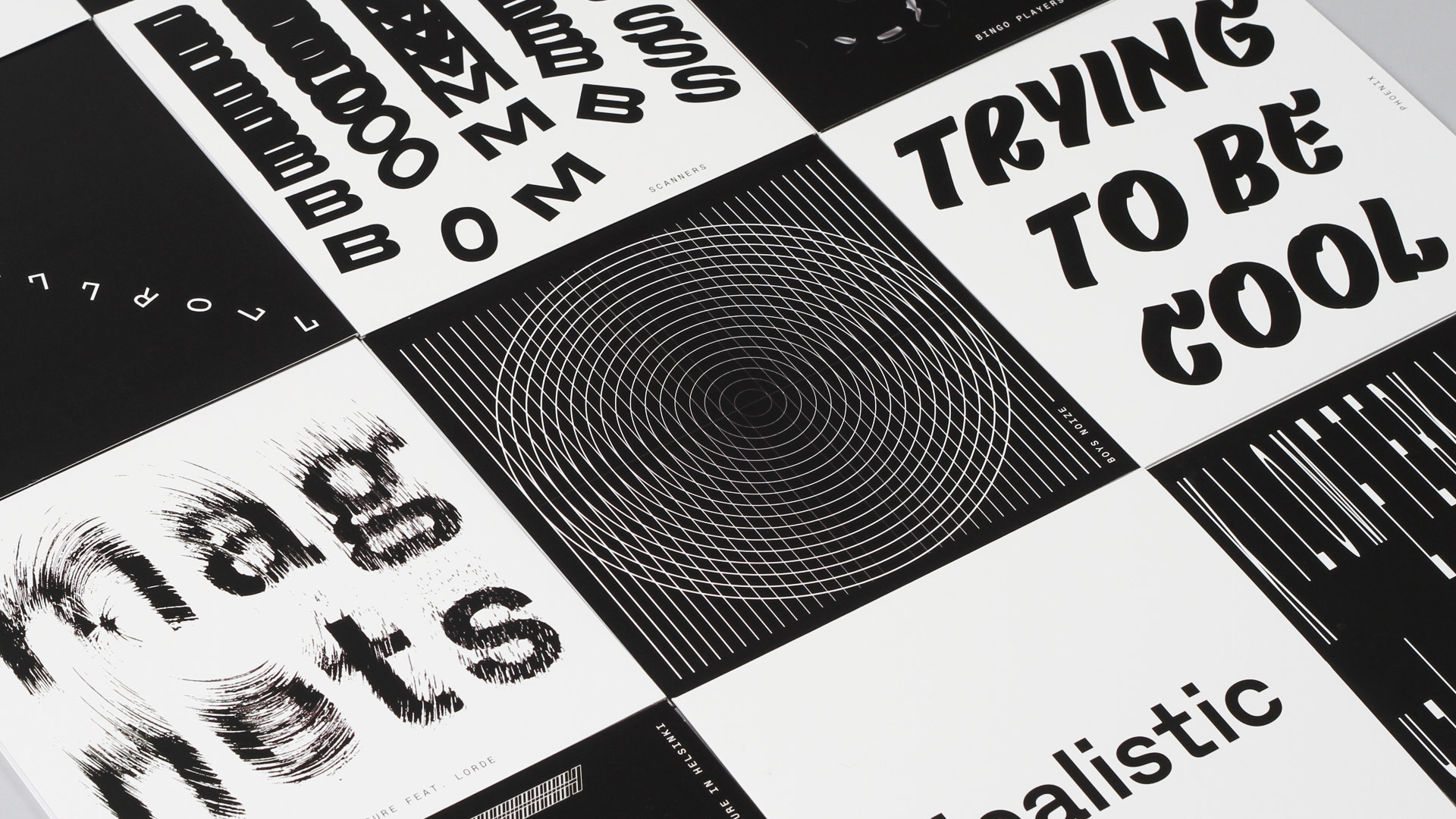
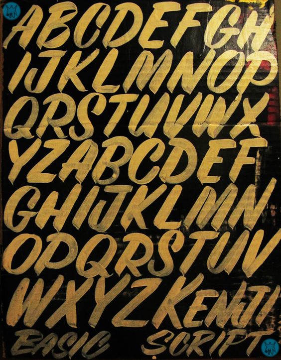
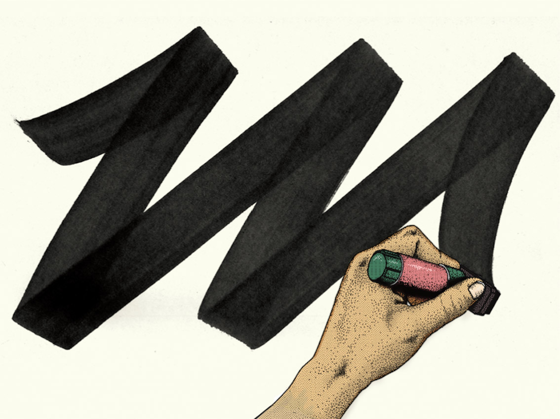
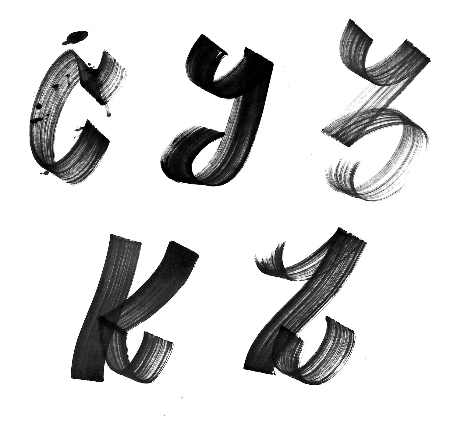
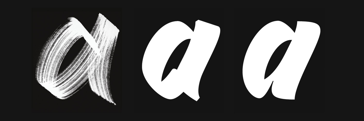
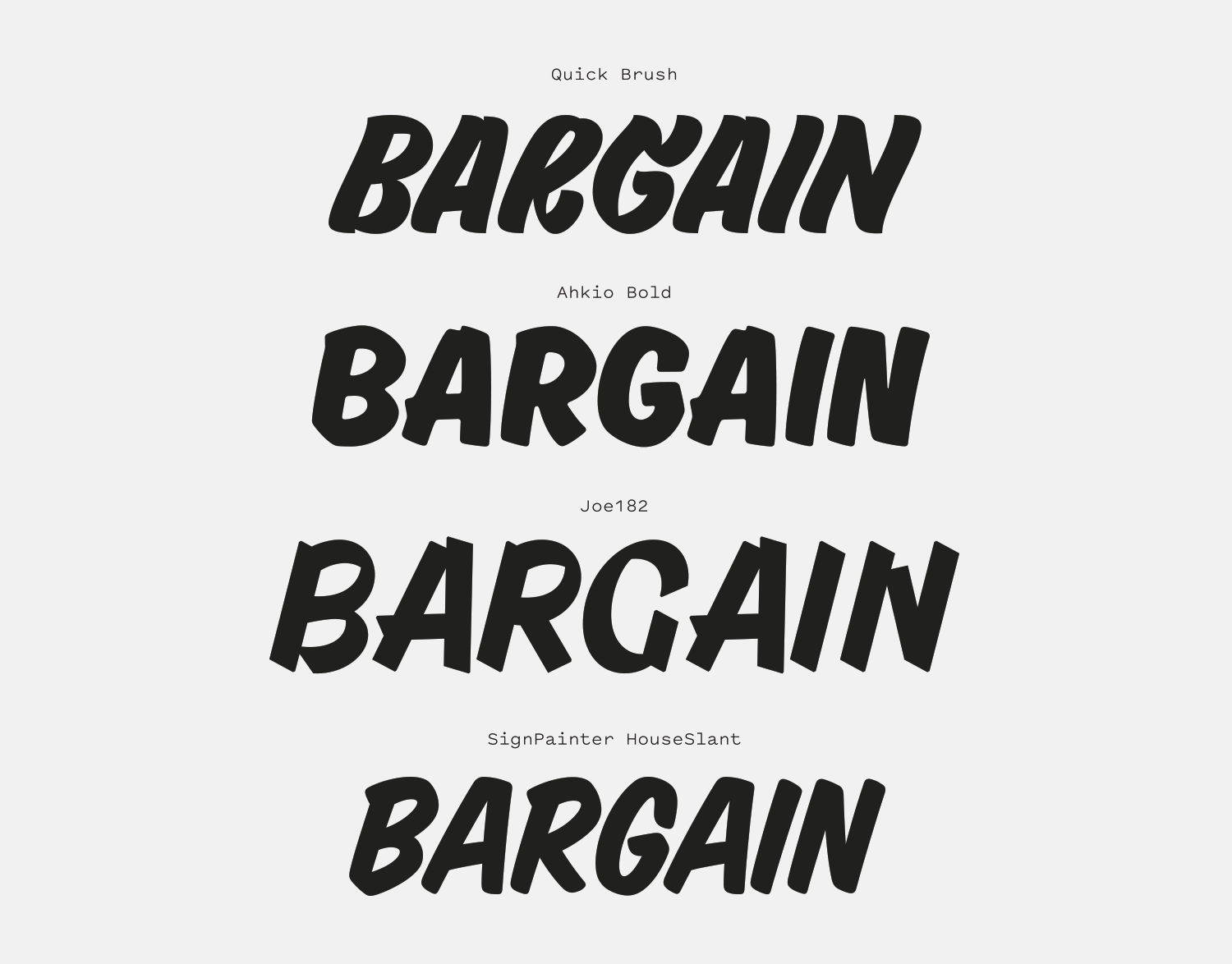
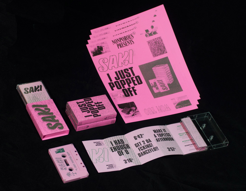
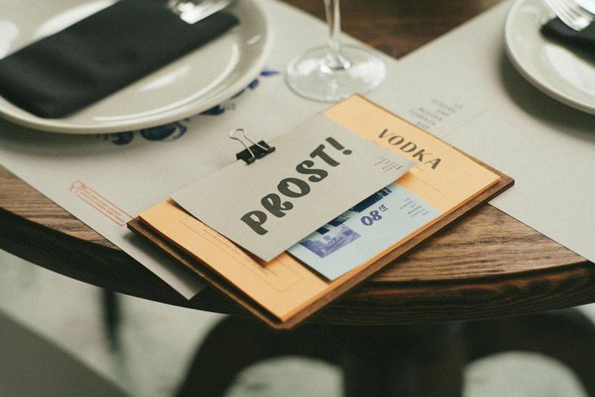
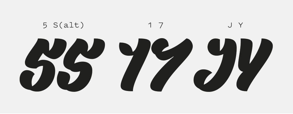
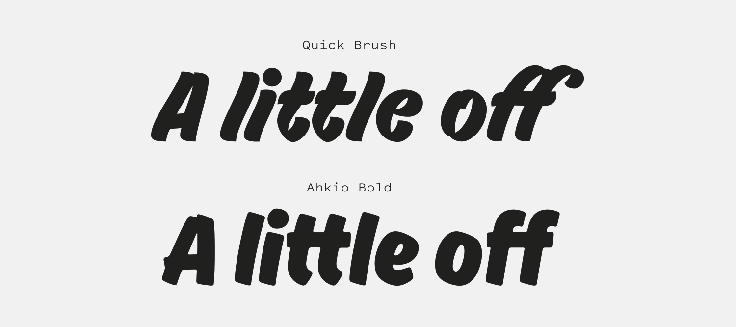
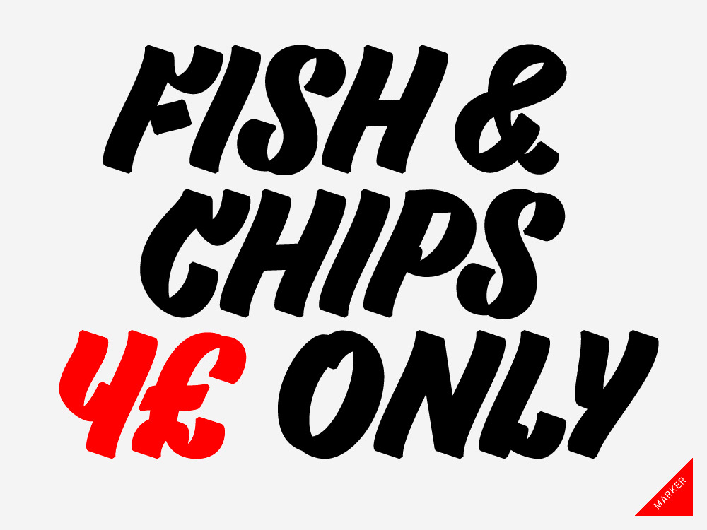
The Quick family of scripts is a set of two slithering scripts. The Marker weight playfully contrasts undulating lines with the geometry that comes from using a square-nibbed writing utensil, and Quick Brush is the more relaxed, smoother sibling.

I am fascinated by the creation of calligraphic systems that are so distinctive and tied to a medium of production (Pique is another great example of this). I find confident, unique designs like Quick Brush and Marker to be intoxicating—I ache to have an excuse to use them. It’s impossible to use these fonts in a neutral way. The ways to deploy typefaces like these might be limited, but when they sing, boy do they belt.

The Quick family of scripts feels naturalistic while staying consistent from letter to letter. It balances feeling thoughtful and consistent but at the same time effortless. You could imagine a seasoned sign painter scrawling out these characters in moments with little thought, but what is left is still masterfully made. The best scripts are the ones that feel ordinary to the owner of the hand that originated them, but to the rest of us (I’m so scared to write that the thought of a whiteboard sends me into cold sweats), Quick Marker and Brush are masterpieces.

behance.net — Quick Marker used in Dia Studio’s work for A-Trax’s In The Loop.
Nº02 behance.net — Quick Marker used in Dia Studio’s work for A-Trax’s In The Loop.

Historic Inspiration

Though the design splits between marker and brush styles, I would say the Quick family of scripts falls into a genre sign painters refer to as “casuals.” A casual lettering style is meant to be flexible, efficient, and expressive of the painter’s individual style. They need to be easy to read and make a lot of impact with an optimized amount of effort from the sign painter. I love going back through old sign painter manuals to see the diagrams and alphabets used to teach aspiring craftspeople how to craft these simpler letterforms[3]. Many are keeping the art form alive today through practice and instruction, such as John Downer, NUTS ART WORKS in Japan, and Glen Weisgerber.

Nº03 archive.org — An example of a casual sign painter script from Sign Painting Course by E.C. Matthews
pinterest.com — This signpainter lettering has some of the playful character found in the Quick family.
Nº04 pinterest.com — This signpainter lettering has some of the playful character found in the Quick family.

While many of the historic influences I see in Quick are found in brush-based scripts, Quick Marker is the member of the family to examine if we want to find the true genesis of the flow and style of the script. Philipp Herrmann was kind enough to send along early sketches he made for Quick with a massive Moltow marker[6], and by seeing these original exercises we can see how the typeface took shape[7]. By seeing how Herrmann planned these strokes, we can see where the dichotomy between cutting angles and undulating lines comes from, and the result is just as charming in its simplified font form.

Nº05 outofthedark.xyz — An illustration showing the type of thick marker emulated by Quick Marker.
Early marker sketches for Quick Marker. It’s remarkable how many of the details present in these sketches made it into the final design. Graciously provided by Philipp Herrmann.
Nº06 Early marker sketches for Quick Marker. It’s remarkable how many of the details present in these sketches made it into the final design. Graciously provided by Philipp Herrmann.

Quick Marker is the gentler of the two versions, but when you see how the “a” evolved from physical medium to final result, you can tell even in the Marker weight a lot of the severity of the original design is toned down[7]. I love directly comparing these and noticing little details Herrmann added in to emphasize the presence of the marker. Note the subtle chamfered corner at the top of the final Quick Marker design, which isn’t present in his actual sketch, but serves to remind us we’re looking at something that was drawn with blunt edges and not the softness provided by a brush. These details compensate for the texture that’s lost in the translation without making the design feel slavish to its source.

Nº07 The evolution of the Quick family, starting with a Moltow marker (left), a closely translated version for Quick Marker (middle), then the adjustments made for Quick Brush (right). Graciously provided by Philipp Herrmann.

The Quick scripts are quite detailed compared to many brush script faces. The “pompadours” present at the top of letterforms like the “E”, “C” and “G” give the family a flair that take it beyond the basic styling many brush scripts are aiming for. This is not a font that’s meant to blend in—it wants to be noticed. In a genre that’s primarily driven by simple, straight strokes, Quick Brush instead chooses to slither. The vertical strokes have a subtle wave to them, giving the lines a relaxing rhythm that’s disrupted by the aforementioned curls and dips, and the whole effect is amplified by the very aggressive forward tilt the family utilizes to convey momentum.

The counters are small, reinforcing the idea that this is a display, showcase font. Don’t put Quick in a corner. Compared to designs like Ahkio and Joe182, there’s little evidence of individual brush strokes in Quick. You’ll find slight overlaps or gaps at the apex of letters like the “A,” but it’s a very clean design overall that isn’t being obnoxious about the fact that it’s mimicking a hand-made aesthetic.

Nº08 Quick Brush compared against other brush script fonts. It has considerable more individual character, a more aggressive forward tilt, and tighter counter-spaces.
An example of pichação lettering which has the slithering lines the Quick family adopted. Graciously provided by Philipp Herrmann.
Nº09 An example of pichação lettering which has the slithering lines the Quick family adopted. Graciously provided by Philipp Herrmann.

Another cited reference in the design of Quick is pichação, Brazilian graffiti art. There is a lot of variety in pichação tagging, but many share a plain clarity in their style with a focus on the message itself over any artistic flair in the letterforms[10]. There’s a controlled aggression and assertiveness in the tagging that is carried over into Quick, and some of the more expressive examples establish the snaking lines Quick carries over[9]. It’s easy to see why Herrmann was influenced by the unique and effective style of graffiti, and Quick is a better design for it.

Nº10 imaginacaofertil.com.br — An example of pichação along the side of a highway in Porto Alegre.
happyending.viewbook.com — Quick Marker’s design is simple enough that it can be used to layer with other typefaces without the design feeling messy.
Nº11 happyending.viewbook.com — Quick Marker’s design is simple enough that it can be used to layer with other typefaces without the design feeling messy.

Quick’s strengths

Oftentimes the thing that spurs me to review a typeface is seeing it used exceptionally well on a single project. For Quick Marker, that project was a brochure made for the Bilbao Art District by Happyending Studio[12]. Quick Marker is used in neon salmon with staid Futura laid on top, and the combination sings. Quick Marker is consistent enough to not feel too dissonant with the rigidly geometric Futura while providing obvious contrast—hand-made vs machine-made. The interplay between scale, type styles and color make a powerful combination, and the second I saw this piece I knew I had to have Quick.

Nº12 happyending.viewbook.com — Quick Marker shines when used at large scale and with bright colors, as shown by Happyending Studio’s work for Bilbao Art District.
non-poro.us — Quick Brush’s simpler lines allow it to handle ornamentation like a shadow or an outline.
Nº13 non-poro.us — Quick Brush’s simpler lines allow it to handle ornamentation like a shadow or an outline.

The Quick family skillfully walks the line between expression and efficiency. It’s not overly textured and has just enough imperfections in the stroke finishes to give you the sense of something that was made by hand without knocking you over the head with it. It’s difficult for any typeface to walk this line between style and clarity, much less a script face.

Nº14 fatbeats.com — Quick Marker’s undulating lines are well-suited with the motion motif used throughout Dia’s work for In The Loop.
fontsinuse.com — Quick Marker used for headlines inside of Gestations.
Nº15 fontsinuse.com — Quick Marker used for headlines inside of Gestations.

This simple confidence allows it to slip into even starkly minimal designs easily, as it does in the work Dia Studio did for A-Trak’s In the Loop compilation set[14]. Each vinyl in the set features a different design with a different typeface[2], and the “Trying to be Cool” cover, featuring Quick Marker is a standout in the set. On the opposite end of the spectrum, there’s a great use of Quick Brush in the I Just Popped Off release from Saki, designed by NONPOROUS[13]. The script is outlined and printed on bright pink paper, proving once again how well-served this font is by neon colors. The smoother lines of Quick Brush are better suited to the outlining treatment than the stricter Marker weight.

Nº16 fontsinuse.com — Quick Marker used on the cover of Gestations, defiantly breaking with the gridded background. Design by Quentin Schmerber.

Like many idiosyncratic scripts, the Quick family can be used in unexpected contexts and provide a jolt of humor and punk aesthetic. In the exhibition booklet for the Gestations exhibition[16], designer Quentin Schmerber uses Quick Marker as a headline font—a peculiar pairing with the also oddball Proto Grotesk. On the cover it is tracked out and set in all-lowercase, further emphasizing how out of place it feels with all the rigidity surrounding it. The whole aesthetic feels very 90’s and a winking way, all the way down to the Sega game box artwork nod with the gridded cover. The booklet is an interesting showcase for using a script so far away from its original context[15]. Scripts are usually avoided in “systems work” like editorial design where they have to repeat the same roles over and over again, and are usually saved for bespoke applications, but here Quick is used consistently and to good effect. The offsetting of the second line in the headline nicely evokes the more free-form environment this typeface is used to being in.

Nº17 domestika.org — Quick Brush playing a supporting role in the eclectic typographic system happyending created for La Ribera Restaurant.
Many characters in Quick resemble each other, which you should be aware of and make sure your audience has the context to properly interpret what they are looking at.
Nº18 Many characters in Quick resemble each other, which you should be aware of and make sure your audience has the context to properly interpret what they are looking at.

Quirks and eccentricities

Quick has a highly specific and unique aesthetic and design system, and a side-effect of that is some of the characters can end up looking similar, or be illegible on their own without the extra context an entire string of words provides[18]. Good luck plopping that “J” in a design and expecting the majority of your audience to know what it is on its own. Folks outside of Philly might think your “Jawn” is actually a “Yawn.”

The Quick family is light on alternates and ligatures, so it is best used in one-off applications where you can really finesse how it is set and which characters are used. Because of the lack of alternates, the longer the strings and the more repeated characters used, the less organic the font starts to feel because your eye picks up on the identical glyphs. I’d call this an “uncanny valley,” because you want the reader to get the sense they are consuming something that is bespoke when they read a script like this, and when it becomes very obvious that it’s not, it can be unsettling.

Nº19 Because the Quick family has a limited number of ligatures and alternates, double up characters (like the tt here) draws the reader into the “uncanny valley” scripts can have.

This isn’t a script you’d choose if you needed something flexible. There’s no extra widths—your only options are if you want the Marker or Brush style. Both are very “full” and bold with tight counters, making it difficult to use either at smaller sizes. If you use the Quick family at larger scale you can take advantage of their casual, graphic tone.

It’s really hard for scripts to draw the line between usefulness and individualism, and in my opinion, Quick delivers on this. It falls more-so on the “individual” side of the spectrum, but as seen in the in-use in this review, it’s been utilized in several different design aesthetics successfully, both as the main attraction and as a role-player. Keep this one in your rolodex in case you find yourself needing a script with a bit of an edge and a lot to say.

- FRJ