Sporting Grotesque
— Designed by Lucas Le Bihan

101.at — Joseph Binder Award for Designaustria, designed by 101.
Nº01 101.at — Joseph Binder Award for Designaustria, designed by 101.

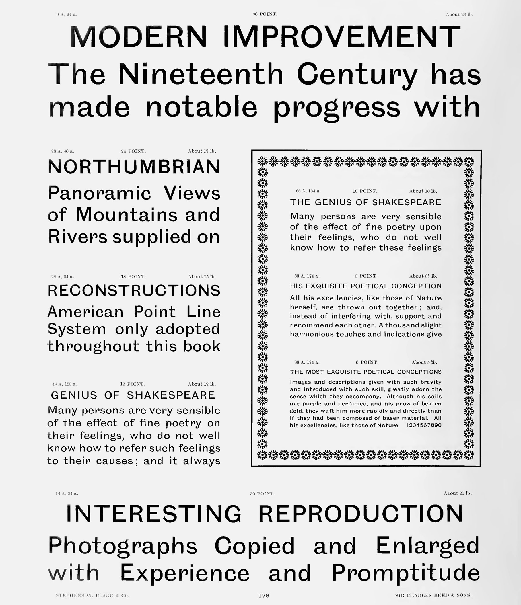
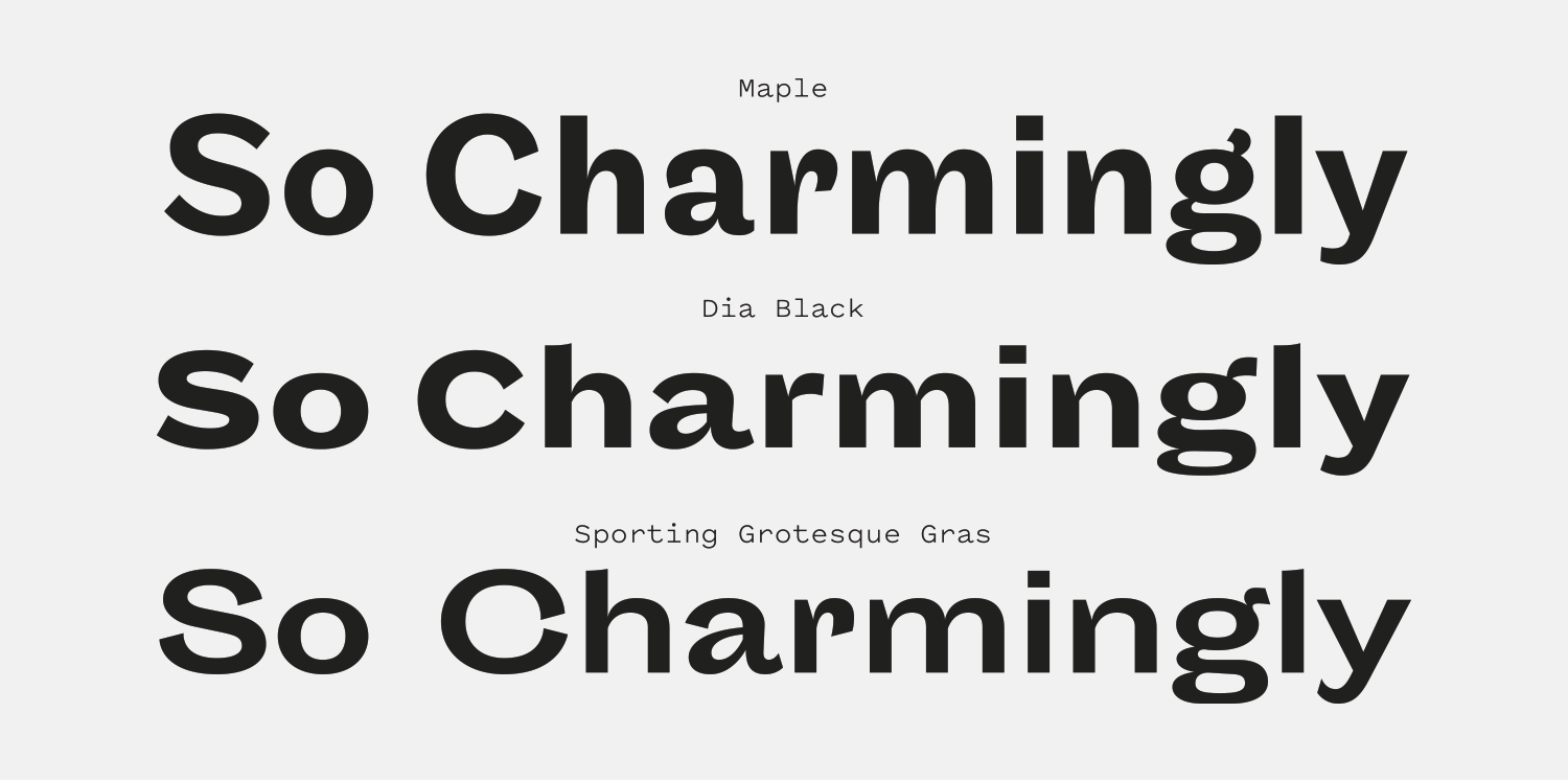
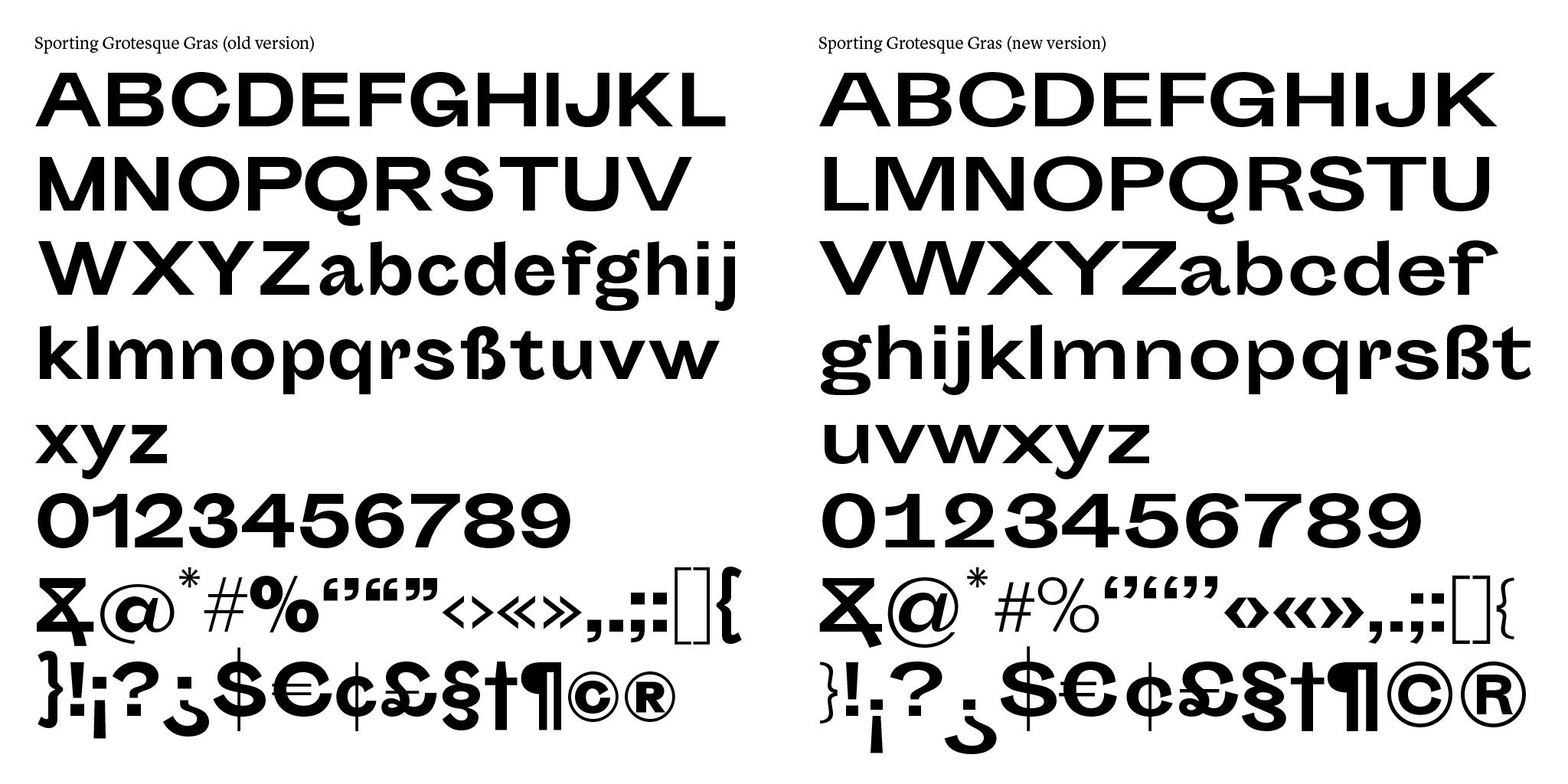
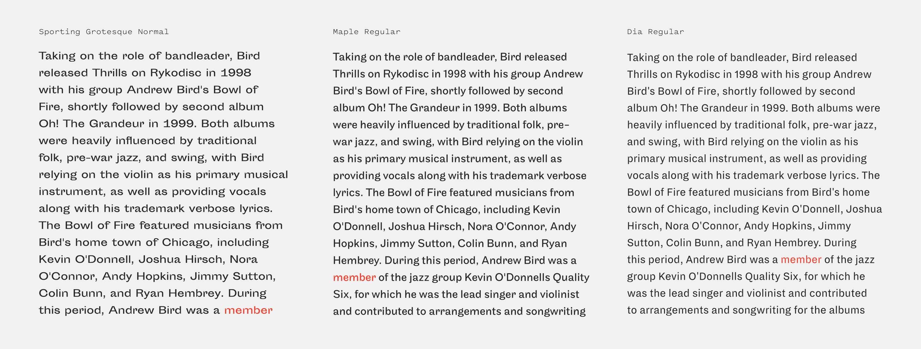
Sporting Grotesque is a bulbous, serpentine, old-school Grotesque design released through the Velvetyne Type Foundry as an open-source font. It’s important to me that the Font Review Journal covers typefaces that are attainable to a range of design budgets, and you can’t get much more attainable than free.

This falls into one of my favorite genres of typefaces: grotesques that are almost aggressively weird and old-fashioned. Maple, Proto Grotesk and Sporting Grotesque are all playful, unsettling and loopy in a way I find intoxicating. There’s a heavy calligraphic influence in this genre—terminals that feel pen-finished, thick to thin contrast and pinching around bowls, and incredibly tight apertures.

Sporting Grotesque feels as if there’s an abnormally high level of gravity squashing its characters down towards the baseline, flattening the characters to make them wider and squatter, and pushing all the apertures so near closing it causes constant unease. Yet it also feels unbound and relaxed, well aware that it is unconventional and not giving a single care about it. This wider base, along with the looping, bizarre capital alternates the typeface has give it a unique presence compared to other typefaces in this genre.

happy-little-accidents.de — Sporting Grotesque (with modified “R’s”) in the Myth Tour de France branding.
Nº02 happy-little-accidents.de — Sporting Grotesque (with modified “R’s”) in the Myth Tour de France branding.
Nº03 archive.org — Stephenson Blake’s Lining Grotesque Nº6, which inspired many characteristics of Sporting Grotesque. Specimens of point line type, 1908.
velvetyne.fr — Sporting Grotesque rather cheekily taken back to its lead type roots.
Nº04 velvetyne.fr — Sporting Grotesque rather cheekily taken back to its lead type roots.

Historic Inspiration

Sporting Grotesque references several classic grotesque designs, most prominently Grotesque № 6[3]. Stephenson Blake’s Grotesque № 6 shares the droopy arm on the “r”, the long spur on the “a” and the tight aperture on the “C” with its irregular terminals. Characters like the “b” have alarge wedge incision between the bowl and the stem, the “s” looks like it’s been stepped on and squashed, and the “y” curls back up in a charming way that informs many of the little flourishes in Sporting Grotesque.

There are a few characters that really define the quirky nature of this font. The “f” droops forward and has no sense of personal boundaries—by contrast, the “r” is squirming to try to avoid touching anyone else. The “C” has mismatched finishing angles on its terminals that make it feel like a living creature, and the “a’s” bowl resembles a paunch that is hanging over a belt buckle. Some of these are direct references of older designs, but many feel calligraphic in nature and the font embraces the history of Grotesque designs while reveling in the freedom that comes from being unbound from the limitations of metal type. The sharp incisions, wide base and smattering of narrower designs (like the “r”) give lines of Sporting Grotesque an unsettling presence that still manages to feel inviting because of its loose design.

Nº05 Sporting Grotesque (bottom) compared to Maple (top) and Dia Black (middle). Sporting Grotesque is much wider and has tighter apertures compared to its contemporaries.
siloenouyrit.fr — Program for Maison de la Culture d’Amiens, designed by Siloé Nouyrit
Nº06 siloenouyrit.fr — Program for Maison de la Culture d’Amiens, designed by Siloé Nouyrit

This genre of Grotesque homage isn’t incredibly common, but there are several excellent examples of the genre, most notably Maple, by Eric Olson, and Dia, by Florian Schick and Lauri Toikka. When you compare all three you can see the common ancestry and even better appreciate the unique traits of Sporting Grotesque[5]. Each of them has the distinctively incised notches where stems connect to rounded shapes. It shares the tucked in “r” of Maple while keeping the extended stance of Dia Black, as well and the long tail of the “a” and the concave shapes atop the stems of the “h” and “l”. The pen-nib inspired finishes on the ear of the “g”, the aperture of the “C” and the shoulder of the “r” lend Sporting Grotesque a more expressive tone than its contemporaries, but I think the expressiveness is still controlled enough that the design feels cohesive despite these touches.

Sporting Grotesque has much tighter apertures than either Maple or Dia, and you can really feel the irregular rhythm to the line when compared to these other grotesques. Maple does more to keep the character widths consistent (notice how much narrower the “a” is) so the downward curve in the “r” isn’t as disruptive as it feels in Sporting Grotesque, where it’s much more noticeable against the wider letterforms. The overall effect is that Sporting Grotesque becomes a bit harder to read, but also brings more idiosyncratic charm to the table.

101.at — Joseph Binder Award bags, designed by 101.
Nº07 101.at — Joseph Binder Award bags, designed by 101.
Nº08 happy-little-accidents.de — Sporting Grotesque (with modified “R’s” in the Myth Tour de France branding.
dumdum.mx — Sporting Grotesque used in branding for Civilización, a creative community initiative.
Nº09 dumdum.mx — Sporting Grotesque used in branding for Civilización, a creative community initiative.

Sporting Grotesque’s strengths

Sporting Grotesque’s unique combination of grotesque and calligraphic shapes give it a unique presence, and it excels in stark designs with strong colors when it’s asked to render punchy strings of text. In all-caps, the irregular shapes and closed apertures of Sporting Grotesque give it an aggressive, oddball presence. It’s commanding, but the voice is a bit unstable, and designers often tweak the design of certain characters to mold that voice to better fit the tone of their designs. German studio Happy Little Accidents uses this method for the Mythos Tour de France exhibition branding, customizing the “R” in both “TOUR” and “FRANCE”, giving them curved, sleek legs which make them feel more “euro” and less grotesque[8]. These more geometric shapes clash against characters like the squashed, serpentine “S” but feel right at home with the wide, monumental “M”.

behance.net — Cartes Postales Book design by Fetanis Ioannis showing off Sporting Grot’s lovely numerals.
Nº10 behance.net Cartes Postales Book design by Fetanis Ioannis showing off Sporting Grot’s lovely numerals.
Nº11 siloenouyrit.fr Program for Maison de la Culture d’Amiens using Sporting Grot’s numerals and pairing it with a more rigid wide sans for stability.
itsnicethat.com — Sporting’s bulbous shapes are well suited to be placed on spherical objects.
Nº12 itsnicethat.com — Sporting’s bulbous shapes are well suited to be placed on spherical objects.

Sporting Grotesque features a fun, expressive set of numerals, and I’ve often seen designs that mix them in against more rigid, lower contrast sans-serif designs, where they provide a bit of playful relief. Designer Siloé Nouyrit sprinkles Sporting Grotesque into the branding and publication design work he did for the Maison de la Culture d’Amiens[11], contrasting it against Druk Wide, which has much lower thick-to-thin contrast. It’s an interesting choice to pair two wide sans in the same design, but I think it works precisely because they share a similar width. If the design used a condensed weight of Druk instead I think the higher contrast and comparatively fussy Sporting Grotesque would feel too discordant.

Nº13 victoriajung.de This flyer for the Animationroom event at Hildesheim University puts the loose and playful Sporting Gotesque alongside loose illustrations. Designed by Victoria Jung.
velvetyne.fr — Sporting Grot used in a lo-fi poster, designed by RAUM MANNHEIM.
Nº14 velvetyne.fr — Sporting Grot used in a lo-fi poster, designed by RAUM MANNHEIM.

The irregular, old-fashioned and hand-touched nature of Sporting Grotesque makes it well-suited to chaotic punk designs[14]. The quirk in the typeface plays right into the awkward scaling and distortion often found in that aesthetic, and can make the audience feel uncomfortable while still being an attractive typeface.

Nº15 behance.net Sporting Grot in more restrained application on the cover of Imperialism, the final stage of Capitalism, designed by Angelo Barbattini.

Sporting Grotesque’s calligraphic influences and personable shapes also make it well suited to be used in illustration-heavy work[13], or work that has a lighter tone. Sporting Grotesque was used in the A Load of Jargon exhibition[12] across five pieces of artwork that were designed by Isabel + Helen to poke fun at tech-industry buzzwords. Sporting Grotesque feels right at home printed onto a large inflatable ball, its unpretentious design and bulbous shapes mirroring the playful nature of medium.

Quirks and eccentricities

Sporting Grotesque’s closed apertures and irregular width rhythm makes it a poor choice for long-form reading, but that hasn’t stopped people from using it that way (more on that in a moment). There are no italics for Sporting Grotesque and just two weights, so this isn’t a workhorse family. However, there is that odd set of alternate capitals (seen in the specimen at the top of the review, and the Notable Glyphs section), as well as small caps, so all things considered, there’s a lot to work with in Sporting Grotesque.

Nº16 myfonts.com — This helpful comparison provided by WhatTheFont user Akira1975 on the differences between the original version of Sporting Grot and the newer version.
behance.net — Sporting Gortesque used in a Brutalist design for KIDS 1995 BY LARRY CLARK – NEVER FORGET by designer Brando Corradini.
Nº17 behance.net — Sporting Gortesque used in a Brutalist design for KIDS 1995 BY LARRY CLARK – NEVER FORGET by designer Brando Corradini.

There’s actually been a few major versions of Sporting Grotesque released, so if you are wondering why some of the in-use examples don’t seem to exactly line up with the specimens, that is why. The newer version is wider than the original, with a slightly lighter overall weight, wider apertures and a more extreme thick-to-thin contrast[16]. Overall, I think the evolution makes Sporting Grot more distinctive and the newer version also has significantly more kern pairings that make it easier to set.

Nº18 velvetyne.fr — Sporting Grotesque is an unconventional choice for body copy, but here the designer takes advantage of its width in a justified text column layout.

This is a display face, first and foremost, and you should use it at small sizes at your own (and your reader’s) peril. The looping characters, extended width, inconsistency in character negative space (look at how much tighter the bowl of the “a” is compared to the rest of the typeface) and extremely short descenders make it difficult to read at small sizes and for long sections of text. The end result is a tangled, dense line of text that isn’t economical with space. If you want the look of Sporting Grotesque in body copy, consider swapping in Maple, which has the same roots and character as Sporting Grotesque, but has a narrower stance, taller x-height, and better proportions for body copy[19]. With that said, designers still use it as body copy, and I’ve included a few examples here so you can determine if you think using it in that context is a challenge you’re willing to undertake.

Sporting Grotesque (left) line density compared to Maple (middle) and Dia (right). The other two grotesques can fit more glyphs on a line.
Nº19 Sporting Grotesque (left) line density compared to Maple (middle) and Dia (right). The other two grotesques can fit more glyphs on a line.
studio.so — Design for the Kunstverein Konstanz by Studio So, mixing stroked Sporting Grotesque with a serif.
Nº20 studio.so — Design for the Kunstverein Konstanz by Studio So, mixing stroked Sporting Grotesque with a serif.
Nº21 studio.so — Program design for the Kunstverein Konstanz by Studio So, mixing standard and stroked Sporting Grotesque.

Because it’s “the style” nowadays, I’ve seen a number of designs that outline Sporting Grotesque, but I would warn against it. Because the contrast is so sharp in this font and the ample pinches and incisions that narrow strokes to thin points, Sporting Grotesque doesn’t hold up well to having a rule around it. On characters like the “a”, “g” and “n” the strokes will meld together and give the illusion of a thickening of the line which clashes with the tightening of the stroke of the letter and creates emphasis in the wrong places. As a general rule, save that technique for typefaces with lower contrast and more evenly distributed surface areas. If your goal is to make the reader feel uncomfortable, go for it, but if you’re looking to “lighten” the look of the font it’s a tougher sell.

- FRJ