Maelstrom
— Designed by Kris Sowersby

klim.co.nz — Maelstrom in the Texas Monthly Touts section, September 2012, designed by T.J. Tucker.
Nº01 klim.co.nz — Maelstrom in the Texas Monthly Touts section, September 2012, designed by T.J. Tucker.

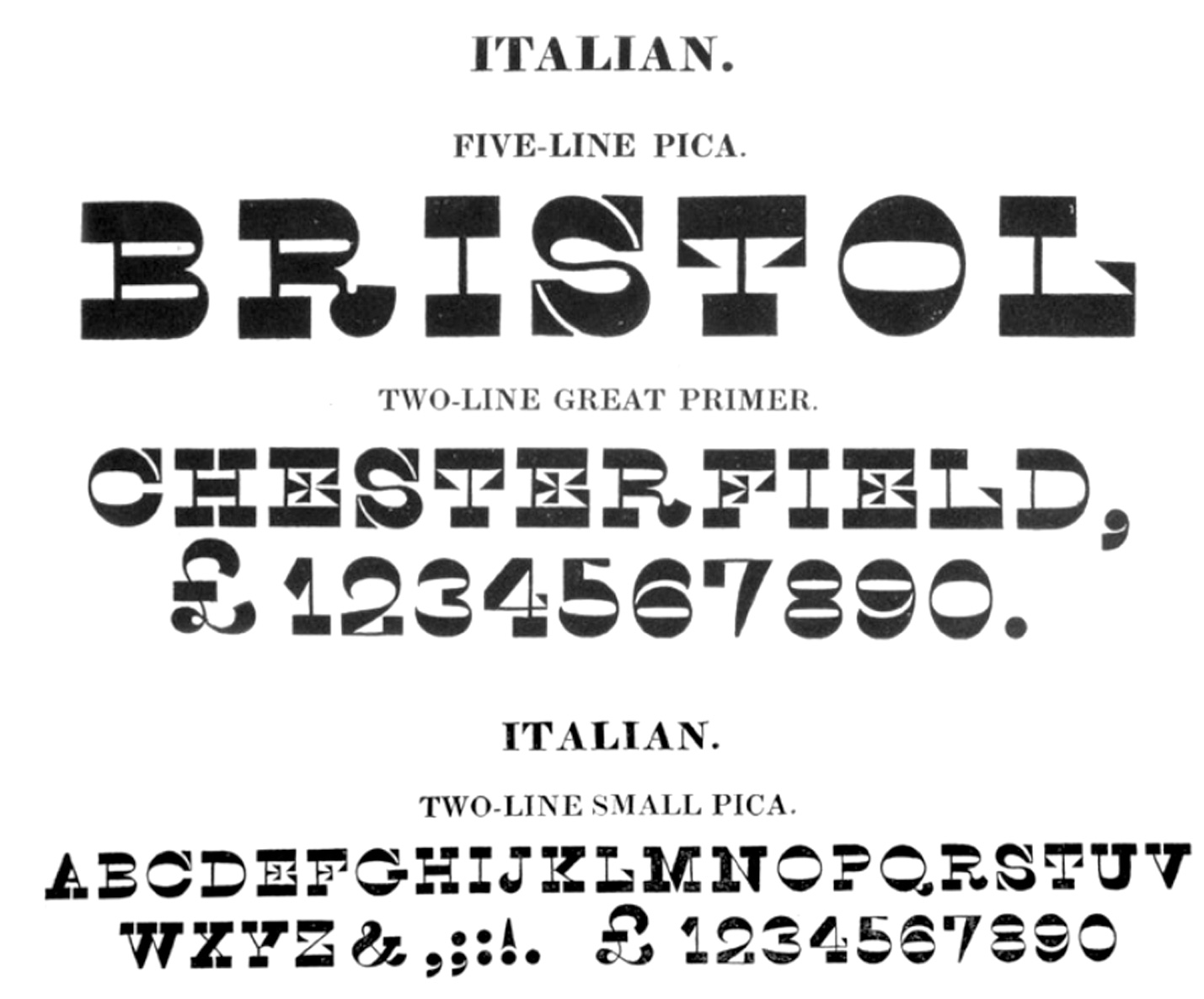
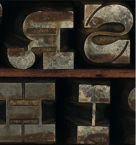
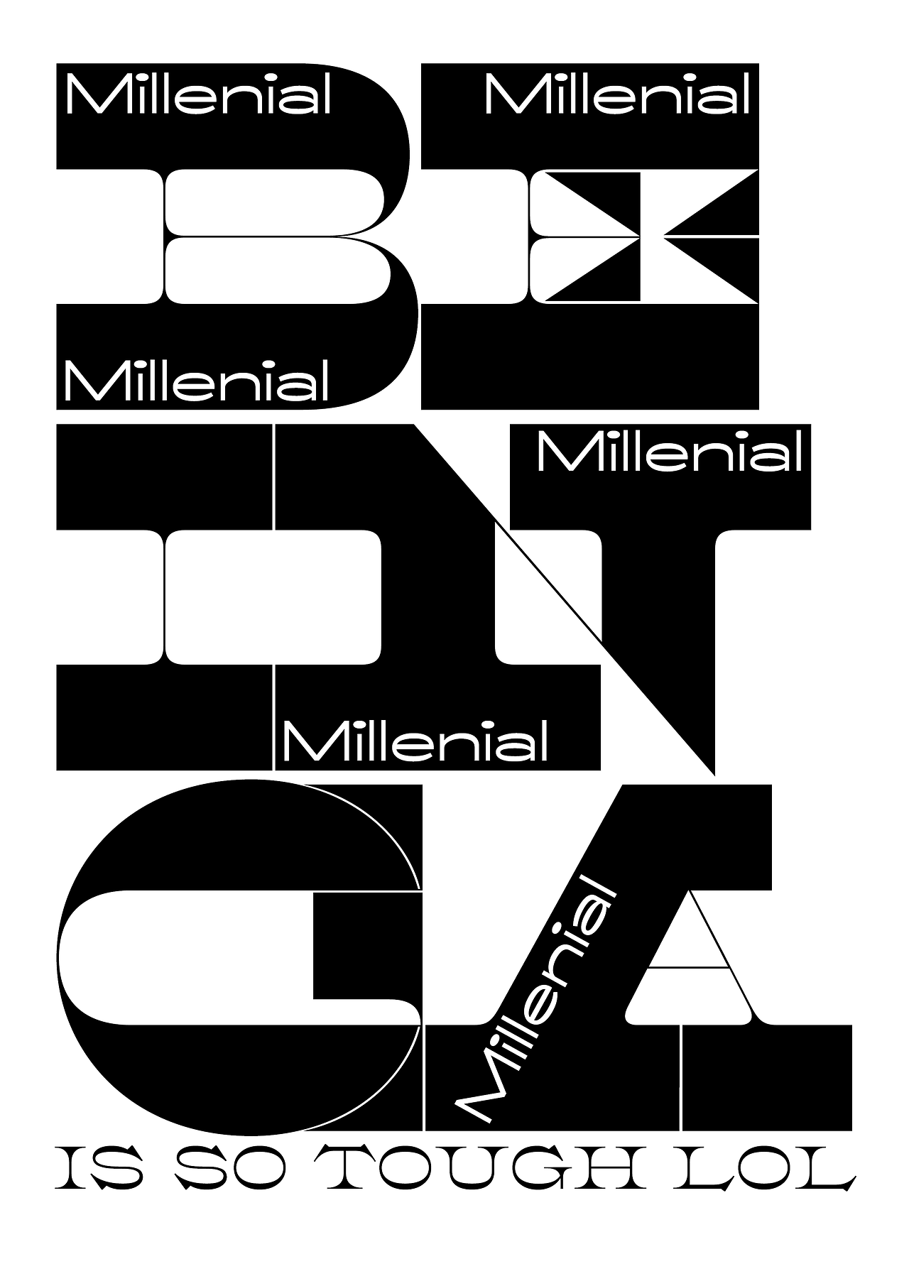
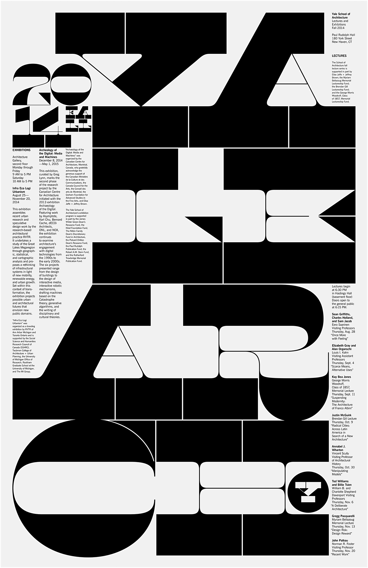
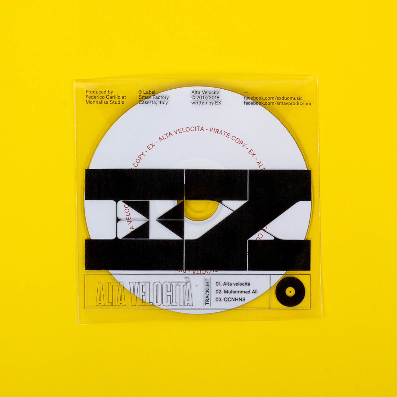
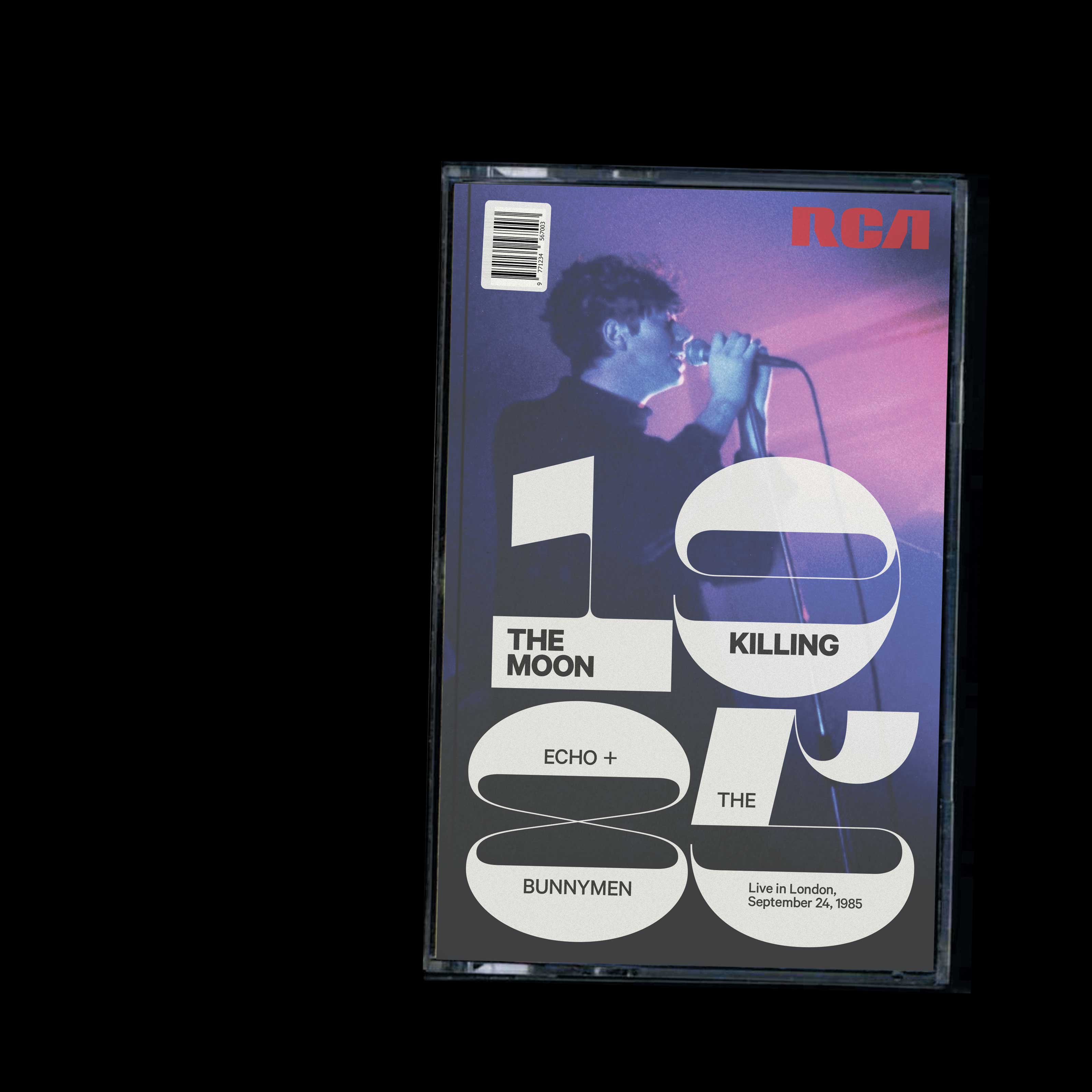
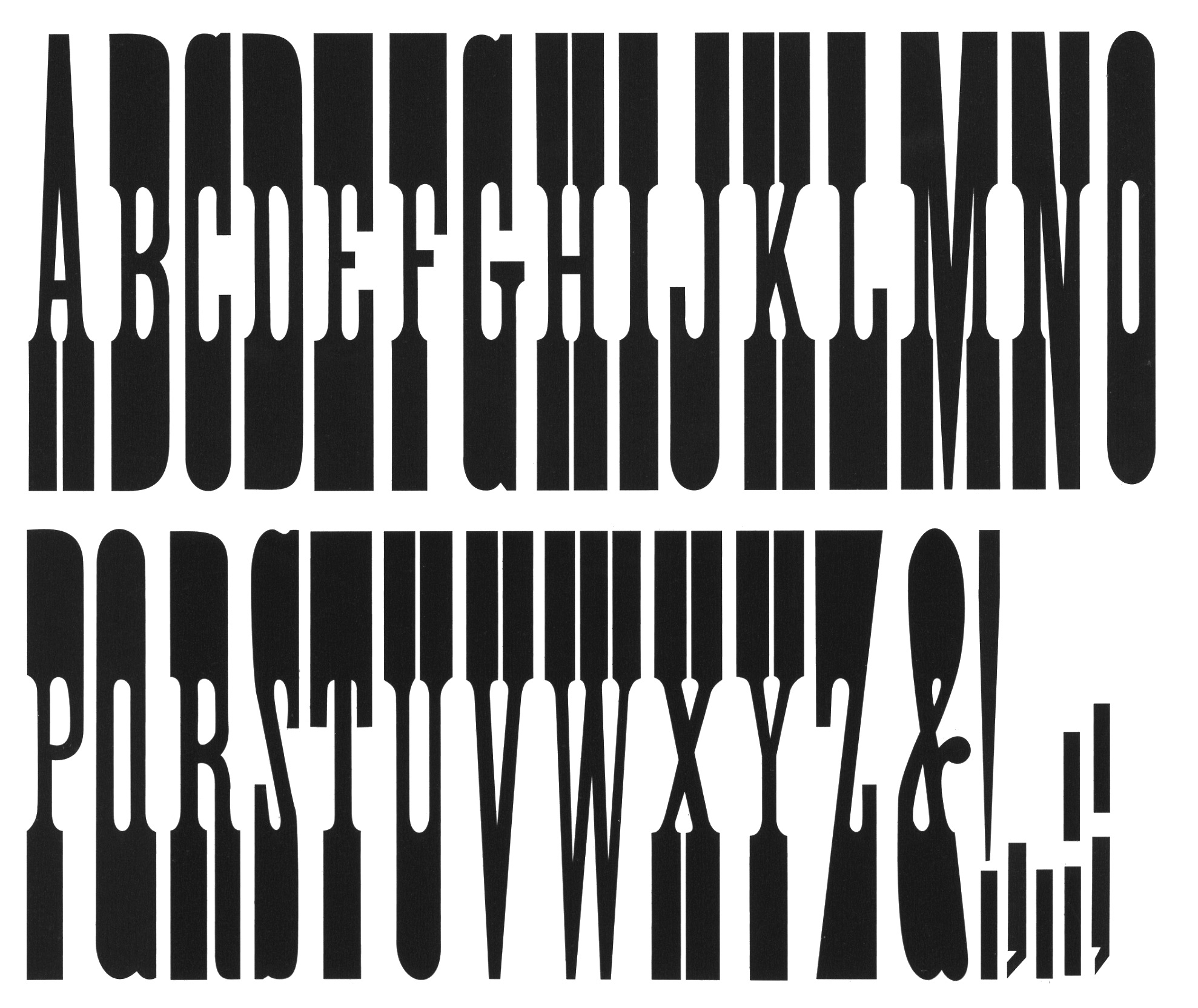
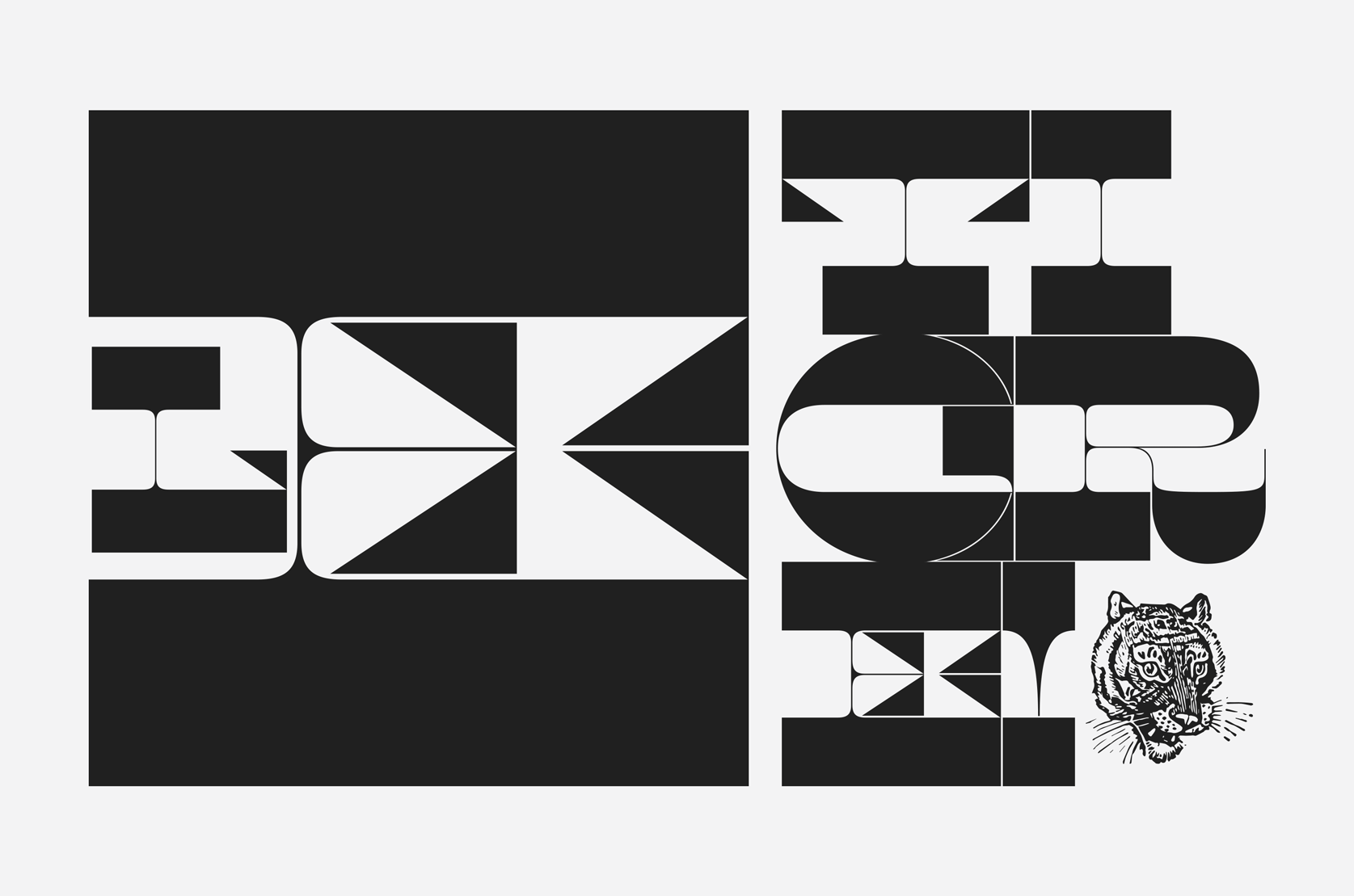
I have a soft spot for reverse-stress typefaces—fonts that are thickest on the strokes that are typically thin, and vice-versa. This is a strange and uncomfortable genre of typeface, which is why it’s so exciting to see it tackled by one of the best typeface designers practicing—Kris Sowersby.

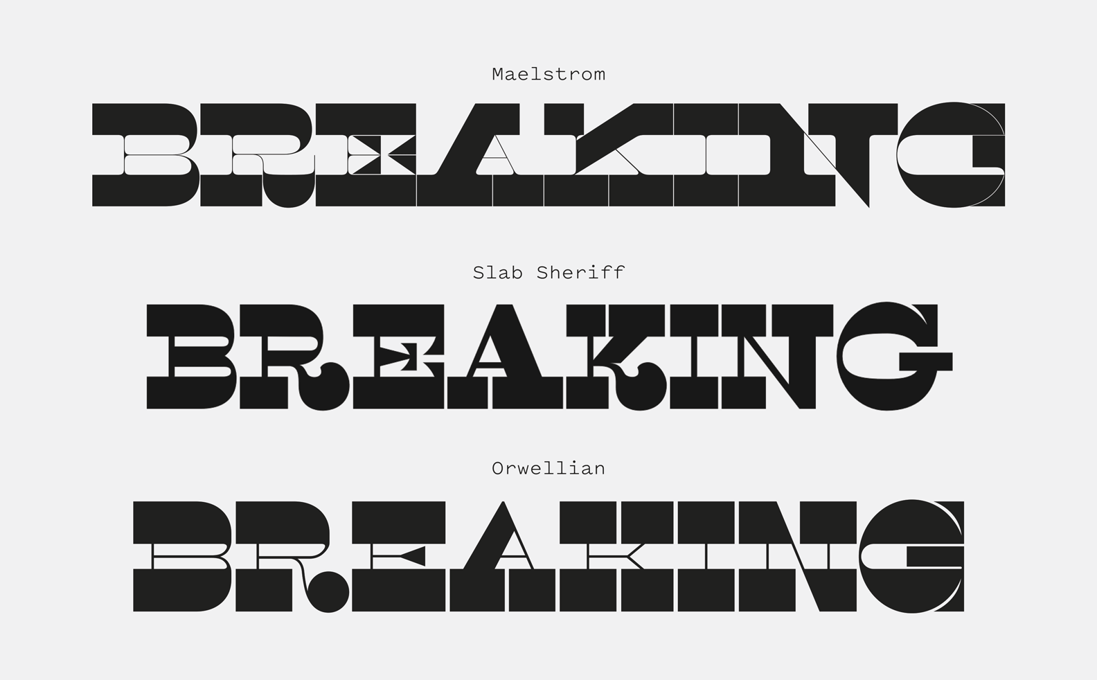
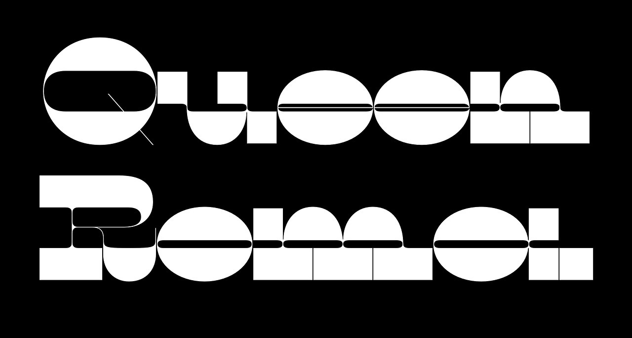
Maelstrom is one of my favorites from this newly-resurgent genre. It takes the concept to its logical extremes, alternating between its massive slab strokes on its ceiling and floors to delicate hairlines in the squishy middle. Each character is full of intricacies and begs to be used at monolithic sizes so the contrast can be properly appreciated. Despite the hilarious heft of its slabs, Maelstrom doesn’t feel bulky or clumsy like an Antique-style slab-serif might. Instead, it feels almost calligraphic, oozing with sassy personality. It is svelte and elegant despite its trappings, and its very existence feels like a middle finger to expectations of legibility.

Maelstrom is so abstracted that it’s easier to appreciate for its formal elements than it is to actually read. This can be used to a designer’s advantage, as Maelstrom’s characters can serve as geometry, pattern and pure graphic presence on the page. Some typefaces are more works of art to be marveled at than tools of readability. Despite its highly specific nature, Maelstrom has its uses, and any time a typeface is this beautiful, odd and exciting, it should be celebrated. Reverse-stress typefaces are currently seeing a bit of a revival through the punk/brutalist aesthetics that often blend blasé typefaces against more idiosyncratic options. I’ve seen Maelstrom popping up more and more inside of these designs, so now seems like a great time to celebrate it and dig into why this is one of the most well-crafted examples in the genre.

A piece of Gundam series fanart using Maelstrom to mimic the visual appearance of Japanese lettering.
Nº02 A piece of Gundam series fanart using Maelstrom to mimic the visual appearance of Japanese lettering.

Historic Inspiration

Maelstrom is an adaptation of Debow’s 20 & 8 Line Italian design[6], which Sowersby noticed while reading Rob Roy Kelly’s American Wood Type. Reverse-stress typefaces were often called “Italians” (type folks in this era loved to name genres after places. “French”, “Egyptian”, etc) after Caslon Italian, produced by Caslon & Livermore in 1821[3]. These were a bastardization of Egyptian slab serif designs, inverting the expected stress of the strokes to be on the horizontal lines instead of the verticals. The resulting designs were made up of eyelid-shaped circles, massive rectangular shapes and small triangular vestigial details. Type historian Nicolette Gray famously described these designs as “perverse.”

Nº03 luc.devroye.org — Henry Caslon’s Italian from 1821, one of the formative examples of the reverse-stress genre.
eyemagazine.com — Detail of five-line pica punches, which were then used to create copper matrices which were used to cast the type. You’ll find the same serif details from the “S” in Maelstrom, detailed in the Notable Glyphs section above.
Nº04 eyemagazine.com — Detail of five-line pica punches, which were then used to create copper matrices which were used to cast the type. You’ll find the same serif details from the “S” in Maelstrom, detailed in the Notable Glyphs section above.

Though this style never found mainstream appeal, it has remained a niche that type designers have dipped into throughout the years, though few explorations in this style are quite as extreme as Maelstrom. Sowersby brings over many elements of the classic Italians—the triangular “flags” that flit off of some of the horizontal strokes, the beaks on the “C” and “G”, and the severe horizontal stress on the “eyelids” on many of the bowls. What sets Maelstrom apart from the historic examples and from other modern interpretations of the idea is its extreme thick to thin contrast, and the simplification and enlarging of the triangular flags seen in the Debow Italian.

Nº05 Maelstrom (top), compared to two other reverse-stress slab designs, Slab Sheriff (middle) and Orwellian (bottom). Maelstrom’s wide stance and extreme thick-to-thin contrast set it apart.
klim.co.nz — Debow’s 20 & 8 Line Italian. This example from American Wood Type inspired the dramatic contrast and triangular details in Maelstrom.
Nº06 klim.co.nz — Debow’s 20 & 8 Line Italian. This example from American Wood Type inspired the dramatic contrast and triangular details in Maelstrom.

Leaning into the style’s inherent display-font nature, Sowersby has thinned the strokes floating in the middle of the glyphs between the massive slabs to hairlines. Maelstrom is also quite wide compared to many modern revivals of the style[5], the stretched out proportions ensuring he has the space in the center of the letterforms for details like those enlarged flags (note that the narrower proportions in Orwellian mean there isn’t as much room for shenanigans).

Committing to the hairline structure in the middle allows for Maelstrom to have design details without the overall aesthetic getting muddled. Slab Sheriff is in some ways a more direct revival of vintage reverse-stress designs, and your eye is disoriented throughout the line due to all the different visual details being expressed. These flourishes come at a cost, and Maelstrom’s consistent “sandwich” structure allows you to “read the middle” while the thick slabs frame the top and bottom of the line.

Nº07 klim-type.tumblr.com — At one point in Maelstrom’s development, Sowersby took a stab at creating lowercase letterforms, an effort he quickly determined was unfeasible.

Maelstrom’s forms are both monolithic and serpentine, the connecting hairlines complimented by lovely details like the half-circle curve on the leg of the “R” (note how much more elegant of a solution it is compared to historic examples[4])and the stunning wave at the top of the “5” (seen in the specimen at the top of the review). These moments alleviate the heaviness from the rectangular slabs and grant Maelstrom the same elegance you’d find in a Fat Face Modern design—an editorial flair. Maelstrom feels graphic and alien, but certainly not monstrous or perverse. Sowersby has simplified the components used to build out the Maelstrom glyphs (you won’t find bulbous ball terminals on the “R” or “Q” here) but the inherent contrast of the design and the aforementioned moments of levity ensure each character feels special while maintaining uniformity.

Maelstrom can be set large while still allowing air through. This can allow for interesting layering and use of transparent surfaces, as seen in this Blank Books album concept.
Nº08 Maelstrom can be set large while still allowing air through. This can allow for interesting layering and use of transparent surfaces, as seen in this Blank Books album concept.
antonioono.tumblr.com — The typeface pairings in this design bring out the hand-crafted feeling of Maelstrom. Designed by Antonio Ono.
Nº09 antonioono.tumblr.com — The typeface pairings in this design bring out the hand-crafted feeling of Maelstrom. Designed by Antonio Ono.

Maelstrom’s strengths

Sometimes it feels as if a typeface comes into existence so it could be used in one transcendent design. In Maelstrom’s case, that design is Jessica Svendsen’s Yale School of Architecture poster[10]. Svendsen is a masterful typographer, and by making very subtle modifications to an “off the shelf” typeface she creates an effect that feels so hand-crafted that you would be forgiven if you thought the letters were custom-made to fill the role. Maelstrom sings at this massive scale, yet it is not so overwhelming that it splits the poster in half—a different typeface would create a solid mass in the middle of the composition and drive a wedge between the content. Instead, she uses Maelstrom’s slabs as the scaffolding of the design, the thick strokes creating typographic strata that the hairline interior strokes snake between.

Nº10 jessicasvendsen.com — Poster for the Yale School of Architecture, designed by Jessica Svendsen. This design is the main reason anyone attempts to use Maelstrom.
klim.co.nz — Maelstrom has really taken off in the world of music packaging design. This design by Attico36 takes advantage of the hairlines in Maelstrom with its transparent packaging.
Nº11 klim.co.nz — Maelstrom has really taken off in the world of music packaging design. This design by Attico36 takes advantage of the hairlines in Maelstrom with its transparent packaging.

Maelstrom is scaled down in two separate places on the design to provide a hierarchical stepping stone to the much smaller text dripping down the edges of the poster. The smaller size allows you to appreciate the more intricate, rounder details in the numerals. The “2” snakes down and widens like a river emptying into a delta, pulling your eye down to the information below, and the “0’s” horizontal stress reinforces the large, layered type immediately to its right.

The poster is a stunning work that I’ve spent inordinate amounts of time studying, and each time I find more thoughtful details that Svendsen has tended to. The stem of the “R” is subtly shifted to match the gap between the “LE” above, reinforcing the architectural masonry. Did you notice she removed the flags in the “E” and “F” so they had enough negative space to allow for air circulation? The change removes one of the most distinctive elements of the typeface, but Maelstrom has more than enough of a design point of view to carry on without them, and it was years before I even noticed the change. I’m fairly convinced that a large percentage of the in-use we have for Maelstrom is a result of designers like myself being moved by this piece and hopelessly fumbling around to recreate some sliver of its impact.

Nº12 klim.co.nz — The Killing Moon cassette design by Andrew Salomon, continuing the trend of using the thickest parts of the typeface to house smaller type. It’s worth noting the 80’s vibes the typeface is able to evoke here when paired with the blue-pink lighting and the classic RCA logo.

Svendsen has set a high bar for using Maelstrom effectively, but there are plenty of other interesting uses for the typeface. This poster design by Antonio Ono[9] uses a similar structure Svendsen’s work—stacking Maelstrom at scale—but instead makes good use of the massive slabs and overlays smaller type on top of them. Ono keeps the “E’s” flags intact, which in this case help create a denser field for the reversed type to cut out from. The paired typefaces are eccentric and dramatic in the same way Maelstrom is, showing off a more playful side of the typeface when compared to the modernistic flair of Svendsen’s piece. The extended, expressive pairing typefaces bring out the slinking, organic quality of Maelstrom’s strokes.

Nº13 commarts.com — Pages from Texas Monthly, using Maelstrom as a way-finding element.
Poster concept stretching out the serifs of Maelstrom to even greater extremes.
Nº14 Poster concept stretching out the serifs of Maelstrom to even greater extremes.

T. J. Tucker’s work for Texas Monthly also explores this playful nature, using Maelstrom as iconic, graphic elements[13]. In the “Touts” section of the magazine, Maelstrom’s “T” is given a unique illustrative treatment in each issue and granted a three-dimensional sense of physicality. Elsewhere in the publication, Maelstrom is used as an identifier of the current section and prefaces the section headings. The exaggerated height of the serifs make it a particularly fitting choice for a Texas-based magazine. French Clarendons[15], with their spindly middle and massive top and bottom slabs, are frequently associated with cowboy and “western” aesthetics. In an interview, Tucker mentioned being on the hunt for a “a sumo-sized retro western” and he found it in Maelstrom.

Nº15 luc.devroye.org — Hamilton Wood Type’s French Clarendon XXX, 1900. This style of slab serif was frequently used in broadside posters and is now associated with American Western aesthetics.

Maelstrom can actually be made to look like those stilt-wearing French Clarendon styles with a little hands-on work. I created a poster exploration where I simply stretched out the slabs on both ends[14] and found it to be a fun evocation of that classic style. It reinforced the hairlines in the negative spaces and further abstracts the triangular elements in the center of the glyphs. It feels like a modern take on those designs, and I am begging for some designer out there to steal this idea and use it on a project!

klim.co.nz — Maelstrom’s triangular elements are mimicked in the chamfered cropping of the photography on this bottle design for Patritti wine. Design by Parallax Design.
Nº16 klim.co.nz — Maelstrom’s triangular elements are mimicked in the chamfered cropping of the photography on this bottle design for Patritti wine. Design by Parallax Design.

Quirks and eccentricities

Well, um, quirks… Where to begin? For starters, there’s no lowercase (though the sketches Sowersby has shared of his attempts are bizarre and charming[7]). This isn’t a typeface to be used for long strings or at small sizes. As noted, the extremely thin middle strokes and the tight letter-spacing render the typeface illegible at anything other than display sizes.

Nº17 The triangular elements on Maelstrom letterforms can make the characters hard to distinguish, and the vertical stroke on the inset “L” feels noticeably lighter than the “E” it’s sitting in, to the point of being distracting.

All of those triangles can make it hard to tell where one letterform starts and another begins, and if you have multiple letterforms that have them back to back at large scale I find it becomes even harder to tell each one apart[17]. If you aren’t familiar with the typeface or the style you might not understand what they are and they could start to feel like unrelated ornamentation instead of the serifs/terminal/whatever they are.

Another issue worth noting is that because the proportions of the thick slabs and hairlines are so fine-tuned, if you mix in multiple scales of Maelstom into the same design it becomes very obvious that the hairlines vary in scale. Obviously this is an issue in any typeface, but because the structure of the design sets the hairlines off to be so noticeable and consistent, it’s jarring when they aren’t. If you’re going to use multiple sizes of Maelstrom in the same design, make them dramatically different, as Svendsen does in her work.

One last quirk? I wish the “Q” was more expressive.

Maelstrom is a bit expensive for its genre, but it’s the Lamborghini of reverse-stress slabs. The care and attention to detail Sowersby put into it shows on every corner. An instrument of precision that should only be taken out on smooth roads on the weekends. But damn, if you won’t have a blast driving it.

- FRJ