Inkwell
— Designed by Jonathan Hoefler & Jordan Bell

typography.com — Detail from an Inkwell specimen.
Nº01 typography.comDetail from an Inkwell specimen.

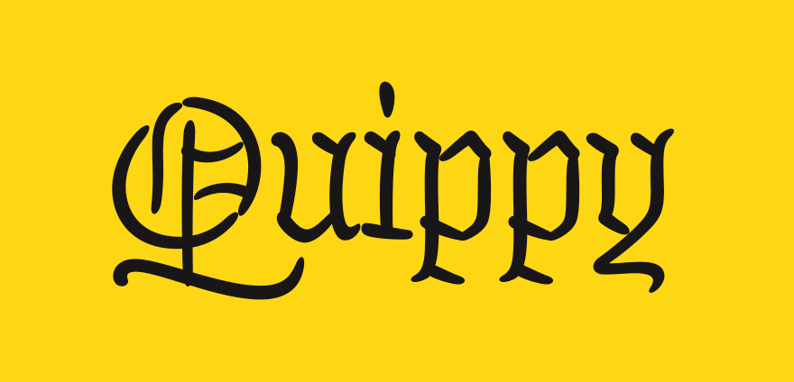
Inkwell is the kind of batshit idea that could only come out of one person’s head: Jonathan Hoefler. A superfamily of handwritten typefaces that not only has a sans, serif and script variant, but a Tuscan, a Blackletter and an open capital style that harkens to blueprint lettering? Pardon my French, but what in the actual fuck?

Not only is the range of styles in this family absolutely insane, each style has SIX weights! I could spend the next 900 words cursing about how off the wall crazy this whole endeavor is, but that is what makes it worth talking about. There’s certainly never been anything like Inkwell before, and I doubt there will be again, unless Hoefler and Jordan Bell decide to add an Italian style in the future just to really complete the typographic buffet.

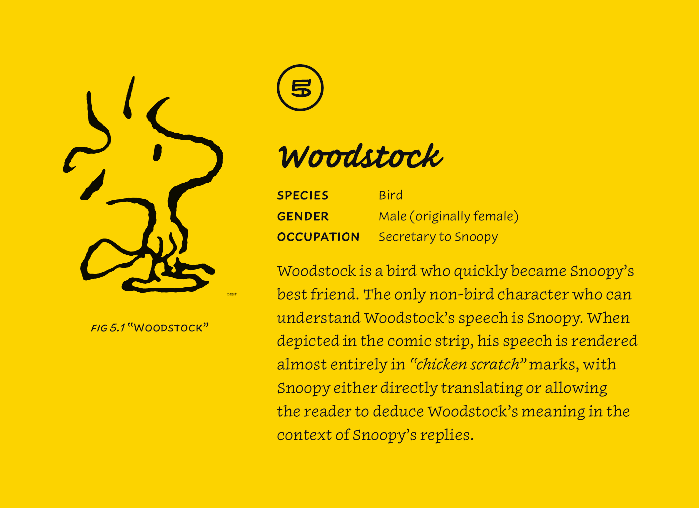
Any of the individual styles are excellent representations of their form. I see bits of Charles Schultz’s gorgeous lettering from Peanuts in the sans and serif—a reference Hoefler mentioned in his presentation of Inkwell at Typographics in 2017[2]. The script toes the line between effortless and fussy and is a real pleasure to read even in long-form. The Blackletter is gorgeous—every character is a gem and worthy of being printed and framed. And the Tuscan is probably my favorite, with its scratchy lighter weights and its organic forms that look like they could be composed out of living plants that is such a fascinating take on a style that originated in hot lead and slabs of wood. I’ll be curious to see if Hoefler & Co’s release leads to a resurgence in handwritten typefaces, and my fingers are crossed that Tuscans and Blackletters see a boost in popularity as a result.

natesanders.com — Charles Shultz’s iconic lettering in a Peanuts strip. Schultz’s lettering was so good he got work opportunities as a letterer before his comic finally took off. Always keep swinging, Charlie Brown.
Nº02 natesanders.com — Charles Shultz’s iconic lettering in a Peanuts strip. Schultz’s lettering was so good he got work opportunities as a letterer before his comic finally took off. Always keep swinging, Charlie Brown.

The value of handwriting fonts

I’m struggling to think of a type family release of this scale that felt so deeply personal to its creators. The eclectic combination of styles reflects Hoefler’s passion for maps and their use of type styles as a visual indicator of type and purpose of the data they convey. While many styles in Inkwell have direct historic influences, the entire family of families had to go the extra step of translating those influences into the handwritten style. I think this unique process results in a beautiful distillation of many of the styles, particularly the Blackletter and the Tuscan. Hoefler and Bell were forced to synthesize what makes a good Blackletter or Tuscan, and what makes a them good that can be drawn as if it was hand-lettered with an even-stroked pen.

Nº03 multiversitycomics.com — Notice the subtle shift in lettering style from the narrator voice to that of the characters, as well as the frequent use of bolding on important words.

There is a large market for handwriting fonts, particularly in the comics industry. Dialog and lettering in comics used to all be done by hand, and artists either worked with professional letterers who filled in dialog boxes after the rest of the art was completed, or the artist themselves handled the lettering on their own. Charles Schultz’s lettering on his Peanuts strip is nearly as iconic as his characters. Comics rely on lettering styles as a form of information hierarchy, using shifts in the appearance of letterforms to differentiate characters from one another, or to clarify if the words being spoken come from a narrator[3]. Nowadays there are foundries like Blambot, that specialize in subtle variations of comic lettering styles, allowing for much more rapid production and ensuring consistency from panel to panel. The breadth and depth of the styles inside of Inkwell could allow for a lot of expressiveness through typography in these visual storytelling formats. In the same way Schultz switched his lettering to serifs when Snoopy composed stories on his typewriter, a particularly morose sentiment from a character could be rendered in Inkwell’s Blackletter style.

Inkwell Serif (left) compared to Elena (right).
Nº04 Inkwell Serif (left) compared to Elena (right).

Inkwell in use

Despite the diversity of Inkwell’s styles, they are all drawn with the same proportions and weights in mind, allowing for mixing and matching as the designer sees fit. This allows for unprecedented personalization inside a handwritten font. If you want to reflect your own habit of writing your all-caps without serifs against your typically-serifed handwriting, the sans small caps will slide right against the serif style without any issues, or if you want typographic asides to feel loose and hastily written, use the script instead of the sans. There’s also an embarrassment of alternates and other typographic fiddly riches that set Inkwell apart from its handwritten typeface companions—Inkwell can handle any tricky typesetting challenge you can fathom with its robust character set.

Nº05 Inkwell’s versatility allows for a consistent typographic voice despite a range of family styles. The personal and casual tone it paints is well suited for certain types of subjects, like comic art.


 Inkwell used to recreate a sample spread of Matthew Butterick’s Typography for Lawyers, originally designed by Matthew Butterick.
Nº06 Inkwell used to recreate a sample spread of Matthew Butterick’s Typography for Lawyers, originally designed by Matthew Butterick.

Because the type family is brand new as I write this review, the privilege of creating in-use examples falls to me, and that’s a responsibility I’ll happily bear. I wanted to give it two tests at opposite ends of the spectrum: a formal book composition and a display piece that could take advantage of all of the sub-families.

For the source of the book typesetting analysis, I used the layout and copy from Matthew Butterick’s excellent Typography for Lawyers. I chose it specifically because Butterick has already designed the book with a multitude of typefaces and styles represented, so Inkwell fits right in[6]. In practice, the serif is charming as the body copy—it could almost pass for a design along the lines of Elena from Process Type[4]. I could certainly see this serving as body copy face for a project that needed a relaxed and personal voice in its text. Using the sans at a smaller size for the sidebar captions gives them a feeling of handwritten notes jotted in the margins by a professor. The Tuscan, Open and Blackletter are cheekily inserted and play their roles as heading and subheadings, and the font even has directional arrows to serve as bullets on the right page in the spread. This is an unconventional challenge for a handwriting typeface, but I’m rather charmed by the results and feel that given the right project these designs would work swimmingly.

Inkwell’s entire family used in an eclectic poster design.
Nº07 Inkwell’s entire family used in an eclectic poster design.

The second challenge was to find a more graphic, playful use for the entire family, and since I just so happen to be a typographer who specializes in multi-typeface designs, I had the perfect project I could adapt[7]. I took a poster I made for the Le Tigre branding project, which was using nearly a dozen different typefaces, and started replacing them with different versions of Inkwell. The result is delightful. The blackletter shines at several weights—the lighter, spindly weights feel borderline calligraphic, each stroke of each letterform confident and precise, and the bolder weights are almost oozing off the screen. I was pleasantly surprised by how well the script performed as a bold, all-caps subheading, full of character and presence. It reminds of of Mistral in the best possible way. It’s got a little bit of sass and assertiveness to stand out when you want it to, but it can be toned down to have a quieter voice as well. As someone who is always looking for supplementary script typefaces for my design and often struggling to find options that have the right balance of presence without having too strong of an individual aesthetic, I will definitely be using it again.

The Tuscan is woody and slightly haggard at this bold weight—to me it cries of someone who’s been left alone with their thoughts for just a bit too long and is scratching out intricate letterforms while they work something out. Several characters stand out, such as the “R” with its leg swooping out like bell-bottomed jeans. The squat, wide-stanced Open family is trickier to use, but I like how it almost tricks your eye into thinking it has some dimensionality. One of the biggest surprises for me was that the families didn’t clash with the badges and other decorative elements I left from the original design, some of which have other, non-handwritten typefaces inside.

Inkwell Blackletter’s sneaky capital descenders.
Nº08 Inkwell Blackletter’s sneaky capital descenders.

Quirks and eccentricities

The Inkwell Tuscan has a few characters that can create collisions with other pairings if you try to apply negative tracking at large sizes (the “R” is a common culprit) so care will have to be taken to your letter-spacing and kerning. The script family is best used at slightly larger sizes for body copy, and really sings at 18pt and above, which is when the legibility really settles in to my eye when viewing at close reading distance.

You might be fooled into thinking you can set the Blackletter with tight leading, but don’t be deceived by the seemingly short descenders. It’s often the capitals that have longer descenders, not the lowercase characters[8]. The design of the letterforms is very boxy and upright which is well served by ample space between lines, and some of the characters, like the “Q” swoop down dramatically and can cramp up what otherwise might have seemed like ample spacing.

- FRJ