Highway Fonts
— Designed by Various

workbyland.com — SAA used in window signage for Easy Tiger, by LAND.
Nº01 workbyland.com — SAA used in window signage for Easy Tiger, by LAND.

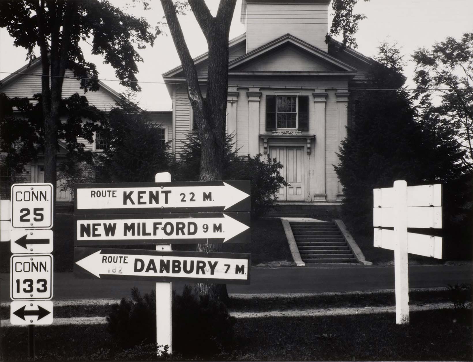
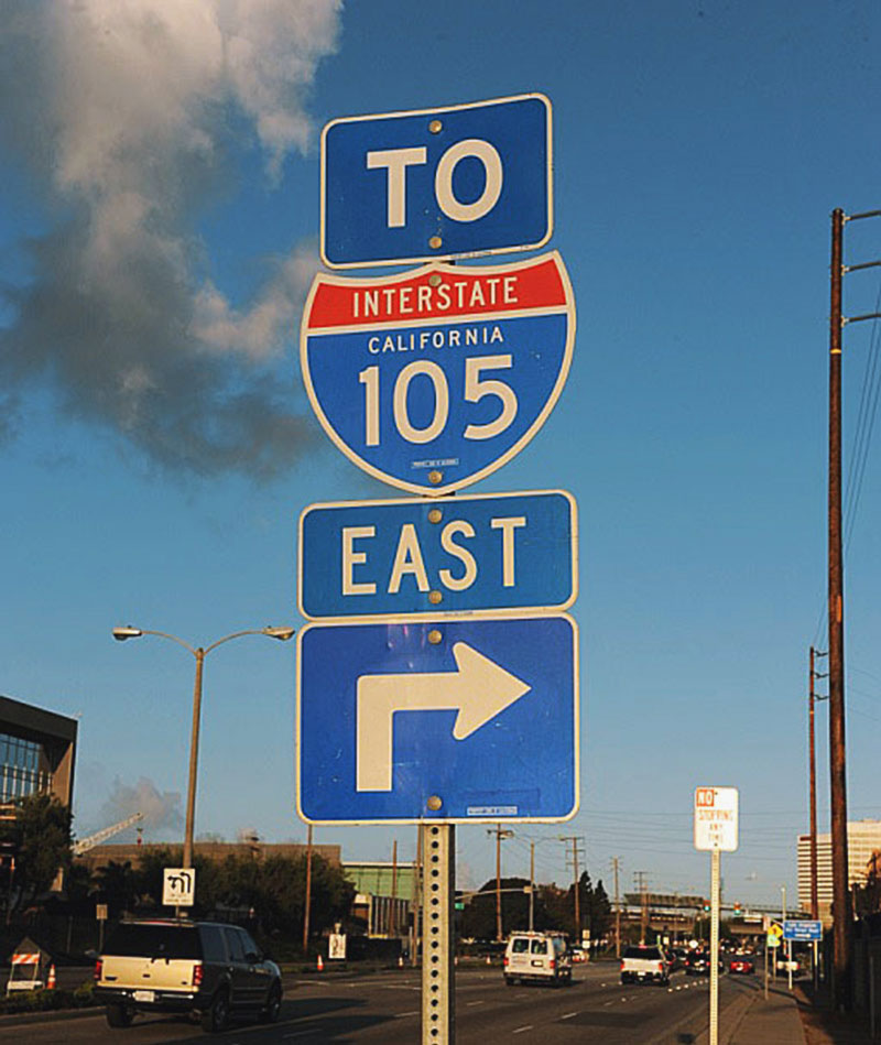
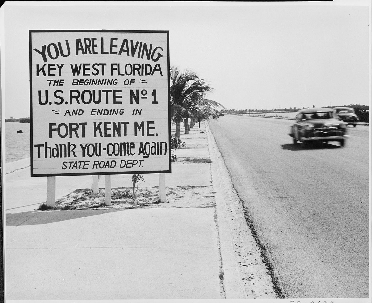
This review is a bit of a departure from the format I’ve established on this site. US Highway fonts are a genre of typefaces that I adore, but there are so many great interpretations that focusing any single typeface would mean missing out on a lot of stellar work. Therefore, this review will focus on the style as a whole, while addressing some of the more notable type families in greater detail.

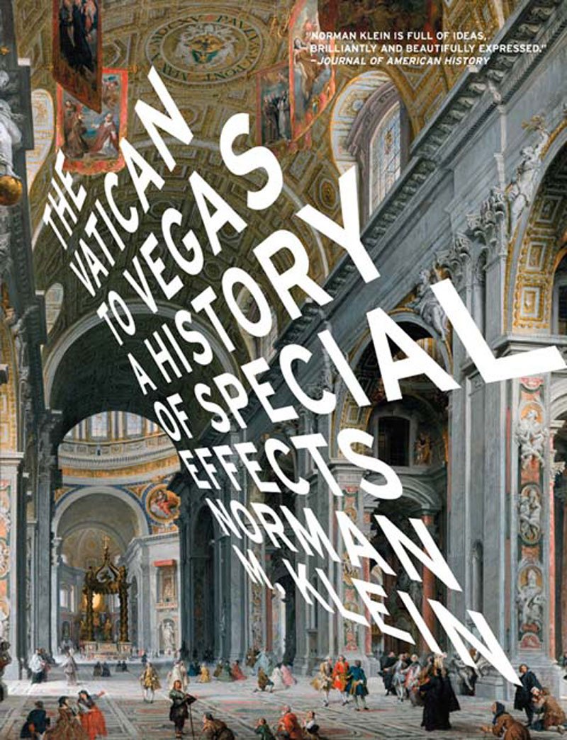
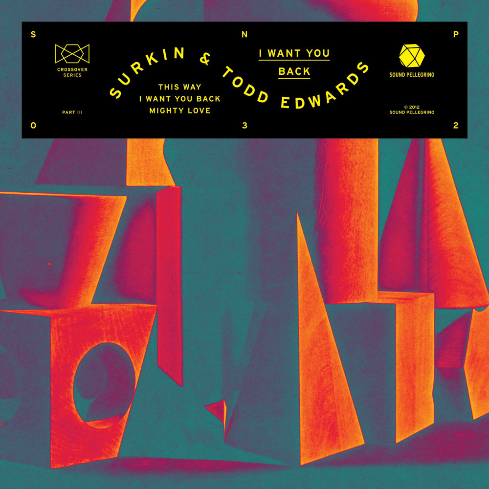
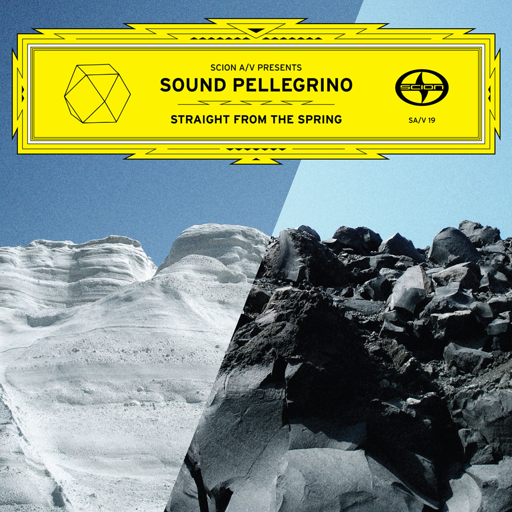
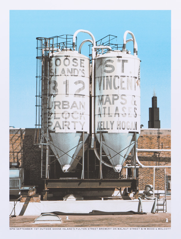
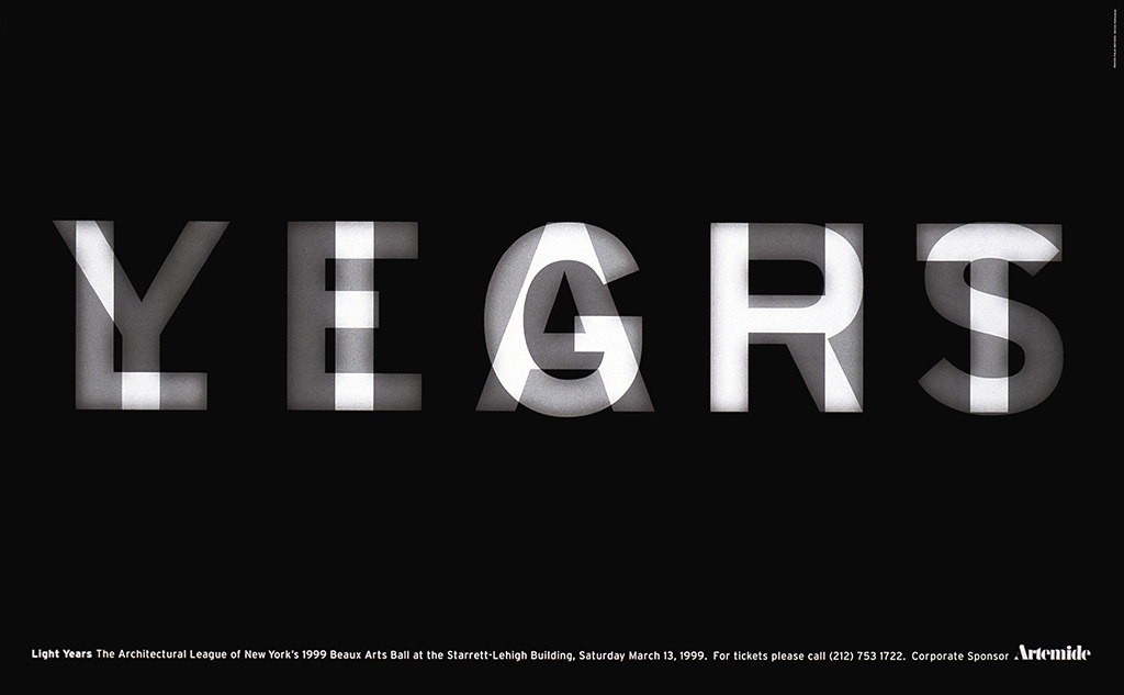
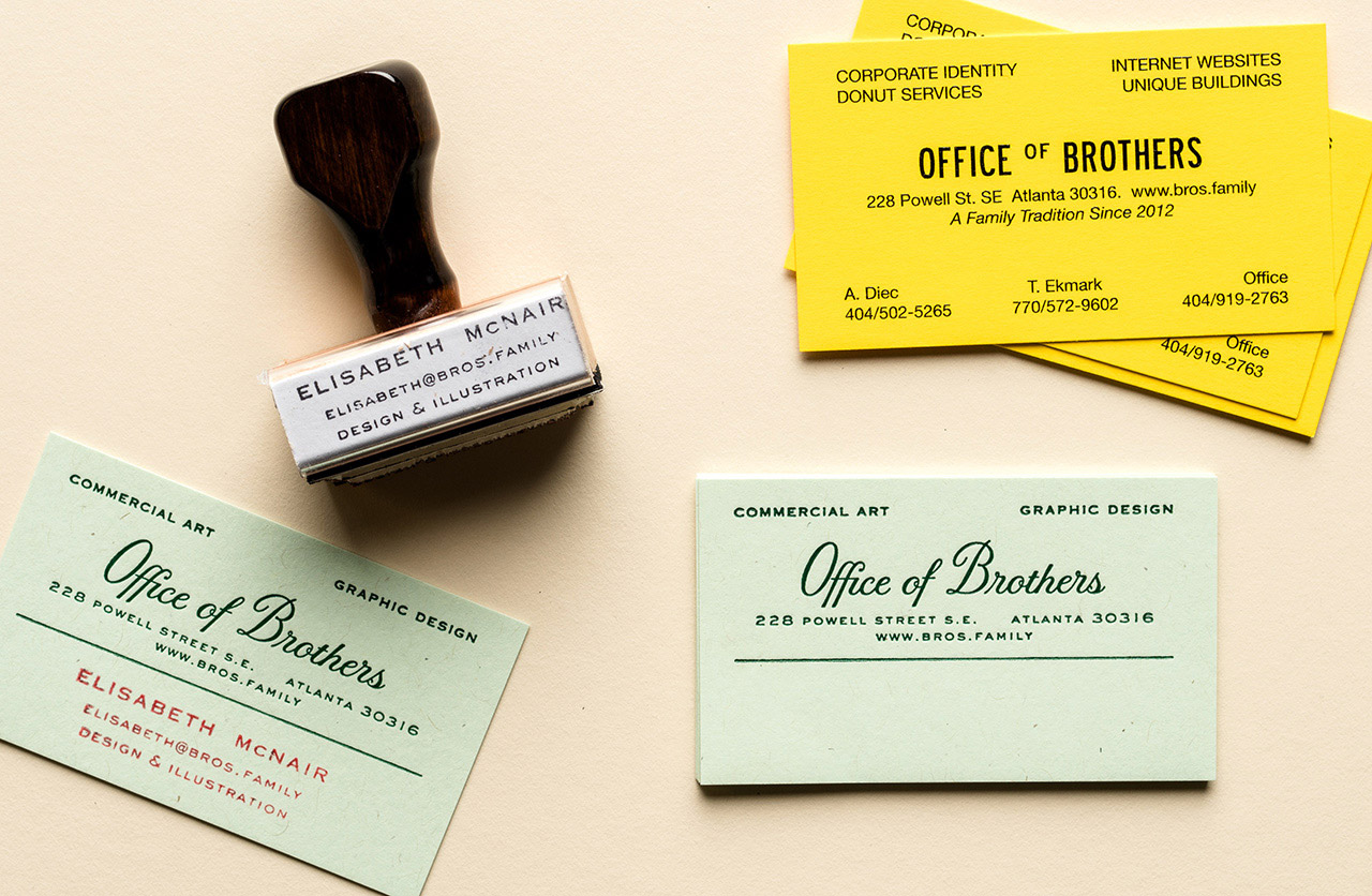
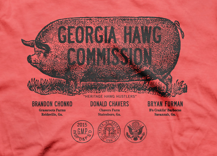
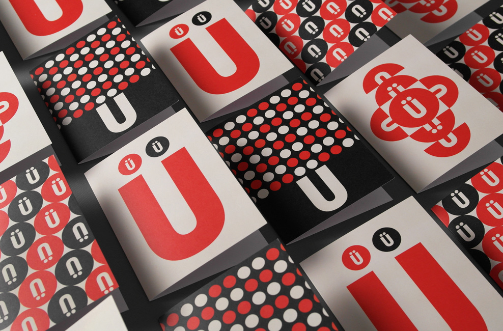
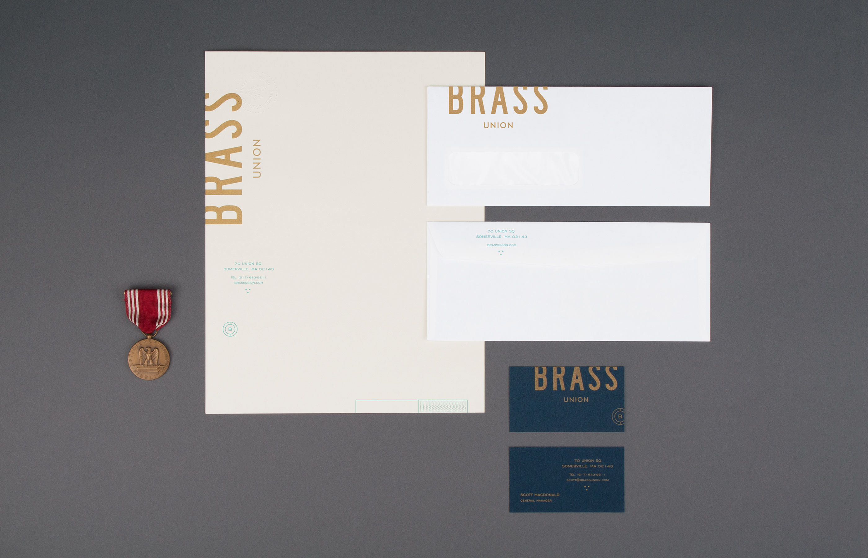
I’m always fascinated when a genre of typefaces finds widespread use outside its original intended medium. Highway Gothic was designed to maximize legibility for road signs are highway speeds, but designers have found surprising and diverse uses for its derivatives in the decades since—everything from entertainment magazine interiors to vintage-themed branding projects. Designers will always find a use for clean, clear letterforms, and that’s helped Highway Gothic and its descendants take on many new lives.

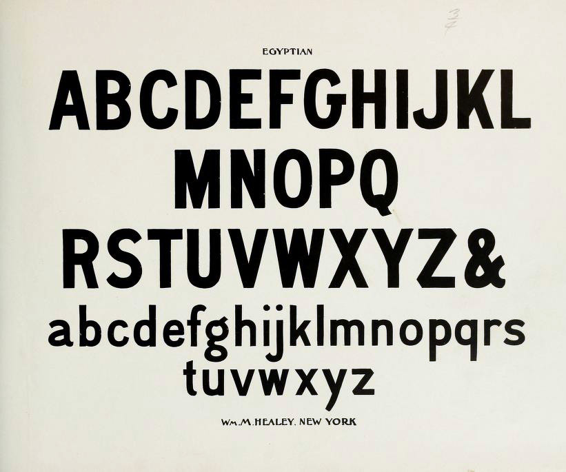
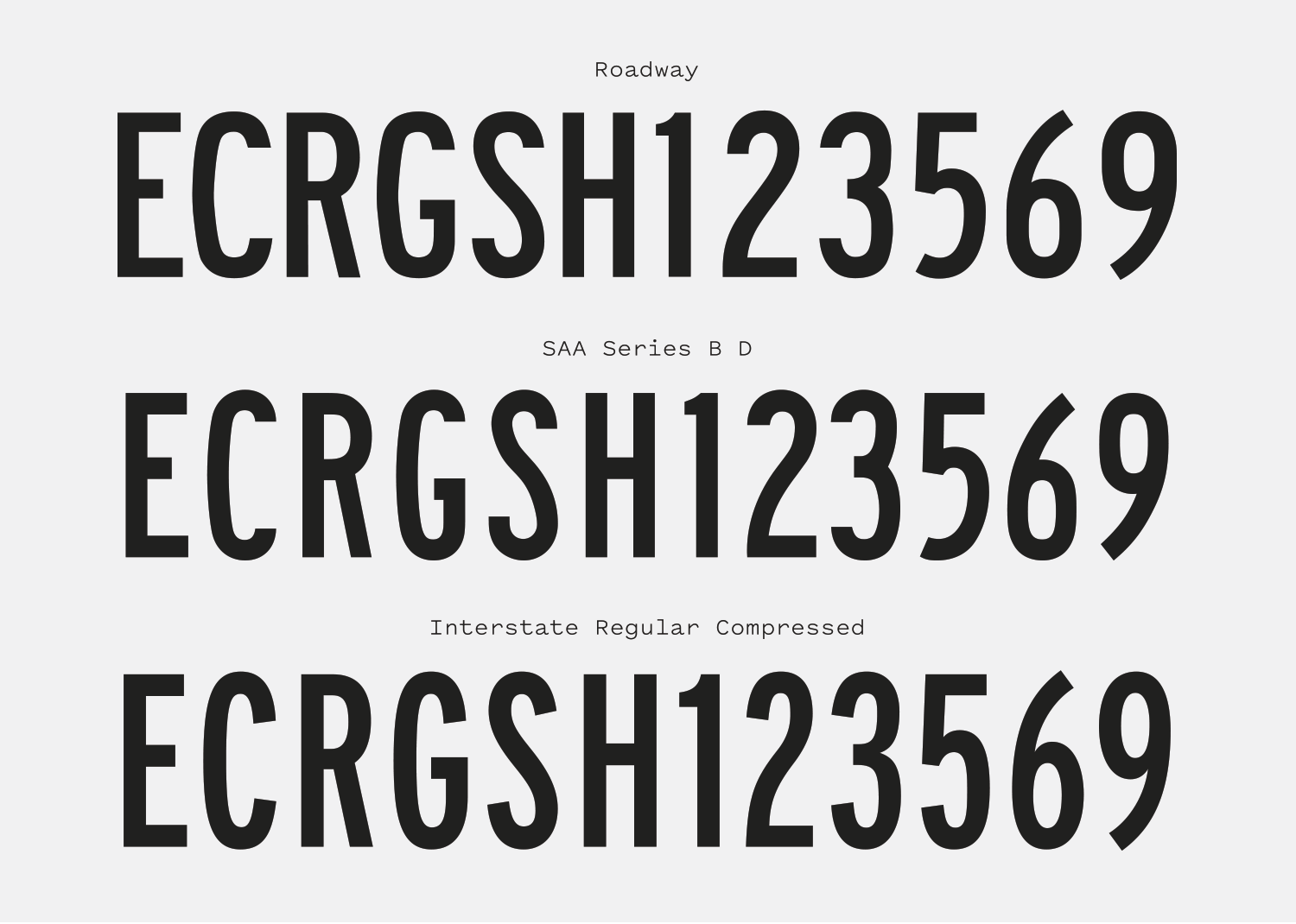
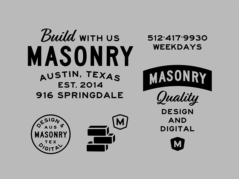
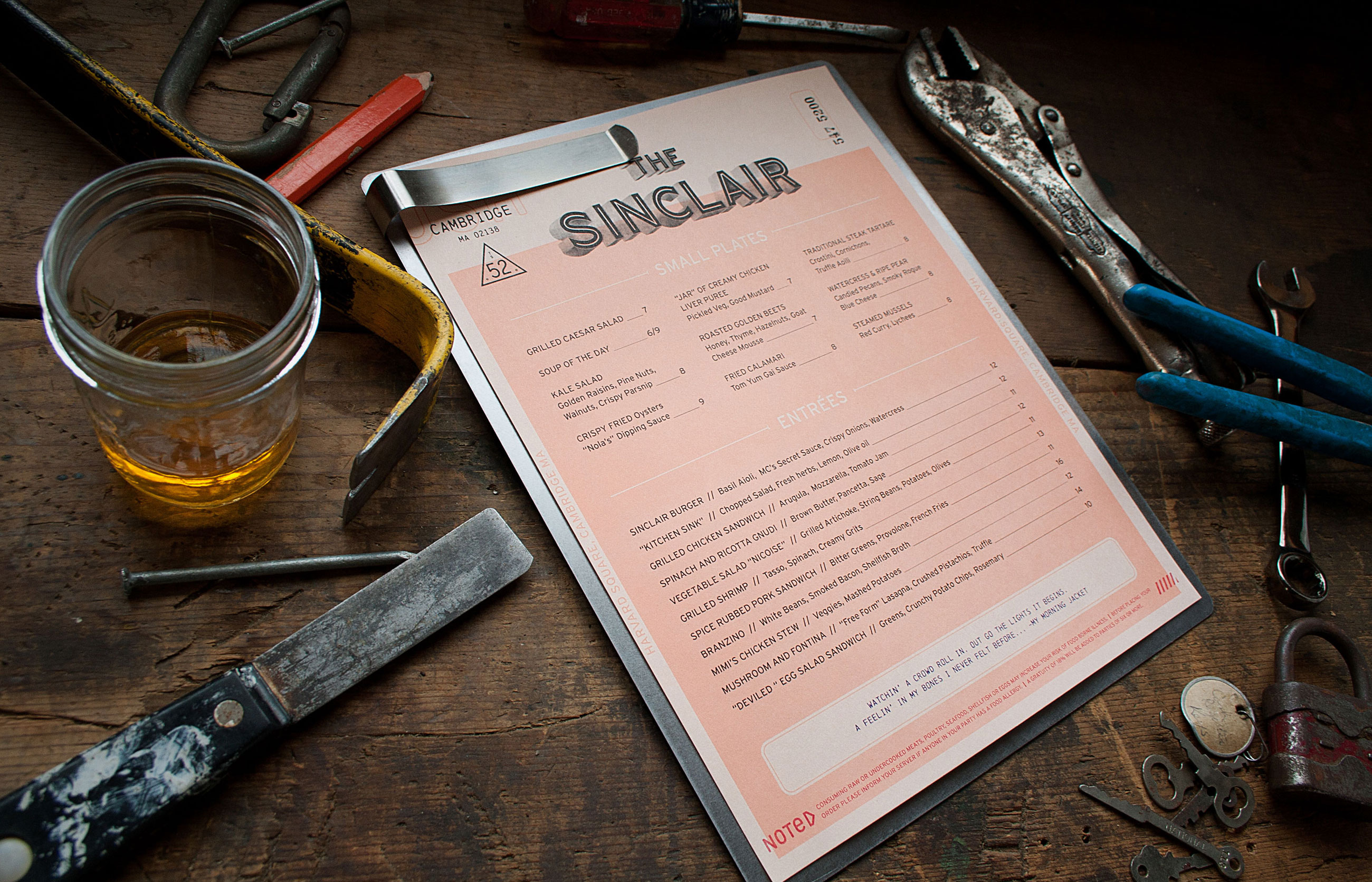
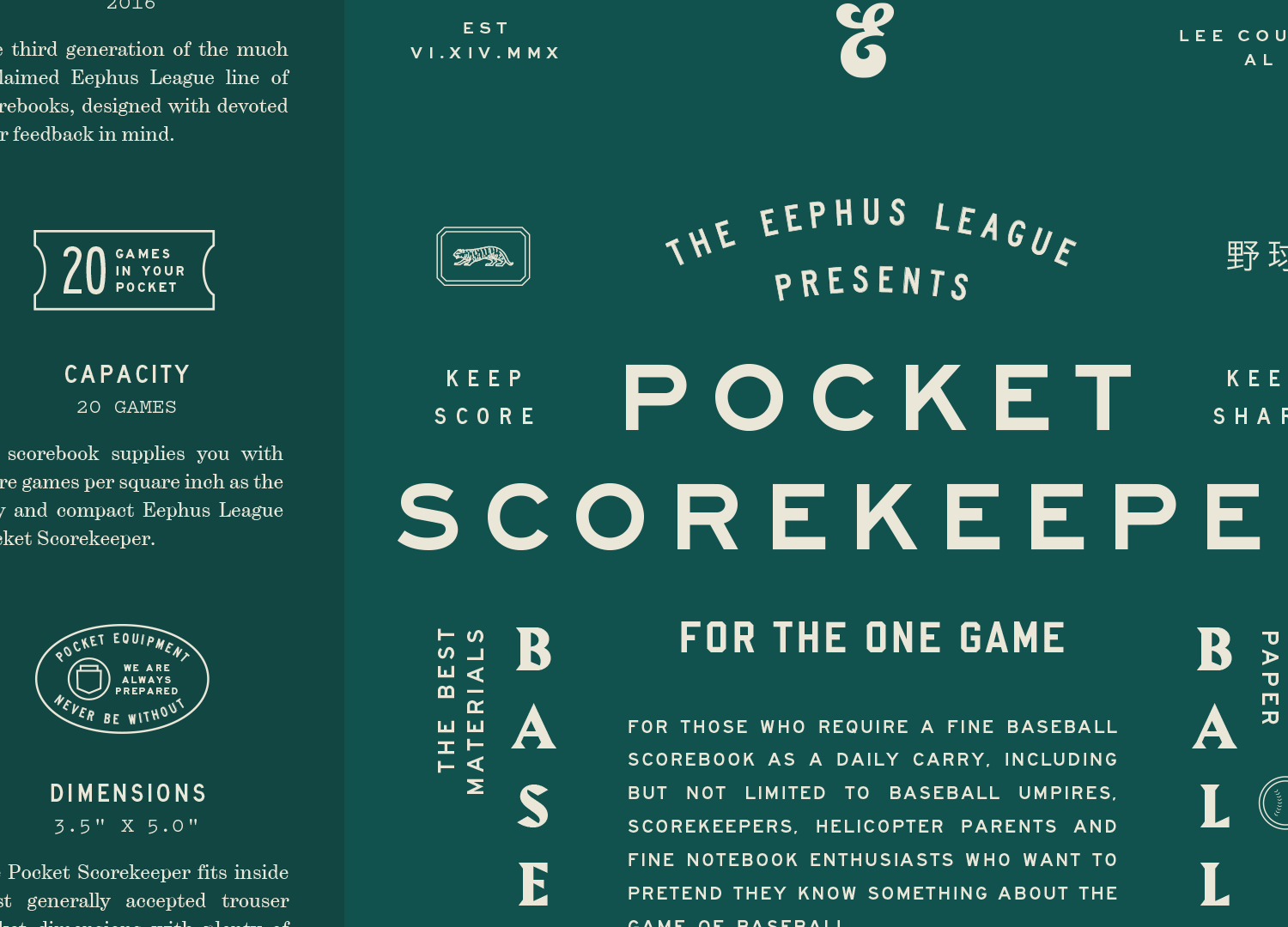
If I had to hypothesize why this genre of fonts has remained so popular, I’d guess that it centers around the variety in the weights and widths available, their ubiquity in American culture, and the unpolished “wrongness” of many of the design details. The numerals are odd and unique while remaining legible and go a long way to adding charm to what could feel like a cold, mechanical design. The letterforms are simple, low contrast and unadorned, yet are brimming with character. The different interpretations and revivals of Highway Gothic that have been released over the years either embrace this quirkiness or attempt to smooth it out, allowing designers to bring as much or as little of the original’s eccentricity as they want into their design. Many of the revivals that exist are available at either low cost or for free, making it an accessible genre for designers to deploy in their work.

bros.family — “Emergency Drinking Beer” packaging by Office of Brothers, Inc, using Roadway.
Nº02 bros.family — “Emergency Drinking Beer” packaging by Office of Brothers, Inc, using Roadway.

Historic Influences

The source for these designs goes back to the 1940’s, when the United States Federal Government released Standard Alphabets for Traffic-Control Devices. Several “series” of fonts were designed at varying widths, with A being the narrowest and F being the widest to be used on traffic signage across the US. The fonts have been adopted by many other countries for use in their own highway signage, and many corporations also use a derivative of the highway fonts for their own way-finding signs

Nº03 florencegriswoldmuseum.org — A Walker Evans photograph of the Congregational Church of Brookfield, Connecticut, documenting some of the many mixed styles of street signage used in the early 20th century in America, including hand-painted signs.
aaroads.com — An example of U.S. Highway signage, using several Series of Highway Gothic.
Nº04 aaroads.com — An example of U.S. Highway signage, using several Series of Highway Gothic.

This standardization of typography within the US traffic system was revolutionary. Looking at pre-1950’s road signage in the US you will find a massive amount of typographic diversity and production methods. Hand-painted signs were common, and many of the route and highway signs used a squared off typeface similar to the style used on bus and subway rolls[3]. While this variation is beautiful and interesting from a typographic point of view, you can see the problems it created for drivers. The lettering is inconsistent, the characters are cramped, and the counters are undersized[5]. I can’t imagine trying to read that while driving.

Nº05 commons.wikimedia.org — While aesthetically pleasing in retrospect, hand-painted signs like these were difficult to read in motion. Photo dated 1951.
miniaturearchitect.blogspot.com — You will find signpainter “Egyptian” lettering influence in the design of highway fonts. This was a style often used when road signs were painted by hand. From Henderson’s sign painter, 1906.
Nº06 miniaturearchitect.blogspot.com — You will find signpainter “Egyptian” lettering influence in the design of highway fonts. This was a style often used when road signs were painted by hand. From Henderson’s sign painter, 1906.

The new highway fonts were intended to be highly legible with distinct individual characters, drawn simply with minimal thick to thin contrast, ample letter-spacing and large open counters. The range of widths were drawn to accommodate different sign sizes and string lengths[4], and I find one of the more charming aspects of the series is that while all the widths share certain characteristics, they aren’t simple mathematical extrapolations of a root design. They feel related, but in a less precise way that we see from so many type families now, where widths are generated by interpolating master designs from a narrow to wide scale.

Nº07 Though Roadway (top), SAA (middle) and Interstate (bottom) are all inspired by the same set of lettering, each has its own subtle variations.
amazon.com — Cover for The Vatican to Vegas: A History of Special Effects, designed by Alan Hill.
Nº08 amazon.com — Cover for The Vatican to Vegas: A History of Special Effects, designed by Alan Hill.

There are a few consistent traits you’ll find across all the Highway Gothic revivals[7]. Characters like the “C” and “S” will have wide open apertures and the line where the bowls on the “P” and “R” and the middle arm on the “E” falls will be raised. That “E’s” middle arm will be short and stubby, the G will be spurless. The 2’s and 5’s will be weird as hell, the 1’s will have an awkward flag, and the stroke supporting the “6” and the “9” will feel truncated, causing the latter to feel like they might fall over.

If a highway font has a lowercase set, the straight ascenders and descenders of the stems will often terminate at a sharp angle, which is a clever trick to help drivers differentiate between vertical strokes while driving. You’ll also find one of the strangest “g’s” I’ve ever seen, with a tail that shoots down and limply tries to curl back up to the left. I have to assume it was designed this way in an effort to prevent it from crowding other letters in the string. You can see all these details in the Interstate BlackCondensed specimen at the top of the review, in the right column.

Of the Highway Gothic derivatives, Interstate (designed by Tobias Frere-Jones over several years in the 1990’s) is by far the most robust, polished and well-known. Frere-Jones used Highway Gothic as the source of inspiration, but redrew the typeface with more modern sensibilities. There is more consistency in the weights and widths and some of the stranger quirks (like the unresolved lower half of the “5” from the original) are smoothed out. The apertures on characters like “C” of Interstate terminate more naturally (and are more closed-in) when compared to other revivals, which lop off the strokes parallel to the baseline and are so wide-open that they feel unnatural. Interstate is a lovely balance of homage and practicality and it’s one of the typefaces I use most often.

soundpellegrino.bandcamp.com — I Want you Back album cover art for Sound Pellegrino.
Nº09 soundpellegrino.bandcamp.com I Want you Back album cover art for Sound Pellegrino.
Nº10 soundpellegrino.bandcamp.comStraight from the Spring album cover art for Sound Pellegrino.
bros.family — Superica restaraunt branding by Office of Brothers, Inc.
Nº11 bros.family — Superica restaraunt branding by Office of Brothers, Inc.
crosshairchicago.com — Poster for the Goose Island 312 Urban Block Party, using the Lane series of highway fonts. Designed and screenprinted by Daniel MacAdam.
Nº12 crosshairchicago.com — Poster for the Goose Island 312 Urban Block Party, using the Lane series of highway fonts. Designed and screenprinted by Daniel MacAdam.

Highway font strengths

This genre of typeface has found many second lives in various genres of design and works in a wide range of aesthetics. We’ll start with the most straightforward trend, which is setting the style big and bold and letting its simple construction hit you in the face with its message. My favorite example of this is Michael Beruit and Nicole Trice’s Light Years poster[13], which served as an invitation for an annual benefit for the Architectural League of New York.

Nº13 archleague.orgLight Years invitational poster for the Architectural League of New York, designed by Michael Bierut & Nicole Trice, 1999.

Interstate is perfect for this design. The low thick-to-thin contrast prevents the overlay of the letterforms from feeling too messy, there’s not much width variation in the letters, and the design isn’t so monotonous that all the strokes hit the same places (note that the crossbar of the “H” is higher than the bottom of the bowl in the “R”). The typeface strikes the perfect balance between uniformity and individual distinction. I particularly love the tension created where the middle arm of the “E” just barely extends past the vertical stem of the “I”. If the “E’s” arm had stopped right on that vertical line, the design would feel more forced and perhaps too perfect.

Nº14 bros.family — Roadway used in the Office of Brothers, Inc business cards.
elisabethmcnair.com — Highway fonts (probably artificially obliqued) used by Office of Brothers in a baseball-card design for Spiller Park coffee. Illustration by Elizabeth McNair.
Nº15 elisabethmcnair.com — Highway fonts (probably artificially obliqued) used by Office of Brothers in a baseball-card design for Spiller Park coffee. Illustration by Elizabeth McNair.
Nº16 bros.family — T-shirt design by Office of Brothers, Inc.

It was exceedingly difficult trying to choose designs in this vintage genre to include in this review—there were dozens of projects that deserved to be highlighted here. One studio that makes frequent use of this genre of typeface is Office of Brothers, Inc. This t-shirt design for the “Georgia Hawg Commission”[16] overlays Roadway on a comical illustration of a very fattened hog, and the font feels quite at home. It doesn’t distract from the illustration but the high bowl on the “R” play against the dropped crossbar of the “A” and the low open counter on the “G” and give it the same competent but quirky feeling the illustration has. It’s set with a curvaceous serif underneath the illustration and paired with several badges and graphical elements which reinforce the vintage industrial aesthetic. Office of Brothers also deployed the genre again in a branding for a Mexican restaurant and gave it.a much different presence, which speaks well to their versatility[11].

Nº17 dribbble.com — Another example of a highway font used in eclectic, vintage-inspired branding projects. Designed by Stephanie White.

Highway fonts have found frequent use in vintage branding projects, and I’d hypothesize there are a few main reasons for this. One, it pairs well with other typefaces because of its low contrast and simple lines. Second, it has a wide range of widths and weight available which makes it easy to slide in as a role player. Third, many highway gothic cuts have a bit of “wrongness” about them, with quirks and design details that get polished out of many typefaces. This peculiar voice tends to work well with vintage designs, which harken back to days when many typefaces in use had the same imperfections. There is still just a whiff of sign-painter styling in Highway Gothic designs[6]. There’s also the fact that there are many open-source or free digitizations of Highway Gothic available, making it easily accessible.

fontsinuse.com — TRÜF’s studio branding shows how well Interstate works in minimalist settings.
Nº18 fontsinuse.com — TRÜF’s studio branding shows how well Interstate works in minimalist settings.
Nº19 oattt.com — Oat Creative using a highway font in branding for Brass Union restaurant, where it feels industrial and official.
bros.family — Menu design by Office of Brothers, Inc, mixing Interstate and SAA.
Nº20 bros.family — Menu design by Office of Brothers, Inc, mixing Interstate and SAA.

You’ll even come across designs that mix and match fonts from this genre. This menu design by Office of Brothers [20] uses fonts from the SAA family mixed in with Interstate, which has much bolder variations available that designs that are simply revivals of Highway Gothic. The studio uses SAA throughout most of the menu, leveraging the unique character that font provides, and saves the more flexible Interstate for when they need a punch of a bolder weight. The slight discord created by using two typefaces that are so similar yet clearly different accentuates the odd nature SAA already has, and helps make the more straight-laced Interstate blend in with the eclectic tone of the branding.

Nº21 oattt.com — Menu design for The Sinclair by Oat Creative, using Interstate for the bulk of the menu text.

The clean lines of this style also make it perfect for warping, path-setting and distortion techniques. I love this cover of The Vatican to Vegas: A History of Special Effects[8] because most of us have seen this typeface imprinted on signage in real dimensional space almost daily in our lives, making seeing it at a skewed perspective clever echo of reality. This style of font was designed with many straight lines and ample letter-spacing built in, so it easily handles the stress of being set on diagonal or curved paths when other typefaces might need significant tracking to avoid collisions and maintain legibility.

The lack of contrast in the letterforms also helps the font stay clear and readable even when it’s tilted or performing other stunts. The Sound Pellegrino[10] music label uses Interstate in all their branding and album art, and on occasion they will set the album names on wavy paths which Interstate handles easily[9]. I frequently set Highway fonts in circles or on directional paths in badge work for my own branding projects, as you can see in these examples from the Eephus League[22] and War Damn Apparel[23]. This is the genre I always start with when I’m doing “badge” work in branding projects. The wide range of widths, loose spacing and clear letterforms make this style of typeface perfect for setting type on angled paths and arches, and its plain construction makes it easy to pair with other fonts.

heckhouse.com — Interstate used in the War Damn Apparel branding.
Nº22 heckhouse.com — Interstate used in the War Damn Apparel branding.
Nº23 dribbble.com — Multiple weights of SAA used in a baseball scorebook design for the Eephus League.
studiobruch.com — Interstate used at large scale for the cover of 47° magazine.
Nº24 studiobruch.com — Interstate used at large scale for the cover of 47° magazine.
Nº25 studiobruch.com — Interstate used inside of 47° magazine, designed by Studio Brunch.
krbee.com — Interstate used as the word-mark for Bitch magazine, design by Kristin Rogers Brown
Nº26 krbee.com — Interstate used as the word-mark for Bitch magazine, design by Kristin Rogers Brown

Interstate has also found a home as an editorial typeface. At small scale, it partners with other typefaces for the same reasons we talked about earlier, and it’s also capable of shining as a headline font. Studio Brunch used it to great effect in 47° magazine[24], using a range of weights and widths of Interstate to convey the “honesty” and “straightforwardness” the cuisine magazine needed to have. Once again, the style’s simple construction is used to project a specific tone of voice, in this case one of trustworthiness. I also find the pointed terminals of Interstate to suit the subject matter of cooking quite well, given all the stabbing and slicing that goes on.

Quirks and eccentricities

Each interpretation of Highway Gothic is going to have its own hurdles to navigate, but I’ll try to address some of the universal ones, and a few from the typeface families in this style I’m most familiar with. Not every highway font will have lowercase characters (or italics, for that matter), and many have quite limited character sets, so be sure to check to make sure everything you need will be available to you. These fonts look best in all-caps and with ample tracking.

Nº27 Interstate Light compared to Myriad Pro, a humanist sans. Compared to Myriad, Interstate feels crisp, machined and cold. The design of the descenders make it more difficult to read.

If you want to try any of these fonts as body copy, your best bet is Interstate, though it comes with its own challenges[27]. The wide numerals stick out in long-form, and odd characters like the “g” are difficult to read at small sizes and hurt legibility. The tall x-height is hampered by a narrow stance for anything other than the numerals, and the spiked stems lead to bodies of text that aren’t exactly inviting.

Roadway has a specific oddity in that on the strokes of round characters like “O”, “G” and “C”, there’s a bit of a irregularity of the curve in the middle section. It’s not a smooth line and the letterform construction in general feels “squished” even compared to SAA, another quirky and unpolished adaptation of highway fonts (reference example[7] above to see a comparison).

SAA is my personal favorite Interstate alternative. I like to use it when I want something to feel less polished. SAA has raised bowls (like it’s hiking up its trousers) that result in smaller counters. This makes your eye jump around a bit more than usual and can cause even all-uppercase lines to feel unsettling. Only the EM D weight has a lowercase set, and really, if you’re going to be using a highway font’s lowercase, you should be using Interstate.

- FRJ