Hercules
— Designed by František Štorm

eephusleague.com — Hercules pairing naturally with patent illustrations on the Eephus League website.
Nº01 eephusleague.comHercules pairing naturally with patent illustrations on the Eephus League website.

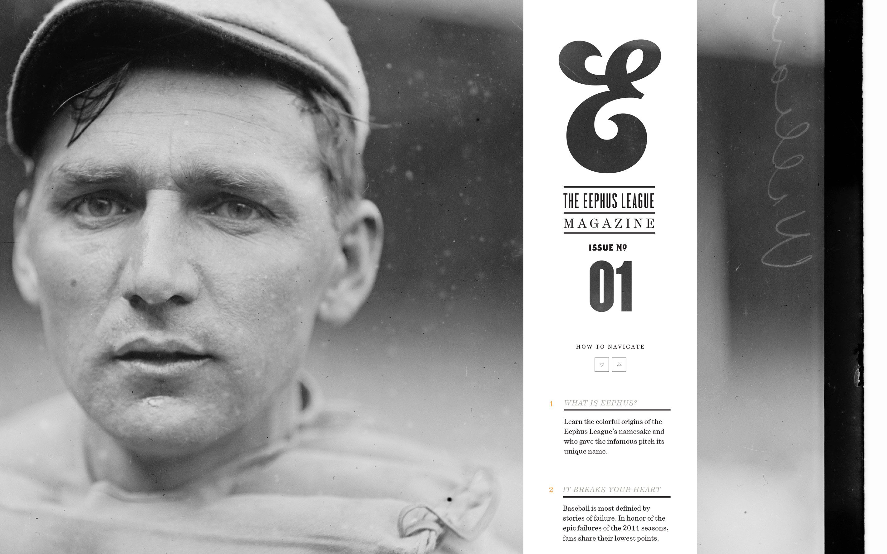
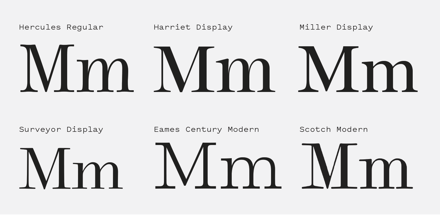
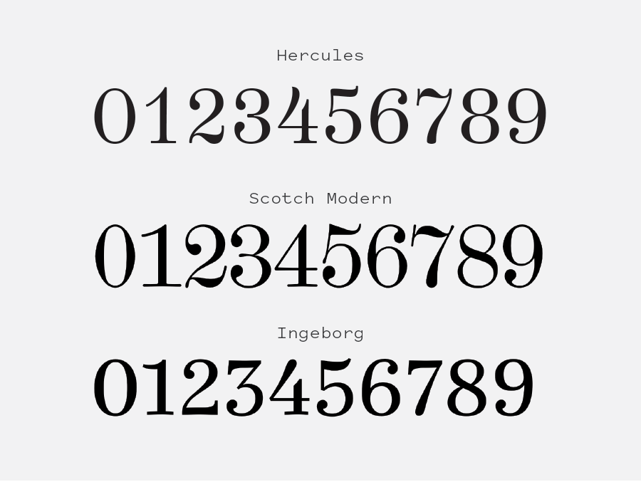
I stumbled across Hercules in 2010 when I was starting work on the Eephus League. I wanted an old-fashioned serif that would hold the vintage aesthetic I needed for the brand, and something about Hercules stuck with me. The numerals are stunning, and it’s a little imbalanced in a way I find authentic and charming.

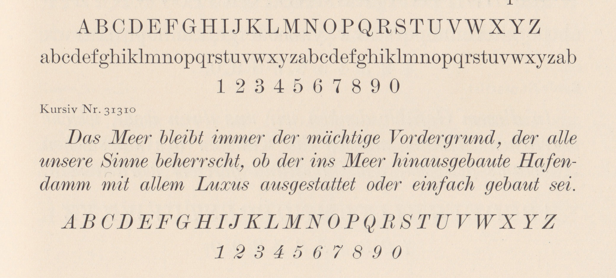
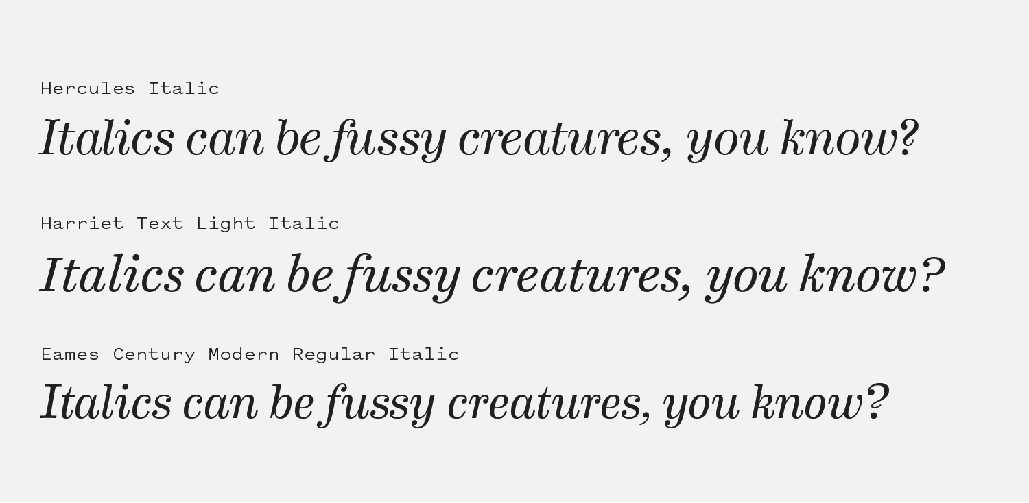
The tight apertures, ball terminals and excessive amount of spurs might normally put this typeface in the “fussy” category, but the slightly imperfect line quality mimics the impression of letters printed on a page and gives the font a worn-in quality that I love. Many modern Scotch typefaces are overly delicate and Hercules does a fine job of having the interesting characteristics of a Scotch while still feeling down to earth. It’s not a gaudy typeface in terms of weights or character set—this is not a superfamily. But Hercules does a lot with its conservative roster of weights and the corresponding italics, with each having several lovely characteristics that let the typeface hold its own in long-form reading environments or as a display face.

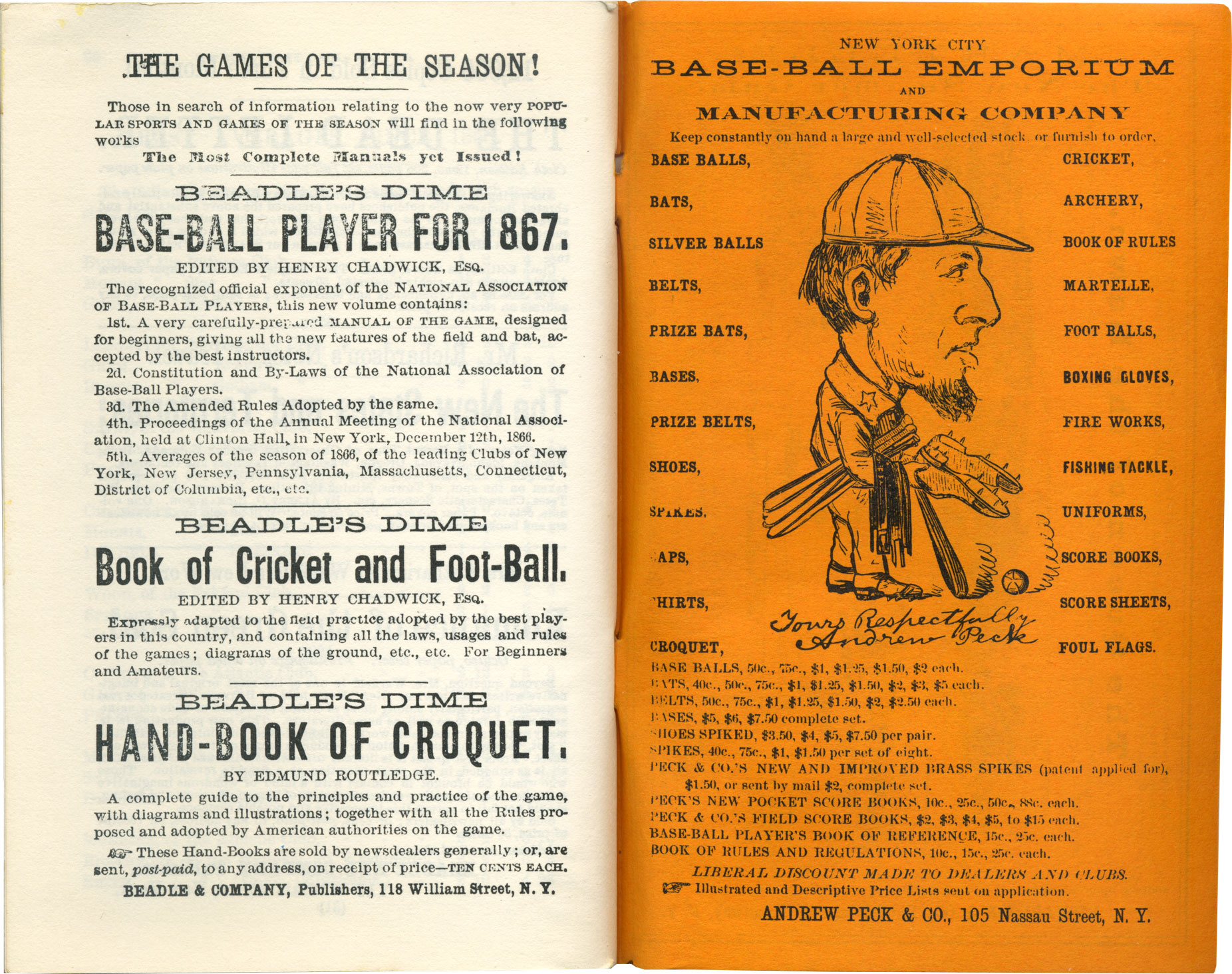
Hercules straddles the line between being distinct in its own right while still being able to be a supportive partner to other typefaces. It’s aided in this by the style’s historical ties to eclectic metal type pairings in booklets, magazines and advertising materials[6]. I’ve paired Hercules with showy typefaces like Brothers, Herald Gothic and Champion and it has always held its own and done its job to enforce the aesthetic.

When I was deciding on typefaces to cover on this site, it struck me that Hercules was exactly the kind of typeface I want to spotlight: A relatively unknown font that is affordable and has an interesting set of strengths and eccentricities. It’s been a great chance to reflect of my time using it and challenge myself to justify why I’ve stuck with it over the past 7 years instead of making an adjustment to a more well-known example of the genre. After spending several days working on this review, I think my instincts in college were right. Hercules was the best choice to intermingle with the Eephus League’s eclectic palette of typography, and I’m looking forward to spending many more years using it.

Eephus League Magazine — The cover the the Eephus League Magazine website experiment.
Nº02 Eephus League MagazineThe cover the the Eephus League Magazine website experiment.

Historic Influences

Scotches are typically considered delicate typefaces. They have wide serifs, the strokes can taper off to extremely thin points, and the vertical emphasis combined with a moderately high thick to thin contrast earns them comparisons with Modern-style faces like Didones. It’s an interesting typeface genre that straddles a few broader styles to create something new—something with the slender details of a Didone that can still work well in text situations.

Nº03 Examples of various serifs related to the Scotch genre.

There’s so much variety within the Scotch genre and so many typefaces that borrow elements of it that there is a wide spectrum of interpretations of the style. Some have squared-off serifs (Eames century Modern), some barely have brackets at all (Scotch Modern and Surveyor Display), some add the “flex” at the top and bottom of strokes to soften the design’s appearance (Hercules, Eames Century Modern and Scotch Modern) and some have shoulders and arms that thin into elegant strokes (Hercules, Harriet Display, Surveyor Display and Scotch Modern). The unifying traits you’ll find in most Scotches are the vertical stress along with brackets, ball terminals, and swashing tails on the italics.

Nº04 flickr.com — Englische Antiqua is a good early 20th century example of a Scotch design. From Genzsch & Heyse Specimen, ca. 1915, courtesy of Klim’s flickr account.
typefoundry.blogspot.com — James Conner’s Scotch.
Nº05 typefoundry.blogspot.com — James Conner’s Scotch.

Scotches have an interesting visual rhythm, especially at smaller sizes. You can see in this 19th century design by James Connor[5] that the capitals really jump out at you and the fine details in the typeface are often lost due to the printing process. The vertical strokes are substantially bolder than the rest of the design details, and you can see the lovely little ball terminals in characters like the “c” and the “r” as well as the curling tail on the “t” that are carried over in Hercules. The result is an uneven line that has a blotchiness to it that isn’t ideal, but thankfully with digital type and better printing technology we can use such delicate typefaces without fear of losing detail through printing mistakes.

Nº06 A spread from Beadle’s Dime Base-Ball Player, 1866, that shows a Scotch typeface used in combination with a plethora of eclectic metal typefaces.

The types of ephemera that inspired me to choose a Scotch face for the Eephus League were pieces like Beadle’s Dime Base-Ball Player (this is a reproduction of the 1866 edition[6]), an annual publication that published statistics, league breakdowns and rosters. These books use a plethora of typefaces, but one that’s used throughout is a Scotch. Again, you can see the uneven visual grey of the line, made even worse by a shoddy print job. The wide serifs, vertical stress, tailed “t’s” and short descenders are all there, as well as the double vertical strokes on the dollar signs, a charming and old fashioned detail that Hercules retains.

Compared to many Scotch-style revivals, Hercules avoids feeling delicate or fragile mainly due to its slight imperfections. The characters have a subtly uneven line, and the strokes never go so thin as to feel like a Didone[7]. The slight concave flex on the top and bottoms of the flat planes of the letters give it a warm, Old Style charm that softens the design despite its straight vertical emphasis. The serifs are wide and bracketed with long-sloping curves, making it difficult to find a straight edge inside of the typeface. The descenders are extremely short, which helps its usefulness in long-form situations and keeps lines focused and tight despite the extra adornments like the spurs and ball terminals.

Example spread using Hercules in both display and text contexts, letting you see the imperfections in the design of the letterforms that become obvious at large sizes. Photography from the Poglia flickr account.
Nº07 Example spread using Hercules in both display and text contexts, letting you see the imperfections in the design of the letterforms that become obvious at large sizes. Photography from the Poglia flickr account.
Numerals for Hercules (top) Scotch Modern (middle) and Ingeborg (bottom).
Nº08 Numerals for Hercules (top) Scotch Modern (middle) and Ingeborg (bottom).

Hercules strengths

If I had to single out one thing that makes Hercules special, it’d be the numerals[8]. They are stunning. The 4 belongs in the Lourve. Look at that arm!!! It looks like it’s been carefully sliced off with a scalpal and is drifting away from the rest of the number. That numeral is emblematic of what makes the typeface special—it confidently walks the line between these gorgeous details while never crossing into feeling overworked or twee. The 3 is distinctive with its double ball terminals and tight aperture, and the flag on the 7 has a delicious wave to it that’s often seen in Scotch designs. I love the curl in the base of the 2 that gives it flourish without making it seem unstable. If only the font had a numero sign!

It’s helpful to compare the number set to other Scotch typefaces, like Scotch Modern and Ingeborg, to get a better appreciation for what Hercules does well. Hercules has the character you expect from the style but still feels tidy and the numerals have plenty of air in them to allow the organic character to show. By contrast, Scotch Modern’s numbers feel overly cramped with tight apertures and flourishing details that they can feel a bit messy. Ingeborg has a nice, crisp set, but it’s missing some of the pretty details that set a Scotch design apart. I feel Hercules showcases some of the best characteristics of Scotch numerals in a legible, controlled way.

Nº09 eephusleague.comHercules in use on a poster design for the Eephus League. It’s a testament to the utility of the typeface that it doesn’t feel frail next to these bold, robust and geometric sans-serifs.

One of my favorite things to do with Hercules is set it in Regular all-caps with a bit of tracking and just let it sing[9]. Both the Regular and the Italic have simple, classic capitals that project a calm presence and never feel shout-y. The “R” in particular is gorgeous, with the stroke on the leg that nearly vanishes as it gets sucked into the bowl and curls up at the baseline. Don’t miss the stately “G” either, with its prim beak and prominant spur. The bold weight amplifies any curves or sharp lines the font has, and the greater thick-to-thin contrast can give it a more formal presence if that’s what you need.

Nº10 How to look at a painting cover, designed by Sarah Maxey.

Designer Sarah Maxey made wonderful use of Hercules on the cover for the hardcover edition of How to look at a painting[10]. She lets the whimsical and expressive lowercase shine, letting the curves in the letterforms create a gentle rhythm. The short descenders are the reason this design works; if there was more leading I think the effect of the “field” of letterforms would have been lessened and it would have felt “stripey” instead of one large mass of letterforms. The strong vertical emphasis also helps this effect and this design is a great, simple showcase of why Scotch typefaces are so valuable.

Quirks and eccentricities

The limited character set of this font is a restriction you have to be ready for. There are no small caps, the alternate selection is limited and it’s lacking the ligatures and fluff of many modern typefaces. What is in the font is stellar, but with so many typefaces releasing with massive amounts of glyphs and OpenType features their absence is noticable in Hercules. The irregular line quality the typeface has becomes more noticeable as you scale it up, and if you are wanting something that feel crisp and clean, this is probably not your typeface, and you should look at alternatives like Harriet, Miller, Surveyor and Ingeborg.

Nº11 Hercules italics (like many Scotch examples) can become crowded and their ribbon-like design can be difficult to read.

Because of the many tails and extra bits in the letterform designs in Hercules you have to monitor the kerning closely. Gaps can often emerge, or elements can feel crammed together and busy if not handled delicately. Scotches need a bit of air in the tracking in general because of the detailed characters so be wary of negative tracking and make sure you aren’t getting any ugly collisions.

I’ve found the italic lowercase set can often bump into one another even on the default tracking, so keep an eye on it[11]. Harriet is a great example of a Scotch Text weight that adds enough space between the letterforms to let them breath so you can properly appreciate each letter while still consuming the string as a whole. Scotch italics have ribbon-like flourishes that will nearly connect from one letter to another, which is a lovely effect that can also be detrimental to legibility.

I was drawn to Hercules because of its gorgeous numeral set, its charming old-fashioned quirks, and its price point. Over the past several years I’ve found even more to love about it, and if there are any designers out there who share my appreciation for the typeface I’d love to see what you do with it! It neatly walks the line between worn-in character and flourishing details and it remains my favorite example of the Scotch genre.

- FRJ