GT Cinetype
— Designed by Mauro Paolozzi & Rafael Koch

somethingsavage.com — A video for Al Jazeera about the philosopher Marshall McLuhan, by Daniel Savage.
Nº01 somethingsavage.com — A video for Al Jazeera about the philosopher Marshall McLuhan, by Daniel Savage.

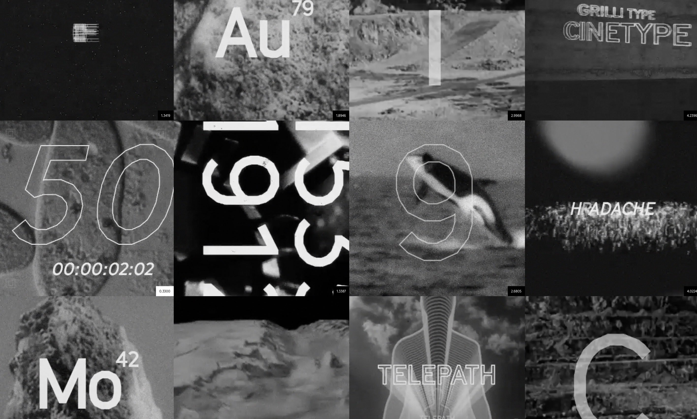
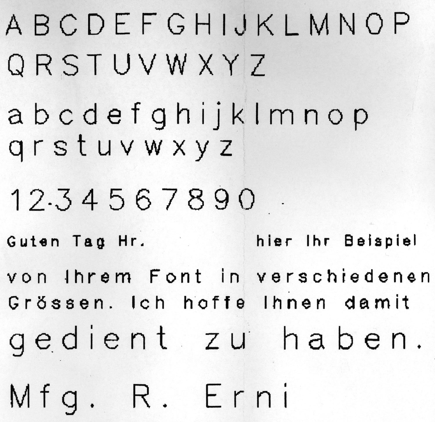
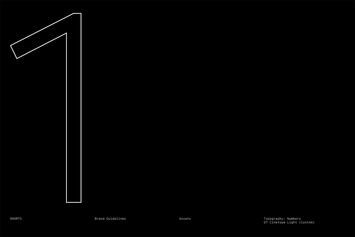
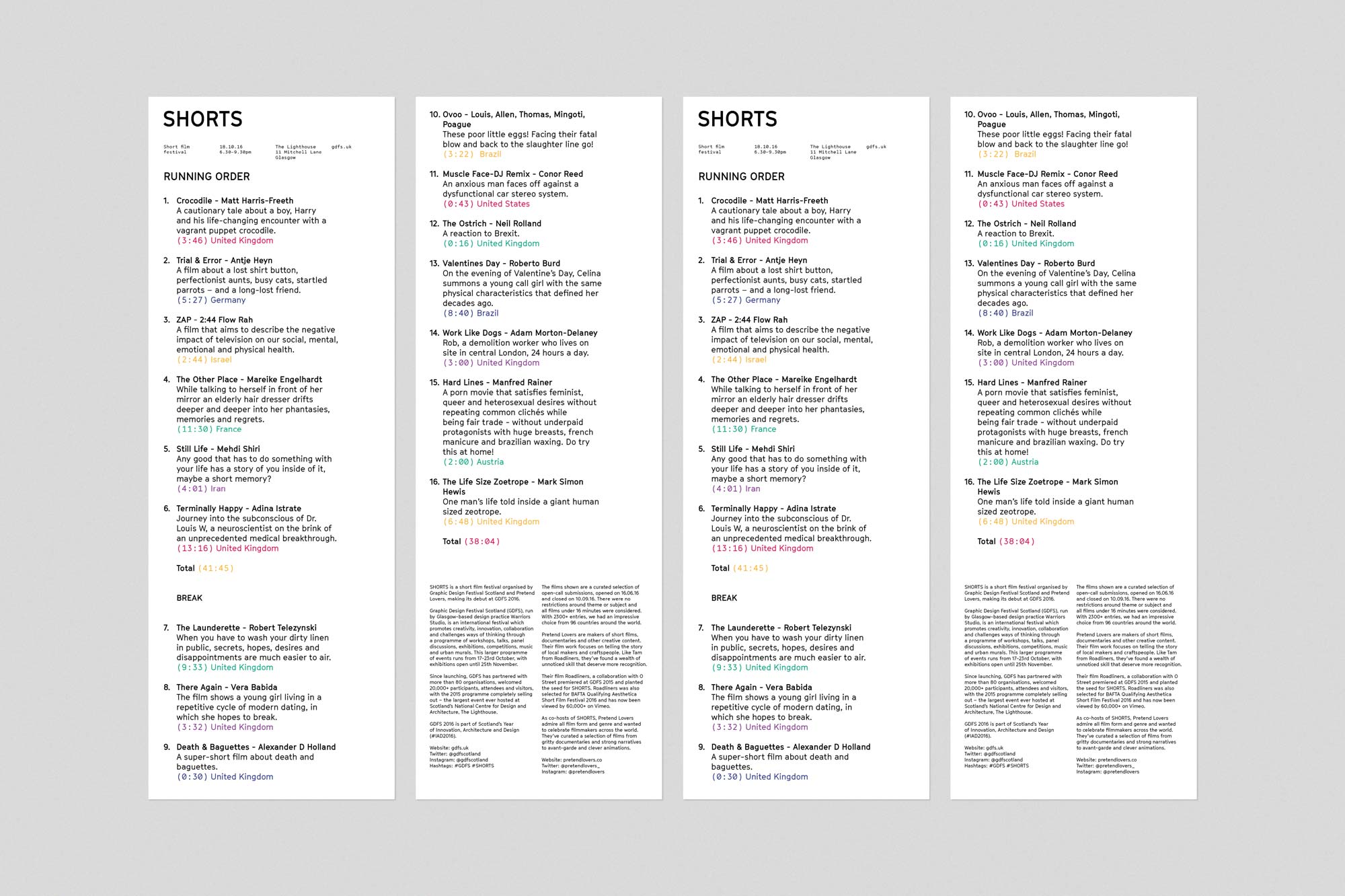
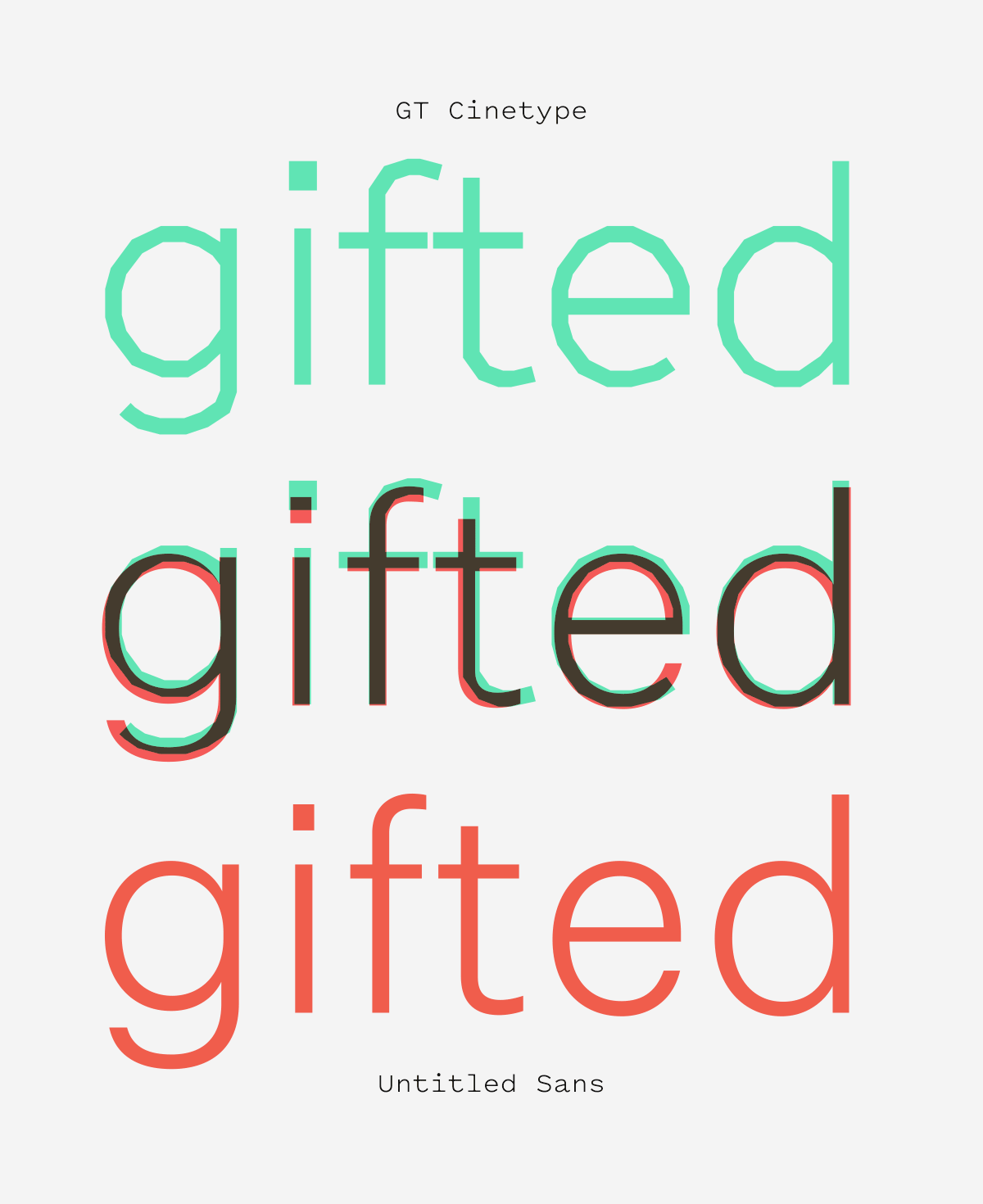
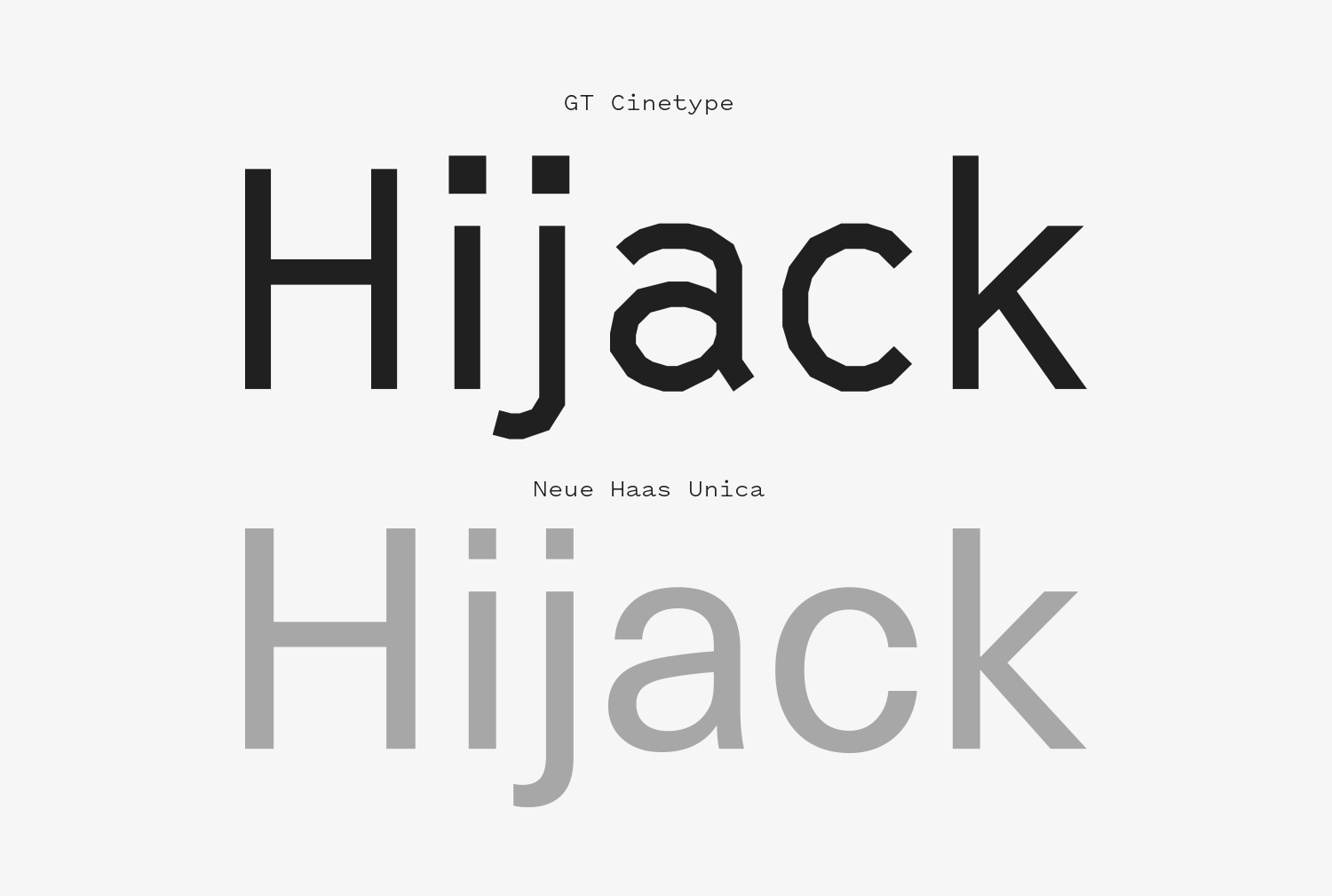
GT Cinetype was designed in Mauro Paolozzi and Rafael Koch as an homage to the Swiss company Cinetype and inspired by a typeface design used by a machine that burned subtitles into film. The result is a quirky but competent sans that never feels weighed down by its design system which requires that every line is a straight one.

Characters like the “a” are endearing and ooze with simple charm. If you set the Cinetype small enough you might not even realize there’s not a single curved line in it. The lowercase Latin “f”, with its hooked end shows no sign of strain against the restrictions of its design; the stepped angles are just as delightful as those made with true curves.

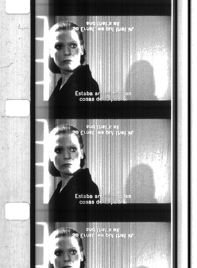
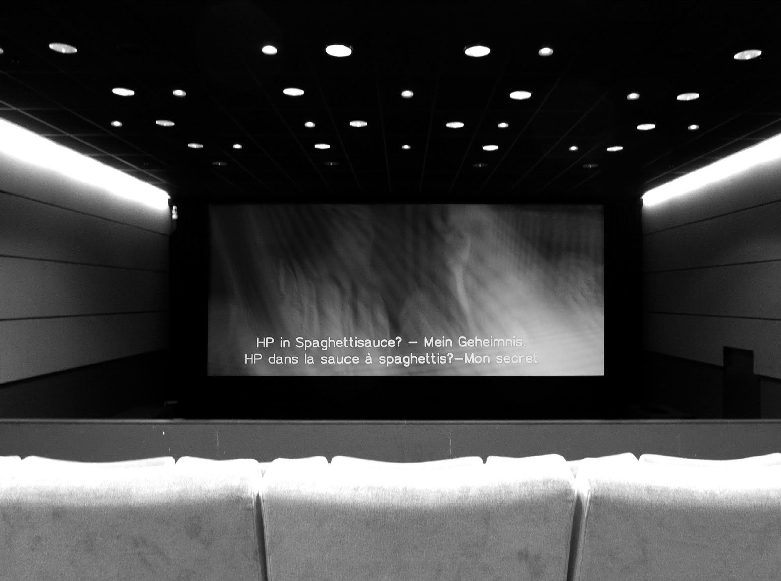
The cinematic heritage of the typeface make it especially well suited to being reversed out of surface, to grainy aesthetics and to lo-fi technology references. Cinetype would look right at home next to the vector Death Star plans shown to the Rebels on Yavin 4[7], and Grilli Type’s promotional site for the font has great fun referencing not only classic films, but the technology that is core to their creation[2]. This style of typeface would historically have its jagged edges smoothed over by the halo effect of light as it burst through film, but we can only see Cinetype in its rough and naked state, missing the production layer that would have given it a greater sense of normalcy. As we’ve done with typefaces with ink traps that no longer serve any value and other type designs that were made to specifically counteract a limit of the technology of their time, we can still appreciate GT Cinetype and find new ways to embrace their specific restrictions.

gt-cinetype.com — Stills from the motion reels used in the GT Cinetype promotional site.
Nº02 gt-cinetype.com — Stills from the motion reels used in the GT Cinetype promotional site.

Historic influences

The Cinetype machine was a hulking, monstrous thing, but the type it burned into film was thin and fragile. When viewed without the backlit haloing effect the bulb in the projector created as it shone through the holes the machine burned through the film, the type looks jagged and not particularly enticing[3]. This makes the sharp edges of Cinetype look positively luxurious by comparison. But even in this state you can see details that Paolozzi and Koch were inspired by, like the spurred “a”, the the wide open “3”, and the petite tail on the “g”.

Nº03 The text the Cinetype burned into film. Image graciously provided by Mauro Paolozzi and Rafael Koch

When you see the type on a piece of film laying on a light table you start to see the haloing effect the light has on the film, filling out the shapes and softening the edges until they are dramatically transformed[4]. It’s at this stage where you see GT Cinetype’s real lineage and I am amazed by how the act of backlighting the type breathes life into those spindly, bitmapped characters. Actually seeing the type projected on screen is the final step of its metamorphosis[5] and in the example below you can see some of the quirks of the original design that Paolozzi and Koch smoothed over, most notably the squashed upper half to the “S” and the squared-off “G”.

Cinetype subtitle text burned into film. Image graciously provided by Mauro Paolozzi and Rafael Koch.
Nº04 Cinetype subtitle text burned into film. Image graciously provided by Mauro Paolozzi and Rafael Koch.
Nº05 Cinetype subtitle text projected on screen. Image graciously provided by Mauro Paolozzi and Rafael Koch.

The more I use Cinetype, the more I’m struck by how efficient it is within its own design system. The distance between points is consistent from character to character, keeping the typeface looking cohesive and uniform without sacrificing the quality of any of the individual glyphs. One could easily understand a temptation to “cheat the grid” and add points to pull off a tricky shape, but if that’s happening here it isn’t distracting to my eye. None of the glyphs appear to be suffering from their constraints—they all feel natural and comfortable. One of the small details that wowed me was that even in a character like the italic “d”, which could be tricky with its bowl connecting to the stem in addition to the slant, they still managed to sneak in a little wedge of counter space between the bottom of the bowl and the stem, just to better form the letter (get a look at it in the specimen at the top of the review, right column, third row).

Nº06 B&RThe Sleeping Hippopotamus and the Missing Eskimo publication showing off Cinetype as body text.

Cinetype has an upright posture and its counters are ample and open, and the apertures on the “a”, “c” and “e” are as well. This keeps the letterforms very legible and contributes to the simple and clean voice of the typeface. The x-height is high enough to make it an easy font to use as body copy[6] and the descenders are rather stubby. The “t” is quite tall, nearly hitting the cap line, and that combined with the raised crossbar make it much more noticeable in a string (look in the specimen at the top of the review for “remote” in the right column, third row, fifth line). I really enjoy the numerals, which are legible but personable, and the monospace numeral set is also excellent.

Source for animation — I used to bull’s-eye womp rats in my T-16 back home.
Nº07 Source for animation — I used to bull’s-eye womp rats in my T-16 back home.
Nº08 Warrior Studio — A section of the brand guidelines for the SHORTS film festival designed by Warrior Studio, 2016, showing off GT Cinetype’s comfort in being outlined.
hearst.co.uk — Cover for The Big Watch Book, 2015
Nº09 hearst.co.uk — Cover for The Big Watch Book, 2015

One of the things that jumped out at me about the font is how big the dots are (I’m sorry, I’m not comfortable calling them “tittles” when referring to their size). Words like “in” go from feeling mundane to slightly starting, making you blink at the giant cube hovering over the stem of the “i”. It has the effect of making the dot look off-center at small sizes and adds to the subtle “jittery” nature of the typeface.

True to its film origins, the characters of Cinetype beg to be used in motion[1] with a film grain, a glow emanating from inside the letterform, or as a timer counting down. It’s also looks slick outlined[8], which gives it a similar aesthetic to the work of Allen V. Hershey and early vector fonts, which weren’t filled.

Nº10 Brandlab — Environmental graphics for University of Engineering and Technology using monumental scale for GT Cinetype.

GT Cinetype strengths

Everything about the way Cinetype is drawn and presented should make it feel artificial and synthetic, yet its charm is undeniable. While the rough edges melt away at small sizes, I’ve seen several excellent examples of designers embracing Cinetype’s sharpness at large scale. Brandlab created an environmental design system for the University of Engineering and Technology in Lima that uses Cinetype as way-finding and architectural markers, and it’s fascinating to see letterforms that were designed to be burned into film at minuscule sizes blown up to be several feet tall[10], and this once again points to Cinetype’s confidence in its design. You aren’t meant to see the constraint of letterforms that can only be comprised of straight lines as a limitation. Even fixtures such as fire extinguishers have supplementary labeling and diagrams[12], and Cinetype really excels at these kinds of technical displays of information with its crisp design. Given the projection lineage of Cinetype it’s not hard to make a connection to augmented reality—it’s as if the information is being projected onto each surface and is a temporary visitor to the space.

Brandlab — A clever use of the monospace weight of Cinetype at the UTEC, 2016.
Nº11 Brandlab — A clever use of the monospace weight of Cinetype at the UTEC, 2016.
Nº12 Brandlab — Environmental graphics for University of Engineering and Technology which evoke projected graphics overlaying an environment.

In terms of type pairings, Cinetype performs remarkably well as a straight man, and works well with a few types of serifs, particularly those with sharp points and geometric flairs. I was stunned to learn that Cinetype was the sans serif used on Esquire’s Big Watch Book publication[9] (the “a” gives it away). At that scale you might not be conscious of its straight edges, but in practice it gives the letterforms a crispness that matches the sharp lines and triangular Latin serifs of Noe Display, the serif headliner. Also note how well these two weights of Cinetype are working together! Check out the Supercommunity website for another example of Cinetype playing well with a sharp serif.

Warrior Studio — A program brochure for the SHORTS film festival making heavy use of GT Cinetype.
Nº13 Warrior Studio — A program brochure for the SHORTS film festival making heavy use of GT Cinetype.
Ludvig Bruneau — 2015 Visuelt Festival program.
Nº14 Ludvig Bruneau — 2015 Visuelt Festival program.

The monospace weight is a true suprise, and delightful in use. It shares the massive glyph set of the rest of the family and has narrower letterforms, along with the expected monospace slab serifs on key characters like the “i” and the “l” (the former of which doesn’t have the same massive dot issue the proportional weights have). When set at smaller sizes the rough edges make it look especially crisp, and it’s a really nice way to break up the texture of the rest of the family. Warrior Studio used it sparingly and effectively in the brochure designs for the Shorts film festival[13], and Daniel Savage used it for a short animated film about philosopher Marshall McLuhan.

Nº15 grillitype.com — A video for Al Jazeera about the philosopher Marshall McLuhan, by Daniel Savage.

Quirks and eccentricities

Cinetype gives itself a natural alias grain effect on screen at certain sizes, which can give it a very specific voice you can play against if you so choose, or it can leave your reader feeling unsettled. Be aware of this and either embrace it as part of the aesthetic or adjust the scale until the letterforms either appear smoothed out, or enlarge them until the edges are clearly defined and legible.

GT Cinetype (top, green) overlaid with Untitled Sans (bottom, red).
Nº16 GT Cinetype (top, green) overlaid with Untitled Sans (bottom, red).
Nº17 Comparing dot placement and size for Cinetype (top) to Neue Haas Unica (bottom)

The enlarged dots on the “i” and “j” were mentioned earlier in this review but it bears repeating here[17]. They really draw your eye because they are wider than the rest of the strokes in the typeface, and because they stretch to tall against the cap-height they feel overlarge and detached to my eye. It can disrupt legibility, especially with words where those two letters are next to each other. It’s made me hesitant to use those characters at large scale, which is a shame because I think the rest of the “j” is quite lovely and love how far it curls back upwards before terminating.

Something else you have to be prepared for are the gangly arms and legs this typeface has. When it’s overlaid against Untitled Sans, you can see how long the crossbars are on the “f” and “t” and the potential for cramping and collisions becomes clear[16]. The “t” of GT Cinetype isn’t even quite as close to the “f” as the Untitled Sans example, yet the crossbars are nearly touching. Because of this and the long curved terminals characters like the “t” have, there is a lot of busy-ness and crowded horizontal space in GT Cinetype. The tall stems on the lowercase characters don’t help. It’s partially offset by the gigantic bowls and tall-x-height, but this isn’t going to create the most even and smooth visual grey as body copy, and the result is darker and heavier than many sans-serifs. The effect is what I’d casually call “grungy”, in that it’s a bit messy and characters can feel cramped[18].

Nº18 GT Cinetype body copy (left) vs Untitled Sans (right). Compare how much air there is in the Untitled Sans example, and how even the visual grey is compared to GT Cinetype, which is darker and more irregular.

Sometimes this is a feature and not a bug! This aesthetic is desirable for type that need to feel a little less polished or buttoned up, or if you want to convey a source that might be technologically out of date or unstable. Again, look for the giant dots and see how they add to that subtle sense of unease in the paragraph. You can always add a bit of tracking to clear this up a bit and tidy up the presentation, it all depends on what feeling you want the copy to evoke. GT Cinetype does a good job toeing the line between distinctiveness and legibility by being just a bit haphazard, but having stellar foundational design decisions and carrying a strong aesthetic point of view.

- FRJ