Cooper
— Designed by Oswald Cooper

brainfeeder.net — Album cover for Thundercat’s Drunk by designed by Zack Fox and Adam Stover. Cooper Black has a long history of use on album artwork.
Nº01 brainfeeder.net — Album cover for Thundercat’s Drunk by designed by Zack Fox and Adam Stover. Cooper Black has a long history of use on album artwork.

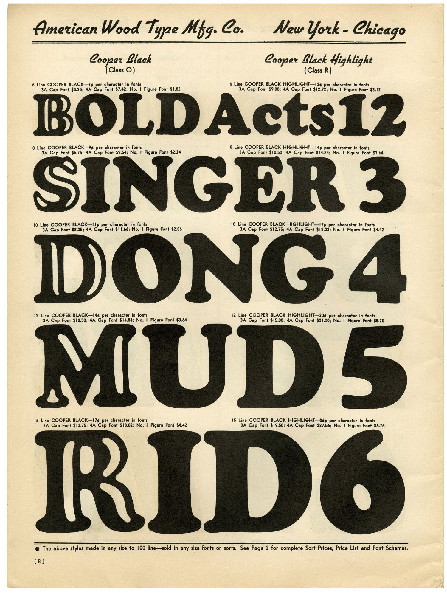
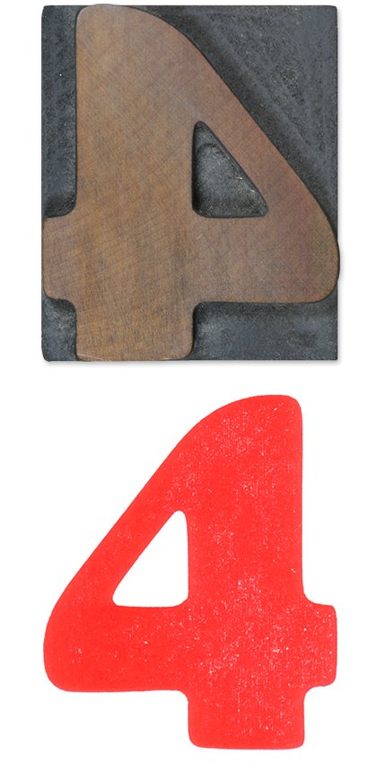
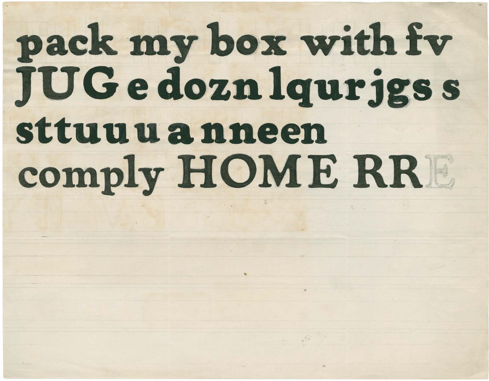
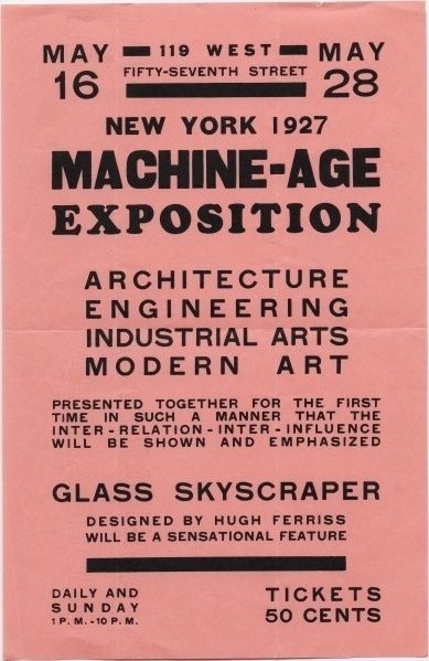
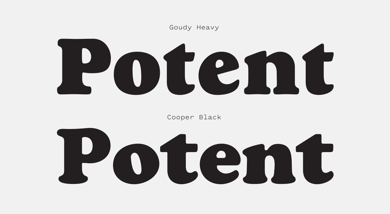
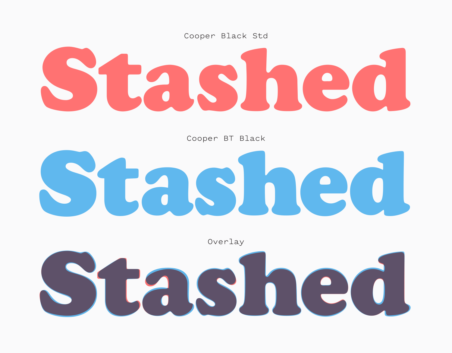
Is there a font that’s been used as successfully as often as Cooper Black and gets less respect? We’re not too far off from Cooper Black’s 100th birthday, and I’m going to do my damnedest to give it the analysis it deserves. For this review, I’ll mostly be covering the Black weight of the Cooper family, though there will be some scattered examples of the lighter (and less popular) weights. Go big or go home!

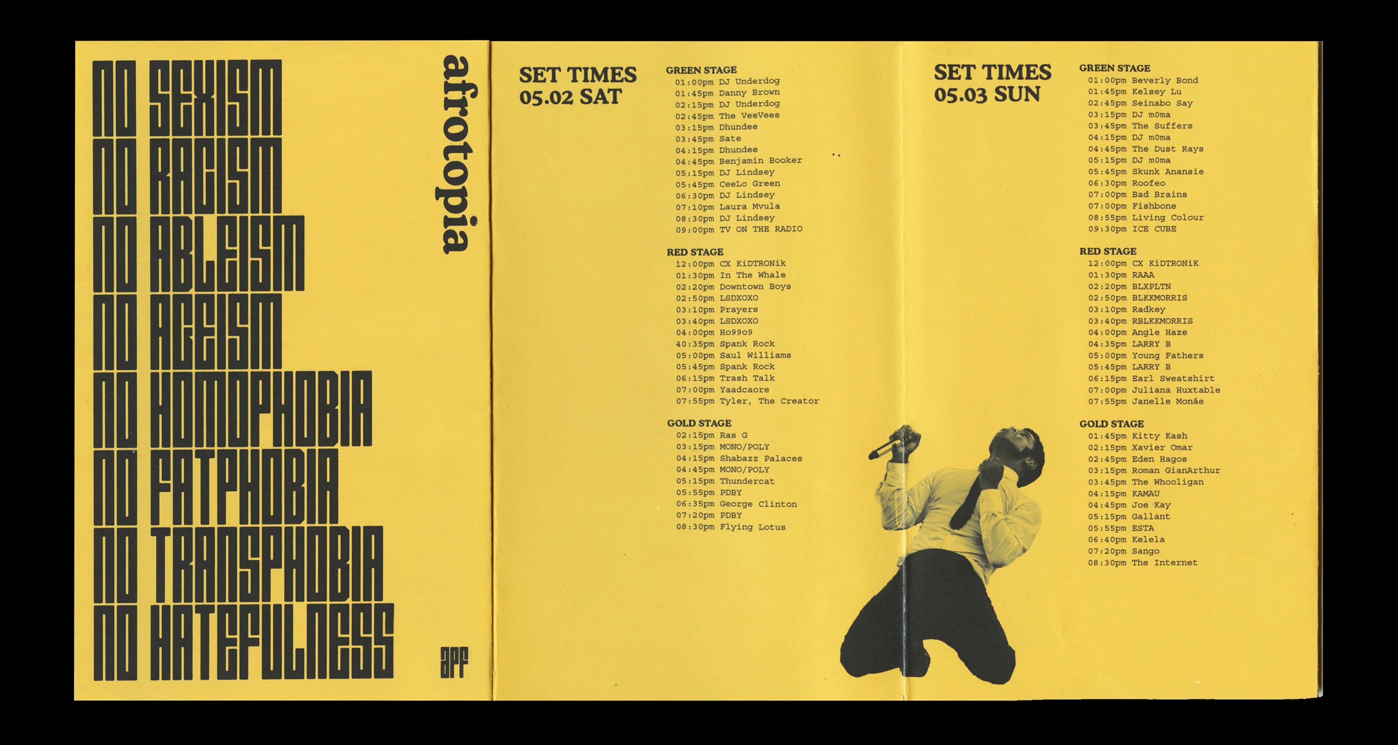
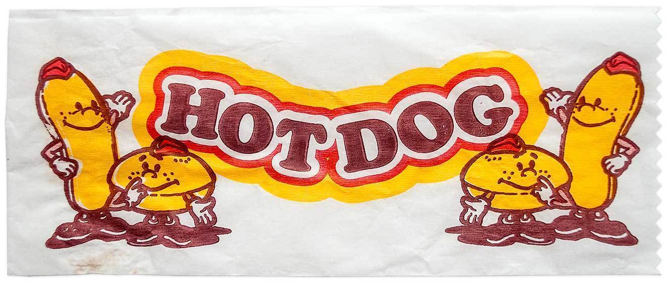
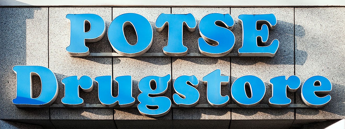
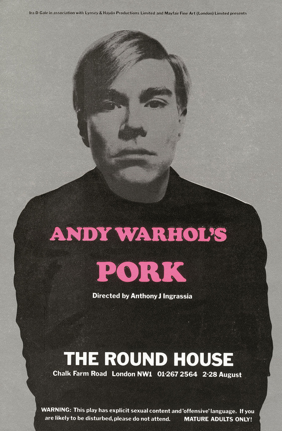
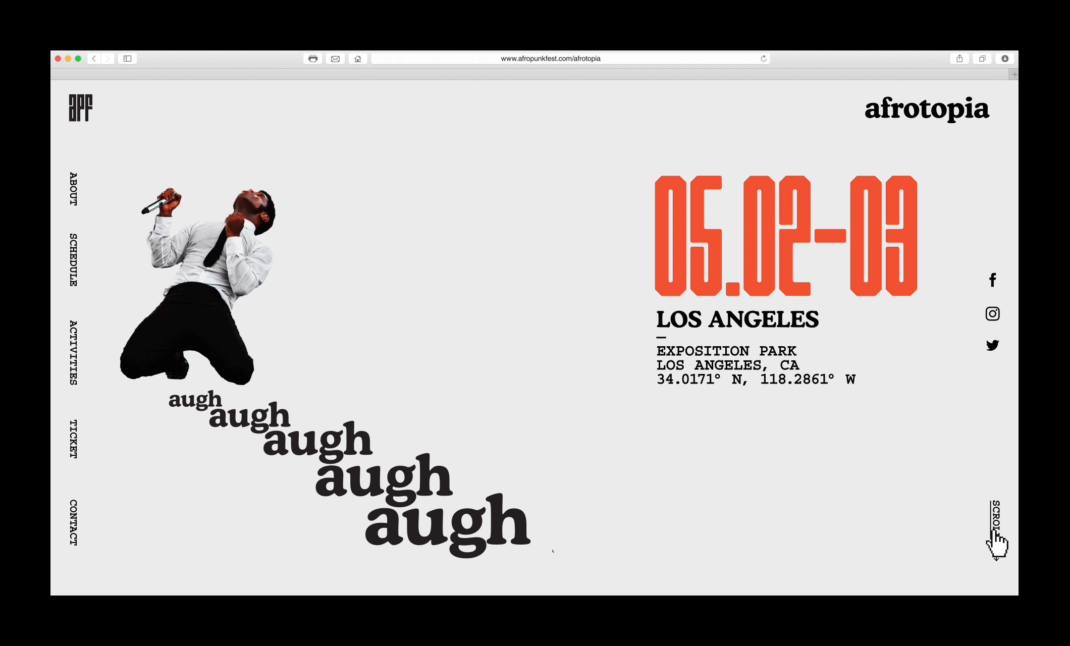
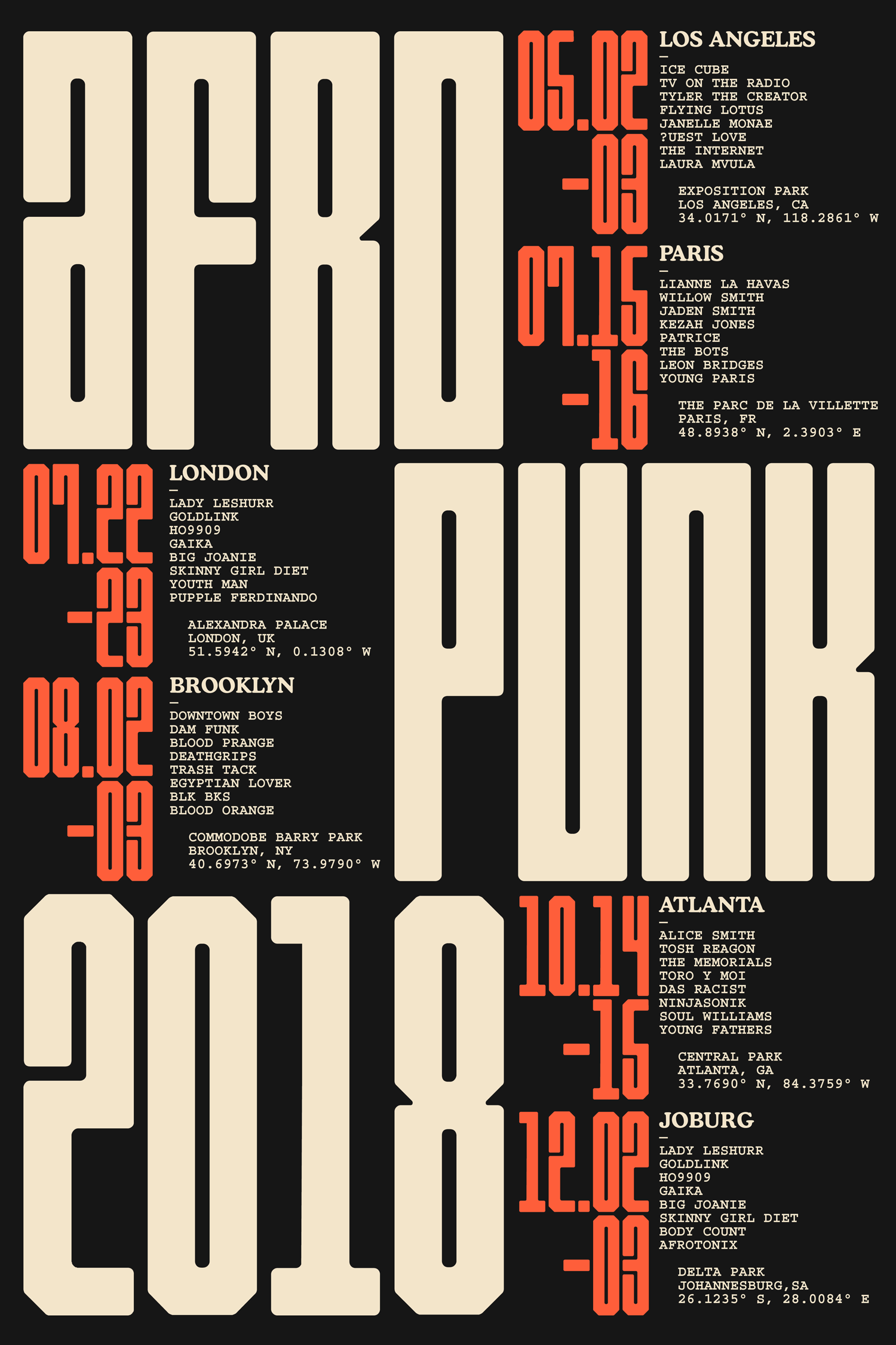
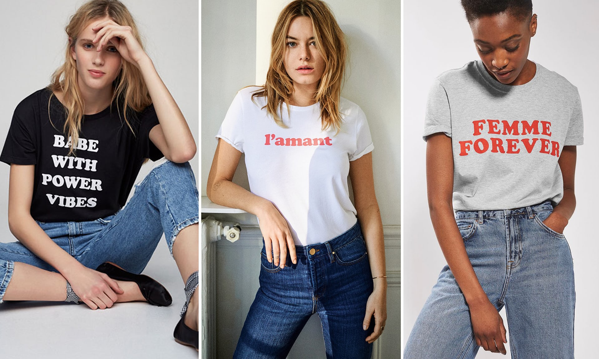
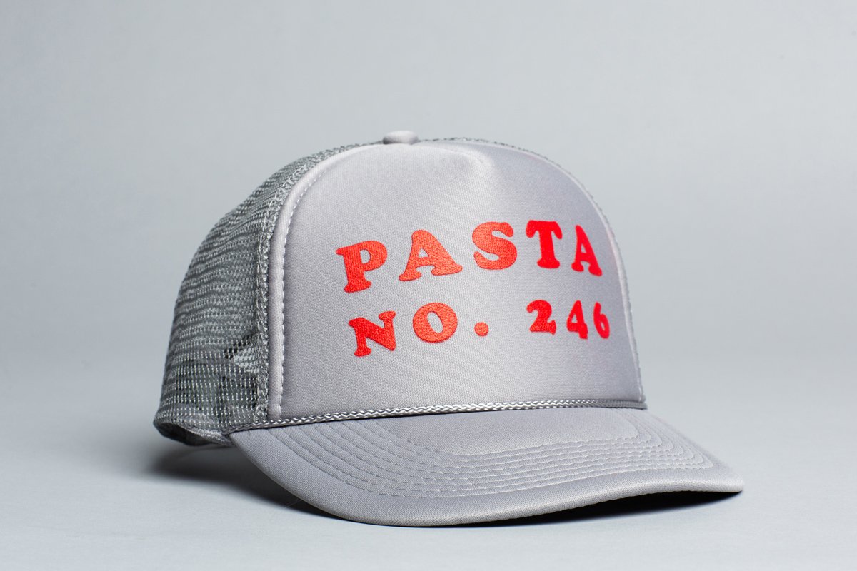
Not many typefaces can represent an era just by being set on a page as well as Cooper Black represents the 1970’s, but its bubbly charm has allowed it to endure for decades in both “high-end” and “low-brow” design applications. Many of us encounter Cooper Black in some form every day, whether it’s on a candy wrapper, a strip mall sign, or an album cover. When I see it used poorly it sticks out like a sore thumb, but how many times have I had to remind myself that Tootsie Roll wrappers use it? It can feel so natural then so very wrong on the turn of a dime. The bigger the personality of a font, the harder it is to wield, and it says a lot about Cooper Black that with as boisterous as it is people still find ways to make it their own. Cooper is a loud talker, but it’s more than happy to shout on your behalf.

It’s a unique challenge to talk about works like this. How do you review a typeface that is so ubiquitous, so steeped in an assumed aesthetic? But there’s so much value in this family—it did not reach its blistering popularity undeservedly. The inflated letterforms remain legible, there’s basically nothing else that looks like it, it holds up in a variety of production techniques and physical manifestations and above all else it is approachable and lets you know you’re about to have a good time. It calls out to consumers to listen to this album, eat these chewy candies, and check out these sweet, sweet discounts on gently-used back to school clothing.

behance.net — Absolutely stunning branding for the Afropunk festival by Yuma Naito for a school project, making use of Cooper Medium and Bold.
Nº02 behance.net — Absolutely stunning branding for the Afropunk festival by Yuma Naito for a school project, making use of Cooper Medium and Bold.
Nº03 letterpress.dwolske.com — American Wood Type Mfg. Co. Catalog No. 36, page 8, printed in 1936.
letterpress.dwolske.com — 12 line Cooper Black.
Nº04 letterpress.dwolske.com — 12 line Cooper Black.

Cooper’s history

Designed in 1922 by Oswald Cooper as a metal typeface, Cooper Black became far and away the most popular weight of the Cooper family. Rounded typefaces first started appearing in the 1830’s, and by the early 1900’s some German type designers had begun exploring more expressive styles that would lead into the aesthetic that became dominated by Cooper Black. When you look at Cooper’s sketches for the lighter weights of the family[5] you can see they more closely resemble an Old Style serif. Even at this early stage you can see the details (the “f”!) that would come to define the Black weight, and you can also see how far Cooper progressed with characters like the “g”, which in this sketch has little of the charm of the final version.

Nº05 britannica.com — Some of Oswald Cooper’s sketches for the Cooper family.

Cooper famously referred to Cooper Black as a typeface “for far-sighted printers with near-sighted customers” and he wasn’t wrong; it’s a hefty font with exaggerated, rounded serifs that is meant to be set large. The lighter weights are attractive in their own right, but lack the consuming presence the Black weight provides.

One of the things that has always struck me about Cooper Black is how soft it is despite the gaudiness of its weight and the scale of its serifs. Everything is smoothed over, “blurred” and a bit muddy. A highlighted version was designed[3], as well as condensed versions and a “Fancy” cut with swashes, but they feel like forced additions to a thought that’s already complete. Competitors like Goudy Heavy[7] were drawn to try to coast on the Cooper Black trend but never reached the same level of success. Its harsher edges suck the charm out of the genre, and Humanist era carry-overs like the tilted “e” only serve to emphasize that this is a classic font style trying to punch above its weight class instead of a wholistic design like Cooper.

Nº06 fontshop.com — An example of Cooper Black used on food packaging, where it fits right in with the cartoon illustrations of anthropomorphized food.
dailytypespecimen.com — Specimen for Goudy Heavy from 1925.
Nº07 dailytypespecimen.com — Specimen for Goudy Heavy from 1925.

Cooper Black has made the transition from metal type, to wood type[4], and even Letraset, such was its ubiquity. I find these tactile production methods to be a particularly good medium for the inherent softness of the font, and they ground the odd characters in a physical way that adds even more warmth to the design. Cooper Black is a staple of business signage lettering[8], but it’s never felt like a fitting use of the typeface to me. The metal and plastic feels too slick and cold, though there is something pleasant about seeing the beefy characters brought into the third dimension.

Nº08 fontshop.com — Cooper Black used in metal signage.

Cooper Black is so closely associated with the 1960’s and 70’s that it consumes our view of the typeface today. After a few quiet decades it roared back onto the scene in iconic pieces of pop culture, like the Beach Boy’s Pet Sounds cover. It matched the hippy aesthetic well with its wobbly, loose design and it’s obvious calligraphic background. It was everything the rigid modernism of the mid-century wasn’t and was adopted heavily in both commercial and counter-cultural circles.

Nº09 itsnicethat.com — Poster for Andy Warhol’s Pork at the Roundhouse in 1971.

Cooper strengths

The best part of writing these reviews is that it forces me to look deeper at typefaces I might have taken for granted. I’m not sure I had ever consciously noted the back-slanted counter in both the upper and lower case “O’s”, the delicious round bulb terminal on the shoulder of the “r”, the endearing fussiness of the “f” or how brilliant the “g” is. More than anything else in the font, I think that letter demonstrates Cooper’s skills as a calligrapher. To create a double-storey “g” in a font this heavy and with this distinct a personality is a marvel.

Nº10 peopleschoice.com — A still from the 2004 cult-classic film Napoleon Dynamite.
monoskop.org — The poster for Machine-Age Exposition in 1927 and its surprising use of Cooper Black.
Nº11 monoskop.org — The poster for Machine-Age Exposition in 1927 and its surprising use of Cooper Black.

Because I’m trying my best to avoid falling back on soft terms like “personality”, I should spend some time trying to break down the character of Cooper Black and why it has endured for this long. It’s not simply an extremely bold serifed font; it’s got rather low thick to thin contrast, which makes it feel more casual and less formal than other ultra bold designs like Fat Faces. Look again at Goudy Heavy and notice how much more visual contrast there is and how it’s more upright, like it has been scolded into sitting up straight[12]. Cooper Black by comparison feels like it’s slouching; the result of its wider stance and the inflated serifs, with the bottoms bulging down past the baseline. I think that the rounded bottoms of the characters are one of the huge factors in the font becoming so popular with novelty shirt designs[10] and signage—because the font doesn’t have a flat base, the letters feel less reliant on an even baseline and can endure being set in irregular or sloppy ways.

Nº12 A comparison of Goudy Heavy (top) and Cooper Black (bottom).

Cooper Black has a low x-height, given that it was designed as a display face, and I think it’s actually foundational to its success as a typeface. The lowercase letterforms are squat and compact and are heavy enough on their own that the capitals don’t jump out at you as you’d see in a lot of low x-height typefaces.

There’s a perfection to the proportion of the capital height and the lowercase forms that I’m struggling to properly express outside of urging you to look at how nicely the “D” leads into the “e” in Justin Pervose’s animation reel for Intercom’s Brand studio[15]. Many of the details in the uppercase set draw your eye towards the lowercase characters that will follow and I think the cap-height, x-height and width of the typeface are all perfectly in sync. Compare how the “o”and “P” in the Cooper Black example above play off each other compared to Goudy Heavy. In Cooper Black, the height of the bowl on the “P” and the height and back-slant on the “o” create a strong relationship between the upper and lowercase characters, but in Goudy Heavy there’s less interplay between those two letters.

Nº14 twitter.com — Cooper Black used in a spread for the New York Magazine. Image provided by Nick Sherman.

I think this spread from the New York Magazine shows off how handsome a design Cooper Black is when you divorce it from your preconceptions[14]. Cooper Black has decades of use and has been used so heavily in kitschy applications many designers scoff at the idea of using it in more “serious” applications, but the excellent designers at the magazine are confident enough to use it regardless of what other people see in the typeface. The cultural cache of a typeface is a valuable thing that designs should be aware of and tap into when needed, but it’s also refreshing to see designers who don’t let the stigma surrounding a typeface dictate how they use it. It seems strange to see Cooper Black used alongside grotesques in a “serious” 1920’s exhibition poster design[11], but it’s a great reminder that the typeface wasn’t always tied to ironic or retro aesthetics, and was simply used because it was a well-made and distinctive typeface.

Justin Pervose — Cooper Black in promotional material for the Intercom brand team.
Nº15 Justin Pervose — Cooper Black in promotional material for the Intercom brand team.
Nº16 walkerart.org A spread from the Hippie Modernism exhibition catalog.

Cooper has characters that share distinct details like the “pinches” of counter space that define characters like the counter of the “c”, the arch of the “f” and the tail of the “y”[17]. I think these unique design details are what has given Cooper Black its lasting appeal and why it suits a certain ironic counter-culture aesthetic well—when used with intent, you can amplify the sumptuous letterforms, and it’s even easier to do with the characters that have these winding curves and thinner arches. It makes them sensuous and just a little dirty.

Nº17 The “pinches” that define the curvaceous character of the typeface.
bpando.org — Packaging for the Weekend coffee shop.
Nº18 bpando.org — Packaging for the Weekend coffee shop.

Cooper Black works brilliantly with saturated colors. Its stout forms can stay legible when reversed out of a hot color without being overwhelmed, and can drink up colorful ink by the buckets. The number of designs that leverage this talent of the font are too many to review here, but I have pulled some of my favorites.

Nº19 fontsinuse.com — An orange easyJet Airbus painted in inverse colors.
gurafiku —This Japanese Poster for Yebisu Garden shows Cooper Black harmonizing with cartoon illustrations and a vibrant gradient. Chikako Oguma, Reiko Tada, Murota Shinsaku. 2015
Nº20 gurafiku —This Japanese Poster for Yebisu Garden shows Cooper Black harmonizing with cartoon illustrations and a vibrant gradient. Chikako Oguma, Reiko Tada, Murota Shinsaku. 2015

British airline easyJet has made Cooper Black a core part of its branding, pairing it with a highlighter orange that’s impossible to miss and delightfully unexpected in the airline industry[19]. The puffy letters resemble clouds and stand in contrast to the sleekness of an airliner. There are clever details like how they try to line up the counter of the “a” with a window of the plane that play into the cheekiness of the branding and leaves a strong impression.

Another example of color + Cooper = brand is the branding for the Weekend coffee shop in Dallas, design by RoAndCo[18]. The bright salmon color suits the playful nature of the typeface, and the word-mark has the letters squished together so they form one inter-connected, cloudy mass. Interestingly, RoAndCo tilted the “e’s” back in the same style as Goudy Heavy, which gives the mark a little more distinction. The word-mark is paired with a clean geometric sans, which plays a perfect straight man against the quirk of its counterpart.

Nº21 walkerart.org A spread from the Hippie Modernism exhibition catalog using Cooper Bold.

The last combination of Cooper and color I want to specifically address is the gorgeous exhibition book for Hippie Modernism: The Struggle for Utopia designed by Emmet Byrne[21]. The cover and many of the interior pages are printed on bright yellow paper that really sets off the Bold weight of Cooper they use for headings and pull quotes. The book uses one of the odder font combinations I’ve seen. Several spreads are set in Pica 10 Pitch, an IBM typewriter font revival, with Cooper BT Bold as the headline. It’s strange but I think it works because Pica 10 Pitch (P10P?) is rounded and has teardrop terminals that have some relation to the bulbous serifs of Cooper, in addition to the fact that both typefaces are closely tied to bygone eras.

behance.net — Afropunk festival website using stepped scaling of Cooper Bold to create a sense of space and movement. Designed by Yuma Naito.
Nº22 behance.net — Afropunk festival website using stepped scaling of Cooper Bold to create a sense of space and movement. Designed by Yuma Naito.
fanboy.com — Lou Dorfsman’s stunning use of Cooper Black for a 1968 newspaper ad.
Nº23 fanboy.com — Lou Dorfsman’s stunning use of Cooper Black for a 1968 newspaper ad.

The Hippie Modernism book rekindled my interest in the lighter weights of Cooper, and the stunning work Yuma Naito created around the Afropunk festival for a student project sent it through the roof[22]. Natio pairs Cooper with APF Display, a condensed and chamfered custom face, which is a stark contrast to the bulbous and airy forms of Cooper. But APF Display has subtly rounded edges, softening its stark geometry and allowing it to play nicely with Cooper’s round shapes and serifs[24].

Courier serves as the body copy and works well against Cooper in the same way Pica 10 Pitch does. Courier relates to the rigidity of APF Display with it’s monospacing and the roundness of its bowled characters and its large counters mirror the lighter weights of Cooper remarkably well. Cooper has an interesting presence when set in all-caps in that it reads a bit “staccato”—you tend to read each letter in sequence instead of seeing the word as a whole. This quirk allows Cooper to play very well with monospace fonts. Cooper breaks up the mechanical nature of the other two typefaces and brings a lot of humanity into the design even though it’s used sparingly. I love this project and wish I could fit more examples of the work in this review. Be sure to check out Naito’s behance page to see dozens of gorgeous pieces and envelope yourself in this excellent work.

Nº24 behance.net — Afropunk festival poster pairing Cooper Medium with Courier and a custom display face. Designed by Yuma Naito.

While Cooper is exuberant in the Afropunk branding, it’s surprisingly stoic in the ad Lou Dorfsman designed for CBS’s 1968 civil rights documentary series, Of Black America[23]. This design is using an altered version of Cooper Black, likely done by a letterer, that has longer and more aggressive serifs. Details like the protrusion at the peak of the “A” that cut back its typical cheerful tone and instead give it a mournful presence, which suits the subject matter. The stacking of the type creates a diagonal line that draws the eye down to the half-painted flag on the man’s face, just one of several small details that make this an exemplary piece of design work. Typeface, imagery and composition combine to create an iconic design.

Colin Miller — DeepLocal branding that pairs Cooper Black with a complementary illustration style.
Nº25 Colin Miller — DeepLocal branding that pairs Cooper Black with a complementary illustration style.
Nº26 Japanese lettering in Cooper Black style. Cooper’s viability has translated across languages and continents. Image taken from Idea Magazine Nº356.

Quirks and eccentricities

You are all probably already well aware of the potential pratfalls of using Cooper Black, but I’ll address a few here. Care has to be paid to kerning in basically any situation, particularly around the “v” and the “w”. The dots on the “i” and “j” are squished, and while they don’t always bother me sometimes I wish they were rounder.

Your mileage will vary with setting Cooper Black in all-caps. Cooper Black was clearly meant to be set in uppers and lowers, but you can make it work in all-caps depending on the situation. This review spotlights several instances of it working successfully, like the Thundercats album cover[1] that pulls the letters close so they interconnect, and Colin Miller’s branding work for DeepLocal[25] which tracks out the text and uses the rounded character in each letter to reflect the tone of the illustration.

theguardian.com — Sézane’s line of shirts using phrases set in Cooper Black, continuing decades of using Cooper Black in fashion.
Nº27 theguardian.com — Sézane’s line of shirts using phrases set in Cooper Black, continuing decades of using Cooper Black in fashion.
Nº28 alvindiec.com — Cooper Black used in all-caps and tracking to emphasize the awkwardness in the spacing. Notice the gaping hole between the “A” and the “S” and how tight the “S” and “T” feel by comparison.

Alvin Diec also plays against the ubiquity of Cooper Black in mass produced clothing items by using it in all-caps, tracking it out and embracing its slightly off-kilter presentation[28]. A typeface that typically thrives on the interplay between its bulbous shapes is spread out in an unnatural way to purposefully make it feel clumsy. It’s a really brilliant move to see a skilled designer use a ubiquitous typeface in its predictable context in a slightly unexpected way.

Nº29 Cooper Black Std (top), Cooper BT Black (middle) and the two versions overlaid (bottom)

Because this is the first review I’ve done of a pre-digital typeface, I am still figuring out how to properly address the question of digitization and the differences between typefaces that have multiple revivals. Your computer likely has a version of Cooper Black already installed, and that version should be all you need. Adobe, Linotype, and others all offer their own versions of Cooper Black, and while they each offer slight variations, I haven’t come across one I felt was markedly superior. If you want lighter weights of the Cooper family, I would recommend Cooper BT, designed by Bitstream in the 1980’s. It offers a lot of refinements to Oswald Cooper’s original designs and has a large number of weights. Their version of Cooper Black also has some distinct alterations, like the rounding of the left side of the crossbar on the “t” and slightly taller x-height[29] so if you are itching to be a high-roller and have a “special” Cooper Black, consider that one.

Cooper Black is what it is and the biggest obstacle in using it is deciding if you can mold it to complement your message. It has a strong presence but the diversity in the applications it has seen over the past century speak to its adaptability as well. This is not a joke font and it’s not cheap kitsch. It’s a beautifully crafted design that’s just waiting for the next adventurous designer to teach an old dog new tricks.

- FRJ