Casey
— Designed by Leslie Cabarga

1999 Fleer Ultra Pedro Martinez card, a favorite of mine and one of the inspirations that led me to seek out a fat-bottom script (This typeface looks like Philly Sport Script, or an ancestor of it).
Nº01 1999 Fleer Ultra Pedro Martinez card, a favorite of mine and one of the inspirations that led me to seek out a fat-bottom script (This typeface looks like Philly Sport Script, or an ancestor of it).

No single typeface has had more of an impact on my life than Casey. How’s that for an intro?

In the summer of 2010, when I was trying to get a jump start on my work for my Senior Thesis in my final semester at Auburn, I was trying to settle on a name and a theme for my project. I knew I wanted to do something about baseball, and as I gathered research and inspiration I settled on the connecting thread being “baseball minutiae”—the little bits of language, mathematics and ephemera that have been created surrounding America’s pastime. But I had no idea what to call it.

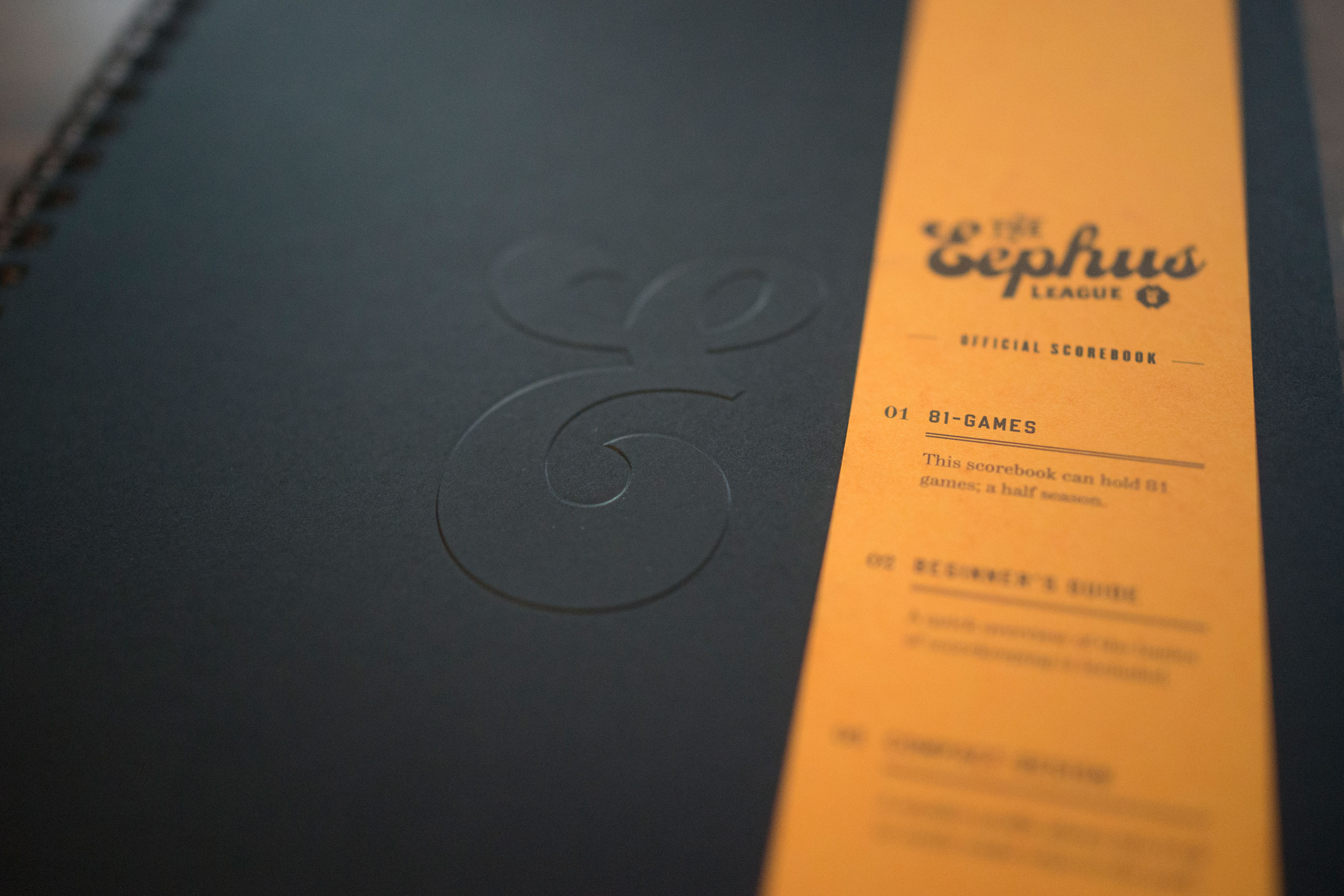
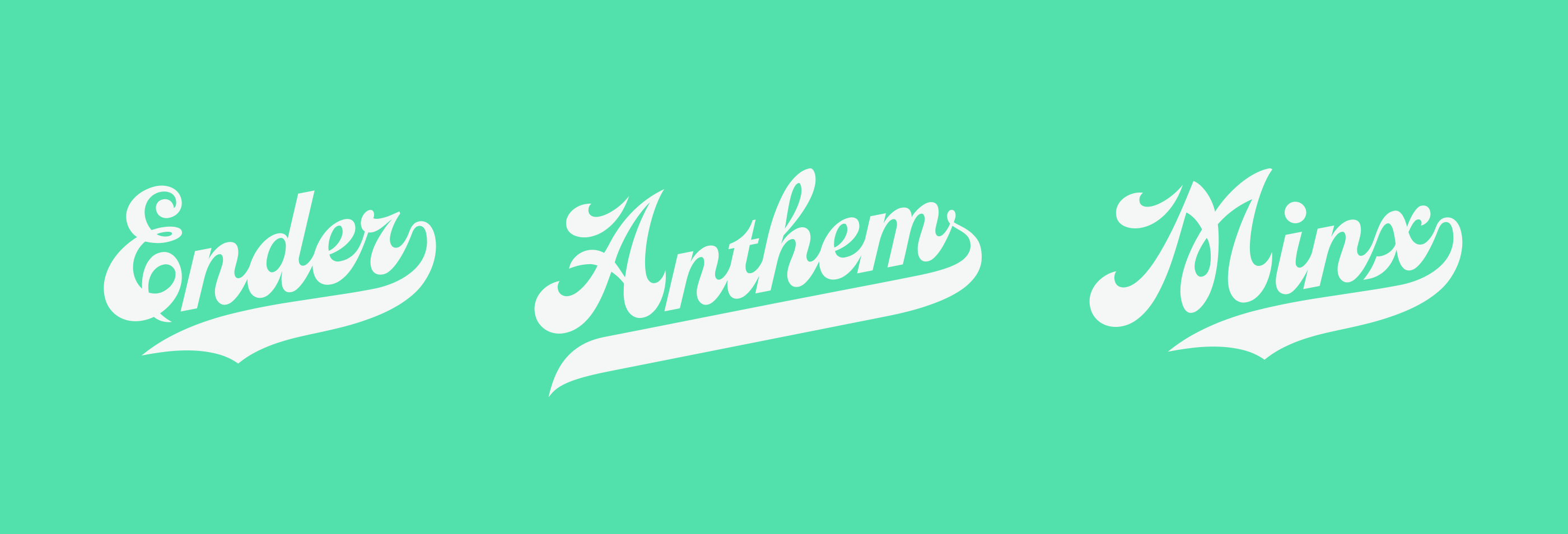
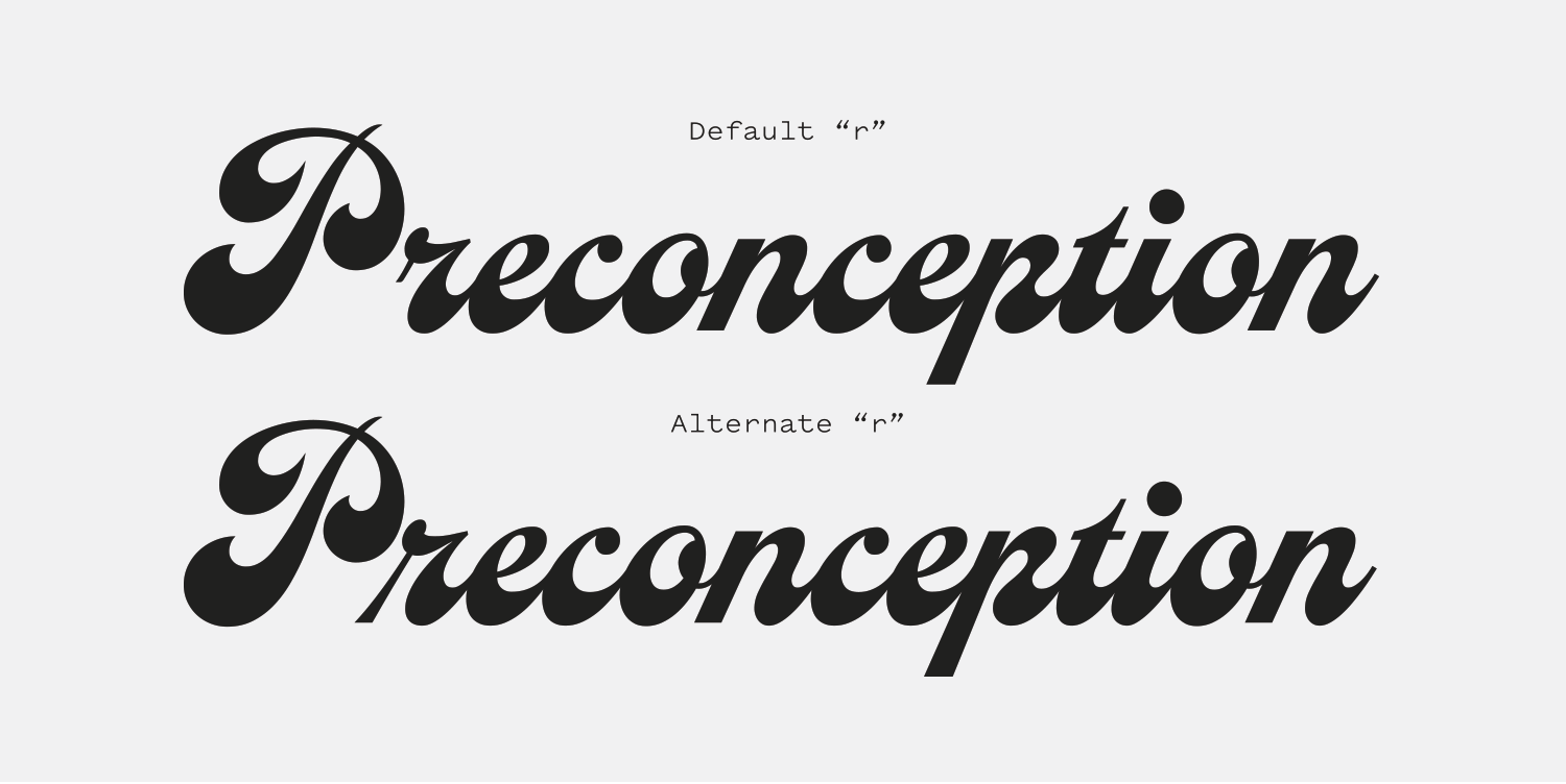
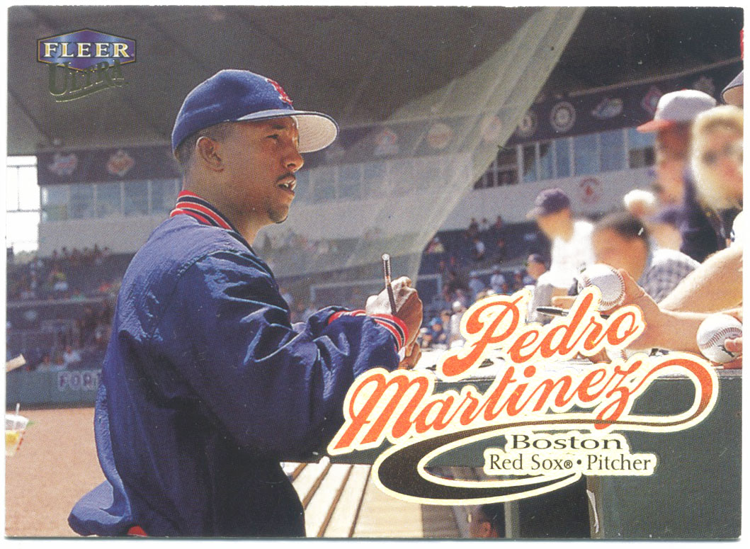
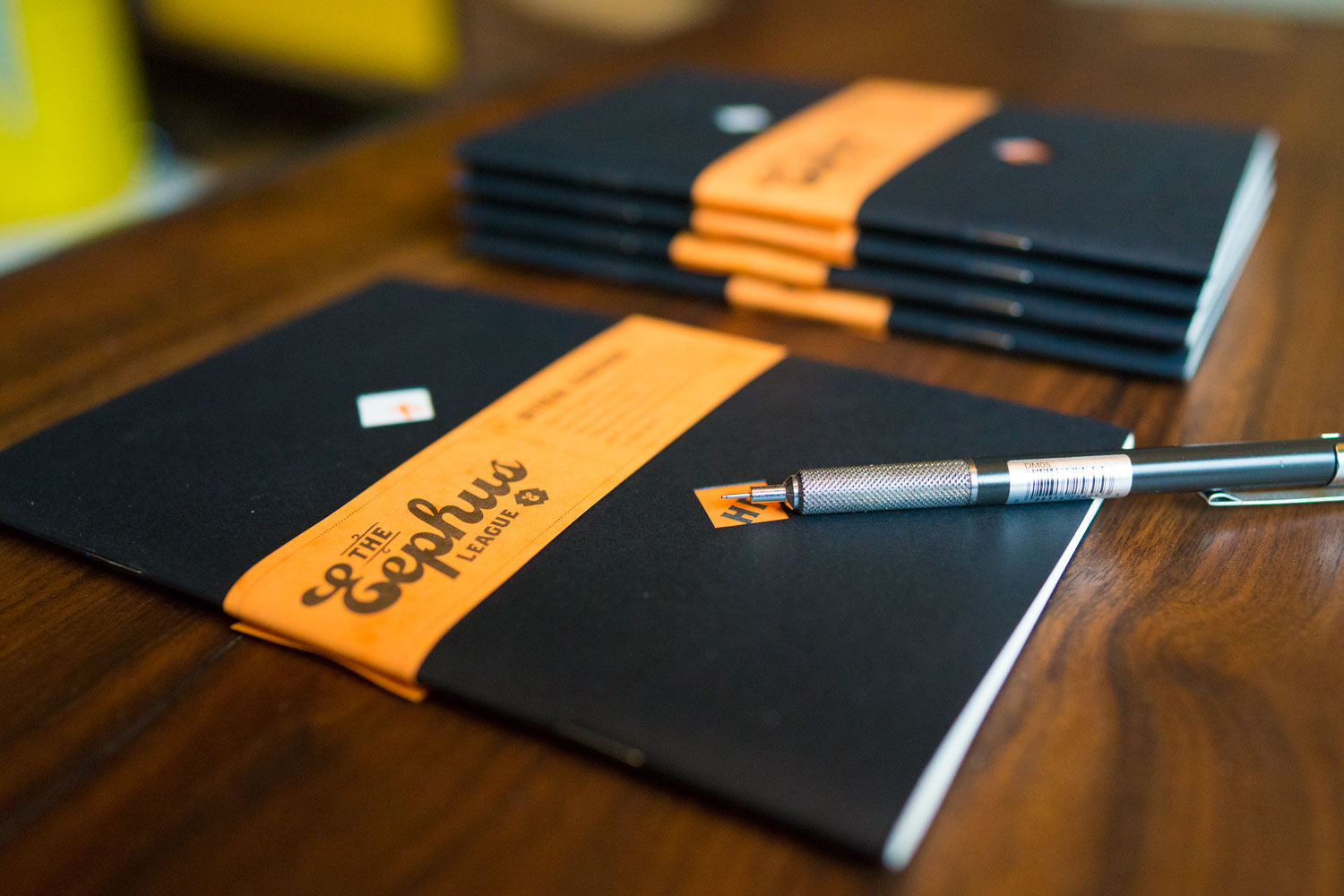
I’m terrible at naming things (rejected names for the Eephus League include “Full Count” and “Cheap Seats,” groan) but I had at least settled on the fact that Casey was going to be the baseball script I went with. It reminded me of my 1999 Fleer Ultra baseball cards (which use something like Philly Sport Script) which is my all-time favorite set. So I started setting words in Casey. And one of the words on my list of interesting baseball jargon was “Eephus”, and as you can see[2], “Eephus” looks fucking fantastic in Casey Bold. So, in effect, Casey named what became my small business and has been my creative outlet for the past 7 years. I’ve had people ask me if the logo was custom lettering and I always take delight in telling them no, it’s just a gorgeous script named Casey designed by Leslie Cabarga. I even left the connecting stroke on the end of the “s” because I’m a Dance With The One That Brung Ya kind of girl.

Nº02 eephusleague.com — The Eephus League original scorebook, showing the logo I designed with Casey in 2010.

All that is to say is that Casey is a supple, fat-bottomed girl of a script that straddles the line between sporty and full-retro with a gorgeous wavy rhythm to its strokes, bowls and connections. I’m truly surprised this font hasn’t seen more widespread usage. It’s right at home in a diner aesthetic or on a baseball jersey, and I think the Bold weight in particular has a lot of dignity about it—it doesn’t feel cutesy or overly stylized. It’s a strong, confident take on an interesting style of script that has been shown too little love in the digital era of type design.

eephusleague.com — Embossed cover of a HalfLiner scorebook, using Casey Bold.
Nº03 eephusleague.com — Embossed cover of a HalfLiner scorebook, using Casey Bold.
Nº04 letteringlibrary.com — A bulletin design from Sign Painting Up to Now by Frank Atkinson.
pinterest.com — A gorgeous example of fat bottom script lettering.
Nº05 pinterest.com — A gorgeous example of fat bottom script lettering.

Historic influences

Fat-bottom scripts are a mostly forgotten genre that were a staple of sign painter work in the later 19th century. The capitals are large and contain various swashes and flourishes, the x-height is low, and the thickest part of the strokes are on the bottom half of the letterform. It is important to note that this style originated in the same time period as Art Nouveau. Though we usually associate that style in art and design with typeface designs such as Arnold Boecklin, these scripts were also common and seen alongside many styles of lettering and type design. The lush, organic feel to examples like this one from the Atkinson Sign Painter book[4] show this style alongside intricate floral borders. In the hands of a skilled sign-painter, swashes would cut through bowls and strokes would interconnect in a controlled tangle. The style could vary between razor-thin points to supple bottom-side curves or fattened up to go from thick to thicker. You can find an excellent version of the former in the same Atkinson book, where it’s referred to as “Heavy Sign Script”[6].

Nº06 letteringlibrary.com — Heavy Sign Script specimen from Sign Painting Up to Now by Frank Atkinson.

This style was brought back to the design world’s attention when John Downer used the style for the iconic script version of the Emigre logo[7]. Downer has created several pieces[9] of lettering in this style, and they showcase the best of what the genre has to offer. In his hands, the letterforms form ribbons of text that weave along the page and through each other, but never in a way that feels gaudy. It’s a controlled application that feels timeless and respected while having a great deal of warmth in its generous curves.

misserif.blogspot.com — John Downer’s iconic script logo for Emigre.
Nº07 misserif.blogspot.com — John Downer’s iconic script logo for Emigre.

Casey strengths

Casey is rather flexible for a script font, and by that I mean you’re rarely going to set a word and have it come out as a total atrocity. A lot of this stability comes from the even pacing of the lowercase set. Most of the letters are a similar width, which keeps the pacing steady and reduces the odds that something will suddenly feel cramped or collide with something else on the line. The Bold and Ultra weights give more space between letters, while Classic mimics hand-lettering a bit more closely and spaces the characters more tightly as a result.

Nº08 twitter.com — Typographica ad featuring Casey Ultra (blame Twitter for the crunchy image quality).

Casey comes in 3 weights: Classic, Bold and Ultra. I find Bold to be the most flexible of the bunch, with a great balance between heft and finesse. It has a really lovely width, with just the right amount of roundness to the characters. Classic is narrower, has more thick to thin contrast and more of a forward tilt. I think Classic shines the most when set on a tilted baseline, as seen in these examples[9]. The forward tilt works towards making the typeface feel natural on an upwards angle and levels out the “speed” the aggressive tilt causes. This also gives you an opportunity to take advantage of the included tail designs without them feeling like they are weighing down the text. Ultra is the widest weight with the least amount of contrast, and works great if you want to really slow the pace of a word down, like you can see in this Typographica promotion[8]. The extra air between letters let you really appreciate each one individually.

Casey Classic examples set on a tilted baseline with tails.
Nº09 Casey Classic examples set on a tilted baseline with tails.
John Downer logo lettering from Idea Magazine, issue 356.
Nº10 John Downer logo lettering from Idea Magazine, issue 356.

Quirks and eccentricities

As is the case with all script faces, whether or not Casey will work for your project depends on if the words you need to type will fit together cohesively in this font. Not all of the capitals lead gracefully into the lowercase set. I feel like certain capitals like the “P” loom awkwardly over the lowercase letters[11]. The default “r” is designed to come after another character it can attach its little appendage to, which can lead to some clumsy looking transitions, particularly with capitals. If you are finding it problematic, look in the glyph set for an alternate which has a leg to stand on and is better at establishing the rhythm of the text that follows. It gives it a more stable and finessed presence in situations where it can’t rub up against the character before it.

Nº11 Casey’s default “r” (top) compared with the alternate (bottom).

I wish the tails were dynamically built and customizable, in the same way typefaces like Metroscript have done. These are glyphs with set sizes, so if you need a different length you are left to either outline the type and try to finesse what is there (I extended the tail in the “Anthem” example above[9]) or draw a new one. Neither solution is ideal, and it’s a shame given how well the tails suit the typeface and the style.

If you are like me you keep a ledger of scripts in your back pocket for those times you need the perfect solution, and I think Casey should be added to that list. The typeface has given me an awful lot, and it was a real joy to pull it out and play with it for this review. John Downer is consistently showing us the value of this genre of lettering, and Casey represents the finest digital interpretations of this timeless style.

- FRJ