Brothers
— Designed by John Downer

behance.net — The Surnames of Matera poster design by Francesco Paternoster.
Nº01 behance.netThe Surnames of Matera poster design by Francesco Paternoster.

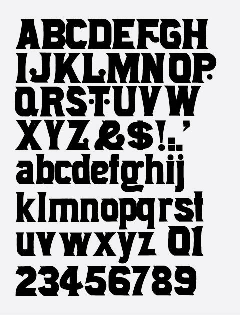
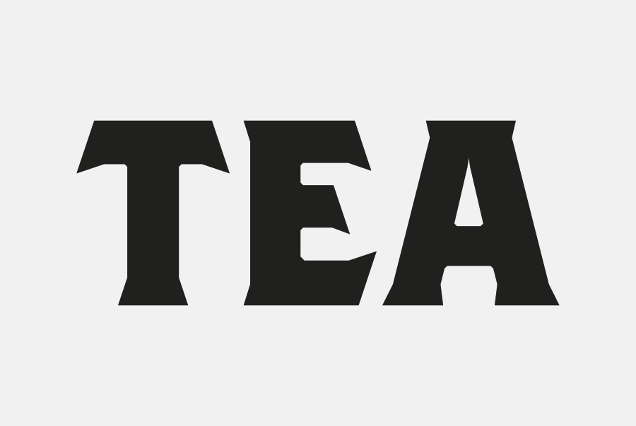
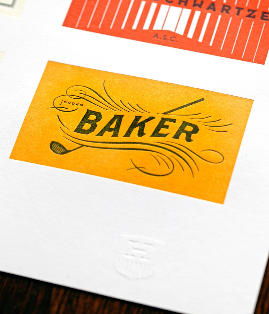
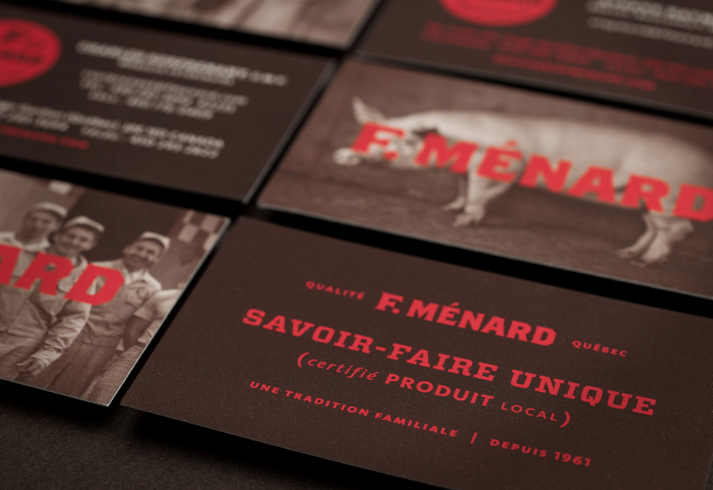
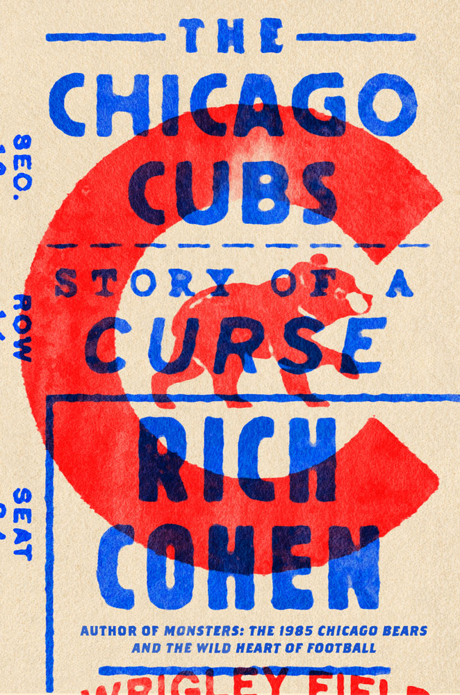
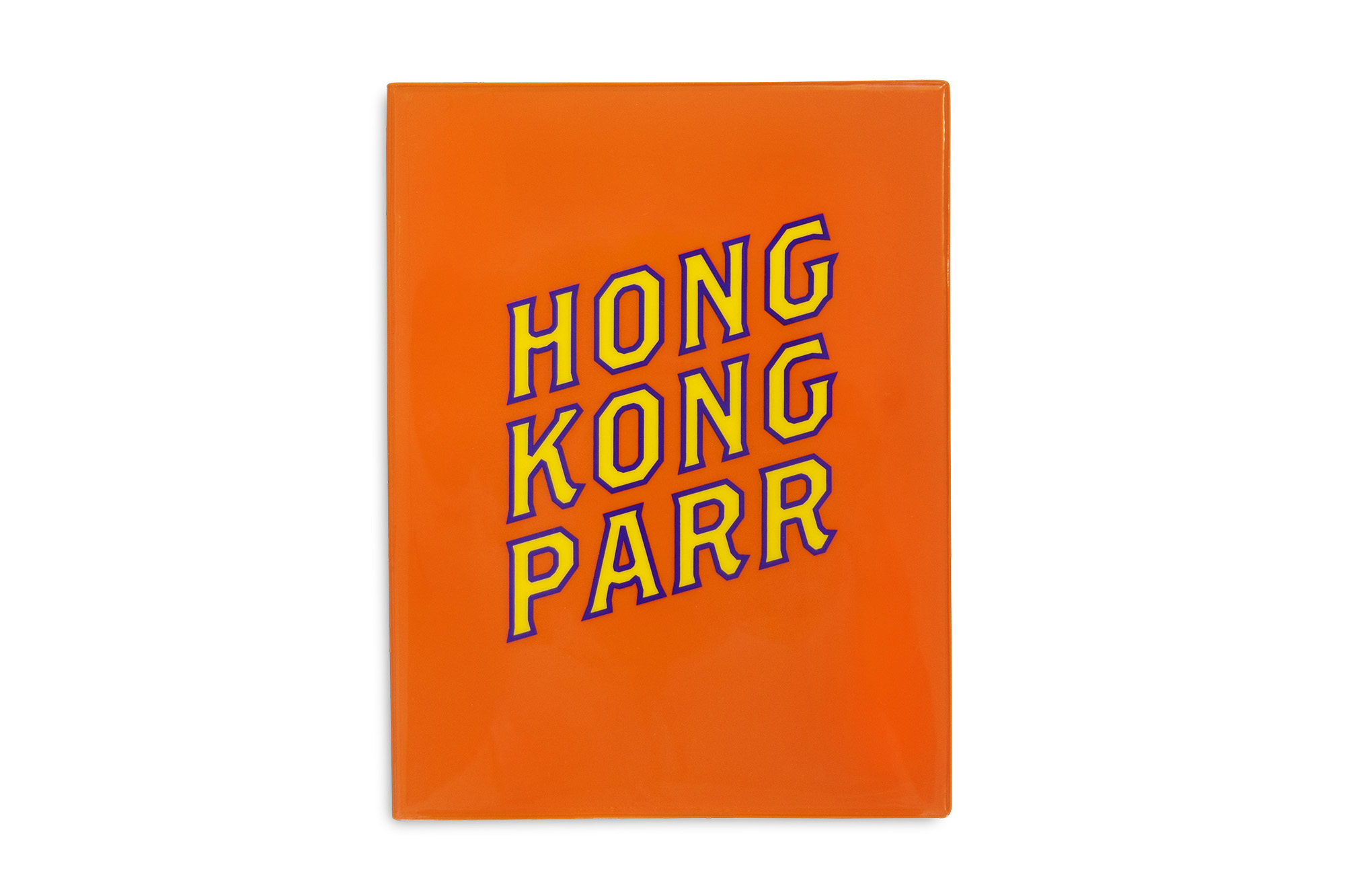
Brothers has always been one of my favorite typefaces. To a certain genre of designer, this typeface is iconic and instantly recognizable. Despite its chamfered edges and pointed Latin serifs, it is a warm design that feels lovingly crafted.

It is easy to see why designers are drawn to the typeface; it’s oozing with personality and has a startling amount of variations and alternates available. I’ve certainly been guilty of taking it for granted and not taking the time to appreciate what a masterful job John Downer has done. Any given weight of Brothers would be a fine display face on its own, but the fact that it has 3 different weights (Regular, Bold and SuperSlant, the italic), that each weight has an alternate set, and that there’s also a set of stunning Word Logos to use makes this font a playground for typographers.

Brothers straddles the line of lettering and type design, and I’m not sure anyone other than the supremely talented John Downer would have the skill-set to make something like this. Despite having an eye-catching aesthetic and a dominating personality, Brothers works remarkably well as a supporting typeface. The risk in using a typeface this distinctive is that it can become the only thing you notice in the design, and I think the most successful designs either wholeheartedly embrace the font and let it drive the design, or use it subtly and let it add color and contrast to more restrained typefaces

lg2boutique.com — F. Ménard branding by lg2boutique.
Nº02 lg2boutique.com — F. Ménard branding by lg2boutique.
Nº03 circustents.blogspot.com — The Cole Brothers 1929 lithographic letterhead lettering that inspired Brothers.

Historic Influences

The genesis for Brothers was lettering on letterhead for the Cole Brothers traveling circus[3]. This was hand-lettered piece, and you can see the inconsistencies in the repeated characters like the “O” and the “E” from the left side to the right. This is a rather small letter set from which to base an entire type family, but Downer is a masterful calligrapher and embraced the challenge. The first weight he designed was the Bold, which most closely reflects the letterhead design. After designing a set of charismatic alternates he designed the regular weight, then the “pseudo-italic” , which is an extreme oblique of the regular weight.

Brothers reflects the design of the letterhead example in a few key ways. Letterers who carved into lithographic stones could achieve sharp outer edges, but the insides were left rounded due to the limits of the production and printing process. Brothers keeps this deign element, and most of the counters in Brothers have smoother articulation compared to the jagged outer edges. Details like the flared, angled horizontal terminals on letters like the “T” and “E” remain, as do the chamfered edges and subdued Latin serifs. Downer took care to even out the widths and proportions, successfully carrying the bold and active personality of the lettering into a typeface.

rrk.finearts.utexas.edu — The Nº 514 Page design, from the Rob Roy Kelly Collection.
Nº04 rrk.finearts.utexas.edu — The Nº 514 Page design, from the Rob Roy Kelly Collection.
Nº05 archive.org — A 1899 lettering example from Elements of lettering and sign painting by the International Correspondence Schools in Scranton, PA

While the Cole Brother’s letterhead is from the 1920’s, you can find even earlier examples of similar typeface designs in both lettering instructionals and wood type specimens. There’s a less-bold lettering style shown in Elements of lettering and sign painting from 1899 that shares the flared terminals, subtle Latin serifs and raised middle arm on the “E” with Brothers[5].

Another example from the era that shares some characteristics is wood type manufacturer Page’s 1887 design, № 514[4]. It has the petite Latin serifs, but instead of sharp edges uses curves to draw its outer edges. This design was produced by die-cutting the design into the face of the wood block to trim around the raised designs while the negative space was cleared away, a process that allowed for more intricate typeface designs. There are details in Brothers, like the wilting middle arm on one of the alternate “F’s” (see the specimen at the top of the review, right column, second row) that could have been inspired by the odd drooping ball appendage on the “F” in this design. One of the reasons I am referencing this specific design is to show the wisdom in leaning on straight lines. You can see how clean and crisp Brothers is as a result, compared to the № 514 design, which feels less consistent, much more busy and is harder to read.

The Brothers Bold alternate “E” resembles the one seen in the Ocean’s Blend tea tin.
Nº06 The Brothers Bold alternate “E” resembles the one seen in the Ocean’s Blend tea tin.
Nº07 pinterest.com — An Ocean’s Blend tea tin with similar Latin style lettering underneath the ship illustration.

Another example I’ve found is this Ocean’s Blend tea tin[7]. It’s a lovely piece of vintage design, with bright colors and a delightful mix of lettering styles. The “TEA” text underneath the engraving of a ship shares a lot of similarities with Brothers. The shape of the “T” is nearly identical (though the Ocean’s Blend lettering has a thicker stem) and the “E” has the same backwards-sloping terminal on the middle arm as the Brothers Bold alternate. The tin’s “A” has an uneven stress, and seeing this example made me appreciate the even weight that Brothers has, which simplifies the letterform construction and better presents the pointed serifs and chamfered edges. If there was more thick-to-thin in Brothers, it could easily become overwrought and difficult to read.

Nº08 bpando.org — Anagrama subtly altered Brothers in the wordmark for Valentto Olive Oil.
theheadsofstate.com — Great Gatsby business card letterpress poster by Heads of State.
Nº09 theheadsofstate.comGreat Gatsby business card letterpress poster by Heads of State.

Brothers strengths

Brothers is best suited for clean presentations where it can retain its crisp forms. I love the way Francesco Paternoster uses Brothers in The surnames of Matera poster[1], where he uses stark colors and Brothers’ strong presence to visualize the number of residents in Matera (South Italy) have the same surname. He makes brilliant use of the alternate’s superscript numerals and has the confidence to let Brothers do its job. It’s a refreshing use of the font and a contrast to the way many designers try to use it. Brothers is a robust font that can handle a lot of texture and distressing, but please, please consider just letting Brother’s crisp lines show through once in awhile.

The other major crime designers inflict upon this typeface is mixing it with other distinctive display faces in an effect to bedazzle their boring designs and compensate for their lack of a design point of view. Brothers can be successfully used against other unique typefaces, but it has to be done thoughtfully and systematically.

One such example is the lovely Great Gatsby-inspired letterpressed poster Heads of State designed in 2012[9]. The poster is comprised of a grid of business card designs with references from the novel. Brothers is featured in the bottom right card, set with a gentle wave in its baseline (for such an angular font, Brothers handles such distortions well). It doesn’t compete with the more than a dozen other fonts in the design because each “cell” of the grid is asked to stand on its own, and the cards a whole are unified by shared colors and healthy use of negative space.

Nº10 behance.net — Business cards from the F. Ménard branding system by lg2boutique.

It’s much easier to use Brothers in type systems filled more restrained typefaces that won’t compete to be the loudest voice. The F. Ménard branding system[2] created by Lg2boutique uses Brothers Bold for the word-mark and leaves the rest of the type system to a combination of FF Kievit and Vitesse, a sans and slab serif, respectively[10]. The supporting fonts are an interesting bunch. Vitesse is wide and industrial, and FF Kievit is a humanist sans that lends the brand a more warmer energy with its almost calligraphic lines. By restricting Brothers to the main brand elements the branding still has the edge the typeface provides without letting it dominate the system. It’s a strong enough voice that it doesn’t need to be seen in every type element to make its impact, and its both bold enough to not get overwhelmed by the extended slab or too cold to compliment the humanist sans.

Nº11 pinterest.com — Rum label using Brothers Regular, designed by Amber Asay.
miresball.com — Ballast Point can design by MiresBall, 2013.
Nº12 miresball.com — Ballast Point can design by MiresBall, 2013.

This Atlantico rum label design[11] pairs Brothers with an angular serif and a near mono-line sans. Brothers partners quite well with the triangular borders along the frame of the label, and its chamfered edges help it feel rustic enough to pair with the engraved illustration above it, and clean enough to not clash with the mono-line sigil underneath. The designer’s restraint in choosing the regular weight over the Bold should also be commended, as I fear the heavier weight would have disrupted the relationship to the comparatively mild elements surrounding it.

Since I just talked about a rum label, I suppose it’s time to address the elephant in the room. Brothers gets used for food packing. A lot. Particularly alcoholic beverages. If I had to guess at a reason behind this, it would be that the straight edges and pointy bits say “masculine heritage” to some designers. Well, I’ll show you how a lady uses Brothers in a bit, but before we get to that, here are the expected beer examples.

Nº13 fontsinuse.com — Smith & Forge can design by Soulsight, 2014.

Two beers, two different uses of Brothers. For Smith & Forge[13] Brothers is used for all of the typography, set large in stark colors, and the copy is really hitting those masculine terms (SMITH! FORGE! HARD! STRONG!). The bold, sharply incised characters in Brothers hit you over the head with the messaging, and the design on the whole is simple, striking, and direct. The Ballast Point can designs feature a lot of Brothers as well[12], but the tone is notably softer. The harsh angles of the font are contrasted with a round badge shape (which is in turn softened even further by the undulating rope border). The design is more formal and classical in its presentation and uses color and composition to clearly segment the design. Both beers use Brothers effectively, but in two very different ways, and it speaks well of the typeface that it is versatile enough to handle both applications.

eephusleague.com — Brothers used sparingly but impactfully on the Eephus League shop pages and products.
Nº14 eephusleague.com — Brothers used sparingly but impactfully on the Eephus League shop pages and products.
books.google.com — Brothers used with a waterlogged effect on a book cover.
Nº15 books.google.com — Brothers used with a waterlogged effect on a book cover.

Brothers was one of the foundational typefaces of the Eephus League, my senior thesis turned small business. Brothers has found its way into quite a few baseball-related materials over the years (see the gorgeous cover of The Chicago Cubs: Story of a Curse[15] for a pitch-perfect example), so I’ve always wanted to be sure my usage of it was purposeful and it wasn’t just a crutch. Thankfully, many pieces of baseball ephemera make use of multiple typefaces and that meant I could use Brothers without relying on it to drive the typographic voice of the work. As I’ve expanded the typographic language of the brand Brothers has stuck around, and I usually save it for “hero” moments. It’s the font for the backwards “K” and “HR” diamonds revealed through the die cut cover of my original scorebook design[14] and it’s used to display prices of items on the Eephus League website. I find the designs I’ve made that don’t use it feel significantly colder, even when I’m replacing Brothers with another chamfered typeface (check out this foil-embossed poster for a good example of the difference in tone without Brothers).

Nº16 ptarmak.com — Branding elements for the Chop Shop by Ptarmak, 2012.

Despite being a detailed and interesting font out of the box, Brothers is often adorned with inlines, shadows and other effects to give it even more presence, and the evenly-stressed foundation of the typeface makes it well-suited for this kind of ornamentation. One design that I think does this to very nice effect is the Chop Shop meat market Branding by Ptarmak[16]. This brand leans on a vintage aesthetic and uses several typefaces to display a lot of layers of information and minutiae. To ensure the business name has the proper hierarchy in the single color design, Ptarmak gave it a simple shadow. It’s a subtle effect but because it is the only type with any dimensionality it does a lot to “lift” the text to a higher prominence by adding subtle dimensionality to the typography. They chose to use the Regular weight of Brothers instead of the Bold, and use the shadow to give it the heft it’s missing while keeping the more open counters and crisper details of the Regular weight. The bold weight might feel too overpowering in this aesthetic, but by going this route Ptarmak gets the added emphasis while keeping a slimmer presentation.

cocktailia.com — Brothers used in the Spirit of 77 bar, using the Brother’s “OF” WordLogo, designed by OMFGCO
Nº17 cocktailia.com — Brothers used in the Spirit of 77 bar, using the Brother’s “OF” WordLogo, designed by OMFGCO
Nº18 heckhouse.com — Le Tigre branding lockup, featuring Brothers with an added inline.

Brothers can also handle ornamentation inside of its letterforms. For the Le Tigre branding I did at Microsoft, I added an inline to Brothers so it would match the sans I used at the bottom of the badge lockup[18]. Because of its solid, evenly-weighted design, Brothers is also frequently used in signage where its letterforms are stuffed full of bulbs[17]. A font with uneven strokes wouldn’t be well-suited for this kind of application, but Brothers’ evenly-distributed bold strokes and subtly pointed serifs make it the perfect choice.

Nº19 sprudge.com — Brothers used in the word-mark signage for La Colombe coffee.
Brothers Bold (top) vs Brothers BoldAlternates (bottom). Notice the loose kerning between the “W” and the “A”, and the too-tight pairing of the “Y” and the “O”.
Nº20 Brothers Bold (top) vs Brothers BoldAlternates (bottom). Notice the loose kerning between the “W” and the “A”, and the too-tight pairing of the “Y” and the “O”.

Quirks and eccentricities

As is to be expected with a blocky, spikey typeface like this, special care has to be paid to the kerning. “L’s” can bump into neighbors and I’ve found I need to move things a bit closer to the right side of the “O” fairly often. The SuperSlant weight is the most tempermental of all of them, so be extra sure to give those strings a once over before you wrap a design. Note that only the Regular and SuperSlant weights and their alternates have lowercase sets.

The alternates add a great deal of character to the typeface—adding dipped crossbars, tails that roll up instead of coming down straight, and give the “W” a pair of stilts[20]. However, the added details come at a cost to legibility, and I find the alternative set is more difficult to use successfully at smaller sizes. When reading from a laptop, at size 30pt and lower these details can start to feel distracting and throw off the legibility of the typeface. Save them for larger uses of Brothers, and be sure to play around with mixing and matching the standard characters with the alternates! I actually think the standard set of apostrophes better matches the design of the alternates. Mixing and matching the standards and alternate sets is one of the joys and challenges in using Brothers.

Nº21 shashasha.co — The cover for Hong Kong Parr, an exhibition catalog for the work of photographer Martin Parr, which uses an inner outline on Brothers RegularAlternates that distorts the text.

As previously mentioned, Designers are often tempted to add more flair to Brothers despite its ornate design. I’m not exactly sure what it is about Brothers that so tempts us to mangle it, but apparently its bold lines and flared serifs aren’t enough for us. I’ve shown some examples in this review that add ornamentation to Brothers in a way I think is successful, but there are dozens I could have shown that are less so. Perhaps its because the typeface is so distinctive that designers feel they need to differentiate their usage if it from the thousands of uses that have come before. Regardless of why its done, I’m making the plea to the designers out there to trust that Brothers is quite ornate and “vintage” on its own and it doesn’t need your help getting there. Don’t get sucked into thinking the prominence of this typeface in certain circles of design means you can’t use it unless you make it different. There’s no shame in using a great font as-is.

- FRJ