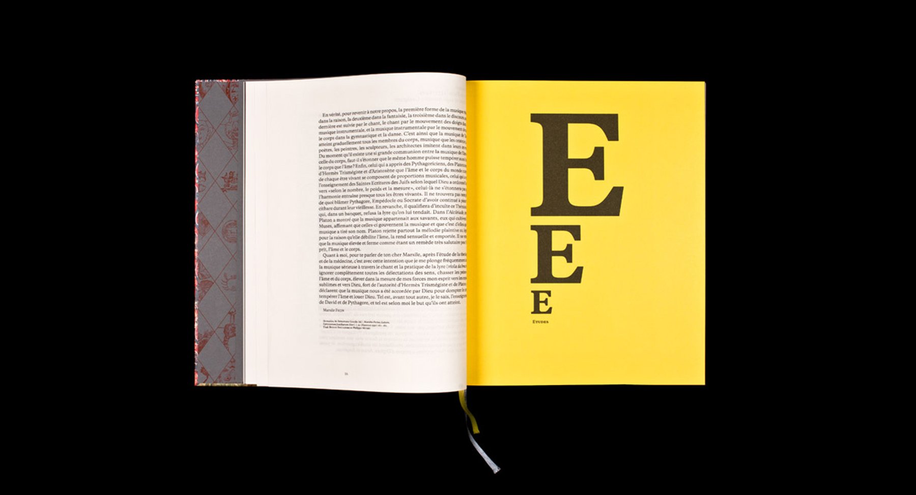
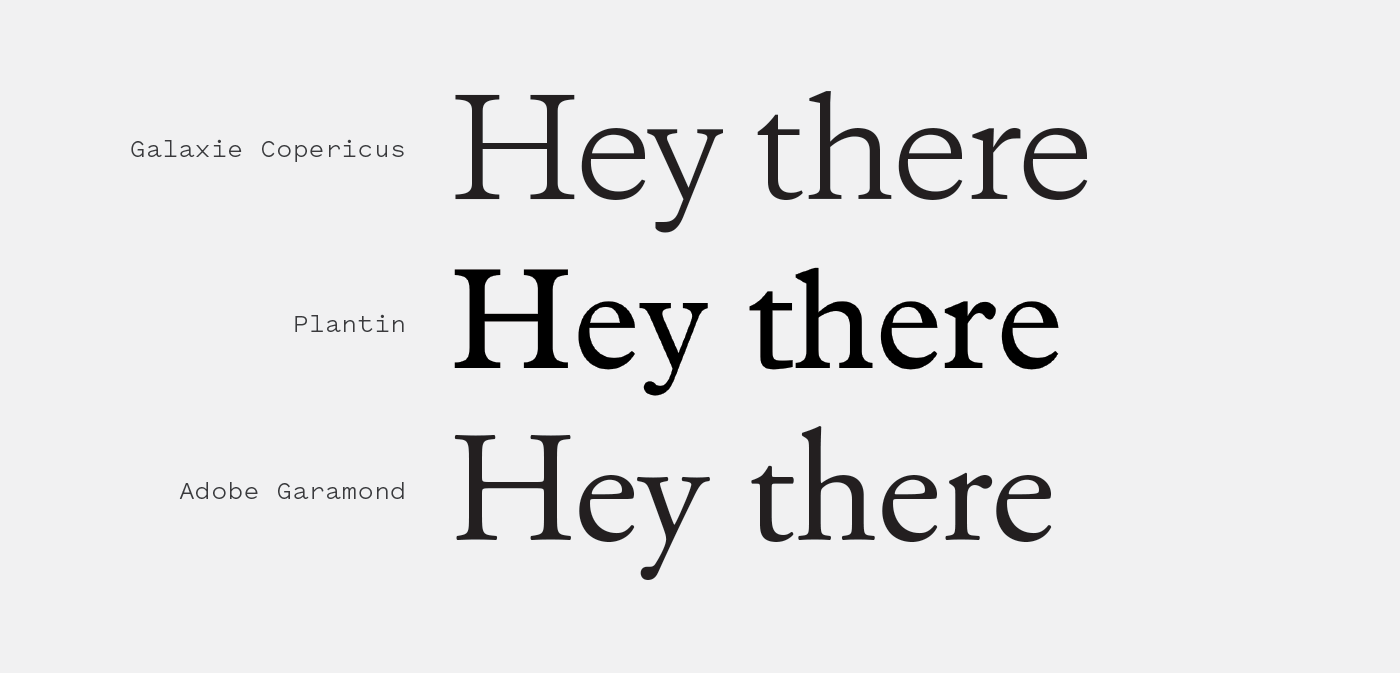
Galaxie Copernicus is a Plantin reconsideration created by the combined powers of Chester Jenkins and Kris Sowersby. It was the final typeface designed for the Galaxie collection of fonts that Jenkins began in 2005.
All of the typefaces in the Galaxie family were designed around the same proportions so they could easily be used in tandem, even though each of the faces represents a different style. The end result of this experiment is a serif that is strong enough to stand on its own while also excelling at playing nicely with others.
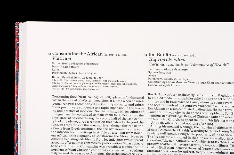
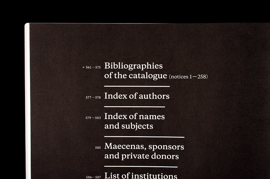
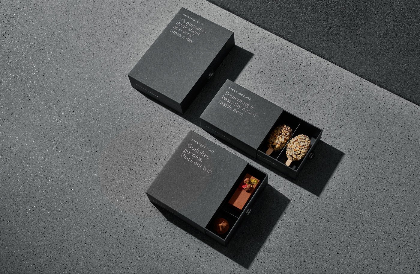
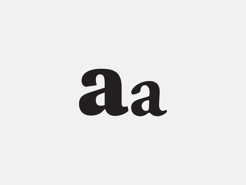
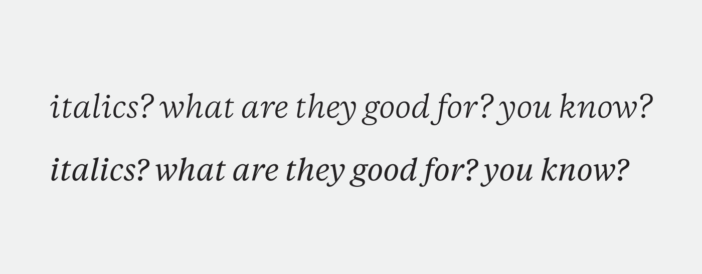
Like its ancestor, Plantin, Copernicus is a versatile serif with a wide base and thick strokes. It’s constructed with supple, curvaceous shapes yet avoids feeling delicate or unstable because of the “wide stance” and balanced proportions. Copernicus has long been my go-to serif for pairing in sans-serif heavy designs because it doesn’t have a strong vertical thrust as so many serifs do and the low thick-to-thin contrast gives it an even presence on the page that melds well with sans faces, which often have the same characteristics.
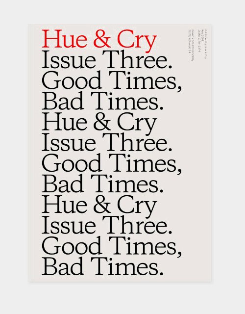
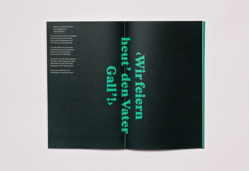
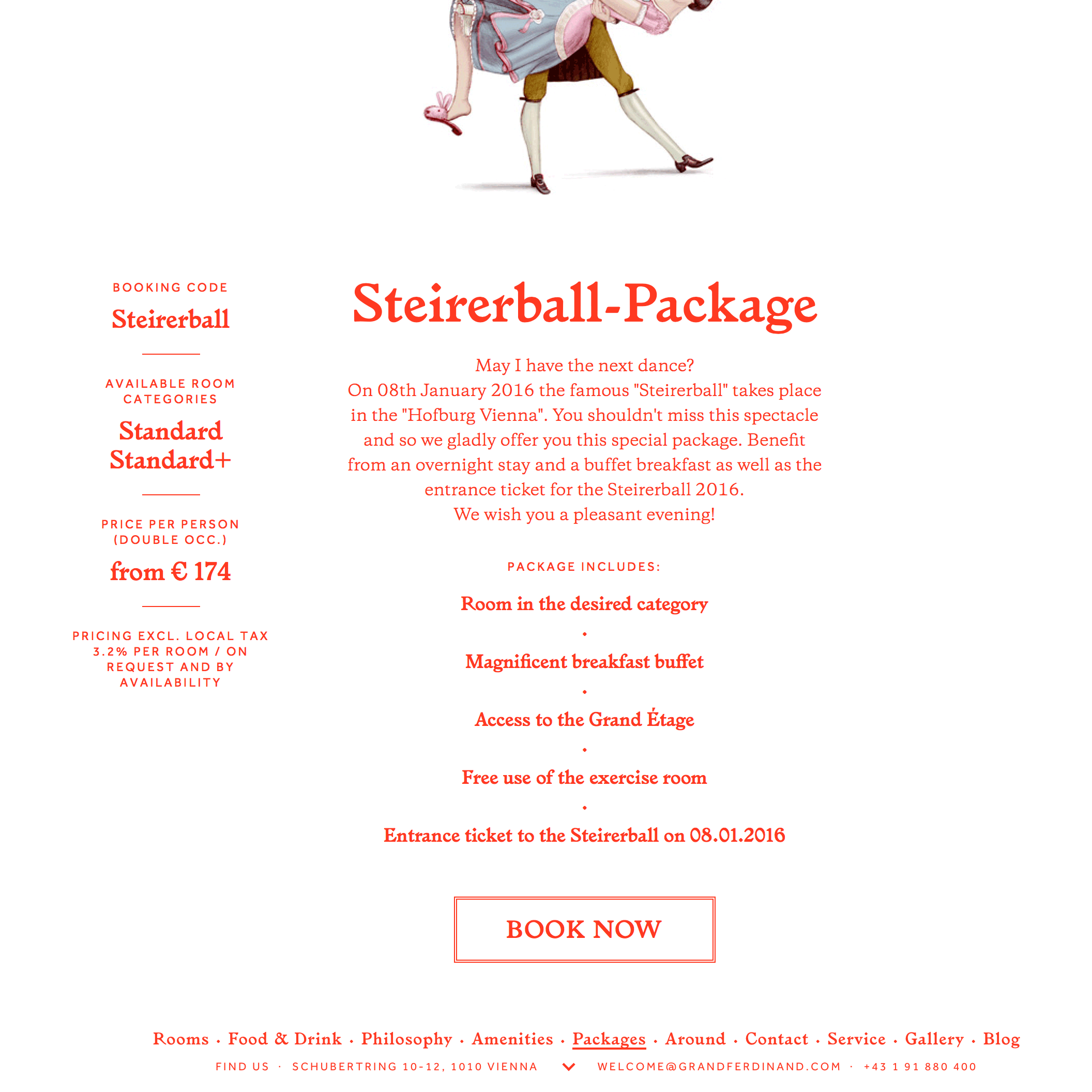
I’ve rarely seen a typeface “wear its weight” in the heavier side of the scale as gracefully as Copernicus, especially considering there is no “display” version of the family. The typeface transforms from a solid workhorse at the lighter weights to a headline powerhouse at the heavier end that shines at large scale and can carry a design all on its own, all while maintaining a calm, controlled voice that betrays just a hint of playfulness[1].

