Aperçu
— Designed by The Entente

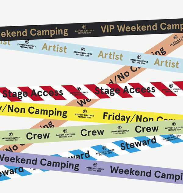
behance.net — Wristband designs for Eastern Electrics Festival by Bunch, 2013.
Nº01 behance.net — Wristband designs for Eastern Electrics Festival by Bunch, 2013.

Aperçu is a grotesque sans-serif that’s found immense popularity since its release in 2010. It melds facets of more geometric designs like Johnston with grotesque characteristics and the result is an awkward tween of a typeface that is both trying too hard yet not trying at all.

It’s a typeface without an ounce of pretension and even when it is shouting in all-caps it’s hard to take it too seriously. The happy ovoid shapes love to be paired with bright colors and geometric illustrations, and even with it’s used in more restrained settings it can’t help but project a relaxed voice. It’s not often that a typeface with geometric heritage can be described as “loose,” but Aperçu is—each glyph feels like a coil that’s been unwound and become a bit deformed in the process (comparing it to a Shrinky Dink might be more appropriate, depending on your childhood experiences).

Selecting the artwork to use in this review was a difficult task, because Aperçu has been used quite extensively in its relatively short lifespan, and a large percentage of the in-use is likely driven by the overwhelming popularity of the typeface than a result of designers choosing it with specific intent (maybe the “g” is just so fun that no one could resist). I want to focus on the in-use cases that I think accentuate what Aperçu does well, which includes amplifying playful colors, illustrations and type settings, as well as designs which directly contradict that assumed usage and pair the typeface with stripped-down materials and minimalist compositions. Like many popular typefaces, Aperçu is often used in designs where it might not be the ideal choice. I’ve heard this described as a “your mileage may vary” font, but a lot of designers have traveled quite a distance with it, and I that makes it worth diving into.
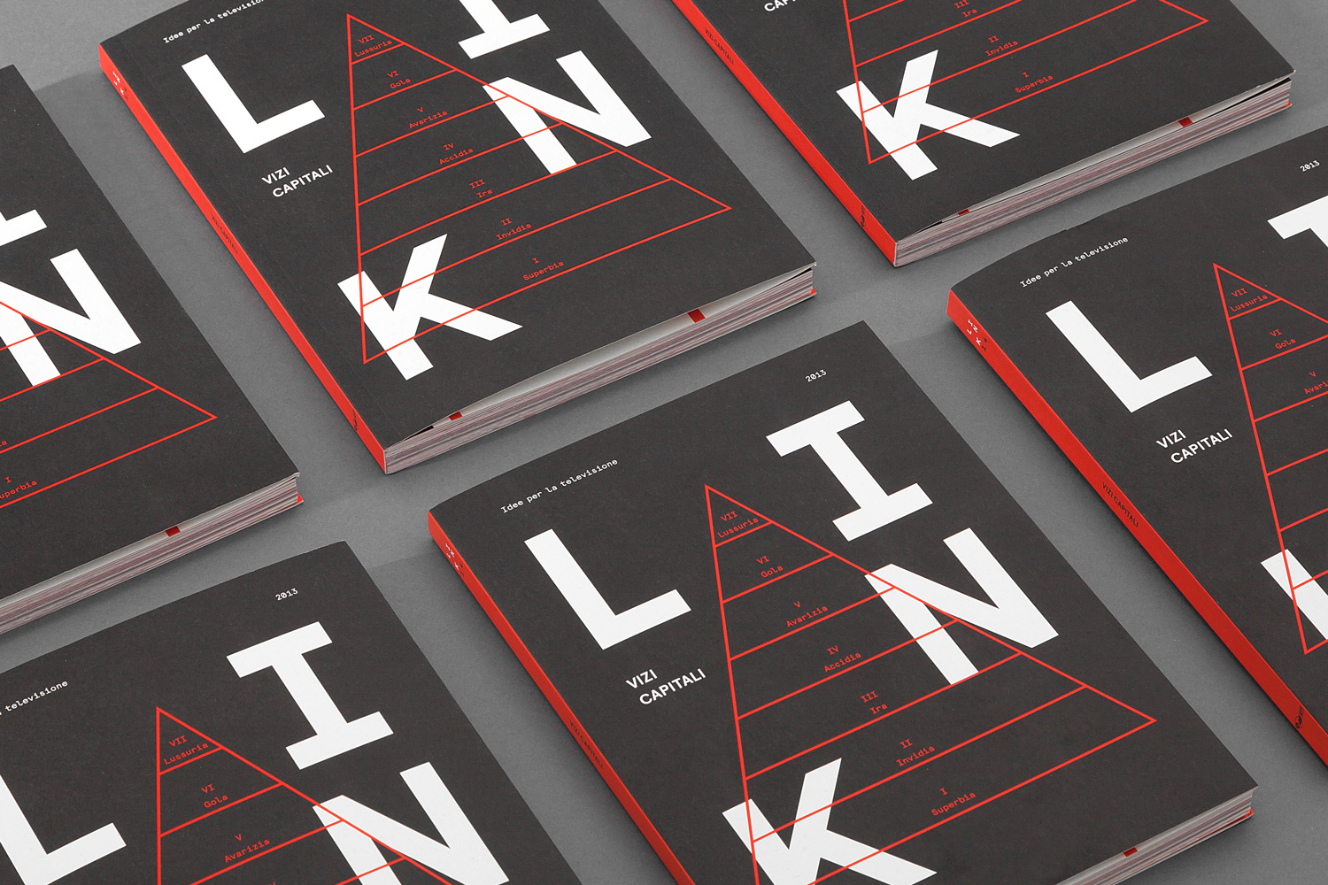
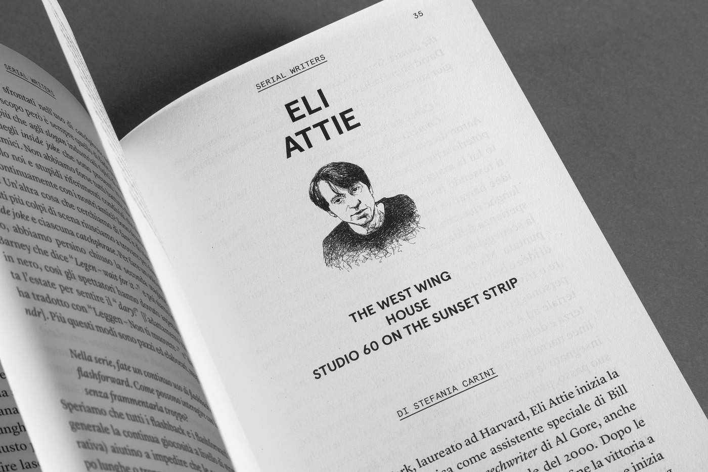
davidedigennaro.com — Cover for Link magazine, using Aperçu and Aperçu Mono. Designed by Davide Di Gennaro, Pietro Buffa and Niccolò Mazzoni.
Nº02 davidedigennaro.com — Cover for Link magazine, using Aperçu and Aperçu Mono. Designed by Davide Di Gennaro, Pietro Buffa and Niccolò Mazzoni.

Historic Inspiration

To start, lets talk about Neo-Grotesques. The classification emerged as an attempt to categorize the refinement of the Grotesque genre, which smooth over some of the quirks of older grotesque designs with their higher thick-to-thin contrast. They are also supposed to have a greater focus on legibility, though its debatable if that’s the actual end result. Aperçu has the low visual contrast and tall x-height you’d expect from a neo-grotesque, but it has its share of tight apertures and holds onto the double-bowled “g” that is a staple of older grotesques—it ends up somewhere in-between.

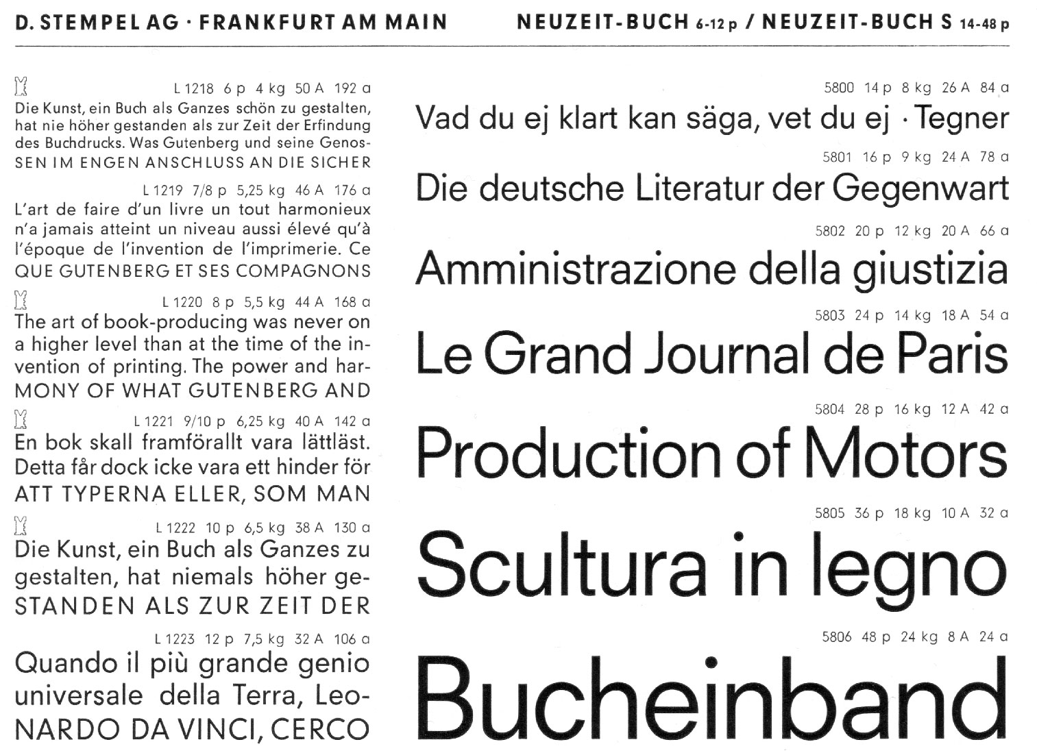
Nº03 flickr.com — Neuzeit-Buch specimen from Gesamptprobe der Lieferbaren Schriften, 1974.
bpando.org — Aperçu’s nebulous historic ties help it blend with a wide range of typeface styles, as seen in the branding Maud created for The University of Sydney.
Nº04 bpando.org — Aperçu’s nebulous historic ties help it blend with a wide range of typeface styles, as seen in the branding Maud created for The University of Sydney.

Aperçu can trace its lineage back through designs like Neuzeit (1928), which was geometric but less rigidly so than designs like Futura. Neuziet-Buch (Book) followed in 1966[3] and begat Christian Schwartz’s Graphik in (first seen widely in 2007, officially released in 2009), an all-around modernization and improvement of the genre. Aperçu followed a year later. Aperçu is not a rigid descendent of this genre, and grotesques like Franklin Gothic have an influence on Aperçu’s design (a cited influence I first raised an eyebrow at, but the more time I’ve spent with the typeface the more apparent it’s become).

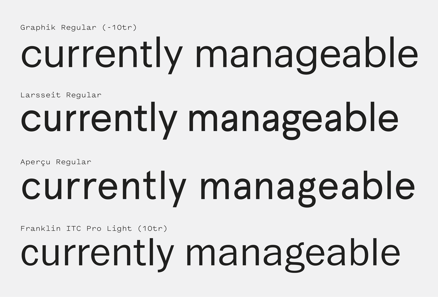
Nº05 Aperçu placed on a spectrum of typefaces from geometric (Graphik, top) to grotesque (Franklin Gothic, bottom). Compared to another like-minded design—Larsseit—Aperçu has more grotesque influences.
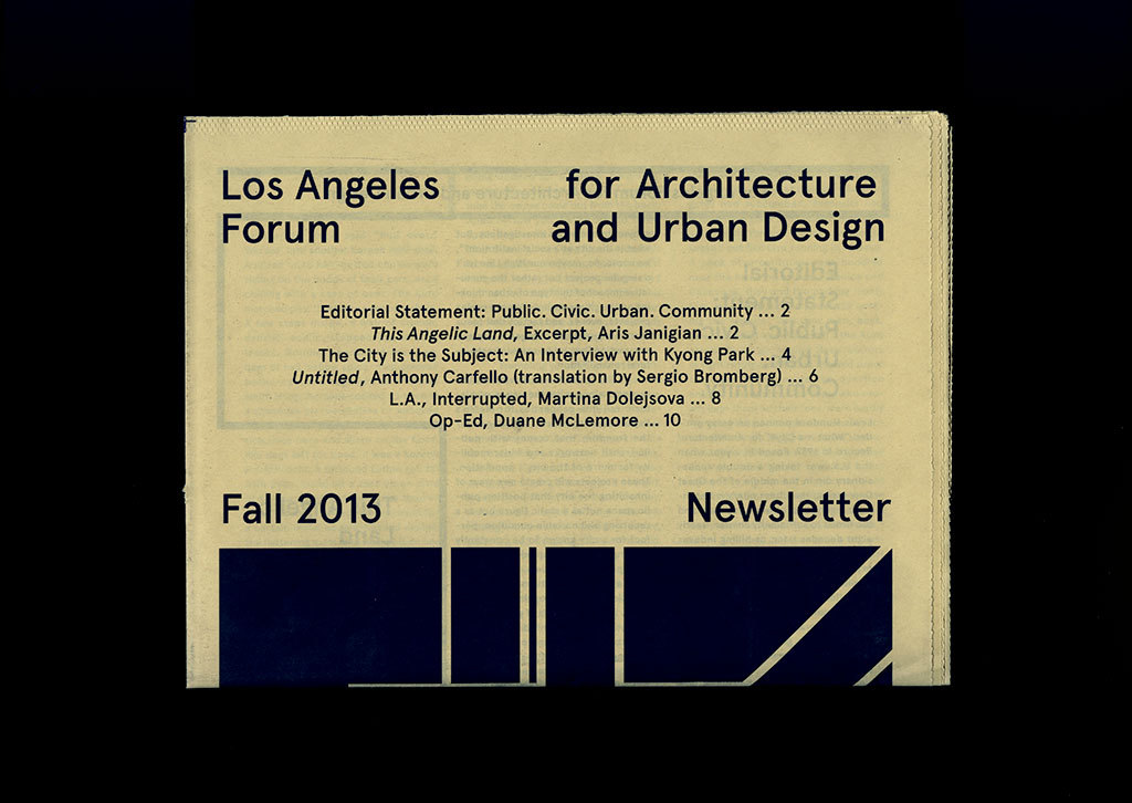
are.na — Aperçu in use in a 2013 Los Angeles Forum for Architecture and Urban Design newsletter design.
Nº06 are.na — Aperçu in use in a 2013 Los Angeles Forum for Architecture and Urban Design newsletter design.

These examples[5] are set in a spectrum of geometric to grotesque, with Graphik hewing the closest to Neuzit and Franklin Gothic being an old-school grotesque. You can see Franklin Gothic’s influence most clearly in the double-bowled “g” and its cheery upward slanted ear, the cramped, “hunched” shoulders of the “n” and in the angled terminals (most evident on the “c” and “e”). The end result is a curious amalgamation of two different styles.

Nº07 davidedigennaro.com — Spread from Link magazine, designed by Davide Di Gennaro, Pietro Buffa and Niccolò Mazzoni, 2013.
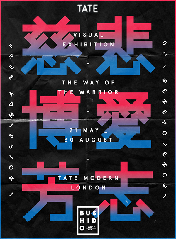
behance.net — BUSHIDO! Exhibition poster concept by Abbas Mushtaq.
Nº08 behance.net — BUSHIDO! Exhibition poster concept by Abbas Mushtaq.

Aperçu’s strengths

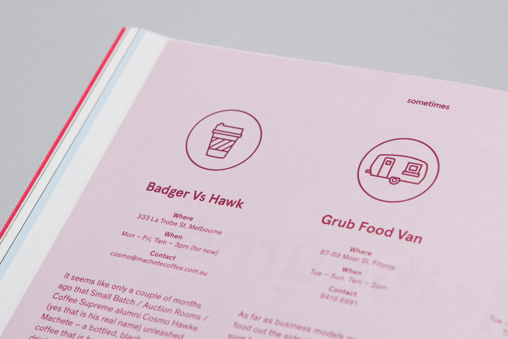
Aperçu achieves a lot of character despite its low-contrast design and that’s made it a darling of graphic designers around the globe. The lack of contrast allows it to work at a range of scales and applications and the idiosyncratic details help it hold its own in display situations. The typeface feels “light” in use, with a charming if malnourished appearance—I liken Aperçu to a gangly teen without any meat on their bones. This awkwardness works to its advantage when it’s being paired with cheerful, geometric illustrations, as seen in Sometimes magazine, designed by James Kape[9].

Nº09 fontsinuse.com — Aperçu’s gangly design pairs well with the twee illustrations in Sometimes magazine, designed by James Kape, 2012.
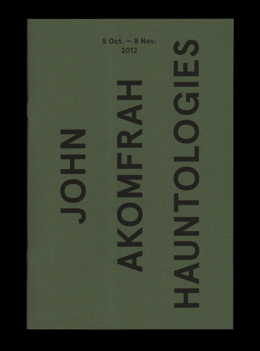
qubik.com — John Akomfrah: Hauntology exhibition book, designed by Joe Gilmore, 2012. I find this to be one of the more striking uses of Aperçu—The all-caps, centered treatment feels reminiscent of military handbooks set in Futura, and Aperçu’s sneaky imperfections subvert the expected utilitarianism.
Nº10 qubik.comJohn Akomfrah: Hauntology exhibition book, designed by Joe Gilmore, 2012. I find this to be one of the more striking uses of Aperçu—The all-caps, centered treatment feels reminiscent of military handbooks set in Futura, and Aperçu’s sneaky imperfections subvert the expected utilitarianism.

In all-caps, Aperçu shows off its “Johnston but not” side, mixing straight angles with its horizontally compressed curves. In many of these designs a more rigidly geometric typeface would come across as neutral or cold. Aperçu manages to pull in some of the graphic qualities that make those designs effective while being “unwound” enough to add some imperfection and warmth. Instead of feeling machined, it feels like it’s been run through the washer and worn in. Designer Abbas Mushtaq used Aperçu his BUSHIDO! exhibition branding exploration[8], and it has just enough geometry in its bones that it doesn’t clash with the straight lines and 45° angles of the lettering in the background. Mushtaq stacks and rotates Aperçu down each side of the poster at those same angles, creating a nice interplay between the elements and amplifying the geometry in the letterforms.

Nº11 bpando.org — Aperçu Mono used with neon colors in the tech-y aesthetic of the STRP Biennial branding by Raw Color.
hjseidler.de — Thank You for Shopping Here exhibition poster. Designed by Hans-Jörg Seidler.
Nº12 hjseidler.deThank You for Shopping Here exhibition poster. Designed by Hans-Jörg Seidler.
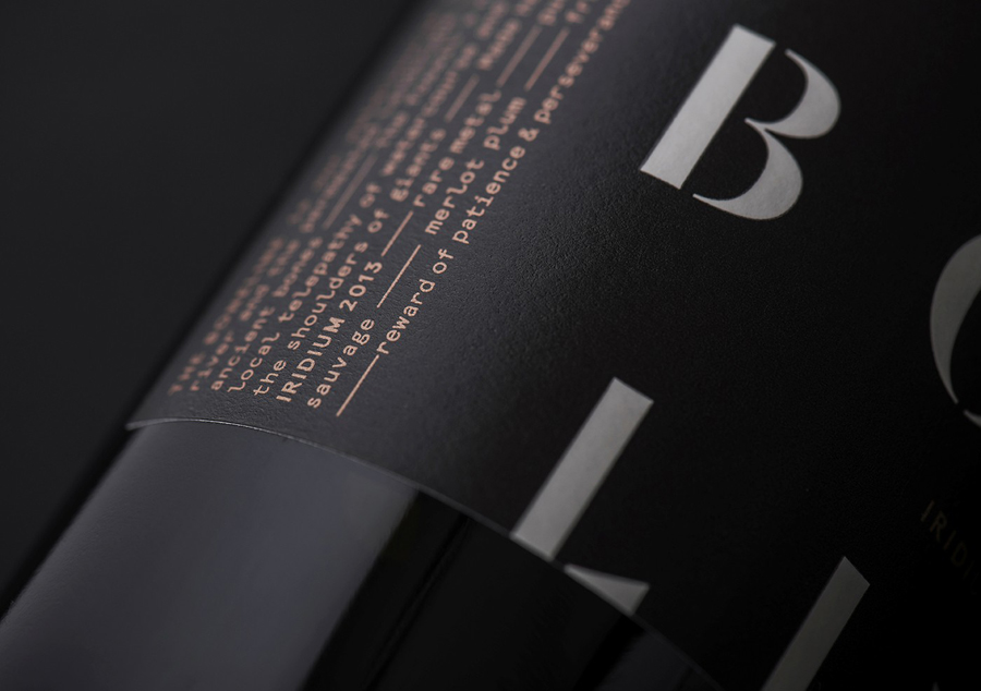
Nº13 bpando.org — Aperçu Mono set in bronze foil in packaging for The Bone Line winery. Designed by Inhouse, 2014.

Aperçu’s monospace weights bring over much of the personality of the family. In designs that want to feel tech-y, like the STRP Biennial branding by Raw Color[11], Aperçu Mono can play a straight man with a knowing wink. In the monospace version, the geometric capitals feel more rigid and formal and characters like the “S” are more conventional (through the “R” retains its long-legged stature). It’s in the lowercase set that the family’s charm returns. The way the “l” curls up is playful and the distinctive “g” carries through from the standard weights, lending what is typically a buttoned-up genre of typeface a more care-free personality.

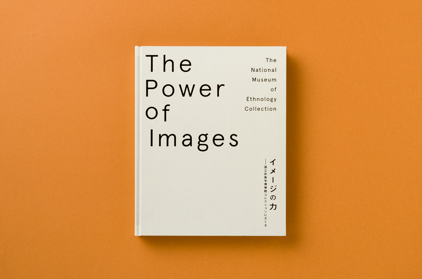
Nº14 umamu.jp — Aperçu’s skeletal, stripped down construction is well-leveraged in this cover for The Power of Images designed by Yuma Harada. There are a few subtle oddities with the type setting that add to the general unease of the typeface and make uncomfortable details like the awkward “r” a feature, not a bug.
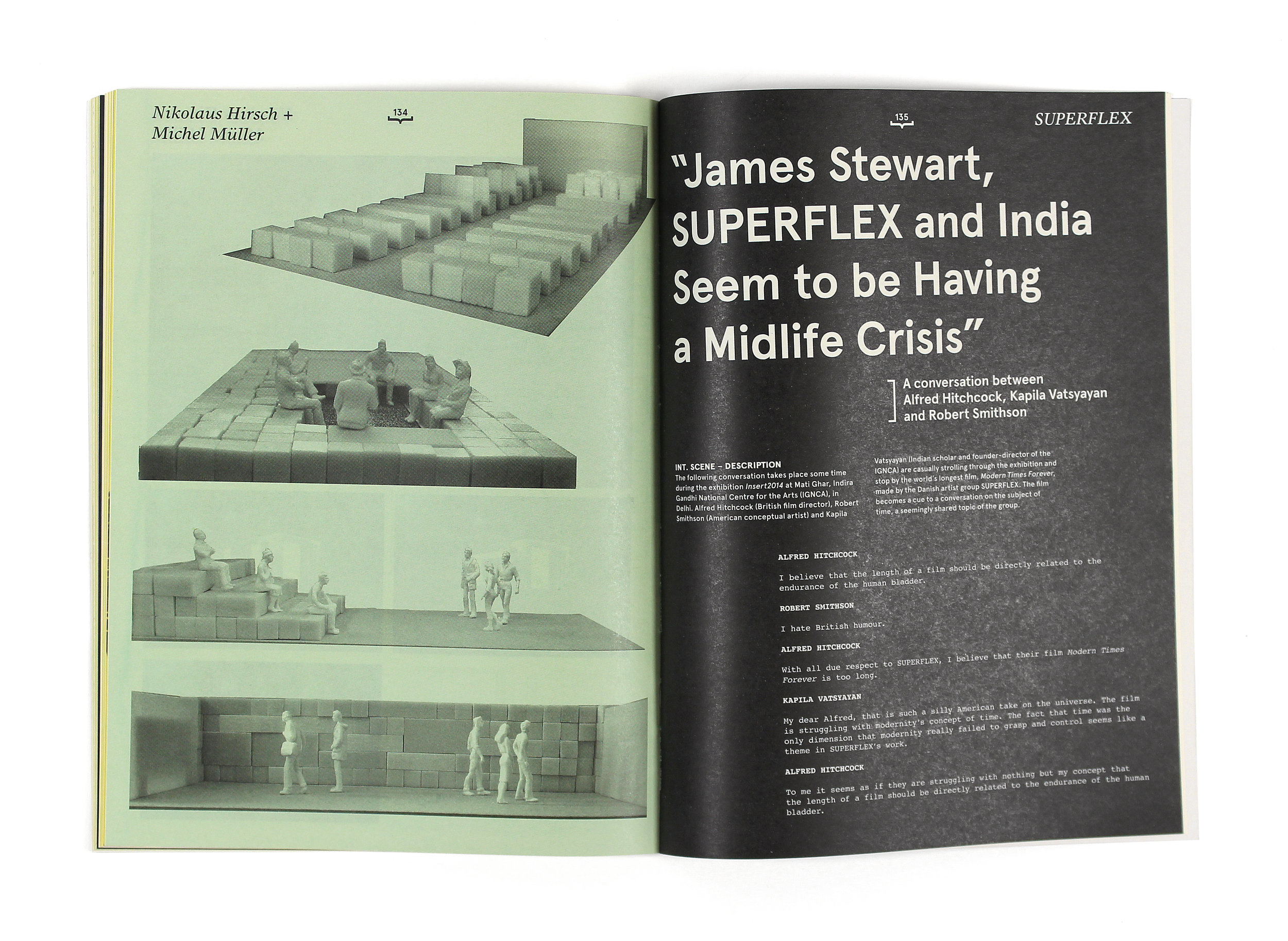
arianespanier.com — Aperçu once again paired with newsprint for the exhibition book for Publication for INSERT 2014, designed by Ariane Spanier.
Nº15 arianespanier.com — Aperçu once again paired with newsprint for the exhibition book for Publication for INSERT 2014, designed by Ariane Spanier.
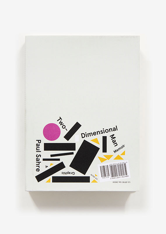
abramsbooks.com — The cover for Paul Sahre’s Two-Dimensional Man, 2017.
Nº16 abramsbooks.com — The cover for Paul Sahre’s Two-Dimensional Man, 2017.

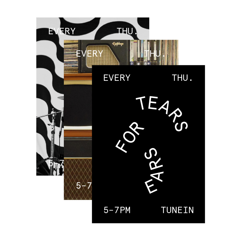
The general sense of instability that’s core to Aperçu’s design allows it to handle slanted or curves baselines quite well. When a typeface always seems a bit drunk on its feet, what’s the harm a bit more wobbliness can do? On the cover for Paul Sahre’s Two-Dimensional Man[16], Aperçu is lying askew amongst the pile of assorted geometry, amplifying the loose, casual nature the typeface has. Alexandros Gavrilakis also uses this “wobbly” nature is good effect in the branding for the Tears for Ears radio show[18], which bends the baseline path to create an abstraction of an ear. Low-contrast faces do well with this technique in general, but Aperçu Mono has just enough discomfort in it already that it helps you forgive the irregular spacing created by the tricky paths.

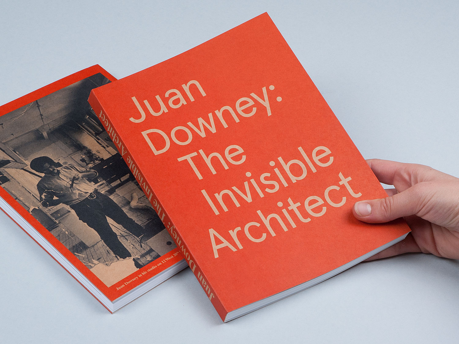
Nº17 nodeberlin.com — Exhibition book for Juan Downey, The Invisible Architect, designed by NODE Berlin, 2011. Aperçu takes on an apparitional presence when it’s reversed out of a background, which I think is due to its general uneasiness.
fontsinuse.com — The Tears for Ears identity from Alexandros Gavrilakis makes use of the unstable proportions of Aperçu by setting it on paths that mimic the shape of an ear. 2016.
Nº18 fontsinuse.com — The Tears for Ears identity from Alexandros Gavrilakis makes use of the unstable proportions of Aperçu by setting it on paths that mimic the shape of an ear. 2016.

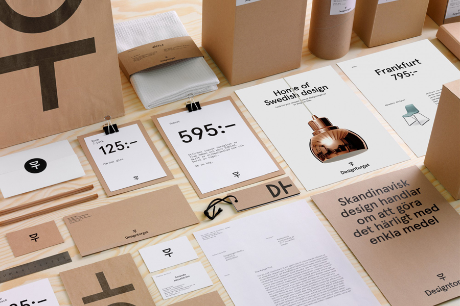
Despite all of that awkwardness, I’ve still seen Aperçu used well in stripped-down presentations. Kurppa Hosk uses it in a Swedish-style design for Designtorget, a design store[19]. It’s interesting to see Aperçu and its friendly tone used in the minimal designs with stark, straightforward materials, which lend an honesty to Aperçu’s eccentricity. The design system frequently mixes left aligned and centered type, echoing the geometric yet humanist design of the typeface, and the brand also makes good use of Aperçu’s DIN-esque, condensed numerals which lean heavily on geometry and neatly reflect the modern lines of the products on sale at the store. “We make clean, modern things, but they’re still attainable!” seems to be the message the branding is communicating.

Nº19 bpando.org — Designtorget branding system by Kurppa Hosk, pairing Aperçu with minimalist design and natural materials. 2015.
fontsinuse.com — Aperçu is well-suited for the color combination in the Mickey & Johnny site, but this shows the risk you run when you try to track in the loose letter-spacing. Seen here compounded by too-tight leading, the typeface starts to become very difficult to read.
Nº20 fontsinuse.com — Aperçu is well-suited for the color combination in the Mickey & Johnny site, but this shows the risk you run when you try to track in the loose letter-spacing. Seen here compounded by too-tight leading, the typeface starts to become very difficult to read.

Quirks and eccentricities

This typeface is not without its detractors. I’ve heard complaints about its “hunched” shoulders which lack the smooth, even curves you’d expect in a geometric face[21]. The curve raises up before dropping off, an artifact of its Franklin Gothic influence, and it stands out against the smooth geometric shapes and tugs your eye up and to the left and away from the center of the line of text (look at the way the “um” pairing first pulls your eye down then harshlly back up in the example below). It’s one of the many things that contributes to Aperçu being a design that isn’t particularly easy to read en-masse.

Aperçu has some of the “rust” you’ll sometimes find in typefaces that are marketed as workhorses but fall a bit short on polish. You have to watch the kerning because there’s going to be odd spaces and you’re going to notice them because the typeface already has a narrow width and loose tracking. Note the gulf between the “n” and “i” in “Just Communication” in the specimen at the top of the review (or the “ha” pairing ni the example below). You would hope things would be a bit more polished out of the box with a typeface at this price point.

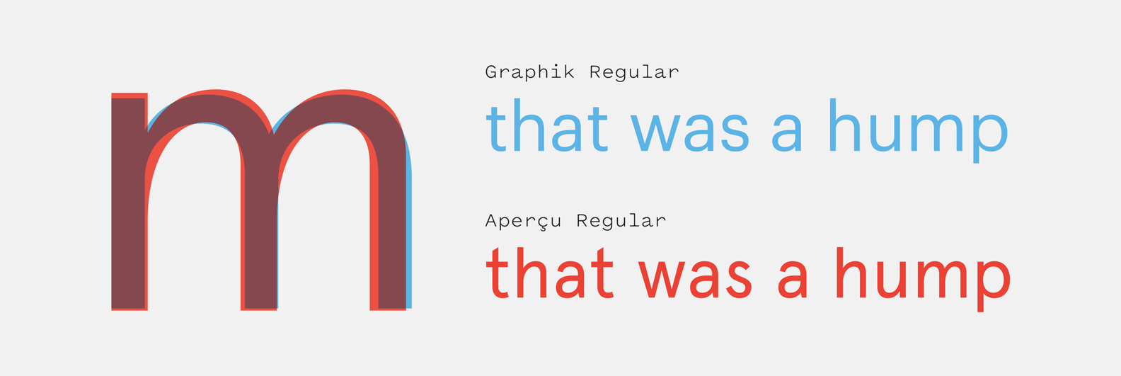
Nº21 Compared to the sleeker Graphik (top), you can see how distractingly tall Aperçu’s “t” is, the unresolved and almost sloppy-feeling “s,” and the painfully hunched shoulders on the “m.”
anamirats.com — PULL&BEAR FW 13/14 catalog by Ana Mirats Studio. Notice where “Autumn Winter” is stacked and how it lets you clearly compare the “n” and the “r.” The “r” almost reads as a stylized cropping of the “n.”
Nº22 anamirats.com — PULL&BEAR FW 13/14 catalog by Ana Mirats Studio. Notice where “Autumn Winter” is stacked and how it lets you clearly compare the “n” and the “r.” The “r” almost reads as a stylized cropping of the “n.”

The “t” is overly tall and it gives it an disproportionate amount of visual weight in a string[21]. The “S” feels a bit unresolved—the bottom stroke ends rather limply and the whole thing feels like it’s leaning back up and to the left. The “r” disturbs me in ways I am not sure I can properly articulate. It’s constructed from a dissection of the “n,” and as a result it feels incomplete and malformed. You can tell it’s a bastardization of another letter, and not a self-realized creation. One last note is that you should tighten the default, loose letter-spacing at your own risk[20]. When the air around the typeface is removed, the gangly glyphs start to feel disorganized and legibility severely suffers.

I suppose I’ll end by framing the typeface in this way: Aperçu is an eccentric design that’s been used in ways it probably shouldn’t, but its immense popularity has also given us some unexpected gems as well. I continue to find the typeface endearing. Sometimes a single glyph carries a typeface, and the “g” on Aperçu is one of the most joyous letterforms I’ve ever encountered. We’re getting far enough away from the mania of its heyday to be able to see more examples of designers choosing it with real intent to amplify its positive quirks, and not just to mimic a popular aesthetic. Try to understand what’s odd about this typeface and leverage it, and don’t expect to get a lot of value out of “setting and forgetting” this specific typeface.

- FRJ