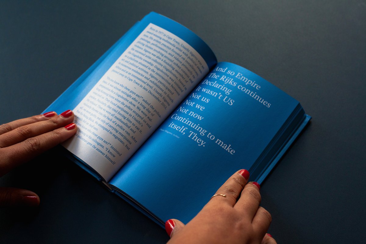
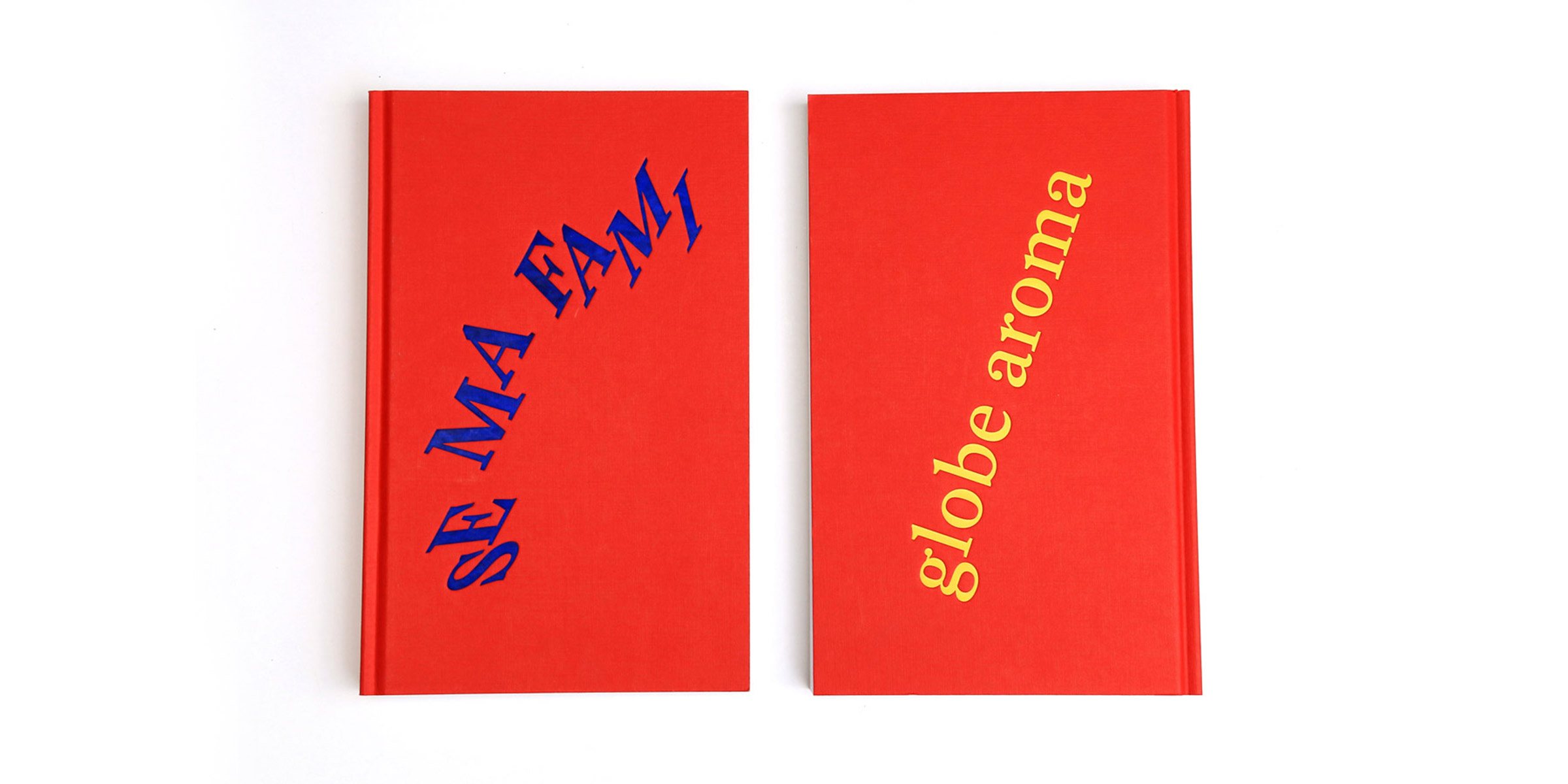
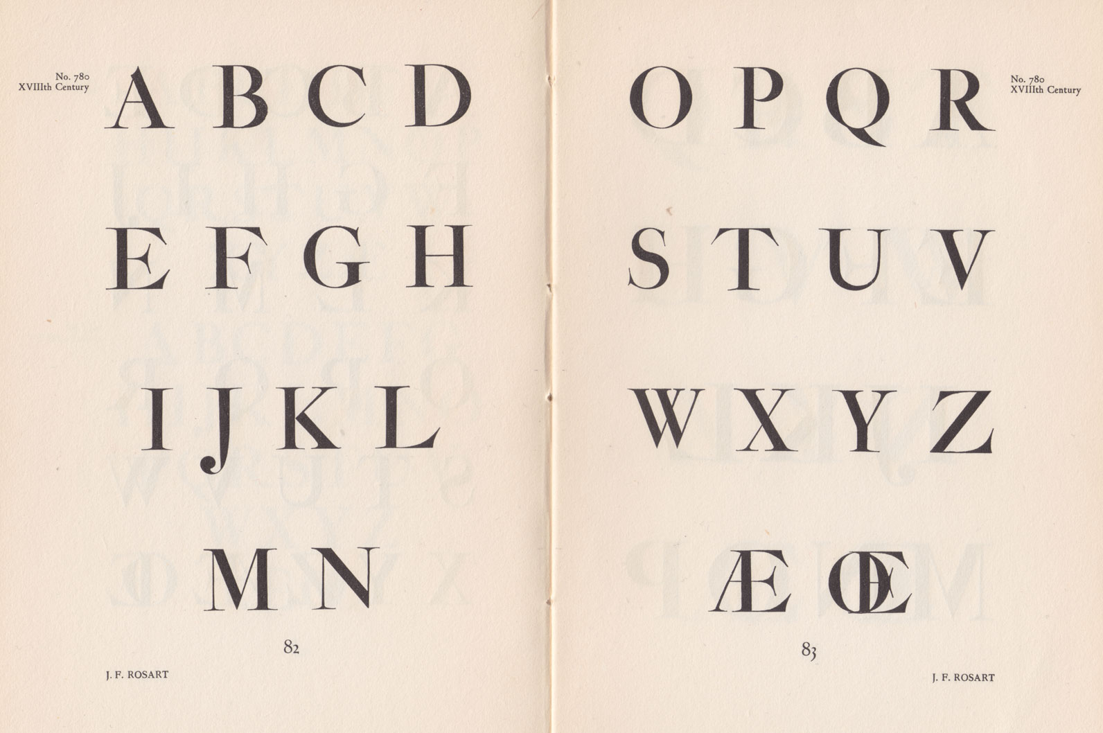
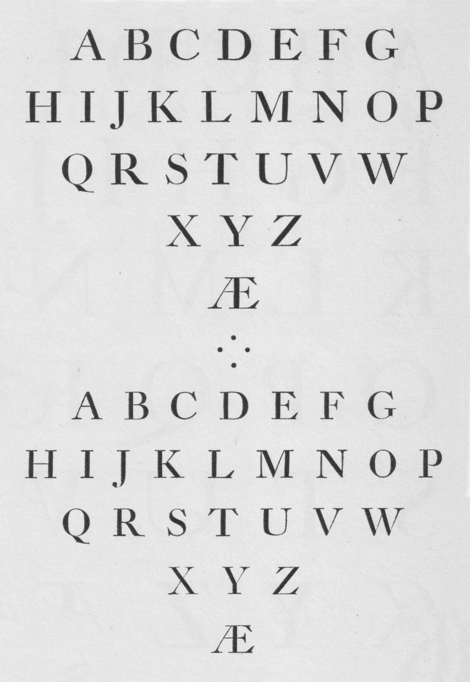
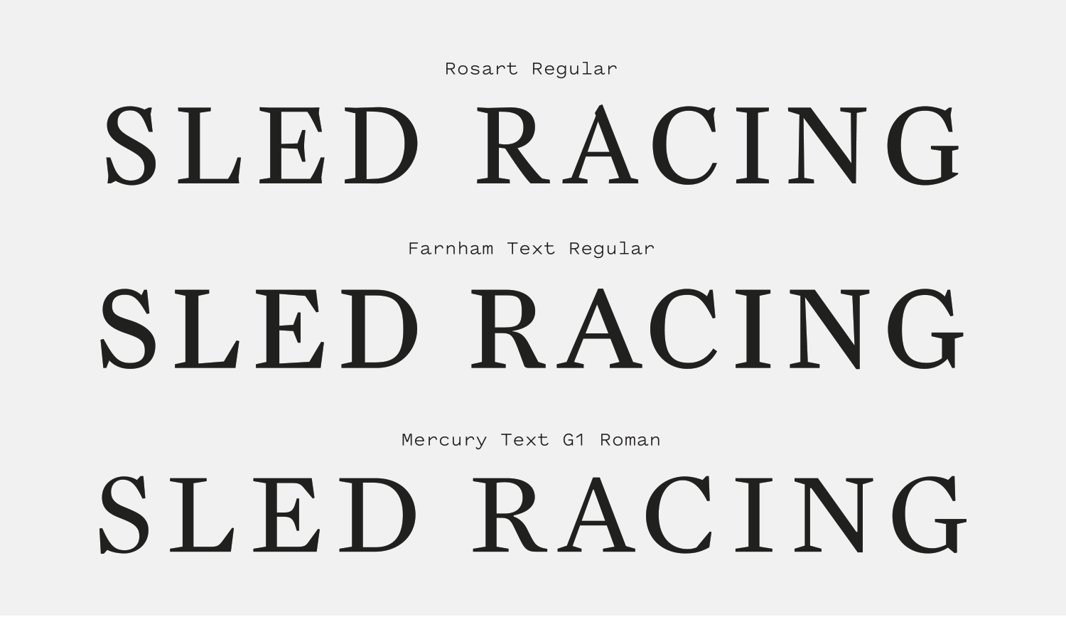
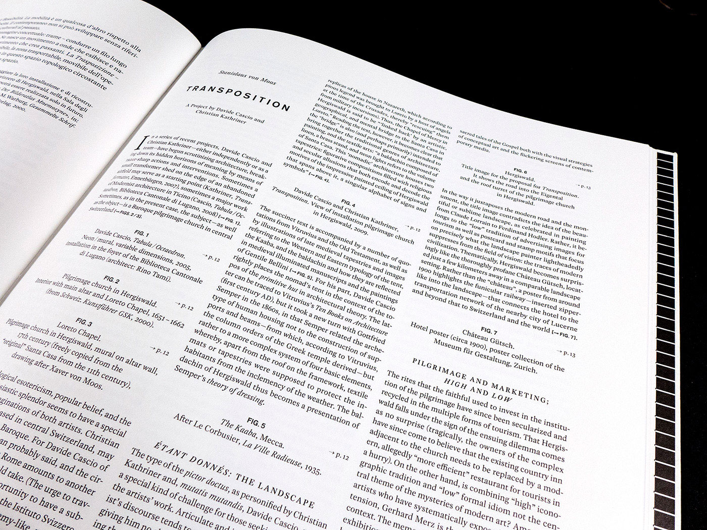
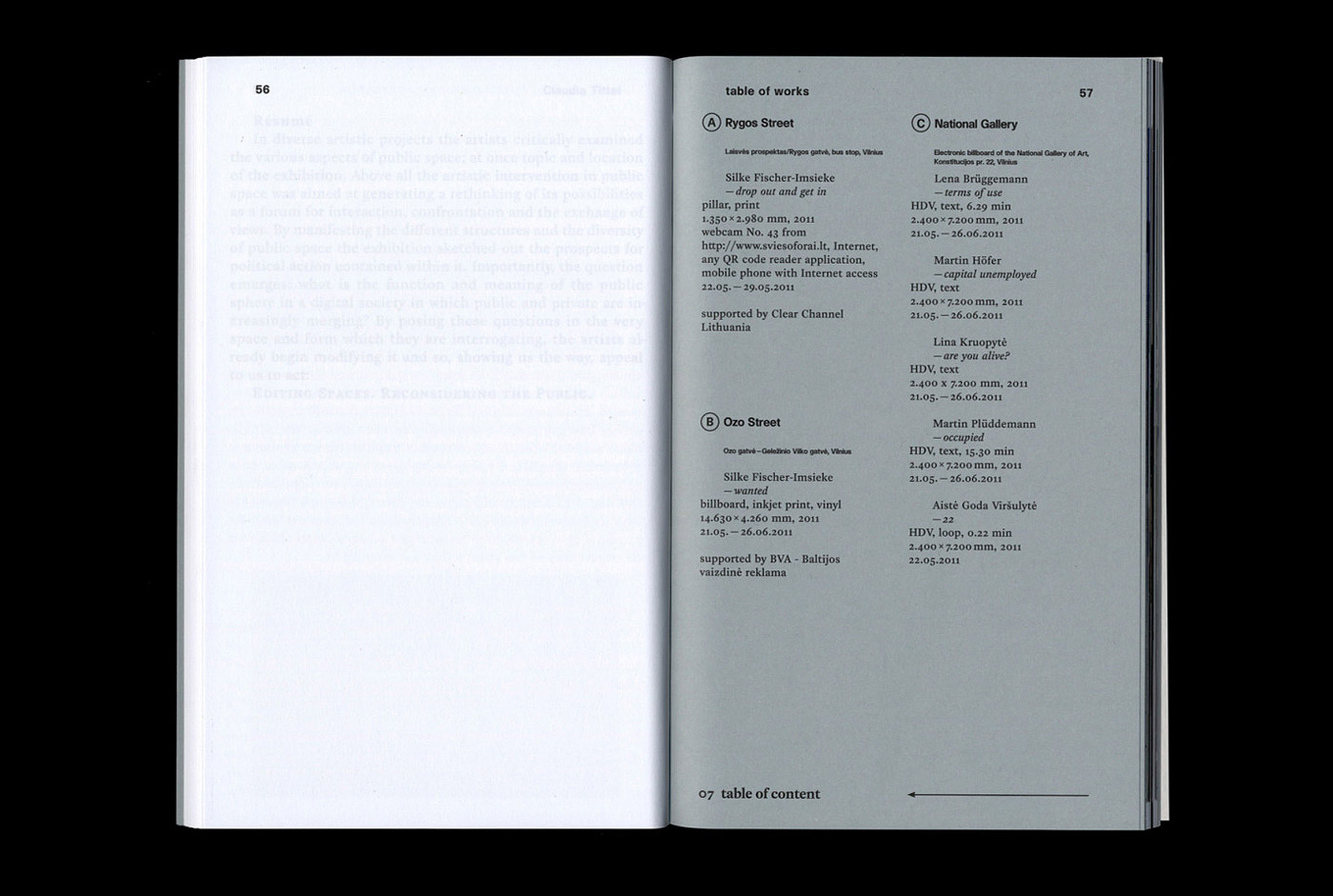
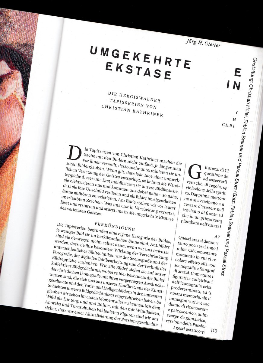
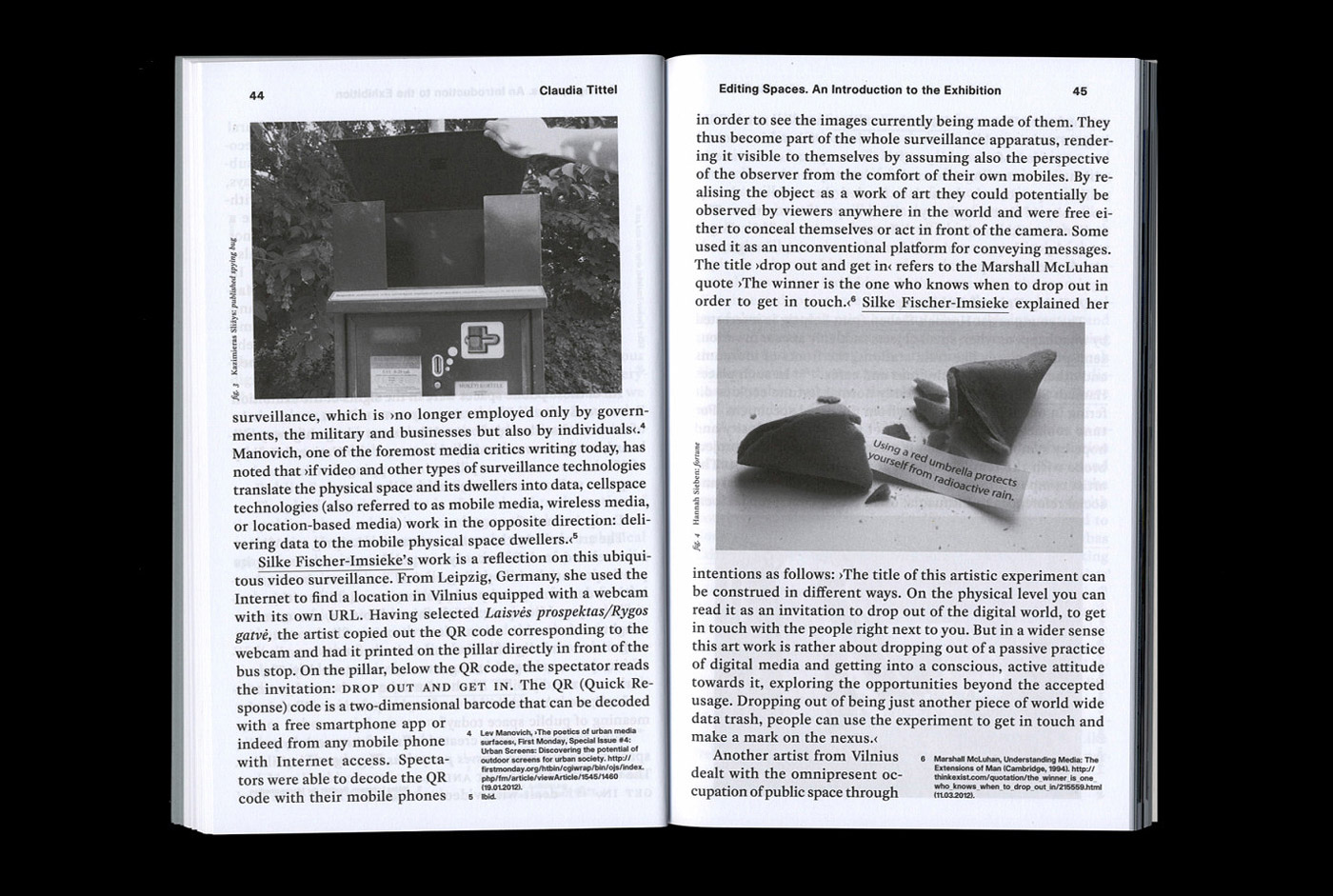
Rosart is a handsome Baroque serif that balances a stately upright posture, angular serifs and bulbous ball terminals that give the design a sense of playfulness and self-awareness about its old-fashioned roots.
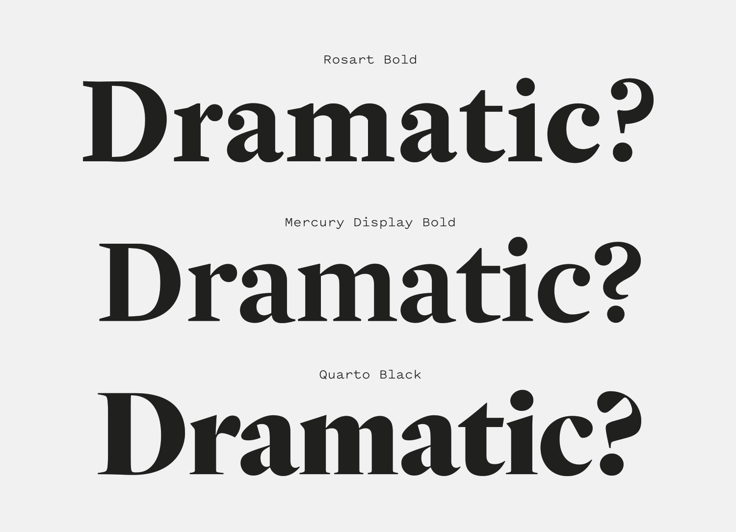
There are many typefaces on the market that are digitizations and translations of the work of Jacques-François Rosart and Johan Fleischman, and Rosart is one of my favorites. Many revivals of this genre stray avoid the more eccentric details of Baroque designs, like the “scalloped” serifs on the “E”, the pointy goatee on the chin of the “G” and the prominent ball terminals, but Rosart embraces them and gives them a striking, crisp modernity. Designer Katharina Köhler has done a marvelous job translating the character of these early designs without the end result feeling like a lifeless facsimile.
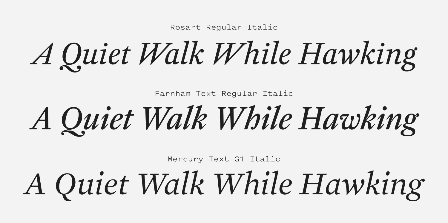
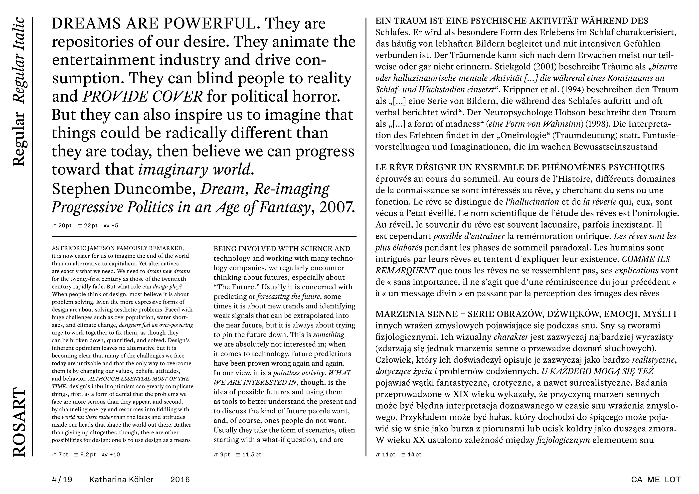
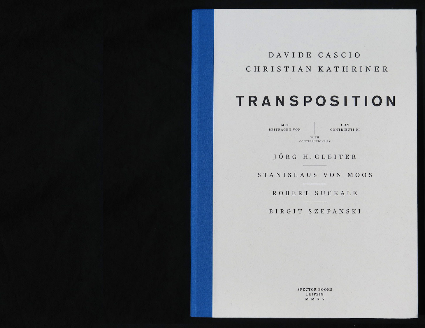
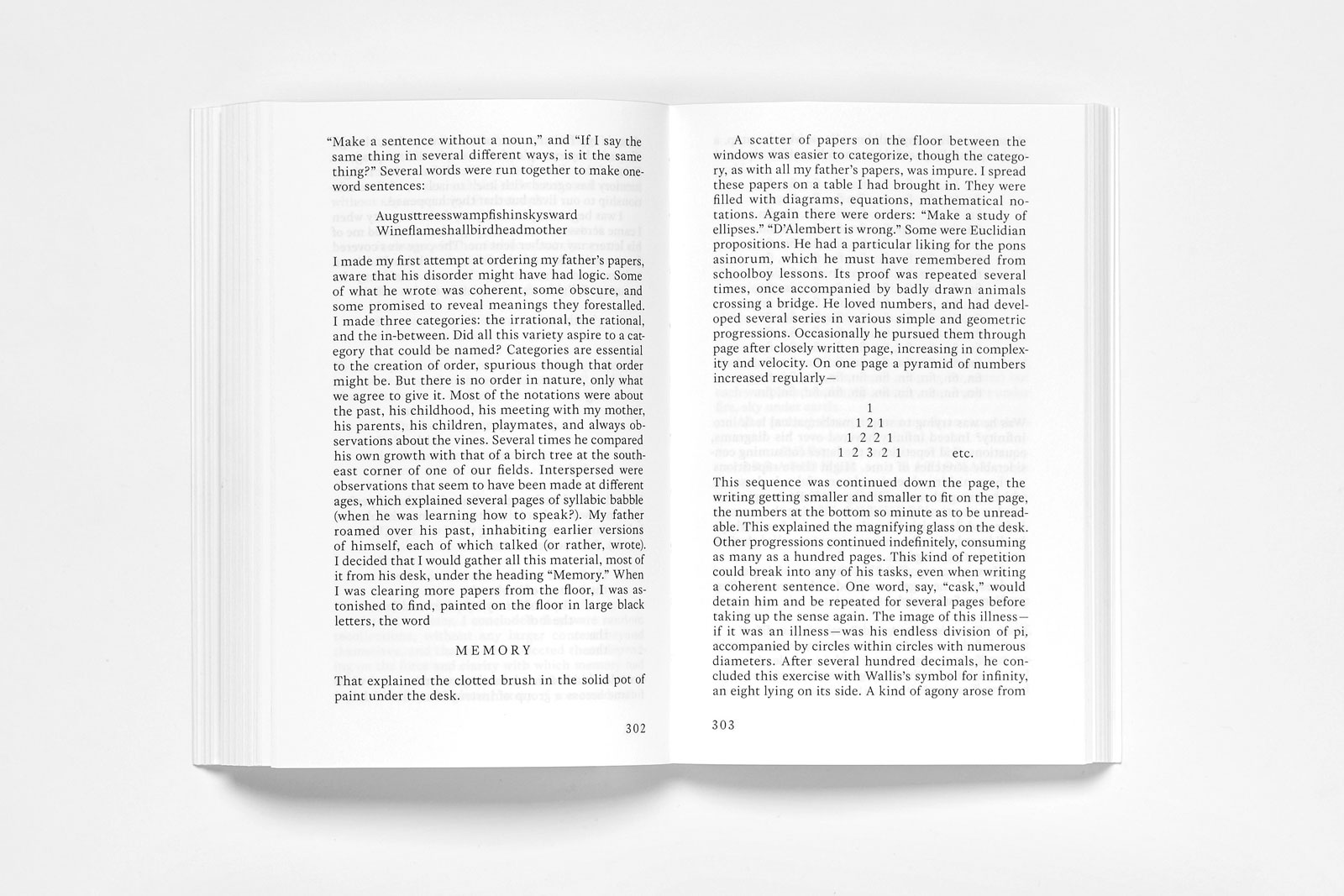
Rosart is a stunning text face that has a beautiful balance of weight, proportion and geometry to create bodies of text that feel sturdy and never fussy, despite the charming flourishes. That same economy is present in the italics, which are utilitarian and strike the right balance between legibility and sophistication. It’s precise without being cold, and robust without feeling inflexible. Rosart is the kind of typeface that makes me want to write a book about important things and spend a year laying it out and finessing its type. It’s hard to ask for more from a typeface than to have it inspire you to try new things.
