Text
— Designed by Gareth Hague

fontsinuse.com — A re-working of the flag of the House of Saud by Aerosyn-Lex Mestrovic
Nº01 fontsinuse.com — A re-working of the flag of the House of Saud by Aerosyn-Lex Mestrovic

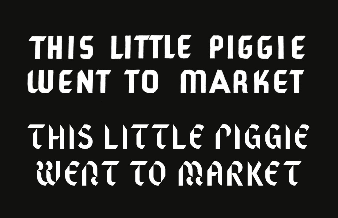
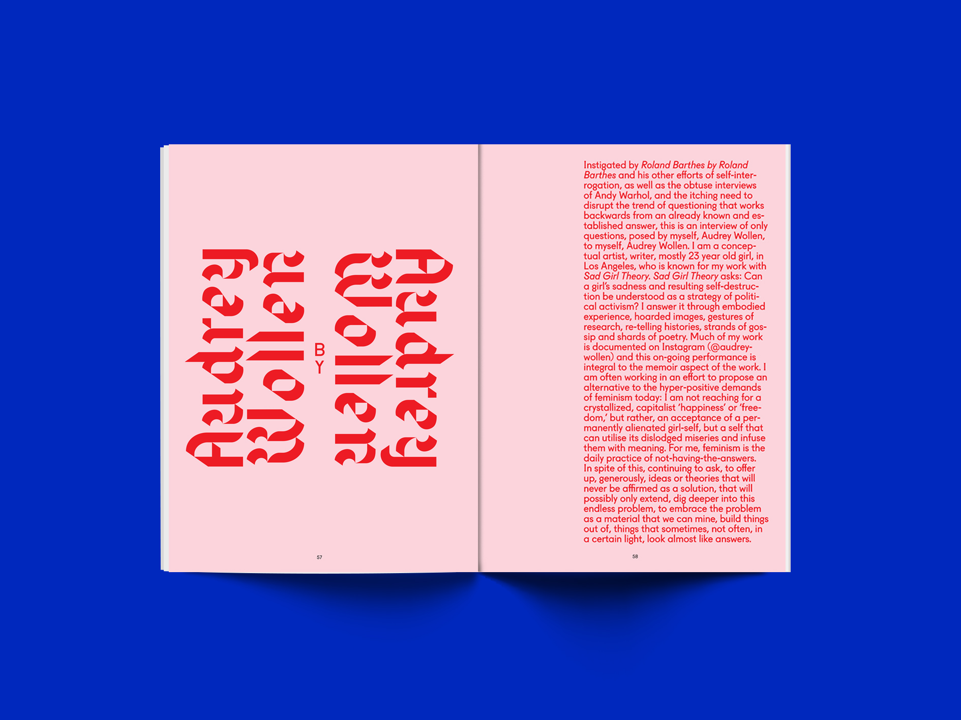
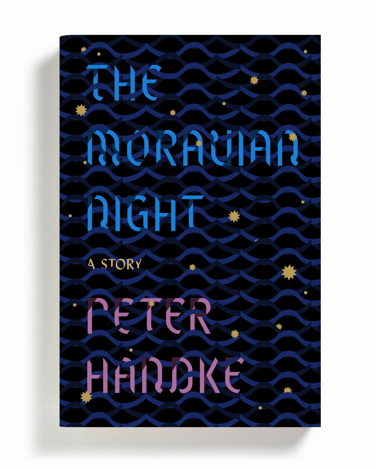
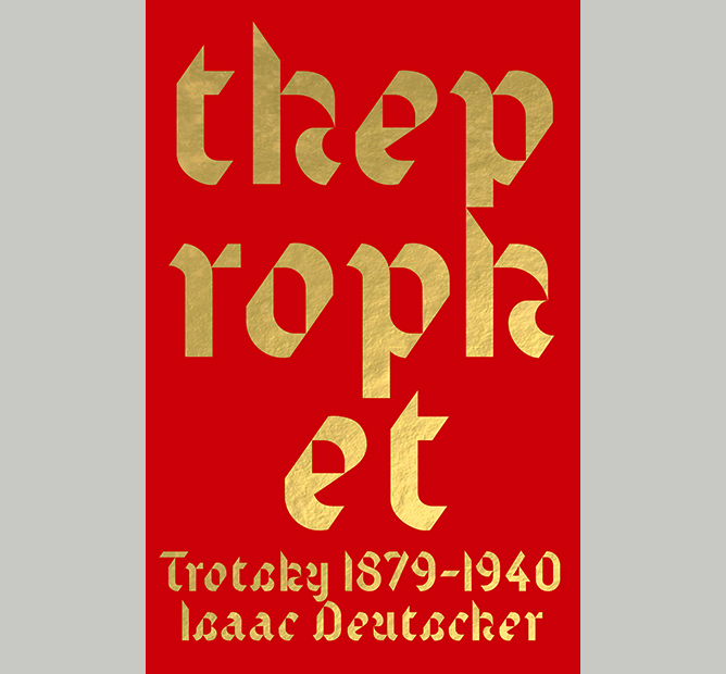
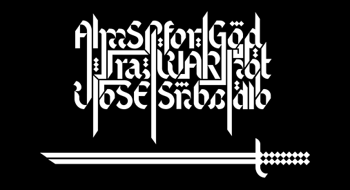
I am a sucker for a weird interpretation of Blackletter styles, so imagine my delight when I came across Text. It has beautifully unexpected letterforms with solid, geometric strokes that still evoke the idea of a calligrapher’s pen while trimming the excesses typically found in Blackletter designs. Design Gareth Hague has described Blackletter as being beautiful and mysterious, and his designs have the same qualities.

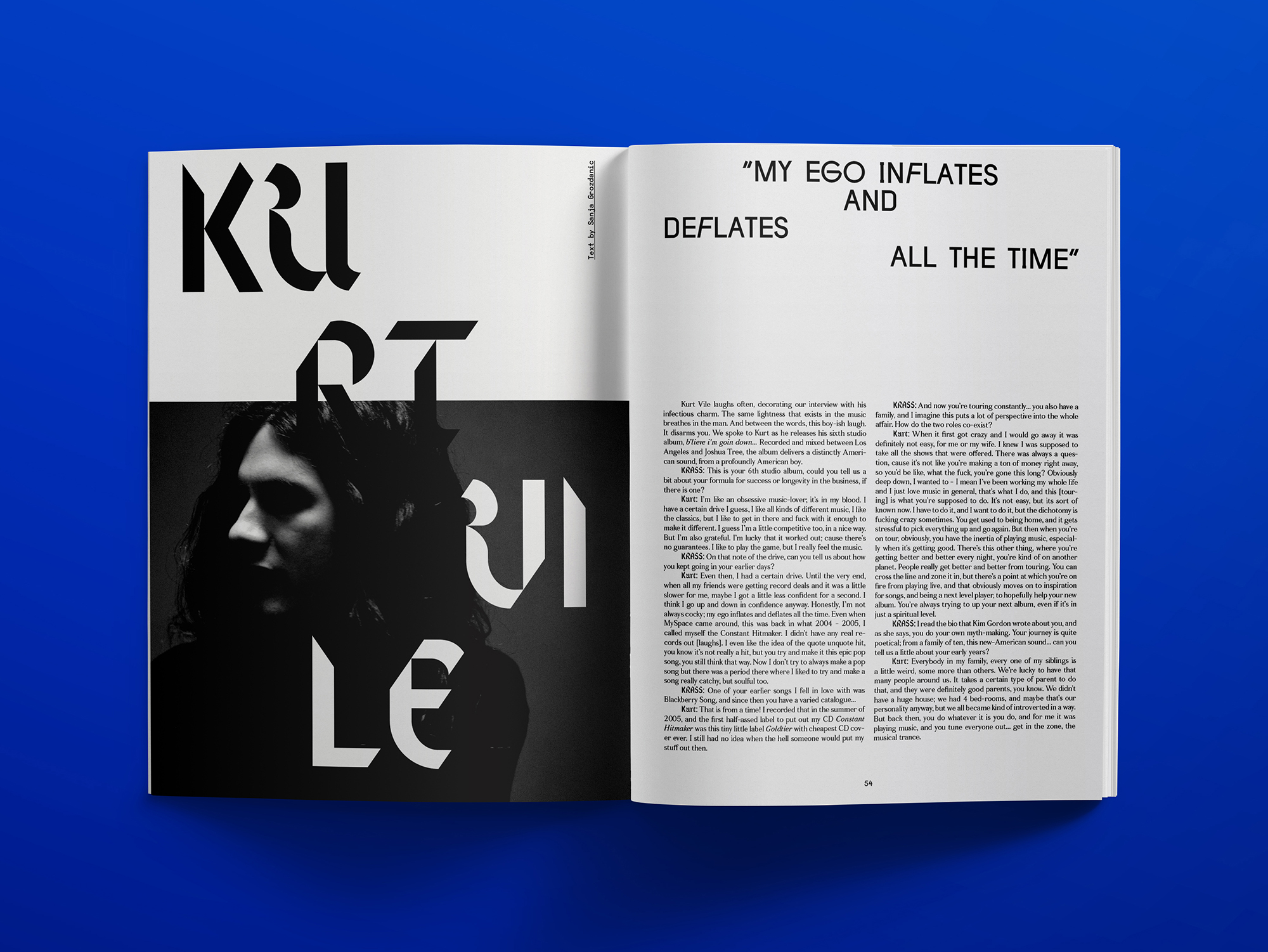
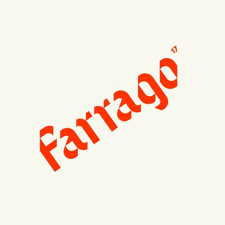
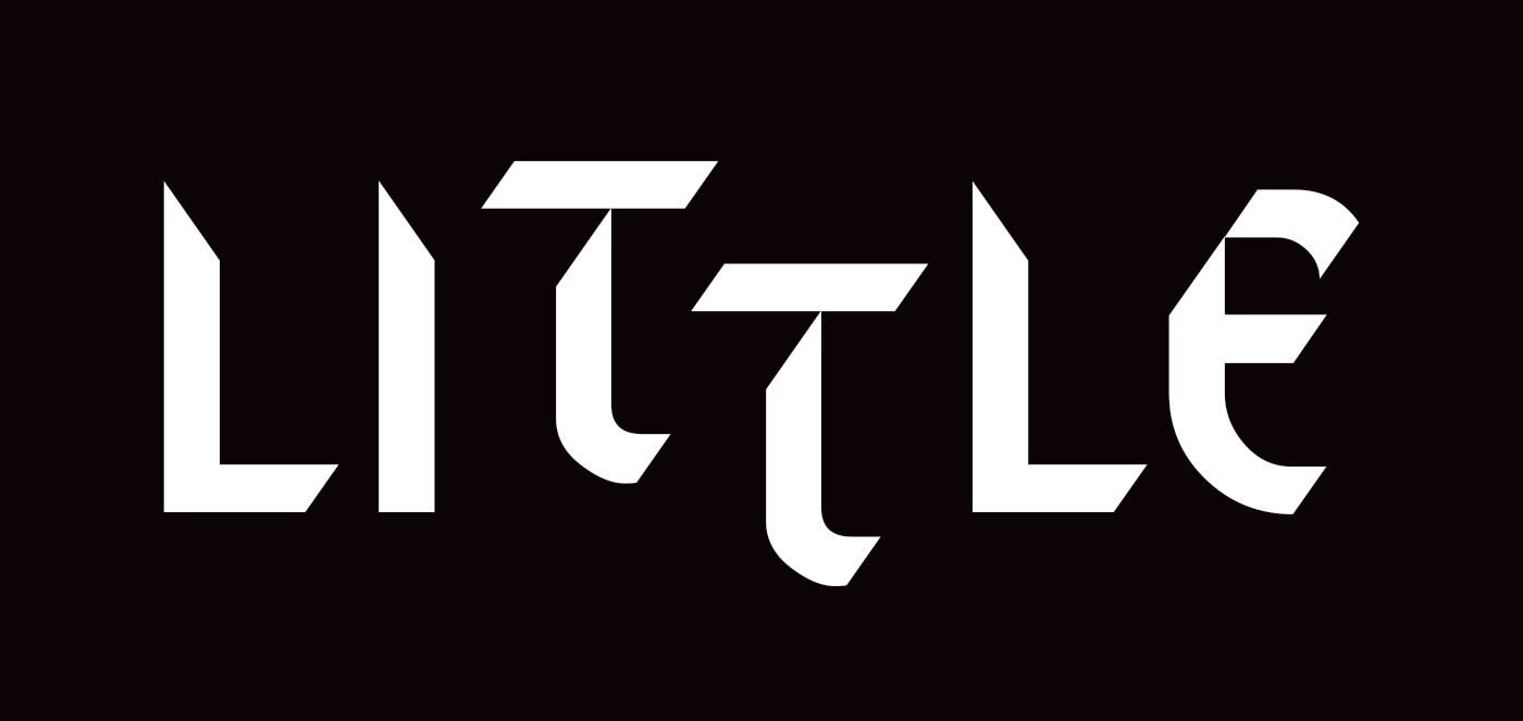
I was late to the game in discovering Text, and I was certain it must have been a fairly recent design because it suits the current design landscape so well with its idiosyncratic nature. The lines transition from being rigid to slinking out of existence, only to re-emerge from the page to dive down and across the page again. Text is influenced by Latin characters, infusing them with a Blackletter aesthetic that includes the aforementioned calligraphy nod, a towering vertical posture, chopped-off corners and a stenciling effect. The combination of design choices makes for a truly unique font where each character is a work of art.

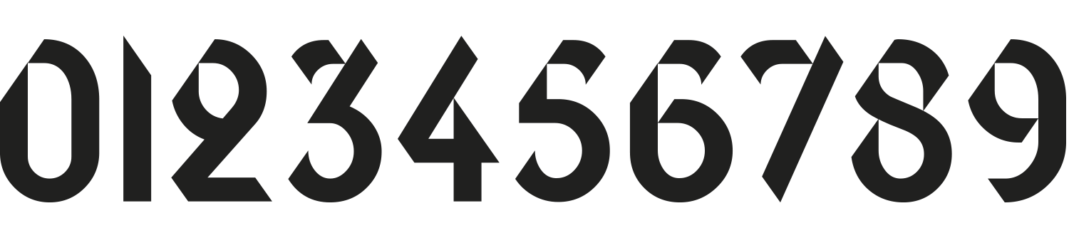
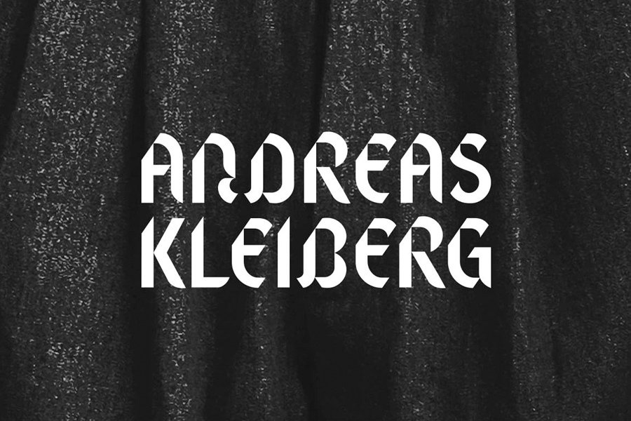
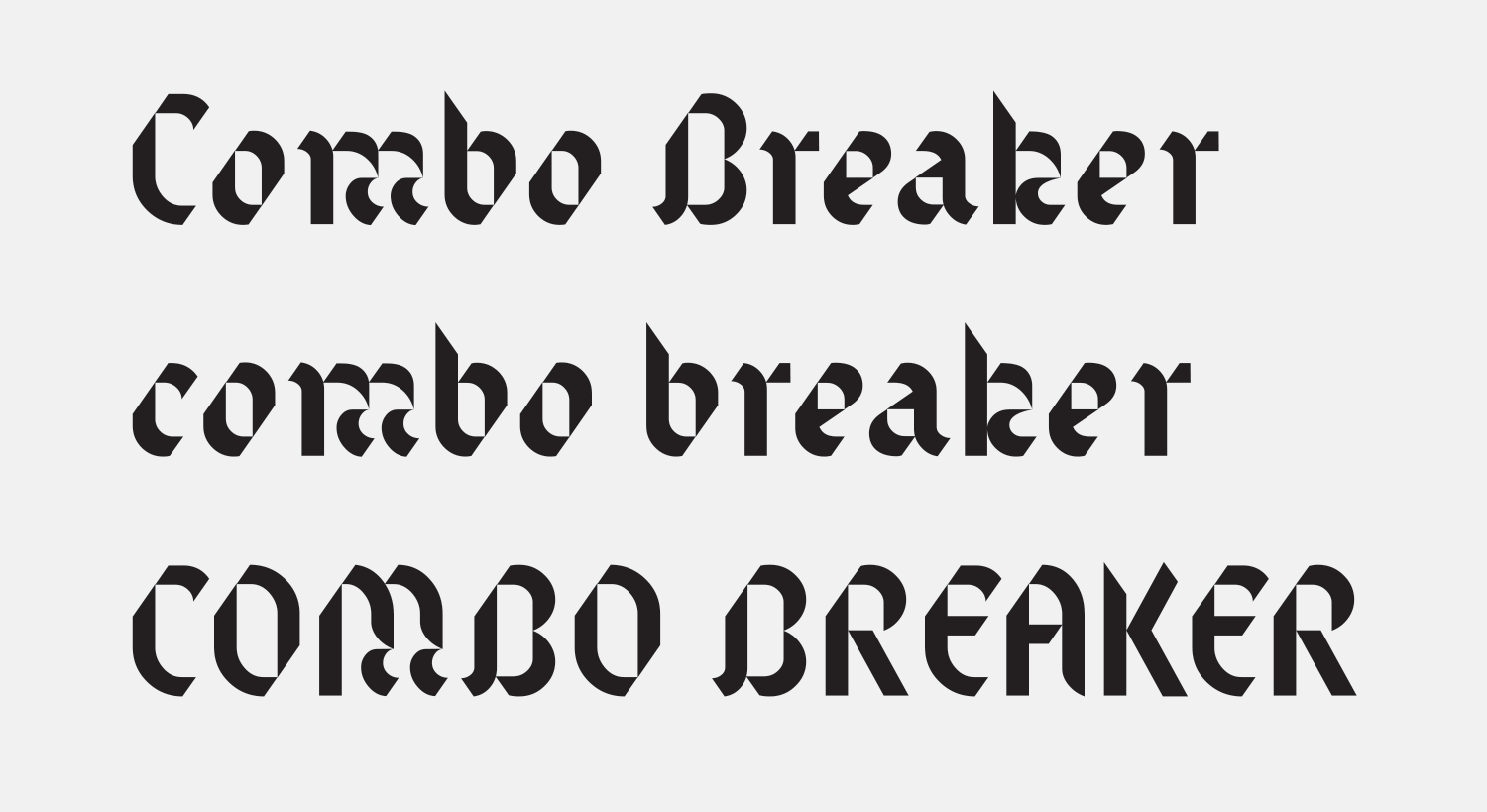
The lowercase letterforms have a similar charm, with little “flags” that twist off many characters and many having paunches and bulbous shapes that lend the font a cheerfulness not immediately evident in the uppercase set. The numerals are also entrancing, almost tricking the eye into seeing extra dimensionality with the angled ends of the strokes. The contrast of the rolling curves with the chopped diagonals on the edges of the letterforms results in lines of text that feel a little unsettling, as if they are being assaulted by a zealous exact-o-knife wielding foe. This is a typeface that makes you work to read it—just another way it demands your attention.

bleed.no — Branding for photographer Andreas Kleiberg by Bleed, building an entire brand off of the “A” from Text.
Nº02 bleed.no — Branding for photographer Andreas Kleiberg by Bleed, building an entire brand off of the “A” from Text.

Design details

Gareth Hague has several exceptional display faces that twist assumptions and conventions about well-worn genres of typefaces, and many of them accomplish that while being very, very pointy and spiky. Text is no different, with diagonal slices lopped off of the upper left and lower right edges of many of the characters, creating shapes that could feel unbalanced but remain upright due to the stable proportions and the confidence of the construction of each character. These angles evoke some Fraktur examples from the 1930’s, such Element from Bauersche Gießerei[3]. The letterforms are rigid and upright, and most corners are sliced off in the same manner as Text, while characters like the “D” retain smooth curves as contrast. It’s this push and pull between soft and hard that make these typefaces so interesting.

flickr.com — Bauersche Gießerei, Frankfurt a.M.: Element. Eine Schrift, die Tradition und Gegenwart vereining
Nº03 flickr.com — Bauersche Gießerei, Frankfurt a.M.: Element. Eine Schrift, die Tradition und Gegenwart vereining
ebay.com — This Little Piggie Went to Market sheet music from 1934.
Nº04 ebay.comThis Little Piggie Went to Market sheet music from 1934.

The thick strokes and controlled calligraphic character to the glyphs evoke Arabic lettering, and this relationship was played up to stunning effect by Aerosyn-Lex Mestrovic in his re-working of the flag of the House of Saud, the flag of Saudi Arabia[1]. By stripping away some of the typical characteristics of Blackletter and sticking to some truly unique design principles, Hague was able to create a typeface that feels at home in the aesthetic of multiple countries and cultures and unlike many Blackletter designs, it’s perfectly usable in all-caps.

Nº05 The Little Piggy lettering (top) vs Text (bottom). While they are different in many aspects, the lopped corners and angle of the cuts are similar.
magculture.com — Detail from the Krass Journal showing an arrangement of Text that plays off the diagonal angles.
Nº06 magculture.com — Detail from the Krass Journal showing an arrangement of Text that plays off the diagonal angles.

One historic example I stumbled across that has some interesting similarities to Text is the lettering on this sheet music for This Little Piggie Went to Market[4] (the song is from a 1934 film titled Eight Girls in a Boat). While the basis of this lettering is an upright condensed sans in the Futura Display vein instead of Blackletter, the corners are lopped off in a similar fashion to Text and at a similar angle[5]. I don’t know if this design influenced Text at all, but it’s fascinating to see the same design detail used in such drastically different styles of typefaces.

Nº07 renewadelaide.com.au — When you set Text sideways you get a new perspective of the sharp angles of the typeface and they become much more obvious. Spread from the Krass Journal.
Text’s modular design offers a lot of potential for animation and masking in motion work.
Nº08 Text’s modular design offers a lot of potential for animation and masking in motion work.

The result of all the angles and odd negative spaces created by Text is that the designer has the potential to play off of geometry and let it accentuate the text. When you set Text on its side, the shapes in the negative space—particularly the triangles—become more obvious[7]. Another one of my favorite, subtle examples that shows off the effect geometry has in the typeface is in this spread in the Krass Journal which arranges the word “Urgency” in multiple rows[6]. This is a very clever way to mix the uppers and lowers of Text in a word without having the capital dominate the line (you’ll notice that most of the examples shown in this review use either all uppercase or all lowercase letters).

By stacking the type in this way the letters are arranged so the chopped corners align with one another and create strong diagonal lines across the composition from bottom-left to upper-right. In addition to drawing the eye across the letterforms, this also creates a sense of “mirroring” because of the matching angles, and details like the “flags” that twist off the “n” and the “y” feel like purposeful reflections of one another. Text is a very modular typeface that repeats several design elements and repurposes shapes, so there’s tons of potential to play off these repetitions in your design.

The letterforms take on another level of macro-typography: they start as gorgeous, self contained designs that communicate an individual character, then when strung in a sequence communicate a word, and finally they communicate as a graphic composition because of the shared design details the composition brings out. It’s a rare and special thing when typography can take on this many levels of meaning, and it’s even more exciting when done with a typeface with as strong a point of view as Text. This is a fantastic example of taking advantage of the unique design details in a typeface.

Nº09 fontsinuse.com — Detail from the Krass Journal playing off the “sliced apart” nature of Text by playing with using it as positive and negative shapes.

Text comes in two weights, Regular and a Stencil version, though the Regular weight thins to so small a point in some places that it evokes a stenciling effect on its own. The Stencil weight is thinner, giving it a more condensed presence. It’s much more delicate, with the strokes that make up each letterform cleanly separated and narrowing into points as if they are melting under the surface of the page, only to re-emerge and resume their course.

Nº10 Text’s glorious numerals, one of the font’s greatest strengths.
fontsinuse.com — Branding for the Farrago Festival plays off the angles in Text by rotating the diagonals to use as verticals. Designed by Alan Kennington.
Nº11 fontsinuse.com — Branding for the Farrago Festival plays off the angles in Text by rotating the diagonals to use as verticals. Designed by Alan Kennington.

Text strengths

Have I mentioned how lovely Text’s numerals are[10]? I love them so much I might write about each of them. They are distinctive and perhaps the most legible characters in the entire family. Unexpected details like how the top arc of the “3” meets the rest of the glyph feel clever and keep the design from feeling repetitious. The “8’s” twisting strokes are anchored by the vertical emphasis in the counters, with the sharp slice in the top left serving as a consistent marker across many of the numerals. I love how the top of the “6” almost wilts as it terminates, and how the diagonal line that defines it and the joint of the bowl and stem of the character almost imply a dimensionality, as if the whole thing was constructed by a few pieces of isometric ribbon or that the numeral is some kind of M.C. Escher tribute. The top end of the “2”, by contrast, loops all the way down to connect with the body (in much the same way the question mark does), lest you think Hague was at risk of repeating too many of the same techniques in their construction. I’ve saved the “4” for last—the triumphant, assertive chap with his chin jutting out and his right half trimmed high and tight.

nanana.kim — Cover for The Moravian Night designed by Na Kim.
Nº12 nanana.kim — Cover for The Moravian Night designed by Na Kim.
Nº13 fontsinuse.com — Text numerals in use in the Tiqqun – Introducción a la Guerra Civil publication, designed by Aazufre.
alias.dj — Unused cover design for a biography of Leon Trotsky, 2015.
Nº14 alias.dj — Unused cover design for a biography of Leon Trotsky, 2015.

Mexico-based design studio Aazufre makes stunning use of Text’s numerals in the Tiqqun – Introducción a la Guerra Civil publication[13]. They are used at a variety of sizes and the design makes heavy use of repetition and scale to maximize their impact. There’s also some clever play with they idea that they have weight and gravity, which Text is especially well suited to take on because of the pseudo-dimensionality of its construction. In some spreads the numerals are stacked and the text underneath is compressed under their weight, and on the next they are smaller, tucked into the top of the panel while the next strata of the text floats underneath, the smallest paragraph anchored to the ground far below. It’s a testament to both the typeface and the designer that the page numbers still feel fresh in every spread despite using only one typeface.

Because of the simplicity of it’s letterform construction and it’s consistent curves and angles, Text plays quite well against simple patterns and shapes. Designer Na Kim paired it with another calligraphic font, Lydian, for the cover for The Moravian Night and set them amidst a sea of gentle waving lines which evoke the undulating arches of Text[12]. Text intertwines with the waves and punches through the dark background with its sharp angles and brighter colors. Kim did make some noticeable alterations to Text in the process, evening out the “flags” that twist off of characters like the “N”, perhaps to give a more mono-line character to the typeface to mirror the waves. She cleverly “filled in” some of the incisions on the strokes of characters like the “T” with darker shades to supplement the original design of the font and provide a sense of depth, as if some of the strokes and waves are casting shadows. I also love how Kim plays off the chopped off terminals in the typeface by creating her own premature endings, such as on the “P” in Peter.

Nº15 fontsinuse.com — Word-mark for photographer Andreas Kleiberg by Bleed, 2013. Text pairs well with the black & white photography used.
An obvious use case for Text would be drop caps, where it really shines. The light and open designs of the capitals have enough presence to hold their own without distracting from the text.
Nº16 An obvious use case for Text would be drop caps, where it really shines. The light and open designs of the capitals have enough presence to hold their own without distracting from the text.

My favorite example of Text used as a driving force in a branding project is the work Bleed did for photographer Andreas Kleiberg[15]. The “A” from Text is reversed out against grainy black & white fashion photography and sets an striking mood right off the bat[2]. The sliced edges of the typeface imply a edge or aggressive tone that’s just a little unsettling and matches the tone of the imagery. There’s something to be said about simply finding a gorgeous letterform and letting it do the heavy lifting in a design. It doesn’t hurt that “Andreas Kleiberg” is a name with many letters that are a similar width and have rounded shapes, and Bleed subtly rounded off many of the strokes (look at the “L” and “K”) to further soften the appearance of the typeface.

Quirks and eccentricities

If one of the numerals is the black sheep of the family, it’s the “9”, which to my eye feels like it’s about to topple over, the lower arch ending before it can really stabilize the rest of the number[10]. The angle on that lower terminal guides your eye to the bowl in such a way that it feels like the figure is off-balance. It’s a shame, considering how stellar the other numerals are.

If you intend to use this typeface en mass, may the type gods be with you. The almost vanishing middle sections of certain characters, the twisting flags, the bulbous bowls on characters like the “a”… It’s a lot of look, to borrow the words of Tim Gunn, and designers should carefully consider what the optimal amount of Text is for their design. Many of the lowercase letterforms are difficult to distinguish (check out the Notable Glyphs section above to see the painfully slight difference between the “h” and the “k”) and they often strain legibility.

Don’t be afraid to deviate from the baseline to help get the best horizontal fit with Text. The angles in the typeface offer plenty of opportunities to create connections between letters that don’t rely on an even baseline.
Nº17 Don’t be afraid to deviate from the baseline to help get the best horizontal fit with Text. The angles in the typeface offer plenty of opportunities to create connections between letters that don’t rely on an even baseline.
Nº18 Sometimes Text is easier to read if the string is either all lowercase, or all capitals. This example also shows the odd interactions that can happen in the negative spaces between the lowercase characters (check out the “dueling mouths” on the “e” and the “a”).

I find a few characters, like the “t” and the “o” to be difficult to kern. The former juts aggressively to the left from an arch at the bottom of the stem and the crossbar, making it visually unbalanced, and the latter is dominated by its diagonal incisions which can lead to awkward abutments and gaps. In the uppercase set, watch out for double “T’s”, like in the “LITTLE PIGGIE” example above[5]. It creates a lot of empty space beneath the arms, but one of the advantage of this being such a modular design is you can get away with doing things like breaking the baseline to perfectly position letterforms[16].

This is not an easy typeface to use, but I think there are consistent trends in the most successful designs that use it. They take advantage of the geometry in the typeface and use the lopped corners to their advantage (notice the diagonal line that runs from both “p’s” in the Trotsky cover above[14]). They also aren’t afraid to break up words into multiple lines to allow for more interactions between the letterforms and to emphasize the abstract and shape-driven aspect of the design. This also lets get the scale needed to let the unique glyphs have the most impact. Finally, they tend to stick to either the lowercase or uppercase set and avoid mixing the two to keep things are controlled as possible[18]. Use these guidelines as a starting point when working with Text and once you feel comfortable, start making your own rules!

- FRJ