Styrene
— Designed by Berton Hasebe

commercialtype.com — The specimen that did me in.
Nº01 commercialtype.com — The specimen that did me in.

I purchased Styrene on a whim after seeing a specimen image shared from Commercial Type’s twitter account. It was simple—demonstrating how the alternate “a” and “4” characters could dramatically change the feel of the typeface—but I was sold.

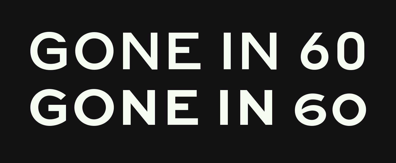
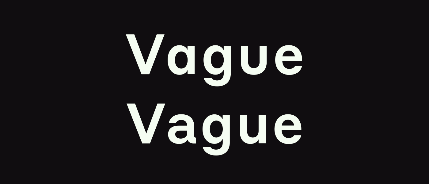
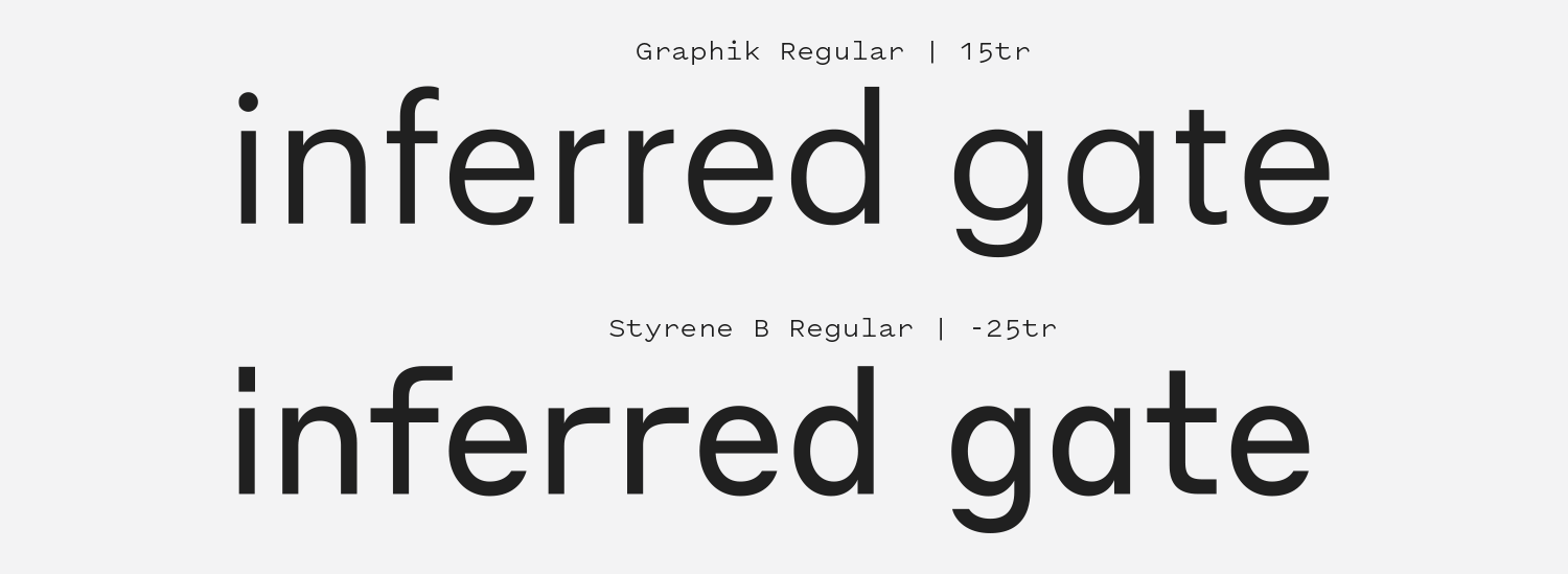
Styrene is a product of its design constraints. The clearest defining feature of the typeface family is that typically narrow characters like “r”, “t”, “f” and “j” are elongated, their horizontal strokes pulled out long past the point of making any logical sense. This gives the font an irregular presence on the page, with gaps in density that give it an uneven visual grey. It comes it two widths: Styrene A embraces geometry (look at the “& Angelcore” line in the specimen above for a great representation of this), and Styrene B is narrower, making it better suited for long-form text. The name Styrene is a reference to the synthetic, artificial nature of the typeface family’s foundational rules. In practice, the font looks clean and mechanical until you encounter the dozen or so truly bizarre glyphs which shift the typeface from cold to odd. It can be made to resemble a monospaced font, but then the hearty lines that make up characters like the “n” and “g” can almost fool you into thinking you’re looking at a grotesque face. Then there’s the matter of the capital “J”, which is so charming that I used Styrene B for the logotype of this website. There are few things I enjoy more than pulling out an underused typeface from my backlog and finding the absolute perfect use for it, and it just so happens that “Font Review Journal” looks rad as hell in Styrene.

othermeans.us — By the People exhibition catalog by Other Means.
Nº02 othermeans.usBy the People exhibition catalog by Other Means.

Historic influences

Designer Berton Hasebe used a quirky typeface from a 1932 specimen titled “Breede Schreeflooze” by the Enschedé Type Foundry as the starting point for Styrene[5] (endless thanks to Graham Bradley and Stephen Coles for making me aware of the specimen in the Typographica review of Styrene). As mentioned previously, Styrene’s defining features are Styrene A’s dogged insistence on maintaining round geometric shapes, both versions’ uncharacteristically wide glyphs for narrower letterforms like the “r”, and that “J”, which looks a bit like a child tucking their legs up against their chest as they tries to hide in a kitchen cabinet during a game of hide & seek.

Nº03 Breede Grotesque specimen from a Enschedé Type Foundry specimen book, reproduced with kind permission of Letterform Archive

Before seeing the Breede Schreeflooze specimen I was curious about the “J” and how it fit into the logic of the rest of the typeface, but after seeing the specimen and others from the foundry it’s obvious that detail was inspired by older designs. Hasebe took the geometric aesthetic and a few of the quirks from Breede Schreeflooze (like how the terminals for the “S” end parallel to the baseline) and added details like the extended lowercase arms and shoulders of Breede Grotesque[3] (which has a lowercase, unlike Schreeflooze) to bring another form of geometry to the design. Graham Bradley very aptly notes in his review that Styrene has just as many squares as circles in its geometry, and that’s a truly unique feature for a typeface design. This genre of typeface design is one of my favorites—when a type designer uses an older design as a springboard for their own unique interpretation of its core ideals, sometimes adding concepts, and sometimes simplifying (check out the “5” in the original specimen!!!)[5].

Nº04 Styrene A Medium (top), Sweet Sans Bold (bottom)
Breede Schreeflooze specimen from a 1932 Enschedé Type Foundry specimen book, reproduced with kind permission of Letterform Archive .
Nº05 Breede Schreeflooze specimen from a 1932 Enschedé Type Foundry specimen book, reproduced with kind permission of Letterform Archive .

The uppercase set could almost pass for a typical geometric sans (if not for that “J”) but the narrow, pill-shaped numerals and the structure of characters like the “G” give away that its roots are in geometry, not lettering. Styrene A evokes the wide stance of engraving gothics like Sweet Sans[4], and it serves as an interesting meld of the historic and the mechanical. It also shares the raised midline of an engraver’s gothic, with the raised bowl on the “R” and shortened middle arm on the “E.” Styrene maintains some of the subtle thick to thin stroke details where curves connect to stems that give the family just a bit of Grotesque charm. Look at how lovely the placement of the counter in the bowl of the “g” is in the “Vague” example below[6]! Alternates like the double-storey “a” and the spurred “u” also bring a bit of grotesque flavor to the typeface. Activating various stylistic sets can push the aesthetic more geometric or grotesque depending on your needs.

Nº06 An example demonstrating how the “a” and “u” alternates make Styrene B feel more like a grotesque.
commercialtype.com — NERIRI KIRURU HARARA catalog designed by E Roon Kang.
Nº07 commercialtype.comNERIRI KIRURU HARARA catalog designed by E Roon Kang.

Styrene strengths

I’ve already hinted that this font’s odd construction makes it a bit of a chameleon, and that is a huge strength of the typeface. Not many fonts with this much individual character could be confused with a monospaced font and an engravers gothic but Styrene pulls it off. Designer E Roon Kang of Math Practice also found another pairing for Styrene—Hongul text. The consistent character widths and irregular gaps in shapes of Styrene look right at home next to Korean phrases, and he leveraged Styrene beautifully in the branding for NERIRI KIRURU HARARA, the Seoul Museum of Art’s Biennale in 2016[7]. I am excited to see what other interesting pairings designers make with Styrene. Personally, I am just waiting for a project where I can use GT Cinetype and Styrene together: two typefaces with mechanical roots yet vastly different styles.

Nº08 typewolf.com — Maison Mono and Styrene A used on the website for the band The National, showing off how naturally Styrene pairs with monospaced fonts.
fontsinuse.com — Document Magazine table of contents.
Nº09 fontsinuse.comDocument Magazine table of contents.

Styrene makes a brilliant pairing with monospace typefaces. It shares the low thick to thin contrast and mechanical nature but is significantly wider than most monospaced faces, allowing you to have a partner typeface that shares the same visual characteristics of your monospaced font while giving you a different width to play with in a typeface that isn’t bound by all the same rigid restraints. This is used to great effect on the website for the band The National[8], where Styrene A is paired with Maison Mono and melds so naturally with it you might think it’s simply a wider version of Maison in a different weight.

Nº10 commercialtype.comBy the People exhibition catalog table of contents, designed by Other Means.

Styrene’s stoic, handsome uppercase set has open counters and their clean construction make it a highly readable font to use in all caps. Other Means uses them to great effect in the project directory for the By the People exhibition catalog[10]. The near mono-line letterform construction of the lighter weights makes the words feel familial to the thin rules dividing each project and the design feels cohesive and automated as a result. It should also be noted how fantastic the numerals look in that example, and that they are making use of the alternate open “4”. The irregular spaces that the abnormally wide lowercase characters create also allows for some interesting design solutions. The table of contents for Document Magazine plays off the odd gaps in each line by setting the text in a staggered grid, systematically shifting the column placement from line to line to create an effect that is both chaotic and controlled[9]. It reflects the duality of the personality of the typeface itself, which is artificial yet endearingly strange.

Nº11 marvil.cz — Styrene used brilliantly in a brand system for The Railway Infrastructure Administration in the
Czech Republic, designed by Studio Marvil.
models.com — Document Magazine spread showing the loose default letterspacing. Design by Povilas Utovka, Matthew Lowe, and Nick Vogelson.
Nº12 models.comDocument Magazine spread showing the loose default letterspacing. Design by Povilas Utovka, Matthew Lowe, and Nick Vogelson.

One of the uses of Styrene I’ve seen that surprised me the most was the work Studio Marvil did for the Czech Railway Infrastructure Administration[11]. The system leans on Styrene’s mechanical geometry to communicate industrial precision without needing to fall into aesthetic cliches like chamfered edges or bold, bulky typefaces. The trains themselves are industrial, and Styrene’s clean lines complement the industrial design of the vehicles while remaining easily readable in motion.

Quirks and eccentricities

To use Styrene is to accept its design system, and the character that comes with it. Styrene is a unique typeface that will require the right parameters to feel natural in a design, and I have tried in vain to use Styrene in several projects where it felt too alien to the rest of the type on the page to blend in. This typeface is supposed to make you feel a bit uncomfortable, which means it’s not going to be the right fit for every project, and it doesn’t always play nice with others. I found a harmonious pairing for it in Untitled Sans, which is used throughout this site. Untitled Sans is a “plain” grotesque that’s meant to have as little personality as possible, so it can relate to the grotesque flavor in Styrene (notice I’m using the double-storey “a” on this site) without stepping on its toes. It’s certainly easier to use in all-caps situations than anything involving lowercase letterforms, where those square shapes will appear and take over the typographic voice of your design. It is impossible to appreciate how odd those characters are until you try to use Styrene with a more traditional sans-serif. Designers should be intimately familiar with all the stylistic sets the typeface affords to get comfortable with the different flavors the family can take on.

Placing Styrene’s lowercase set against a similar geometric grotesque font like Graphik is the best way to show many of the font’s oddities at the same time[13]. To balance out the letterspacing between the pair, I had to track out Graphik and apply quite a bit of negative tracking to Styrene. The “f” in Styrene has an elongated top that causes it to loom over the proceeding character. The double “r’s” on Graphik let quite a bit of air in, while Styrene’s stretch on and close off the space, creating a boxed shape. The longer crossbar on the “t” also makes the gap between it and the “a” more pronounced, creating almost a triangle shape in the negative space. More geometry!

Nº13 Be mindful of the effects the wider lowercase characters can have, especially when placed next to each other. Also note the large empty area between the “a” and the “t”.

You’ll notice that many of the specimens at the top of this review use negative tracking. Styrene has pretty airy letterspacing by default (which is part of the reason why it feels like a monospace font in some applications), so at larger sizes I tend to bring it in unless I specifically want to enforce wide tracking, as in the all caps examples. However, I’ve seen the default spacing be used to great effect in certain aesthetics, like Document Magazine[12], so this will ultimately be up to the preference of the designer.

- FRJ