Proto Grotesk
— Designed by Jean-Baptiste Levée

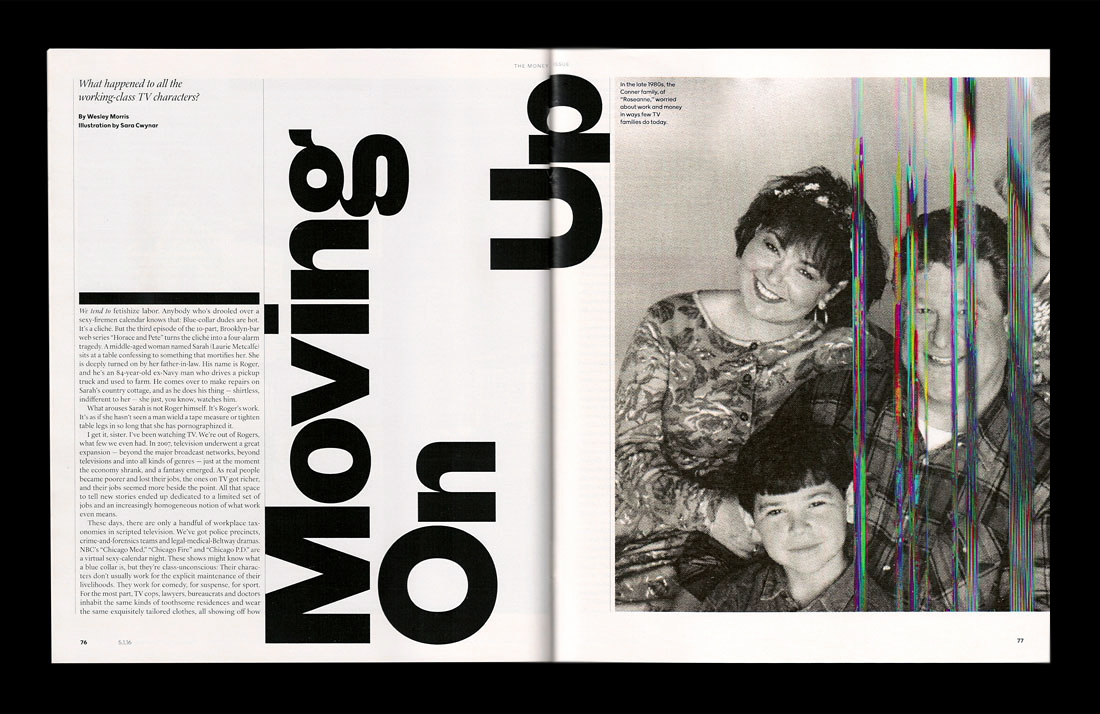
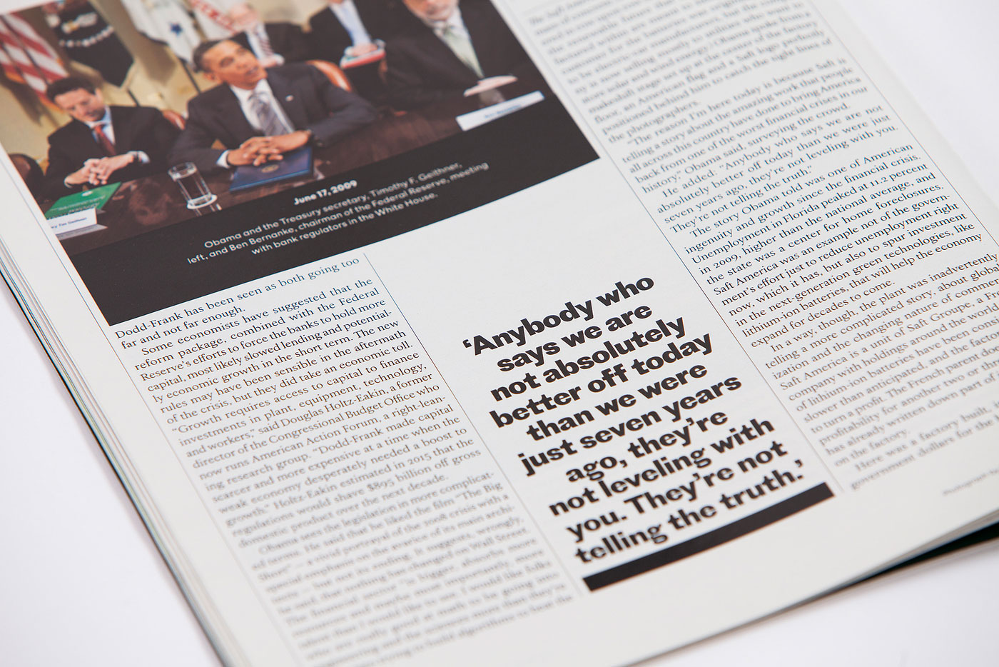
chloescheffe.github.io — Proto Grotesk used in The Money Issue of the New York Times Magazine, design by Chloe Scheffe.
Nº01 chloescheffe.github.io — Proto Grotesk used in The Money Issue of the New York Times Magazine, design by Chloe Scheffe.

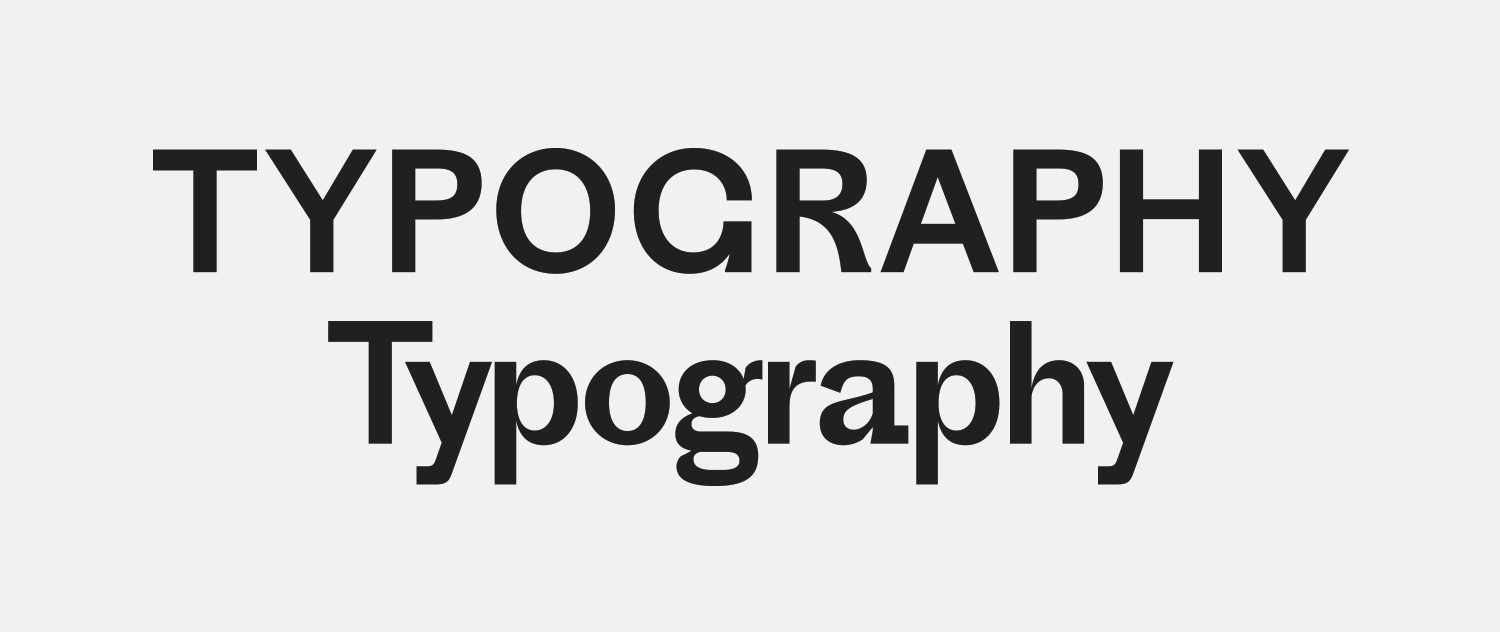
Proto Grotesk is defined by its “G’s”—The uppercase, which resembles a “C” with a goatee, and the stunning stacked “g”, with it’s massive lower bowl that anchors the letterform from below the baseline. This is a typeface you buy because there are a handful of characters that are so distinct you can’t wait to find an excuse to use them.

Proto Grotesk oozes with personality, combining some very old-school grotesque characteristics with a quirky, modern sensibility to create something that feels brand-spanking new. It’s got a sharp thick-to-thin contrast (even in the lighter weights, which is a rarity) and in the bolder weights the oval shaped counters swell up like bubbles.

It’s both friendly and alien, historic yet sharply mechanical. It embraces geometry while maintaining its grotesque roots, and remains legible despite its quirks and unique details. I love typefaces like this that can seem fairly understated in one setting, but when the right characters are deployed you realize just how odd a typeface it is. It can be beautiful but it’s always meant to make you feel slightly uncomfortable.

Proto Grotesk is gorgeous at large-scale—its supple letterforms can be the hero of a composition—or it can be subdued, taking on a charming vibe as a secondary or body-text typeface. In researching for this review I’ve been pleasantly surprised at the myriad of ways people have used it, and how subtle it can be in the right hands. It’s a typeface of contradictions and abnormalities and yet it all works.

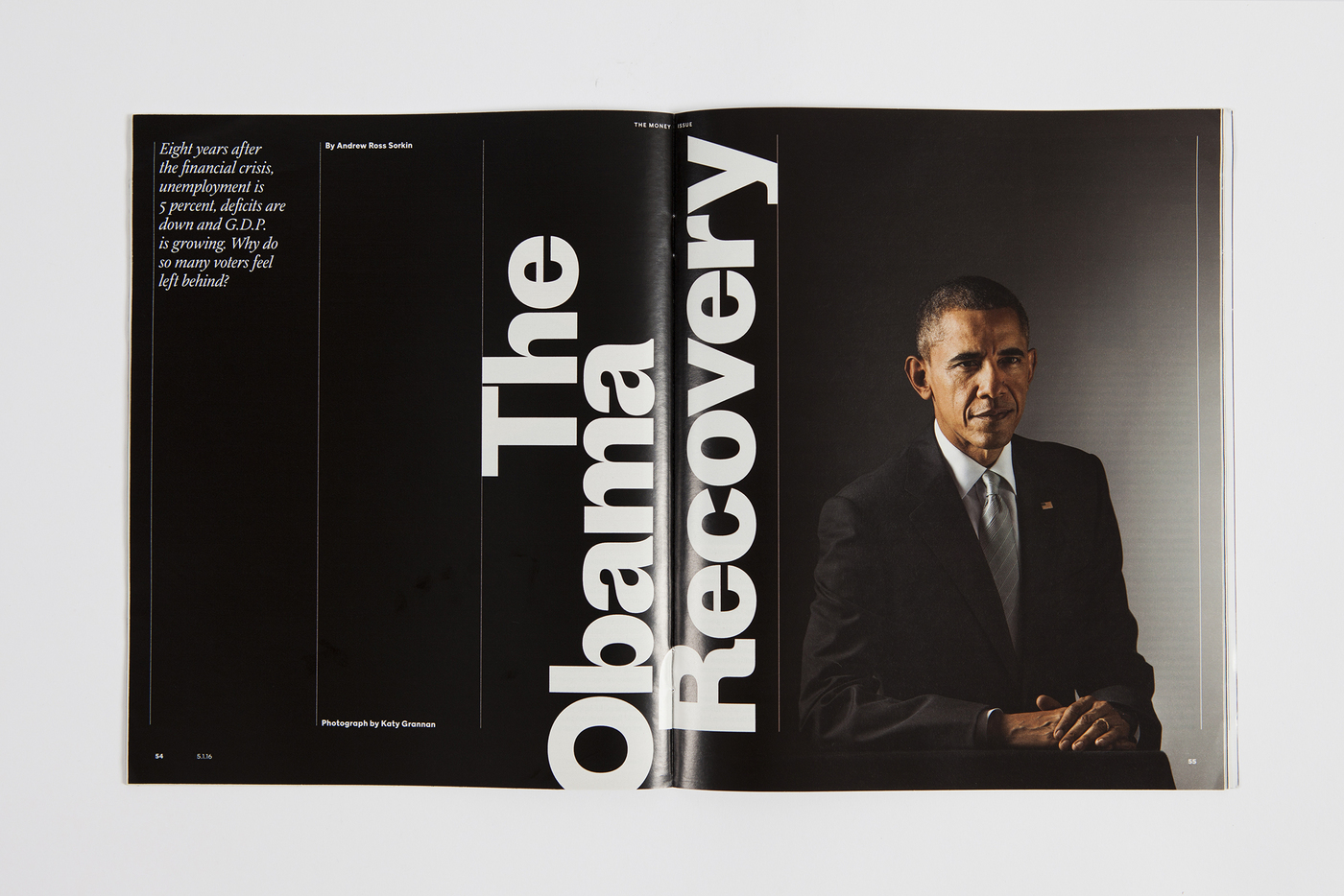
fontsinuse — The Money Issue of the New York Times Magazine uses Proto Grotesk so well that I had to include multiple examples. Direction by Gail Bichler.
Nº02 fontsinuse — The Money Issue of the New York Times Magazine uses Proto Grotesk so well that I had to include multiple examples. Direction by Gail Bichler.

Historic influences

Jean-Baptiste Levée cites a German sans-serif face, Breite Halbfette Grotesque by the Bauer & Co foundry from 1883 as the source of inspiration for Proto Grotesk. There’s a stylized reproduction of it in Production Type’s specimen for the typeface, but I’ve not been able to find a satisfactory reproduction of it online.

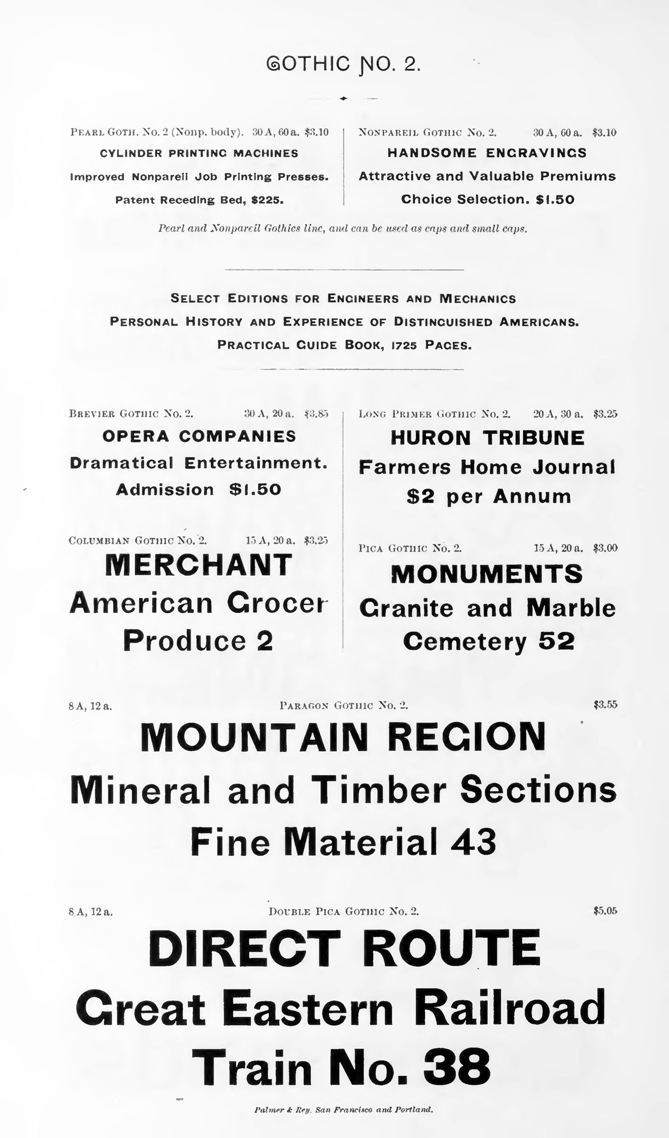
babel.hathitrust.org — Gothic Nº2 specimen from The seventeenth book of specimens from the Cincinnati type foundry, 1888.

The cited version of Breite Halbfette Grotesque was an interpretation of Gothic № 1, a design from White & Co. from the 1860’s, which is frustratingly difficult to find online. Thankfully, a more accessible specimen related to all of these is Gothic № 2, a successor to № 1[3]. There you will find the “t” with the stem that flattens to run along the baseline, the curved leg on the “R”, the almost-fragile bar on the “e” and of course, the goateed “G”, along with the stumpy arm on the “r” and the teardrop counter in the “a”[5]. Add in the similarity in the overall proportions and numerals, and the resemblance is uncanny. This is a fascinating example of typeface designs crossing across the world—from the US, to Germany, and eventually to Jean-Baptiste Levée in France—and inspiring the growth of a style over multiple centuries.

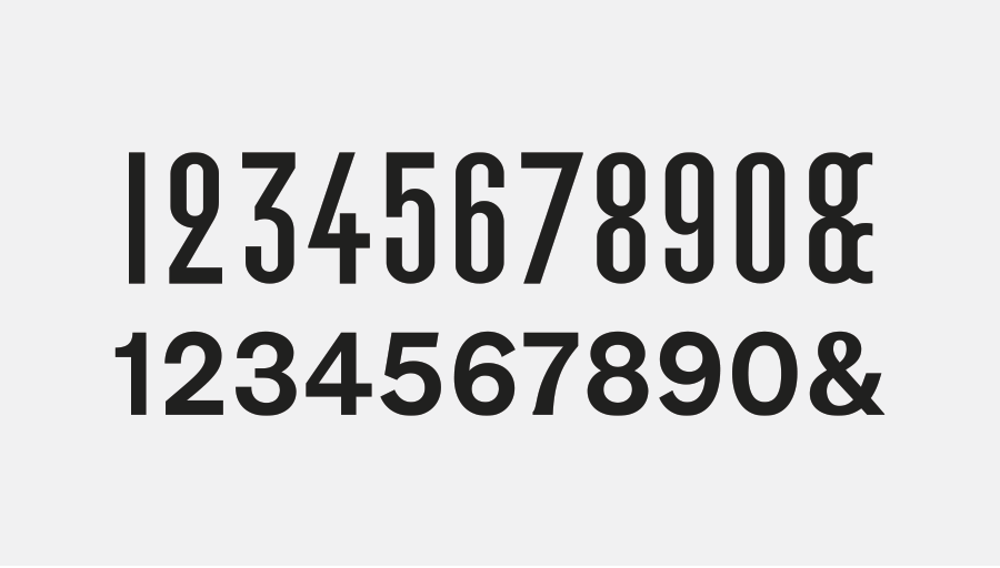
The alternate (top) and default (bottom) numeral sets in Proto Grotesk. The condensed alternates reinforce the typeface’s off-kilter nature.
Nº04 The alternate (top) and default (bottom) numeral sets in Proto Grotesk. The condensed alternates reinforce the typeface’s off-kilter nature.
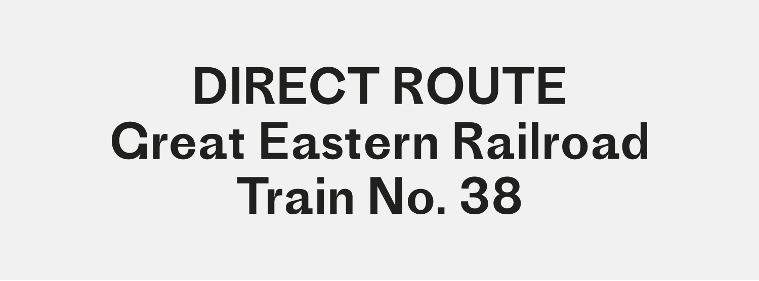
Nº05 Proto Grotesk, showing its similarities to Gothic Nº2: the odd leg of the “R”, the spurred “G”, the tails on the “A” and the “t” and the vertical stress carry over.
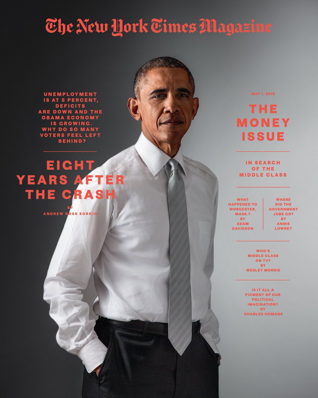
twitter.com — Cover of The Money Issue of the New York Times Magazine.
Nº06 twitter.com — Cover of The Money Issue of the New York Times Magazine.

Another way Proto shows its grotesque roots is with its low x-height. You can see in the example above how the capitals loom over the lowercase characters, and even details like the dot in the “i” of “Train” fly noticeably away from the shorter characters[5]. The font is an interesting mix of influences from 19th century sans-serif designs and a really lovely modernization of some great characteristics that have often been polished out of revivals. It’s allowed to be “unoptimized” in the name of preserving character and interesting design details, which helps make it unique. I’m quite curious as to where the inspiration for the alternate set of numerals came from[4]. They feature a closed loop “2” and one of the odder ampersands I’ve come across.

Nº07 chloescheffe.github.io — Proto Grotesk used in The Money Issue of the New York Times Magazine, design by Chloe Scheffe.
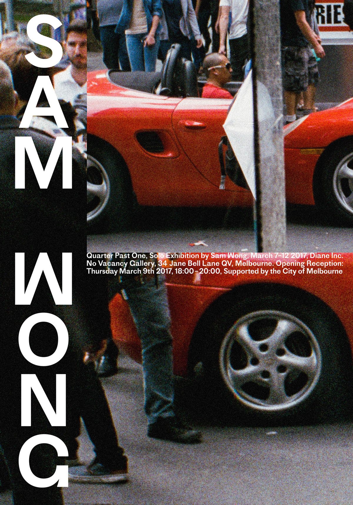
bureaucollective.ch — Bureau Collective uses Proto Grotesk stacked vertically in these posters and throughout the campaign for photographer Sam Wong.
Nº08 bureaucollective.ch — Bureau Collective uses Proto Grotesk stacked vertically in these posters and throughout the campaign for photographer Sam Wong.

Proto Grotesk strengths

I’m going to dedicate this first paragraph to the G’s in this typeface, because they encompass many of my favorite qualities of this typeface. If you’ve come across this typeface there’s a decent chance you noticed it because of that minimal “G” with its bottom-wedge[8]. This lovely carry-over from Gothic № 1 and 2 straddles the line of legibility (the default “C” in Proto has a very wide aperture, which I suspect is an attempt to differentiate it from the tighter “G”) but it’s going to do work for you if you can give it the space to perform. I particularly appreciate how the stroke is thicker on the lower terminal to bring more subtle emphasis to that area to reinforce that it’s a “G” and not a “C”. It’s rare to find a design so simple yet so impossible to ignore. The lowercase “g” is similarly full of charm, the gorgeous round shape of the top bowl offsetting the stretched shapes underneath and preventing the letter from feeling too irregular. The upturned ear pull the emphasis of the letter upward and nicely offsets the weight of the lower half and gives the whole design a cheery presence.

Nº09 The different character of Proto Grotesk’s uppercase and lowercase characters, particularly when it comes to the “G’s”.

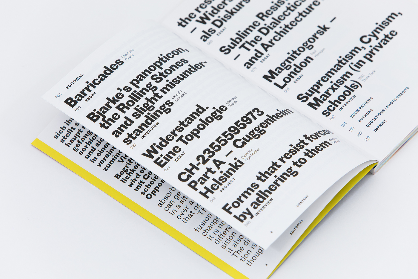
Proto Grotesk’s high contrast makes it perfect for display use and extremely large sizes, and it was Gail Bichler and Matt Willey’s use of it for the 2016 Money Issue of the New York Times Magazine that made me fall in love with the typeface[7]. In the interior spreads, article titles are set vertically in Proto Grotesk Bold, the unique orientation allowing for more vertical space for the photography, which is striking and evocative. Proto’s Bold weight is loud but avoids feeling cold or overbearing at these large sizes because of how the strokes thin to nearly vanishing as they take their curves. It showcases how crisp and voluptuous the font is, and I could have only illustrated this review with examples from that issue and it would have done Proto Grotesk justice.

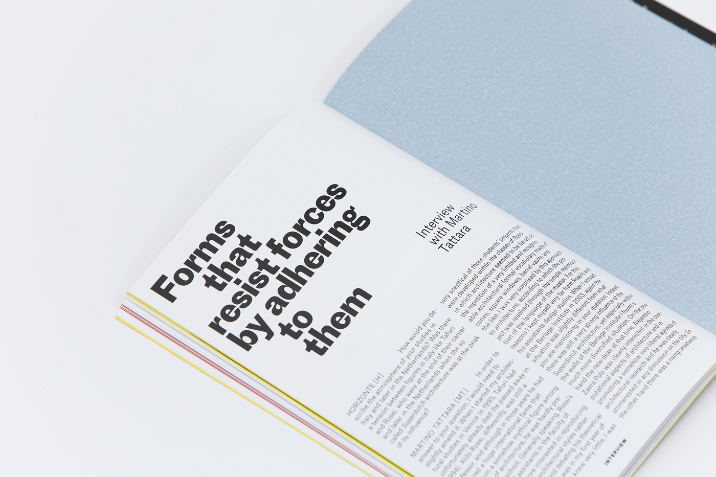
Nº10 fontsinuse.com — The 10th issue of Horizonte Journal pairs the more restrained Atlas Grotesk with Proto Grotesk Bold, and the two feel familial, with Proto serving as the more boisterous sibling to Atlas’ straight-laced personality.
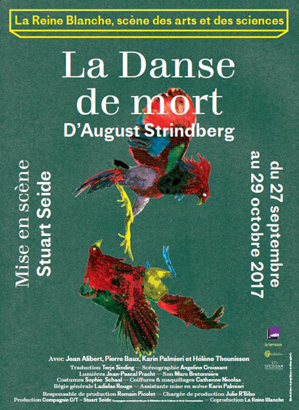
twitter.com — Proto Grotesk paired with Totentanz on a poster for the Théâtre de la Reine-Blanche.
Nº11 twitter.com — Proto Grotesk paired with Totentanz on a poster for the Théâtre de la Reine-Blanche.

This is a typeface that can look quite different in all-caps vs. uppers and lowers, and that can be a boon for you if you want to prevent a system from feeling monotonous. In contrast to the curvaceous nature of the interior spread usage in the New York Times Magazine Money Issue, Proto Grotesk feels more old-fashioned and restrained on the cover, where it’s used in all-caps[6]. While old grotesque features like the “G” and the curved leg on the “R” slip in and give the font some character, the overall look of the uppercase set it much more even in tone and restrained compared to the playful details in the lowercase characters.

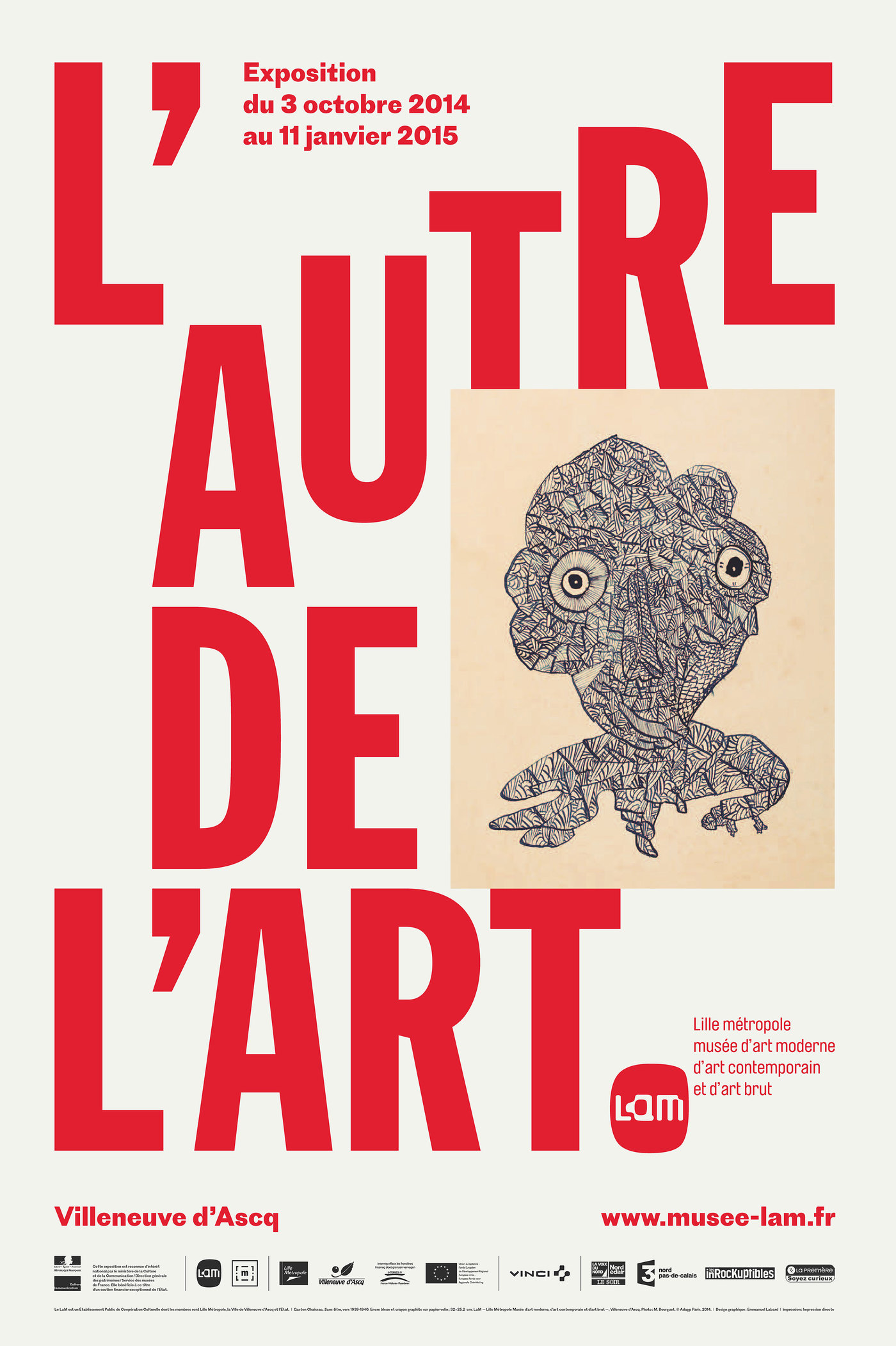
Nº12 fontsinuse.com — Proto Grotesk pairing nicely with its distant cousin, Franklin Gothic, in branding for the L’Autre de l’art exhibition, by L’Atelier collectif.
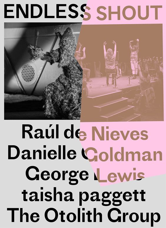
endlessshout.icaphila.org — Proto Grotesk used in promotions for the Endless Shout exhibition at the Institute of Contemporary Art. The torn details evoke collages and Proto’s sharp details are well suited to the jagged patchwork.
Nº13 endlessshout.icaphila.org — Proto Grotesk used in promotions for the Endless Shout exhibition at the Institute of Contemporary Art. The torn details evoke collages and Proto’s sharp details are well suited to the jagged patchwork.

Proto Grotesk’s quirky nature enable it to evoke or mirror the personality of the other type and imagery placed around it. L’Atelier collectif made brilliant use of it in the branding for L’Autre de l’art, a cross-discipline exhibition held at the LaM in France. Designer Emmanuel Labard pairs it with a condensed weight of Franklin Gothic, and the two grotesques play well weight each other due to their shared ancestry. But it is Proto’s connection to the quirky art showcased in the poster that really makes the type pairing sing. The juxtapositions of the bulky stiltedness of characters like the “j” and “t” keep you off-balance when contrasted with the lovely geometric shapes and the offset oval counters in many of the letterforms. It creates an approachable but unknowable presence for the typeface, much like the tone of the artwork in the exhibition, which is abstract and unconventional.

Nº14 fontsinuse.comHappy Little Accidents cleverly uses the directional nature of the lowercase “t” and indents the words that lead with it in this heading inside of the 10th issue of Horizonte Journal.

When paired with a serif and used at the Regular weight, Proto comes off as a bit more restrained without the extra weight to contrast against. The La Reine Blanche theater in Paris uses Totentanz and Proto Grotesk for its branding, and the two fonts are well suited for each other. Both are odd twists on older genres of typefaces and in these pieces their personalities are visible but smoothed out. You notice they aren’t your typical type choices but neither screams for your attention, showing a quiet confidence in their own eccentricity.

fontsinuse.com — Branding for the 802 C Festival by Building Paris, 2014. Proto Gortesk shines when paired alongside these bright and playful colors and geometric shapes.
Nº15 fontsinuse.com — Branding for the 802 C Festival by Building Paris, 2014. Proto Gortesk shines when paired alongside these bright and playful colors and geometric shapes.
fontsinuse — Proto Grotesk used for pull quotes in the Money Issue of the New York Times Magazine.
Nº16 fontsinuse — Proto Grotesk used for pull quotes in the Money Issue of the New York Times Magazine.

Quirks and eccentricities

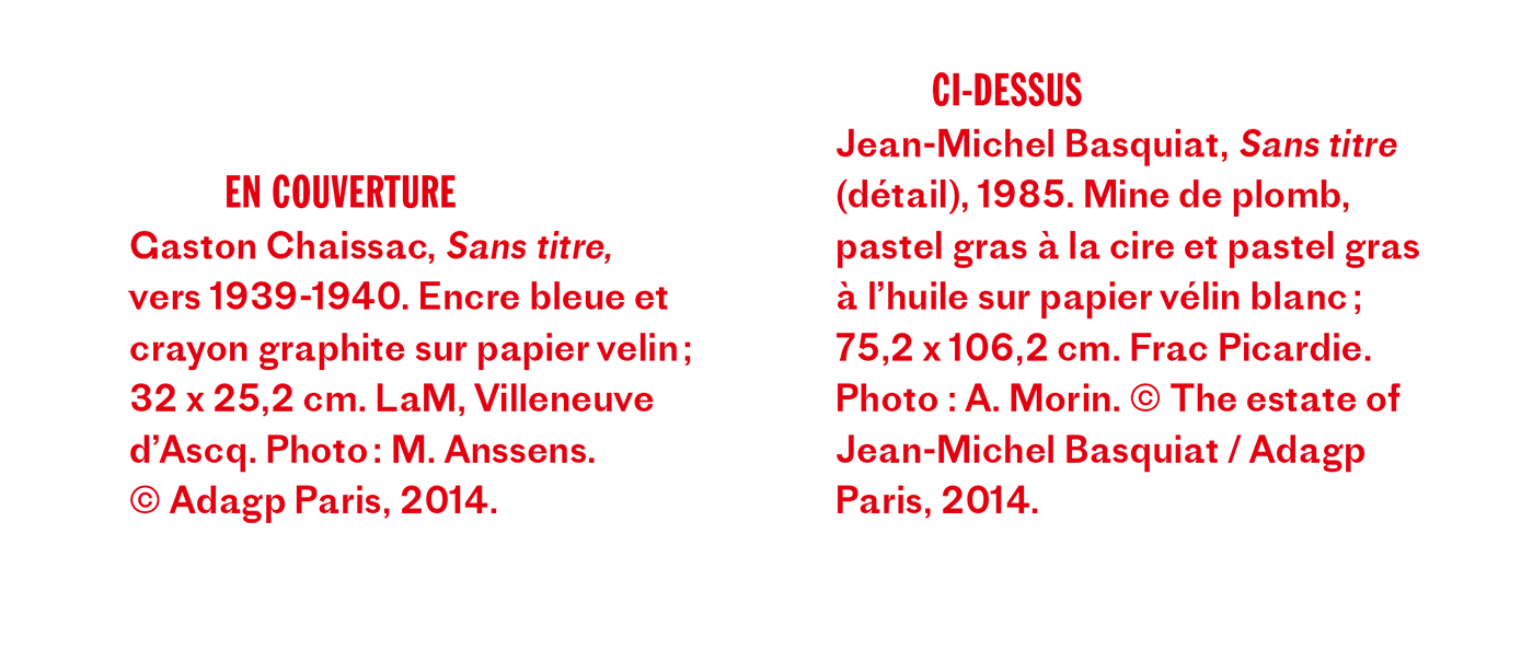
I’ve already described this font as quirky a few times, so there will be quite a few notes here. For starters, there’s no italics. The L’Autre de l’art exhibition work uses a forced italic for the artwork labels[17] that serves its purpose (note also the added tracking to aid legibility at small sizes), but I can’t help but wonder what a proper italic might look like for a typeface with this kind of character. You can also see the effect of the low x-height in this example as the numerals and capitals really jump out at you, to a degree that starts to hinder readability.

Nº17 fontsinuse.com — Proto Grotesk with artificial italics, the low x-height making the capitals look large in sentences. From branding for the L’Autre de l’art exhibition, by L’Atelier collectif.

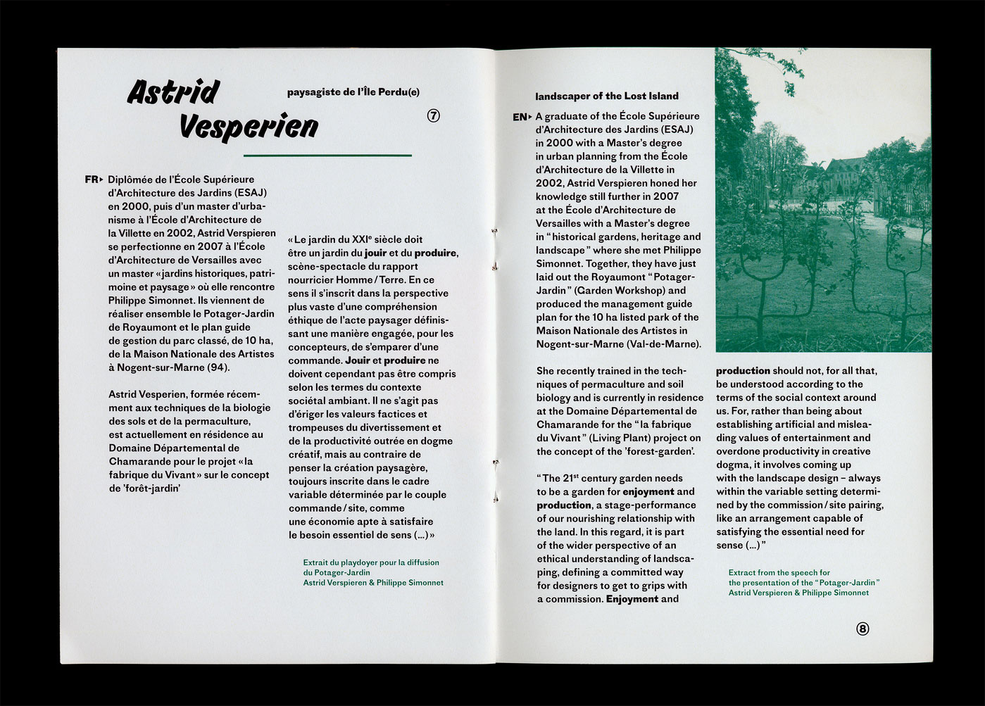
The previously mentioned low x-height and high contrast of Proto Grotesk make it an unconventional choice for body copy, through that hasn’t stopped people from using it in that way. Quentin Schmerber used is as the main typeface in an exhibition booklet for Gestations in Amiens, France[19]. Seeing it here in the Regular weight you realize just how heavy that weight is (I often find myself wishing that the Regular weight was a bit lighter and that there was another weight between Regular and Bold), and it lays a thick visual grey. But since the descenders are short it’s still usable in this situation, just make sure to add some tracking.

Nº18 fontsinuse.com — Proto Grotesk used in the exhibition booklet for Gestations, designed by Quentin Schmerber.
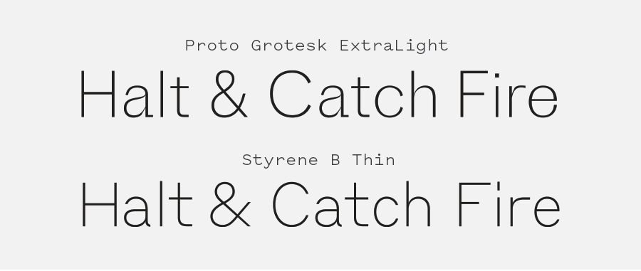
Proto Grotesk ExtraLight (top) compared to Styrene B Thin (bottom), showing the impact stroke contrast has in lighter typeface weights. Proto feels harsher and even at this scale some strokes are at risk of getting lost.
Nº19 Proto Grotesk ExtraLight (top) compared to Styrene B Thin (bottom), showing the impact stroke contrast has in lighter typeface weights. Proto feels harsher and even at this scale some strokes are at risk of getting lost.

The fact that there is still contrast in the lighter weights is unique. Usually as a typeface gets lights in weight it loses contrast, reducing down to a near mono-line, skeletal version. That’s not quite how Proto Grotesk is designed. The narrowing strokes along curves and bowls that are present in the heavier weights are still present in the lighter weights and give it a crisp, sharp and angular presence. Because of the retained contrast, be careful that those razor-thin details are still legible at whatever size you’re setting the ExtraLight weight in, as they make it more difficult to use them at smaller sizes.

The last note should be that this isn’t the easiest typeface to kern. There are a lot of eccentric characters that you have to massage in many situation and I find I have to do more adjustments when setting in all-caps than on many grotesque faces. The default letter-spacing is tight and the typeface really sings if you put in the effort to clean up any awkward gaps.

- FRJ