Ogg
— Designed by Lucas Sharp

dribbble.com — A detail showing the contrast between Ogg’s liquid forms and course brush textures. Designed by Ryan J. Hubbard.
Nº01 dribbble.com — A detail showing the contrast between Ogg’s liquid forms and course brush textures. Designed by Ryan J. Hubbard.

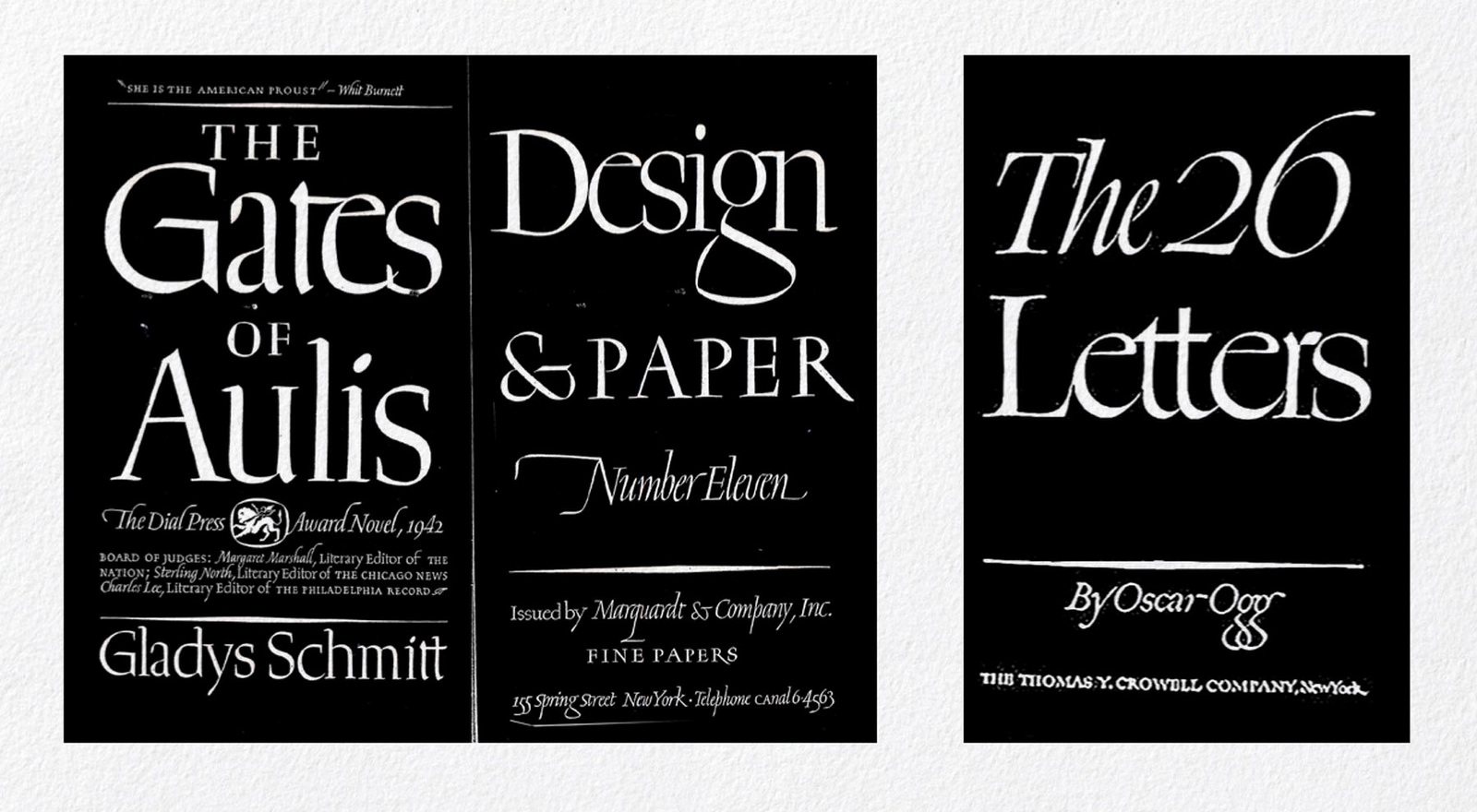
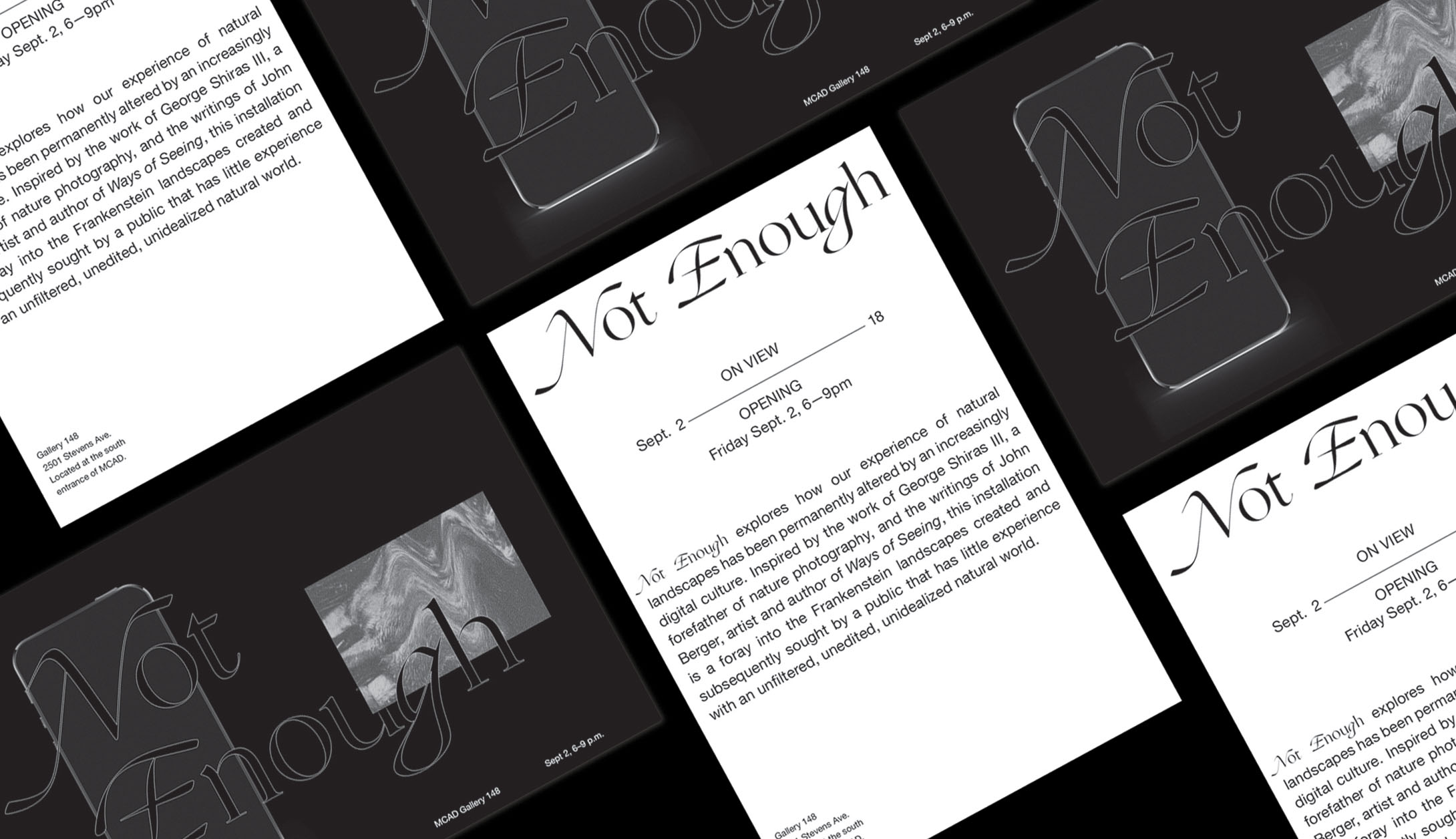
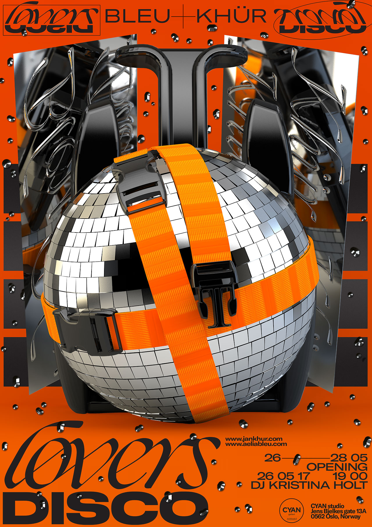
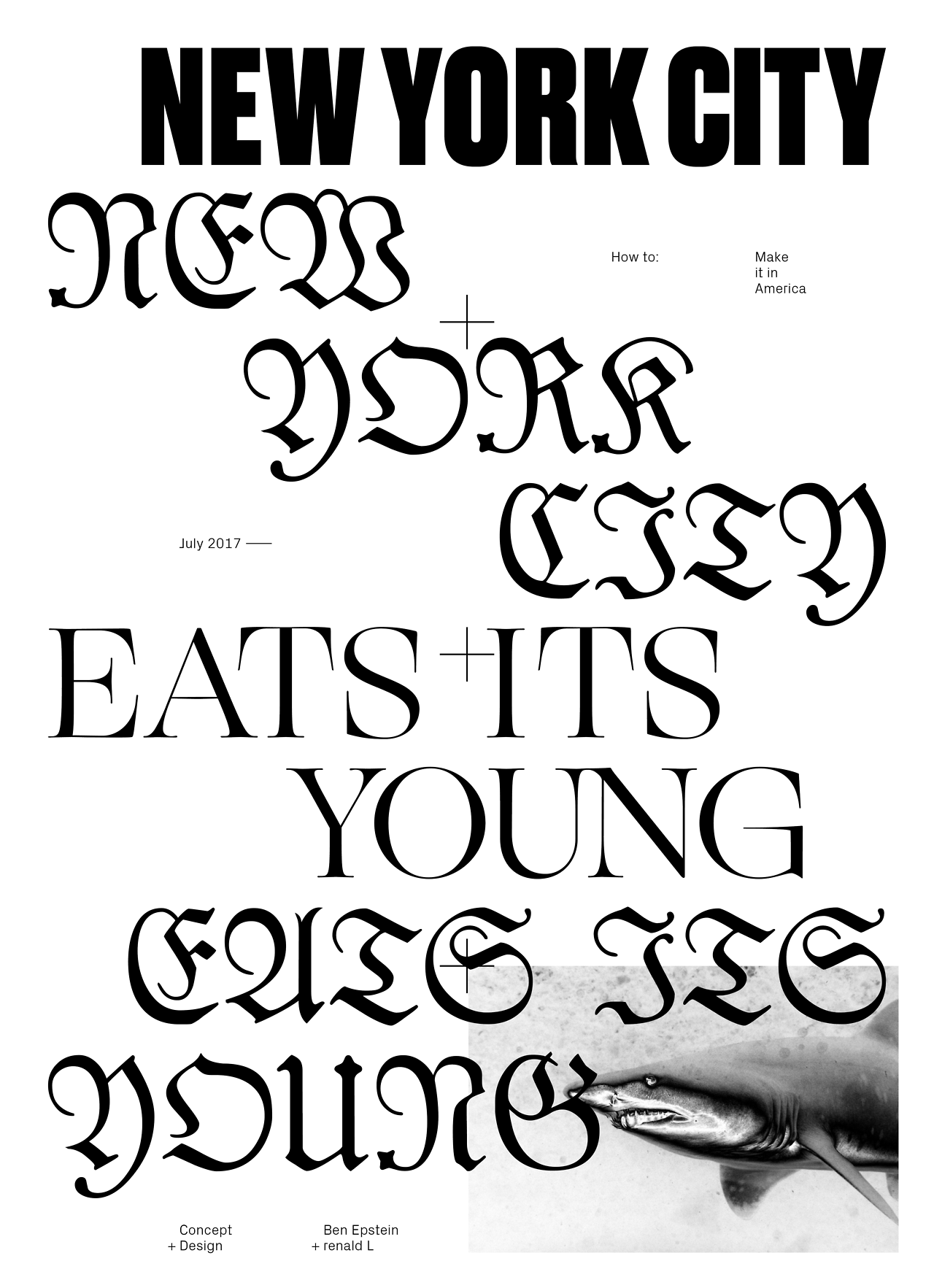
Ogg is a difficult typeface to ignore when you see it in use. It spiked my curiosity when I saw it on a few posters over the course of this year, and after identifying it with the help of the fine folks on the WhatTheFont Forum, I grabbed it for myself and started digging deeper.

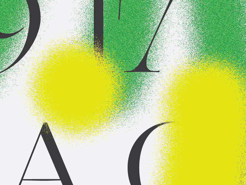
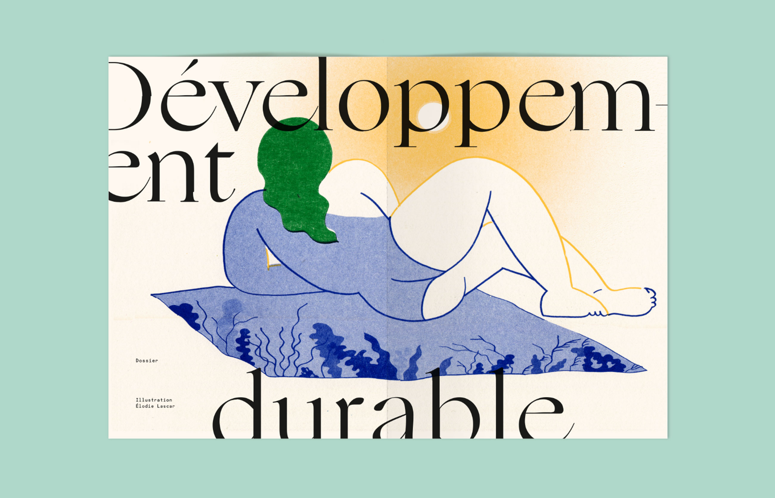
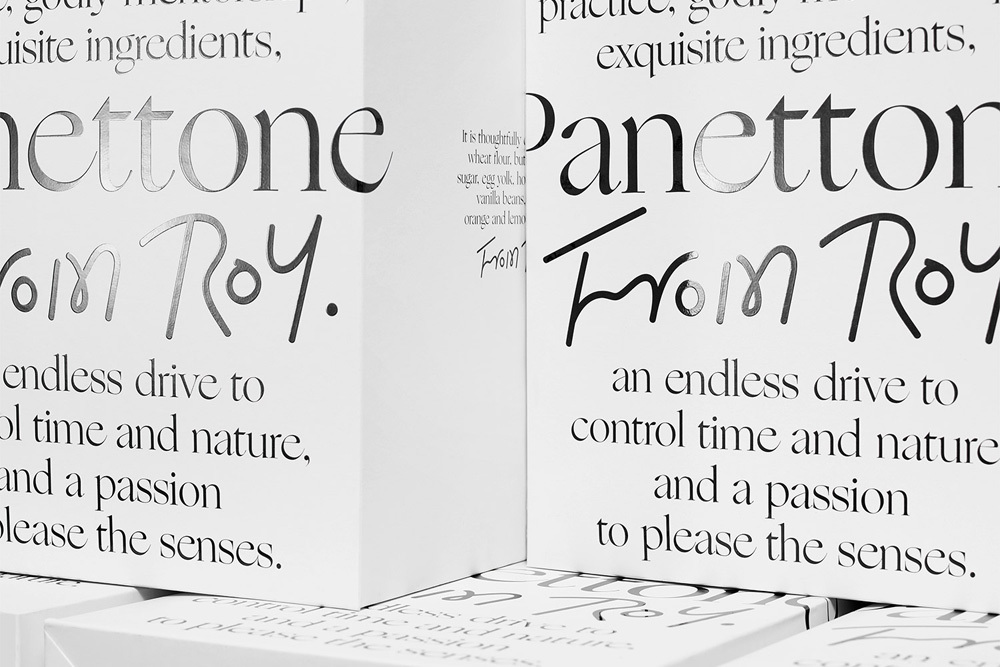
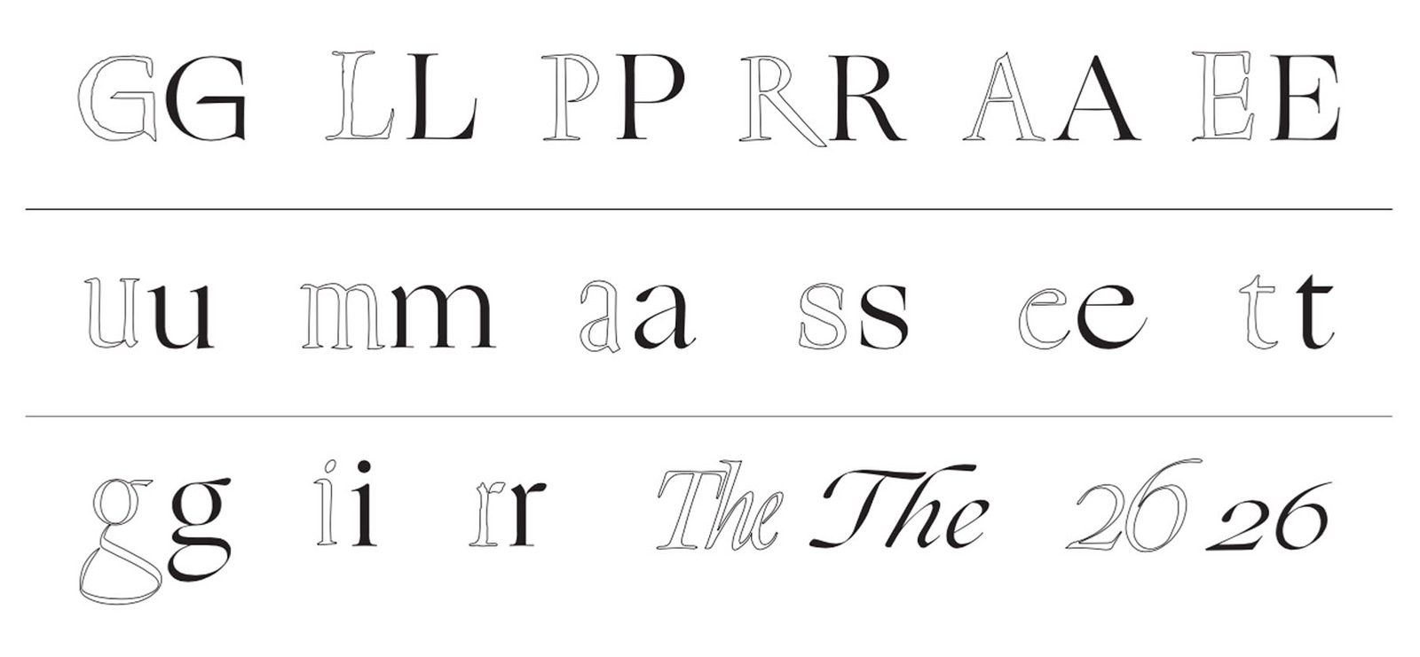
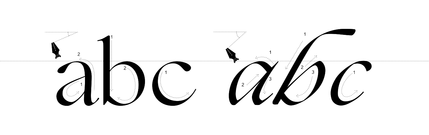
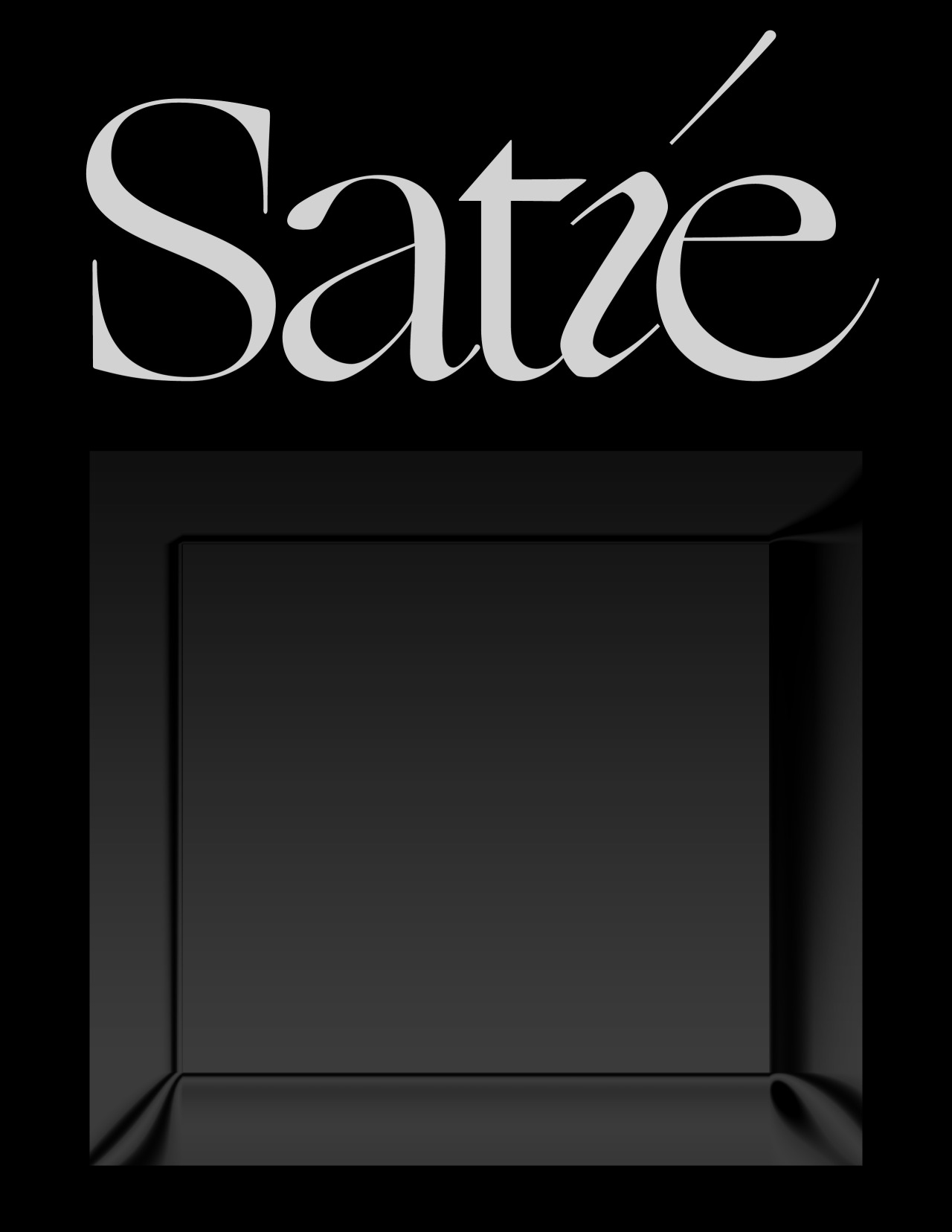
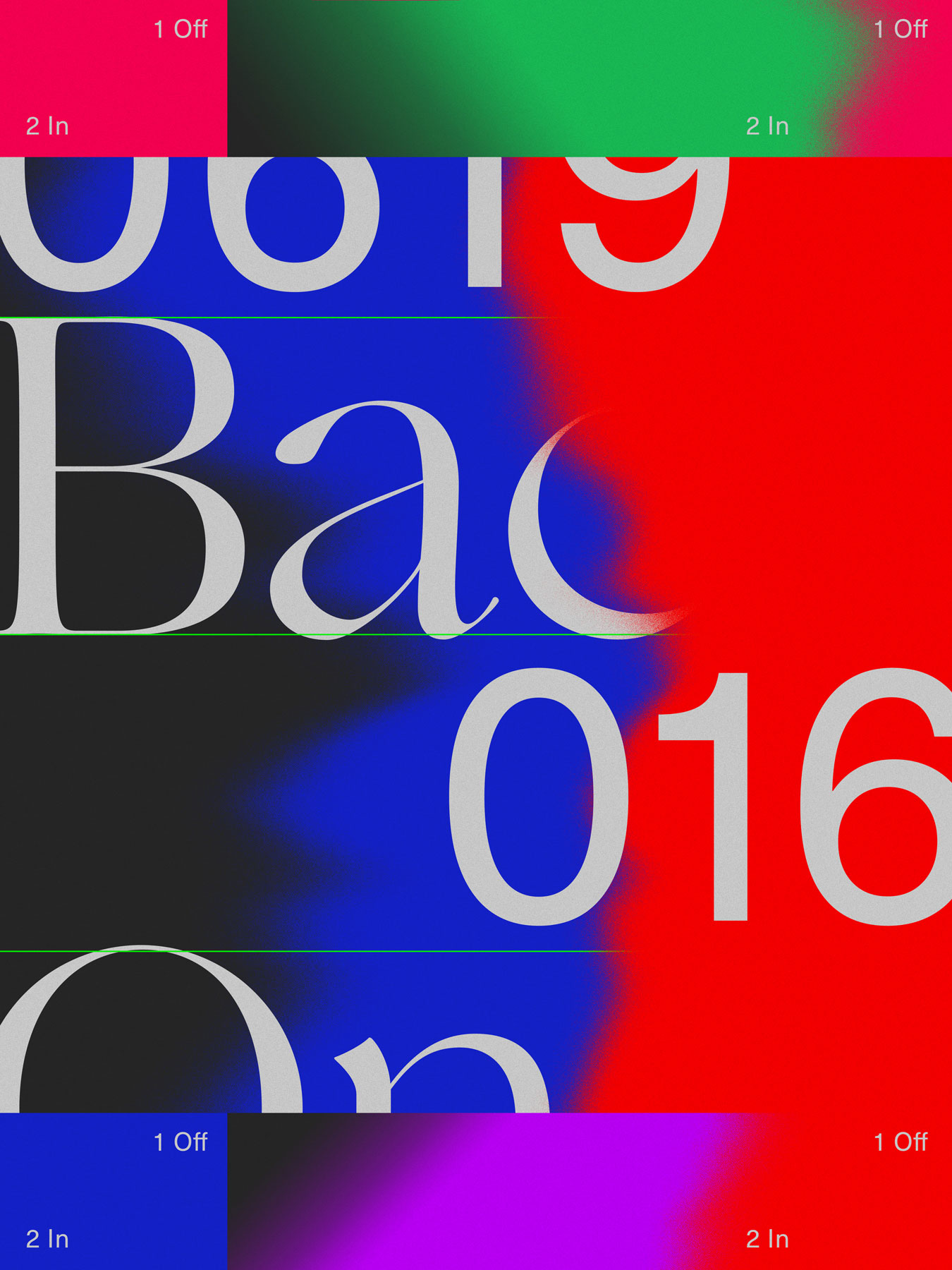
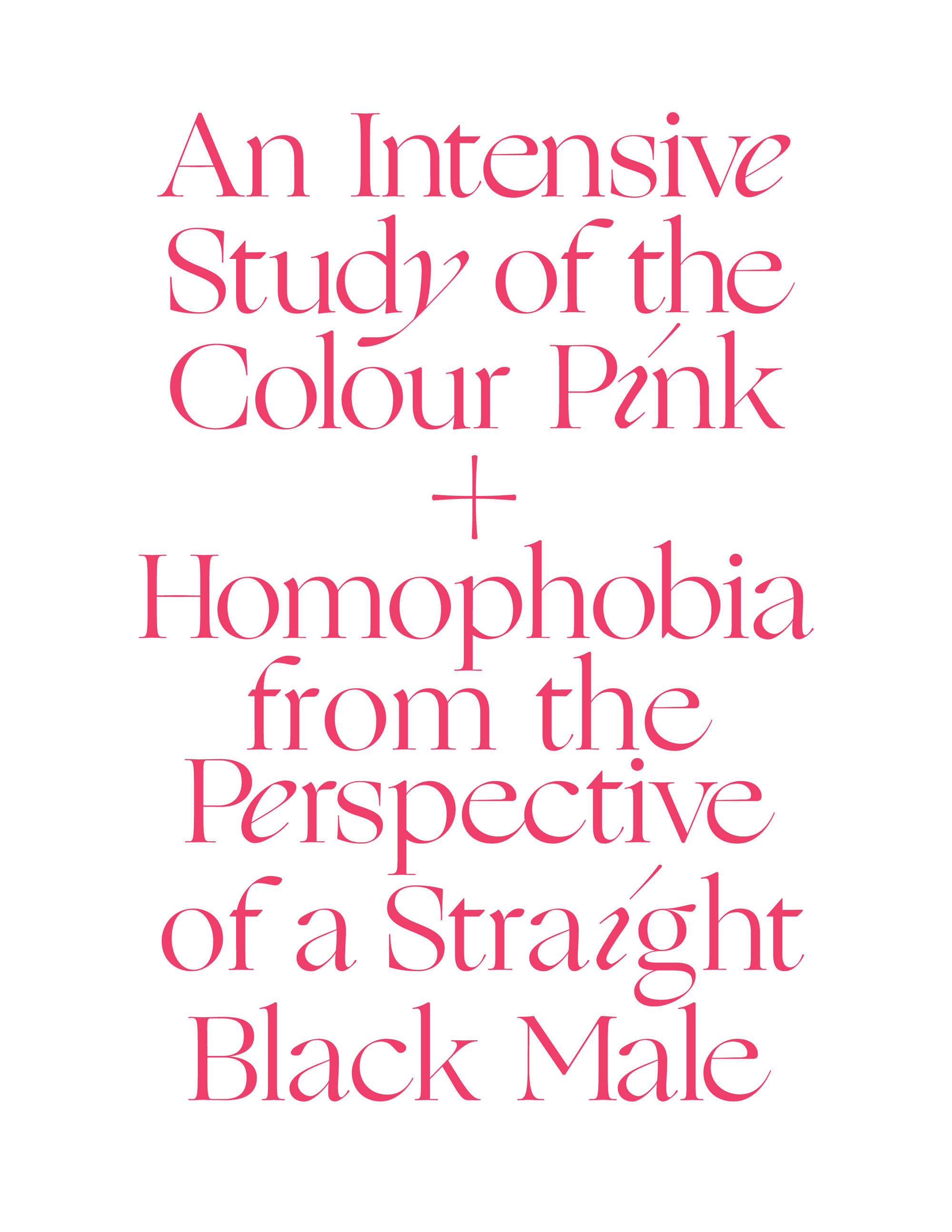
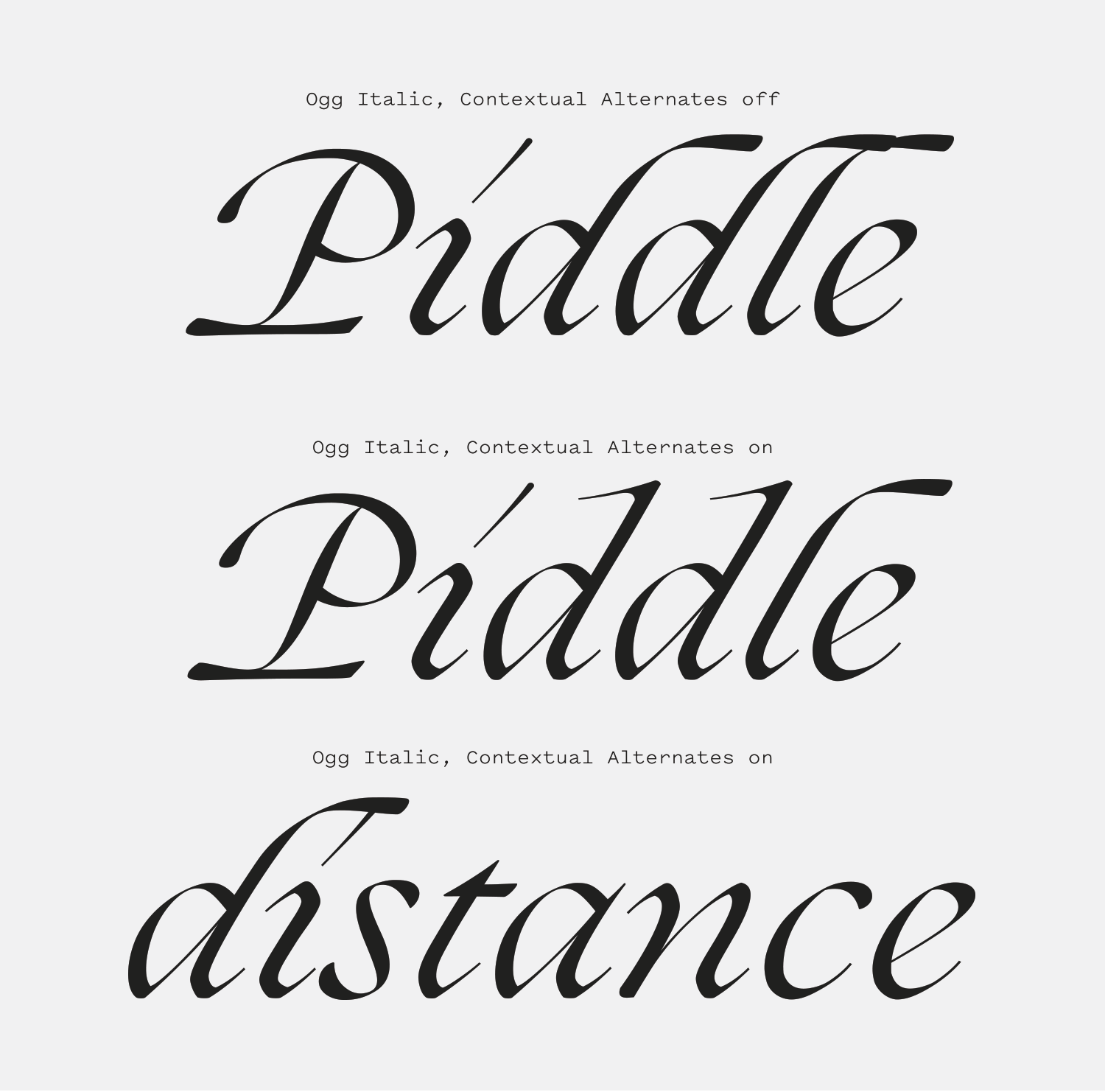
Ogg has svelt lines that thin to near-hairlines before swelling out into its ample brackets and wide serifs. Can brackets be luscious? Ogg has luscious brackets. It’s a typeface that looks like it is molting; that the hairline bones are sloughing off excess water that pools into the brackets and serifs at its ends. Ogg is a melding of calligraphy and serif type design and was directly inspired by the 20th century calligrapher Oscar Ogg. The more you see of Ogg, the more the calligraphic influence becomes clear. There’s the fattening of the stroke at the top of the “4” (see right column in the specimen above), or the concave shape at the top of the stems next the delicate serifs, made from the nib of an imaginary pen. Switching to the italic gives you a luxurious calligraphic script with extravagant capitals and swooping ascenders and descenders.

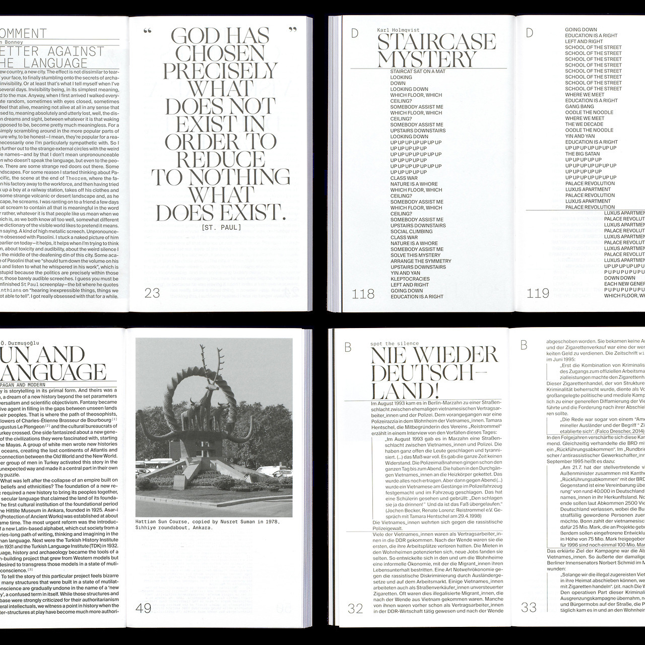
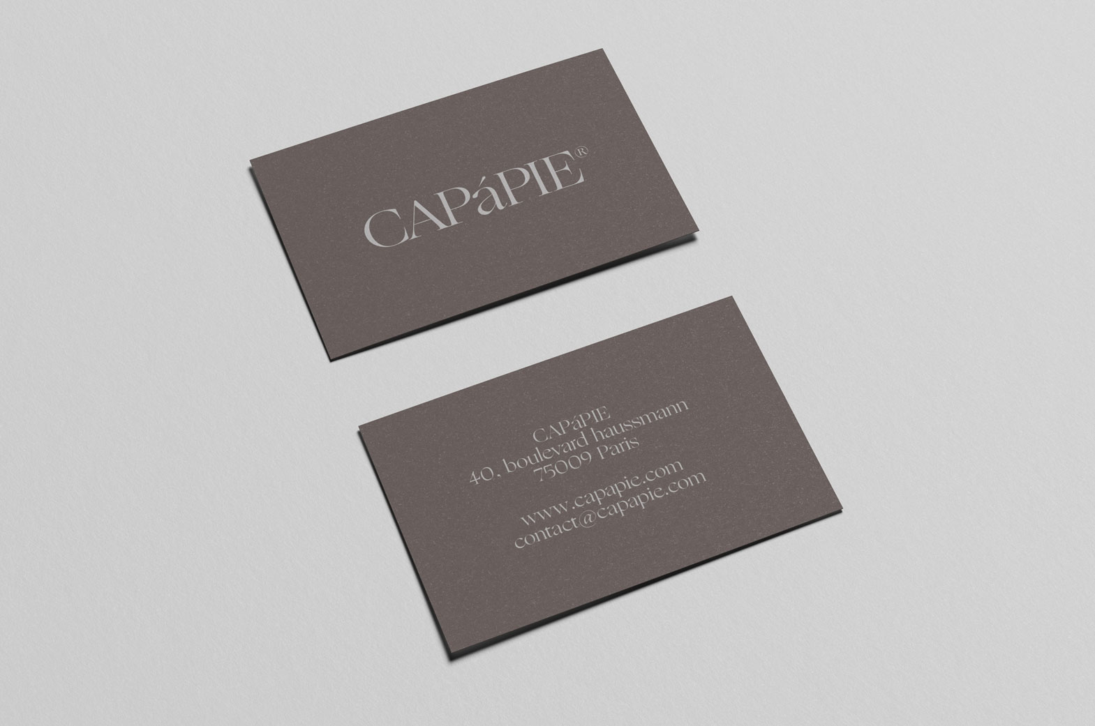
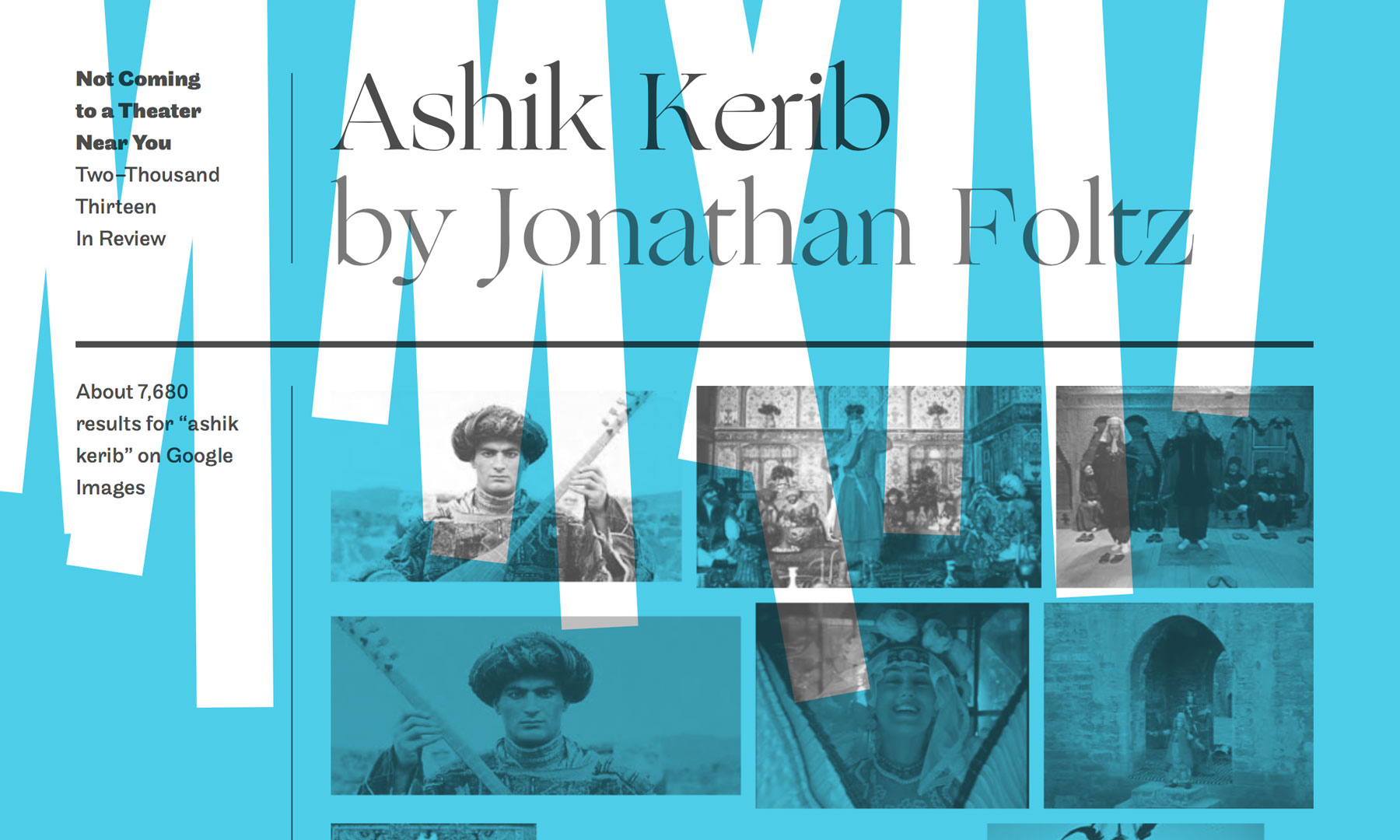
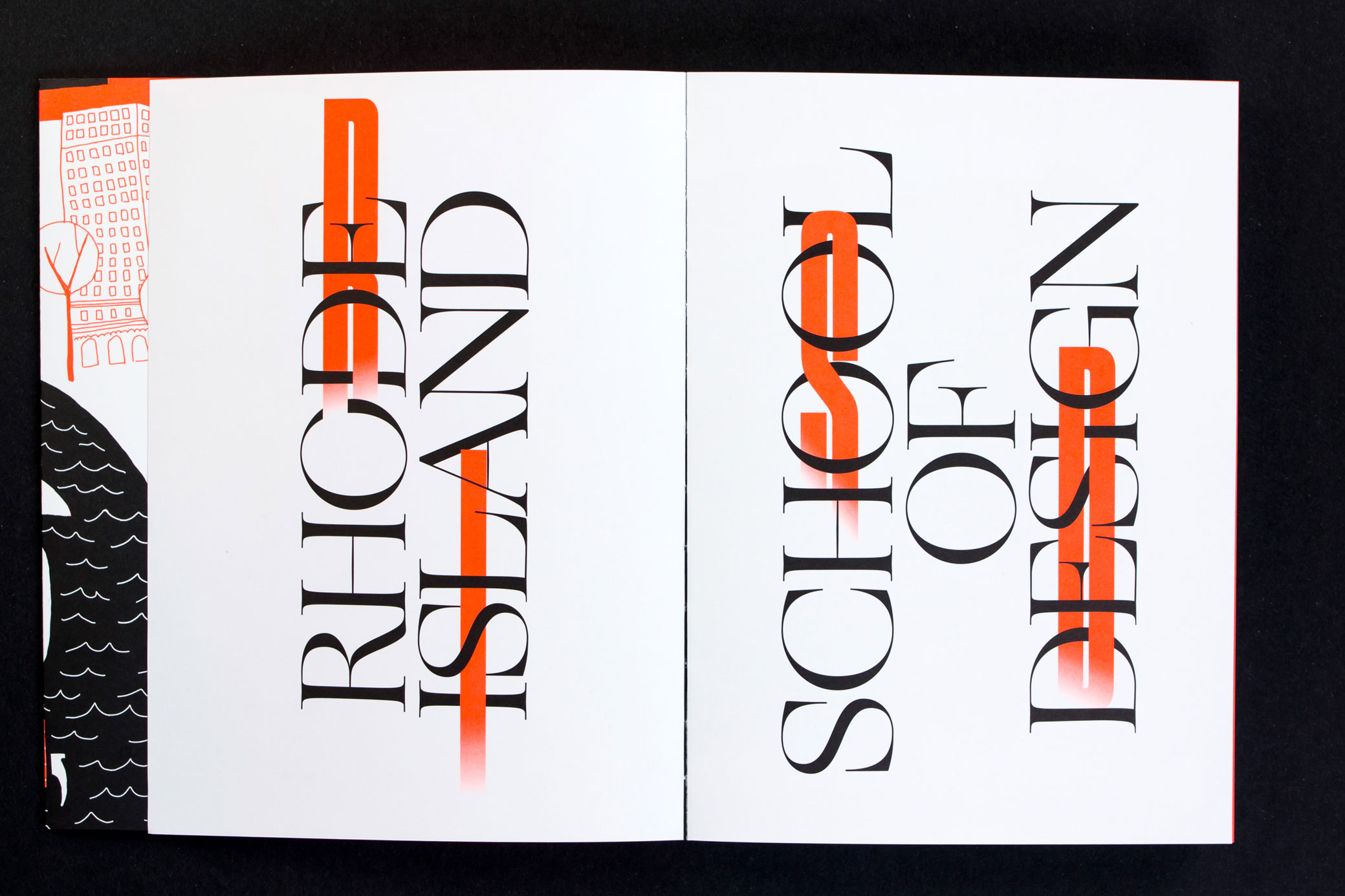
The merging of the two genres allows Ogg to have a formal presence while also feeling off-kilter enough to let it play alongside bolder and more aggressive typefaces. It has become a popular typeface for poster designs where it can contrast against wide grotesques and works extremely well when paired with illustration[2]. It’s a small family—just a single Roman and Italic weight—but has proven to be a versatile design that’s found use in a range of designs from posters, websites, and editorial work.

behance.net — A spread from W Magazine #1, art direction by Violaine & Jérémy.
Nº02 behance.net — A spread from W Magazine #1, art direction by Violaine & Jérémy.
Nº03 vllg.co — Examples of Oscar Ogg’s iconic book cover calligraphy.

Historic Influences

When you look at Oscar Ogg’s work you can clearly see the specific characteristics type designer Lucas Sharp was inspired by, and that Ogg himself was translating Old Style serif characteristics with his Roman calligraphy[3]. The “e” with its tiny bowl and massive lower half, ending out in front with a severe underbite is present in all 3 of Ogg’s covers. The Italic capital “N” and “T” have swashes that thrust out to the side, drawing your eye in. Oscar Ogg also mixed Italics and Romans in each of these lovely book covers Ogg designed, so Ogg the typeface owes more than just its name and design details to the calligrapher—it owes its construction as a family. It’s fascinating to see a calligrapher translate a movable type design into calligraphy, only to have those handmade designs transferred back to a typeface centuries later.

fontsinuse.com — Panettone packaging and branding by Base Design New York.
Nº04 fontsinuse.com — Panettone packaging and branding by Base Design New York.
Nº05 vllg.co — Tracings of Oscar Ogg’s original calligraphy compared to the final Ogg designs by Lucas Sharp.

Sharp’s interpretation retains much of the charms of Ogg’s lettering while refining it and making it repeatable and consistent. To do this without stripping the character out of the designs is a massive feat, and I think Sharp was successful in his efforts. Ogg is very easy to use despite how flagrant it is, and the contextual alternates smartly help typographers avoid dicey collisions with the more expressive letterforms.

Nº06 offshorestudio.ch — Ogg used in all-caps for headlines in the first issue of Klassensprachen, designed by Offshore Studio.
typewolf.com — OTHER studio’s website, mixing Ogg with the Maison family.
Nº07 typewolf.com — OTHER studio’s website, mixing Ogg with the Maison family.

His interpretation of the “e” is a brilliant summation of Sharp’s overall strategy in translating the calligraphy. The proportions were widened and the x-height balanced, the bowl still cramped in the upper half of the circular shape of the letter while having a larger counter to aid legibility and to prevent it from becoming a caricature. When you step back and look at the rest of his drawings compared to tracings of Ogg’s originals, you’ll see the same kind of adjustments made again and again[5]. These tweaks are all in service of the proportions of the typeface to ensure it is pleasant and evenly paced and every effort is made to give the font large counters and breath air into the design, giving the letters a more inviting presence.

Nº08 Ogg (top) compared to Quarto (bottom). Ogg’s design reflects a more relaxed interpretation of Old Style characteristics.

Another way to really appreciate the hand-drawn influences in Ogg is to compare it to an Old Style serif[8]. We’ll use Quarto, designed by Colin M. Ford, Jonathan Hoefler and Sara Soskolne and based on Hendrik van den Keere’s 16th century design Two-Line Double Pica Roman (I think we’ve gotten a bit better at naming typefaces over the centuries, eh?). Quarto’s vertical strokes are heavier, even in its Light weight, there are more sharp edges in the heads of stems and the way characters like the “t” end in a point at the bottom (note the subtle bulge at the bottom of the “t” in Ogg, implying the naturalistic finish of a pen stroke) , and the brackets are just a little more subtle. There’s also much more emphasis in the shoulders compared to Ogg, which slivers off on those curves instead of thickening like an Old Style serif would. Ogg stands apart with its wide stance, calligraphic details, smoothed edges and exaggerated proportions. The quirks from the original calligraphy that Sharp retained make the font feel more naturalistic and expressive than something as classical and buttoned-up at Quarto.

Nº09 sharptype.co — Diagram illustrating the stroke structure of Ogg, as well as the pen angle shift between the Roman and Italic.
tumblr.com — Ogg’s Roman and Italic used in a moody poster design by Eric Hu.
Nº10 tumblr.com — Ogg’s Roman and Italic used in a moody poster design by Eric Hu.

I wish I knew more about calligraphy so I could communicate those aspects of the design more clearly, particularly about the Italic version of the font. I did find this diagram[9] helpful in showing how the strokes of the Roman and Italic characters of Ogg would be drawn by a pen, and how the angle the pen is held affects the stress of both the Roman and Italic letterforms.

Nº11 ryanjhubbard.com — A poster design mixing Ogg with bright colors and course brush textures. Designed by Ryan J. Hubbard.
www.hongkiat.com — An Apple computer ad from the 1980’s using a classic serif to convey professionalism and warmth.
Nº12 www.hongkiat.com — An Apple computer ad from the 1980’s using a classic serif to convey professionalism and warmth.

Ogg’s strengths

I first noticed Ogg in use on several poster designs by Ryan J. Hubbard. Earlier I described Ogg as having a “liquid” nature, and perhaps that is why it looks so striking next to the noisy brushwork Hubbard is using on this series of posters. One is static-y and the other looks like mercury. Both ephemeral, but with different textures and manifestations. This was also the first place I noticed the trend of pairing Ogg with sans-serif faces (particularly Grotesques), bright colors and abstract imagery—contrasting artificial-feeling designs against the dual personalities of Old Style and calligraphy present in Ogg.

Nº13 krstnklkv.tumblr.com — A poster design by Kristyna Kulikova using Ogg at large scale and with 3D rendered imagery.
behance.net — CAPáPIE branding by Signe Dejgaard Jensen.
Nº14 behance.net — CAPáPIE branding by Signe Dejgaard Jensen.

I think a few factors have contributed to the trend of using Ogg in this aesthetic. Ogg resembles some of the classic serif designs used in the 80’s in tech advertisements by companies looking to make computers seem warmer and more approachable to consumers who had never used one before[12]. Since many of these posters draw heavily from 80’s-style coloring and use vague, abstract or 3D rendered textures and shapes that are difficult to immediately relate to, the choice of a similar but not too on-the-nose typeface makes sense. These posters need the warmth in their messaging in the same way early computers did. I think Ogg excels in these designs because it’s referential to all of these earlier designs but is “loose”(due to the calligraphic influences) and doesn’t feel self-serious or stodgy while still being classically beautiful. The wider proportions and smooth brackets reduce the impact of the vertical stress in the design, giving it a more relaxed feeling compared to Old Style or Modern serifs and evening the tone enough that it can pair against lower-contrast sans-serif fonts.

Nº15 notcoming.com — Ogg used on the Not Coming best of 2013 website, paired with a similarly personable sans, Maple.

In direct contrast with these more “punk” stylings, Ogg is also often used in formal presentations where it is asked to be quiet and refined[14]. These are the use cases it was likely designed for and it certainly does the job well. Ogg is a lush design and can hold its own in simple designs and feels right at home when paired with soft colors, lux materials and fancy printing techniques. It makes a great alternative to Modern-style serifs for designers who want something that feels editorial and fashionable but a little less stiff.

One particular example I love that pairs Ogg with muted colors is the branding Dum Dum studio did for the cosmetic brand Alxima, based out of Mexico[16]. The soft pastels and the light touch of Ogg give it a calm visual tone, and Ogg pairs well with Founders Grotesk as the secondary face. While a geometric sans like Proxima Nova might be the more expected choice for a clean, luxury look in a brand like this, Founders shares some of the same slightly unexpected quirks and irregularities of Ogg. The use of Pitch as a tertiary typewriter face adds to the tactile feeling that Ogg establishes and is supported by the loose, hand-drawn illustrations. It’s a smart design system, from color, to imagery and typography.

dumdum.mx — Ogg’s calligraphic roots allow it to work well alongside hand-drawn sketches in the Alximia branding work by Dum Dum.
Nº16 dumdum.mx — Ogg’s calligraphic roots allow it to work well alongside hand-drawn sketches in the Alximia branding work by Dum Dum.
krstnklkv.tumblr.com — A poster design by Kristyna Kulikova that contrasts Ogg and naturalistic imagery with Grotesque type.
Nº17 krstnklkv.tumblr.com — A poster design by Kristyna Kulikova that contrasts Ogg and naturalistic imagery with Grotesque type.

Ogg looks fantastic at large scale where it is often used to contrast with heavier Grotesque sans-serif faces. The organic, lightweight and svelte forms of Ogg show off all their smooth curves at big sizes, and they can stand in stark contrast to the heavier and less naturalistic forms in Grotesque faces. I was struck by this spread in the RISD 2016 yearbook which threads Druk through the wide-open lines of Ogg, which has the effect of making Ogg feel like a natural growth that’s growing along and intertwining through a lattice[18]. It’s a wonderful example of the natural vs. artificial push and pull that’s so often present in designs that use Ogg.

Nº18 behance.net — Ogg intertwining with Druk in a clever play of scale and organic vs man-made in the RISD 2016 yearbook. Design by Jon Rinker and Barron Webster.
renaldl.com — Renald Louissaint combined Ogg’s Roman and Italic in his explorations around the color pink and homophobia.
Nº19 renaldl.com — Renald Louissaint combined Ogg’s Roman and Italic in his explorations around the color pink and homophobia.

I can’t finish this section without addressing Ogg’s Italic. Its extravagant capitals and sharply tilted lowercase set give it significantly more dramatic flair than the Roman design. It’s a very formal calligraphic design that works well in the expected use cases of invitations and the like, but I’ve see it used in surprising ways as well. Joe Letchford mixed Ogg’s Roman and Italic in the same line for his Not Enough exhibition while studying at the Minneapolis College of Art and Design[20]. The exhibition focuses on how digital technology has altered our experiences of natural landscapes, so the insertion of the Italic “N”, “E” and “g” into the Roman string mimics the effect of something being imposed or distorted. This same interchanging of Roman and Italic Ogg was used by Renald Louissaint in his intensive study of the colour pink and homophobia from the perspective of a straight black male[19].

Nº20 joeletchford.com — Joe Letchford’s Not Enough exhibition branding, combining Ogg’s Roman and Italic.
krstnklkv.tumblr.com — Kristyna Kulikova makes a clever alteration to connect the strokes of Ogg Italic and create a ribbon effect.
Nº21 krstnklkv.tumblr.com — Kristyna Kulikova makes a clever alteration to connect the strokes of Ogg Italic and create a ribbon effect.

Ogg’s Italic has a looping, ribbon-like quality to it, and this poster design by Kristyna Kulikova makes an alteration to the letterforms that amplifies that ribbon aesthetic: she connects the letterforms of “lov” by extending the serifs and creates a lacing effect[20]. The letterforms feel intertwined and a part of one single, rhythmic stroke. It’s a clever way to push the aesthetic of the typeface’s design from formal to experimental.

Nº22 fontsinuse.com — Menu for the 12 Essentials student exhibition from the Lahti Institute of Design in Finland, using the italic in a formal way (though without the contextual alternates activated).
joeletchford.com — Ogg used in Joe Letchford’s thesis, Disconnection: A Reality.
Nº23 joeletchford.com — Ogg used in Joe Letchford’s thesis, Disconnection: A Reality.

Quirks and eccentricities

Ogg’s lack of alternate weights give it a singular style and limit your flexibility as a designer to give it your own twist. Since there are only two ways to use Ogg, it’s automatically more at risk of becoming overly familiar to an audience. However, I have been genuinely surprised by many of the ways I have seen designers use the family so far, from the aesthetics its used in, the smart alterations people make to it, or the scale they set it in. There’s something to be said for limiting your typographic tools and stretching their individual utility to the limit, and this review is full of diverse examples that use just two styles of a font go a very long way.

Ogg has a dramatically different presence in italics vs. the roman, and even in all-caps vs. uppers and lowers. In all caps, the Roman is dramatic and some mixture of imposing and formal. If a Christopher Lee-style vampire existed and needed a letterhead, you’d have to consider using the “fang-y” Ogg in all-caps for that design. By contrast, the italics are a rush of whirling ribbons, something Dracula might find trite and abhorrent. Get comfortable with both versions and know that just because the Roman works for your project, it doesn’t mean the Italic will, and vice-versa.

renaldl.com — Ogg used in a poster combined with a Blackletter typeface, designed by Renald Louissaint.
Nº24 renaldl.com — Ogg used in a poster combined with a Blackletter typeface, designed by Renald Louissaint.
Nº25 An example showing Ogg with contextual alternates off (top), on (middle) and on, but not preventing a glyph collision (bottom).

Ogg has contextual alternates that do a pretty good job of avoiding tricky collisions with the swashes and more ornate characters, but they aren’t foolproof. Characters like the “b”, “d”, “h” and “k” have stems that wilt to the right and can bump into other characters, and the contextual alternates catch most of these and will replace them with alternative that terminate sooner and cut back to the left instead. But sometimes things like the “di” combination happen that the contextual alternates won’t automatically fix. You can repair the problem yourself but simply manually swapping in the alternate with the shorter stem.

In conclusion, Ogg is a well-made and well-priced design that’s seen a rush of popularity amongst younger designers who value its price point and unique characteristics. As I’ve spent more time with it, I’ve been surprised by how often I find myself realizing that few things other than Ogg are going to get me the light, dramatic touch I often want in serif form without being harsh and jagged. It very nicely fills a need I didn’t know I had, and it seems a lot of other designers feel the same way.

- FRJ