Melany Lane
— Designed by Ryan Martinson

The LeTigre wordmark, making use of Melany Lane.
Nº01 The LeTigre wordmark, making use of Melany Lane.

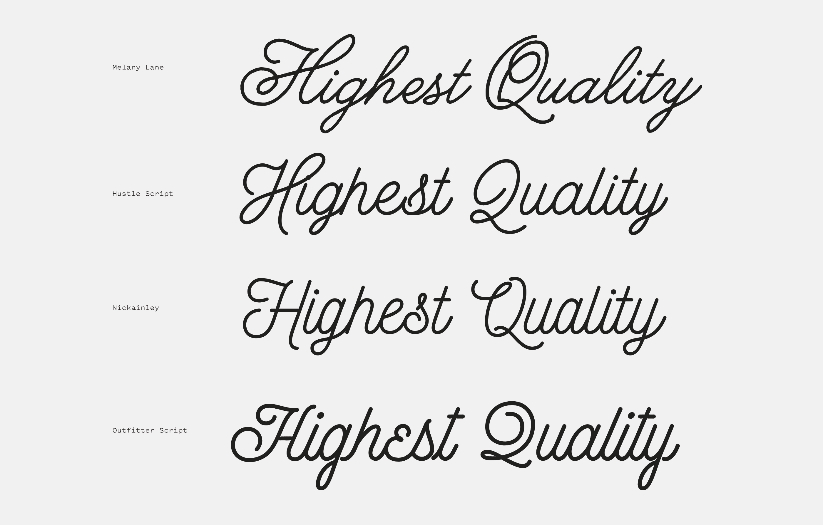
I can barely sign my own name. Because of this, I spend a lot of time seeking out script fonts to supplement my vintage-inspired designs when I imagine most of my cohorts are capable of creating these letterforms on their own. However, if I didn’t have this handicap, I doubt I would have stumbled across Melany Lane, a really beautiful and flexible script face.

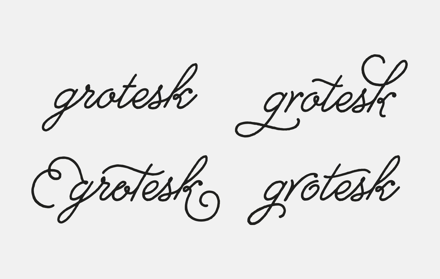
There are a lot of script typefaces coming out at this point, most of them brush-y, textured and full of flourishes; tailor made for wedding invitations and the like. Melany Lane fits that bill, but I think there’s more to it than that. The Regular weight is a mono-line script with a lowercase set that has some charming character to it and a set of large swooping capitals that can dramatically change the voice of the text. But what makes this more than just another display script is the obscene number of alternates available for nearly every character. There is exponential variety in how you could choose to set a word, making it ideal for short words and phrases where you can get extremely specific about how you want the letters to connect to each other, what flourishes should appear where, and which characters should be the stars.

Melany Lane compared to other monoline script fonts.
Nº02 Melany Lane compared to other monoline script fonts.

Design Details

There are 2 weights of Melany Lane but I will be focusing on the Regular weight, which is the one I have experience with and the one I find the most interesting. At its Regular weight, Melany Lane is a mono-line cursive script with interconnecting letterforms, a subtle roughened texture and a very low x-height. The heavier weight drifts into the calligraphic “wedding font” aesthetic which I am not as familiar with, so we’ll skip it for this review.

There are several popular methods for teaching cursive lettering, and I see a lot of the Palmer Method[3] in Melany Lane’s design. The loop at the start of the “Y”, the oversized capitals and short lowercase characters are all hallmarks of the Palmer Method, though the connections are much narrower and tighter in Melany Lane and the individual characters are more distinct.

Nº03 wikipedia.org — The Palmer Method alphabet, from The Palmer Method of Business Writing, 1901.

I don’t do this for every review, but in this case I’m not sure you can get the full picture of what makes Melany Lane interesting without comparing it to other typefaces in the same genre[2]. By studying the example above we can start to see where Melany Lane carves its niche: It’s got a more aggressive forward slant than many of these scripts, the capitals are large, detailed and expressive, and it also more closely mimics cursive handwriting rather than the modified mono-line scripts that are in fashion right now, which mix traditional cursive letterforms with other styles of script letter construction (note the “e” in Outfitter Script, and the unlooped stems in the “h” and “l’s” in most of the other script faces). The x-height is considerably lower, which gives the ornate capitals more prominence in the design, and the connections and flow between the letterforms feels more natural. The characters feel proportional to one another and flow into one another gracefully unlike several of the other examples, where certain transitions feel forced and have letterforms that awkwardly overlap and bump into each other.

Nº04 wikipedia.org — Sample writing from The Palmer Method of Business Writing, 1901.

It’s really nice to see connections like the “ty” that mimic the flow of a pen. Melany Lane feels surprisingly effortless considering how involved some of the letterforms can be, which allows it to feel rich without devolving into fussiness. You will rarely type a line with the default characters that will cause collisions or strained connections, and that’s incredibly valuable (and rare) in a script font.

Melany Lane in use in the Le Tigre branding.
Nº05 Melany Lane in use in the Le Tigre branding.
All possible alternates for the “a” character in Melany Lane.
Nº06 All possible alternates for the “a” character in Melany Lane.

Melany Lane strengths

When used in all lowercase, Melany Lane is a quite legible cursive typeface, and can feel controlled and restrained. As mentioned before, it’s remarkably well-made, and you can count on it to give you a clean line of thoughtfully connected letters without any extra work on your part. If you hunt through the glyph palette of this font you will find a stunning number of ligatures made to accommodate tricky pairings of letterforms and to try to prevent any doubling of the exact same drawing of a character back-to-back. You can make the font feel quite naturalistic and bespoke if you wish; there are quiet, subtle alternates to go alongside the more extravagant versions[6].

Nº07 Four examples of the same word using different glyph combinations in Melany Lane. Top left is using defaults.

It’s when you get into the massive number of alternates and the giant, looping capitals that things get gaudy, and that can be an advantage or disadvantage, depending on your use case. Clearly, many of the swashes and looping details were meant to be used on things where extra flourish is expected. Some of them have caused me to laugh out loud with how over the top they are, going far beyond what a cursive hand or calligraphic technique would guide you towards creating[7]. Choosing to use these swooping versions of the characters means working a little harder to keep the balance of the line and making sure that your swash elements don’t cramp or overlap each other. There’s certainly a real art to using more than one or two of these “hero” alternates in the same word.

Nº08 mamas-sauce.com — Constellation poster series designed by Jen Pepper.

There is a fantastical element to this typeface when you mix the upper and lowercase letters and that’s certainly why it’s proven popular on wedding invites. Designer Jen Pepper takes advantage of the fantasy of the font in her series of posters which illustrate several constellations named after animals[8]. Melany Lane is used for the Latin names of the constellations, and the looping, unbound nature of the font plays nicely with the astronomy theme.

Nº09 jfletcherdesign.com — The Charleston Gourmet Burger Company logo, designed by Jay Fletcher.

I’ve also seen Melany Lane used in more down-to-earth aesthetics, like Jay Fletcher’s work for the Charleston Gourmet Burger Company[9]. Fletcher mixes Melany Lane against a geometric sans and controls the letterforms so they appear bespoke but practical. He altered the “G” to be slightly more restrained and cleverly created a loop on the “t” to encase the “co.” on the line below. In this use-case, Melany Lane feels like a manicured vine intertwining the other elements of the design. It feels very naturalistic and effortless here, and I hope more designers start to use it in this fashion.

Quirks and eccentricities

The unique designs of the capital letters will make or break the font in most situations. If you need capitals in your design but the Melany Lane glyphs are too detailed, personable or proportionally large compared to the lowercase set, you’ll have to find other solutions, like drawing your own. There are a few tame capitals in the set, and one trick I’ll share with you from my own experience is that many of the more insane flourishes start to resemble letterforms in their own right. I’ve used this to get around the “E” in Melany Lane, which I find to be overly fussy and awkwardly designed[10].

Nº10 You can use some of the extravagant flourishes in Melany Lane as letters in their own right. The swash on this “e” resembles a capital “E”, tricking the eye into thinking it’s an “Ee” ligature.

In the example above, the top row shows the default “E”, and the next glyph is an “e” with an extravagent swash next to it that just so happens to look exactly like an “E”. So, I’ve used that “e” in the front of “Eephus” to give the same effect as typing the company name even though it’s actually just “ephus”. You can see the string below using this trick and the default “L”, which is similarly muted. I wish there were more toned-down capitals so the typeface could go this casual more consistently.

As you start adding in alternates you can very easily create what appears to be a warped baseline (look at the “hump” in the two examples in the right column in the “grotesk” examples above[4]) so you will have to take care to use characters that still hold that line level, or the font is going to start looking unpolished and frantic.

- FRJ