Founders Grotesk
— Designed by Kris Sowersby

klim.co.nz — A slightly modified Founders Grotesk is used for branding for the Wellington City Gallery. Designed by Designworks.
Nº01 klim.co.nz — A slightly modified Founders Grotesk is used for branding for the Wellington City Gallery. Designed by Designworks.

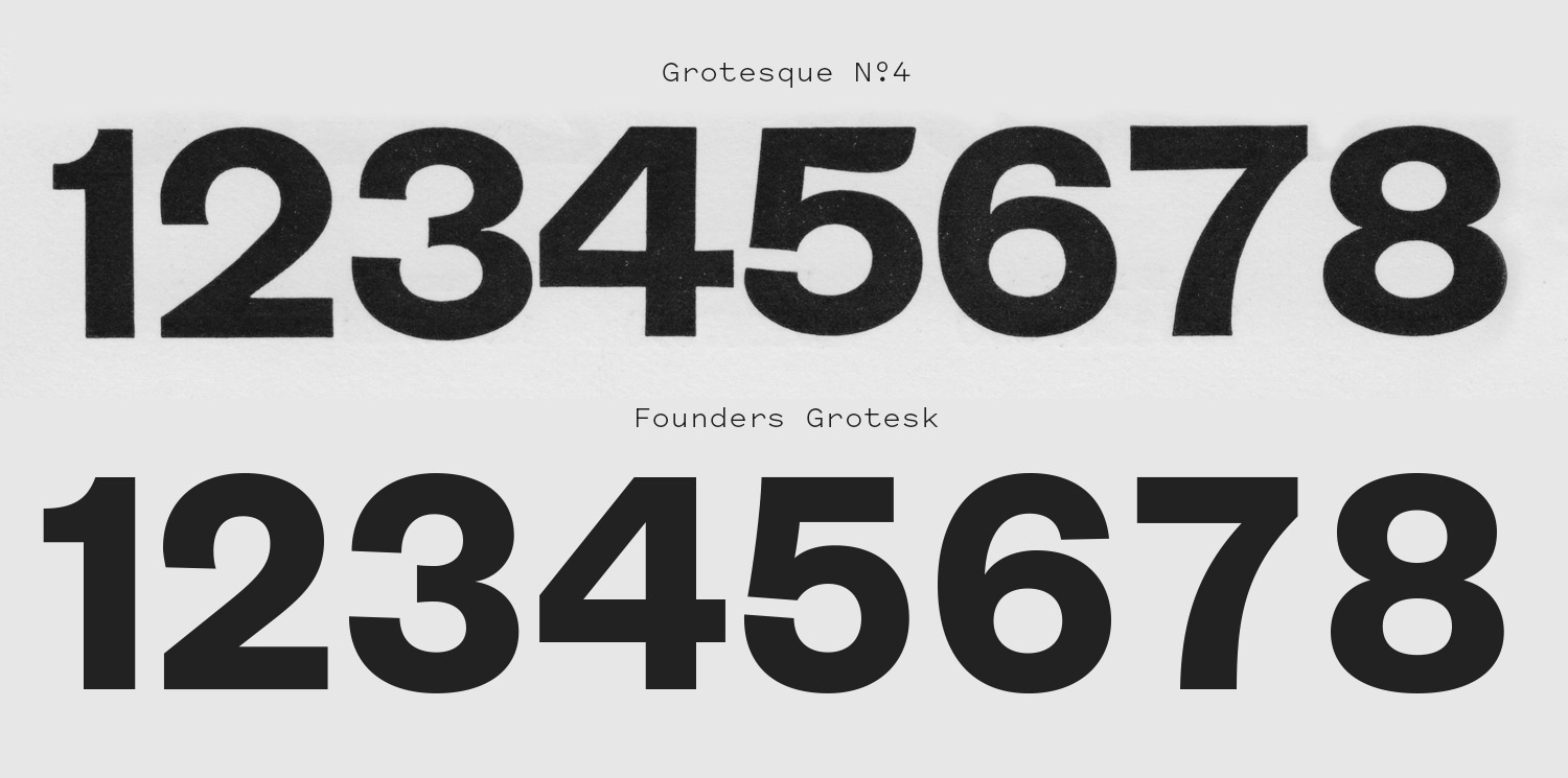
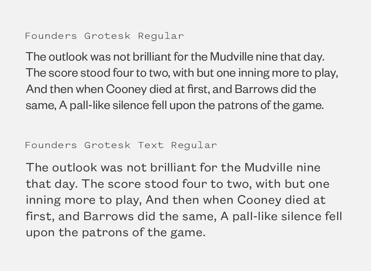
Founders Grotesk is probably the prettiest Grotesque face I’ve had the pleasure of using. That’s an interesting distinction in a genre of typeface design that got its designation because it was considered, well, grotesque.

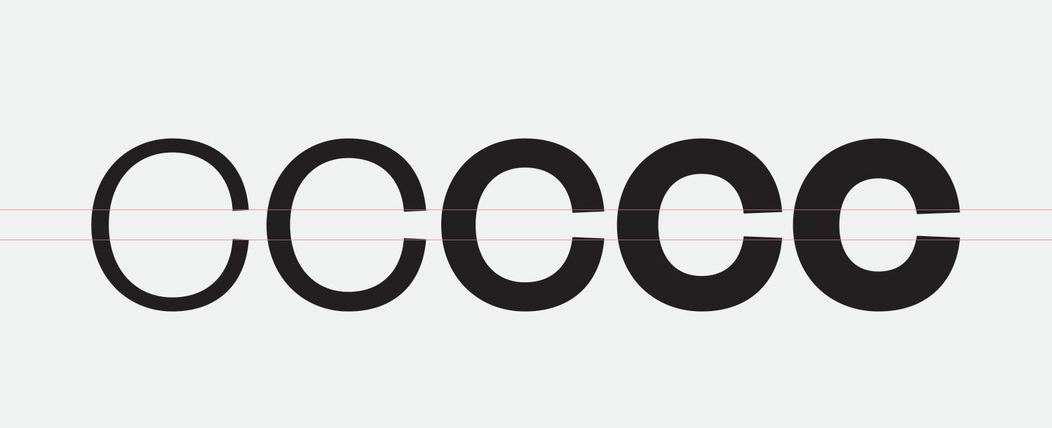
Founders is certainly still a grotesque, mind you. The low x-height, the double-storey “g”, the spurred “a” and the apertures that threaten to close off are all classic characteristics of the genre, yet it’s a very easy to use typeface with gorgeous proportions. It’s difficult to set a word in Founders and have it look bad, and it’s often used to drive publication and branding aesthetics all on its own. Founders is at once both familiar and unique, matter-of-fact and charming. Founders has grown into a robust family of widths and styles over the years, but this review will focus on the original version, and we can address the text, mono and condensed versions in separate reviews.

It is difficult for me to think of a classic grotesque that’s as effortless as Founders. Typefaces like this can be awkwardly proportioned (sometimes intentionally and endearingly so) and the individual characters can be so loud as to distract from the text as a whole. While Founders is refined, it is in no way cold or aloof—it is simply a grotesque design that’s been re-birthed a century later by a master of the craft. No one is better at these types of non-revival revivals than Kris Sowersby.

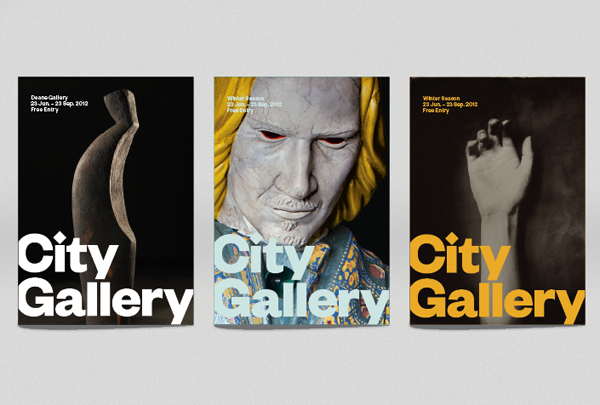
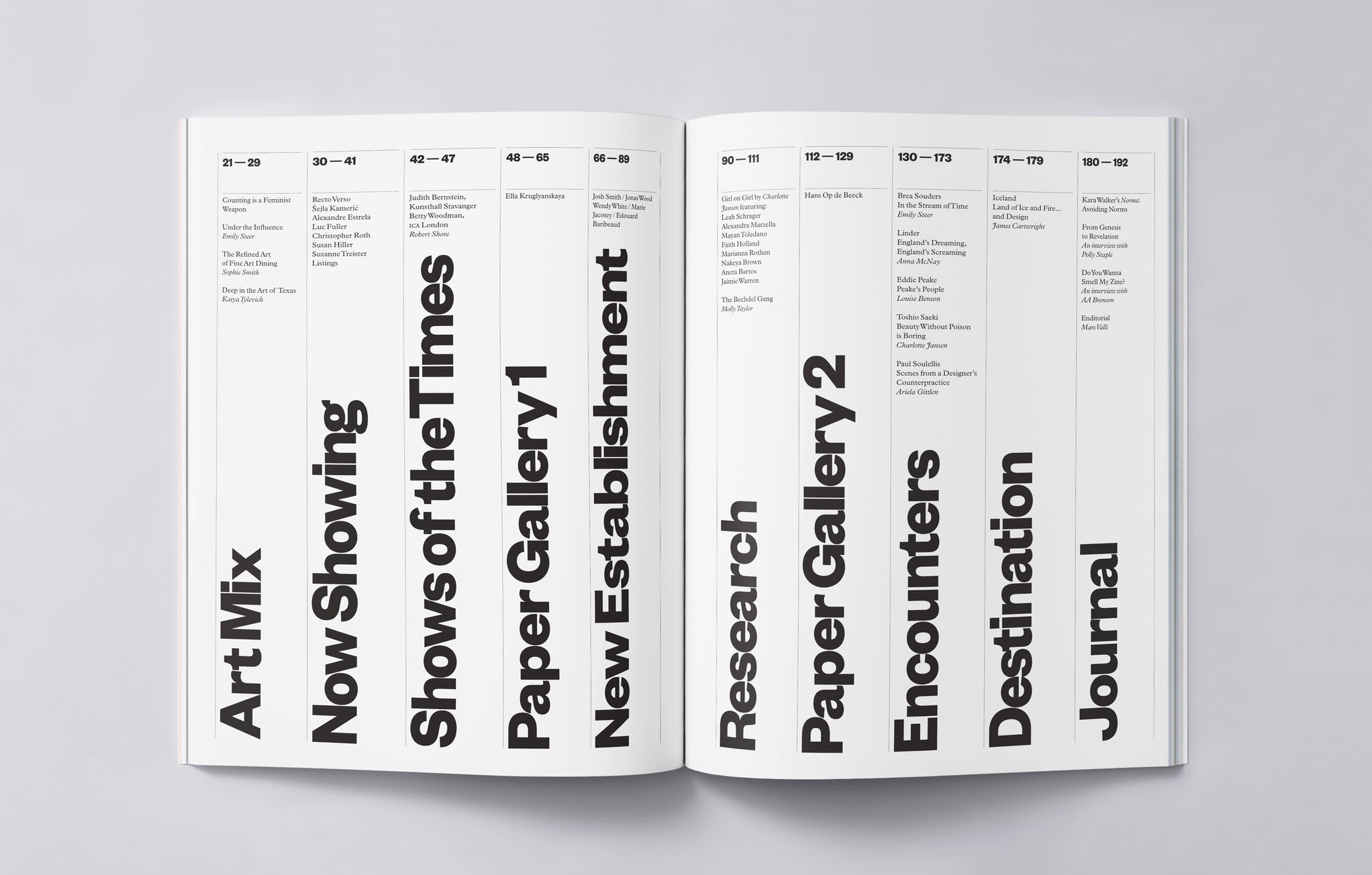
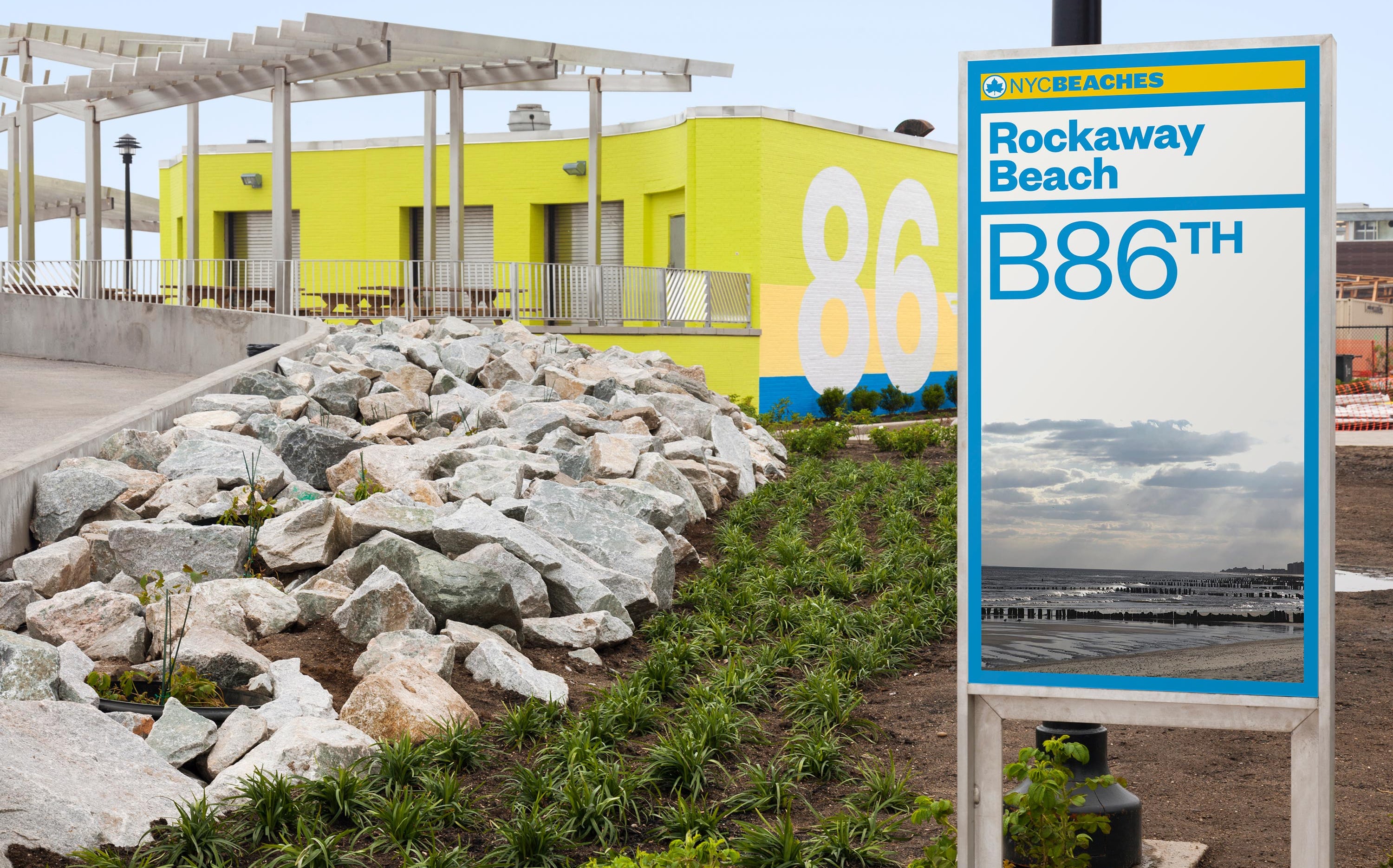
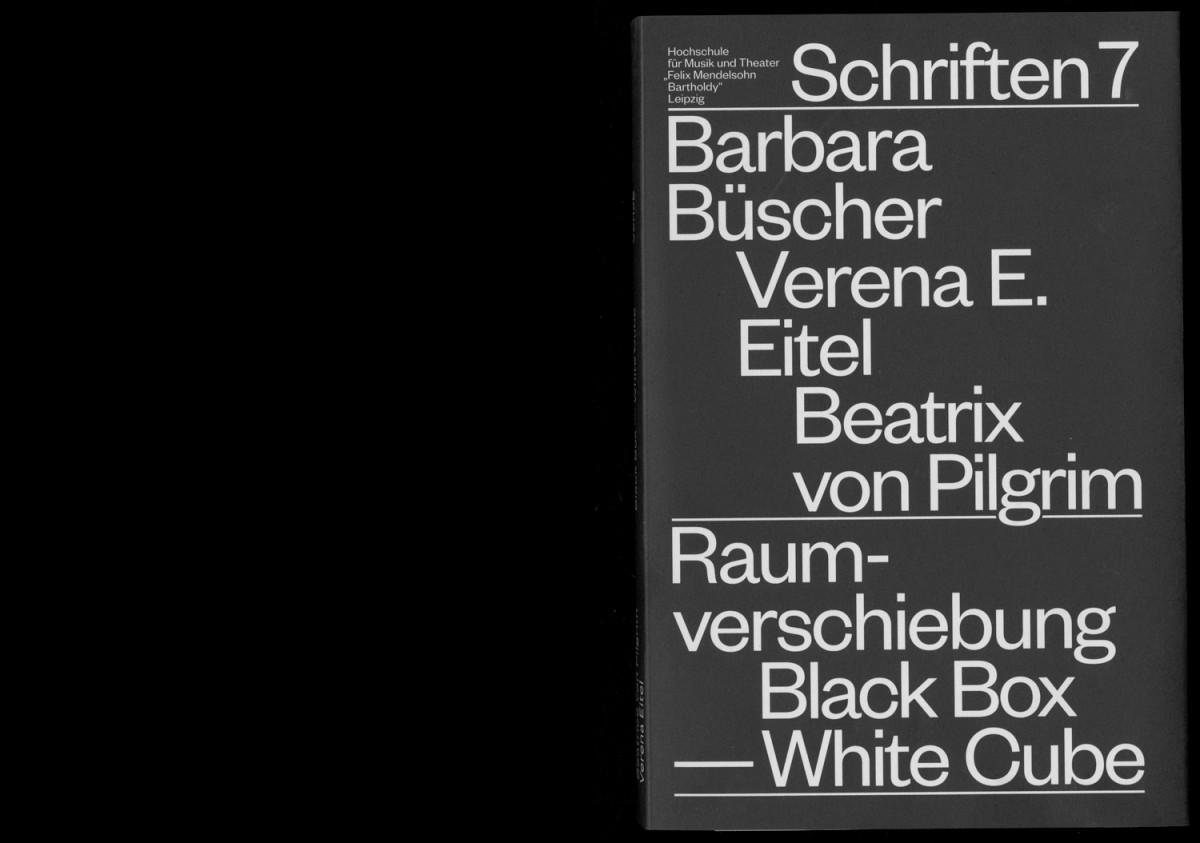
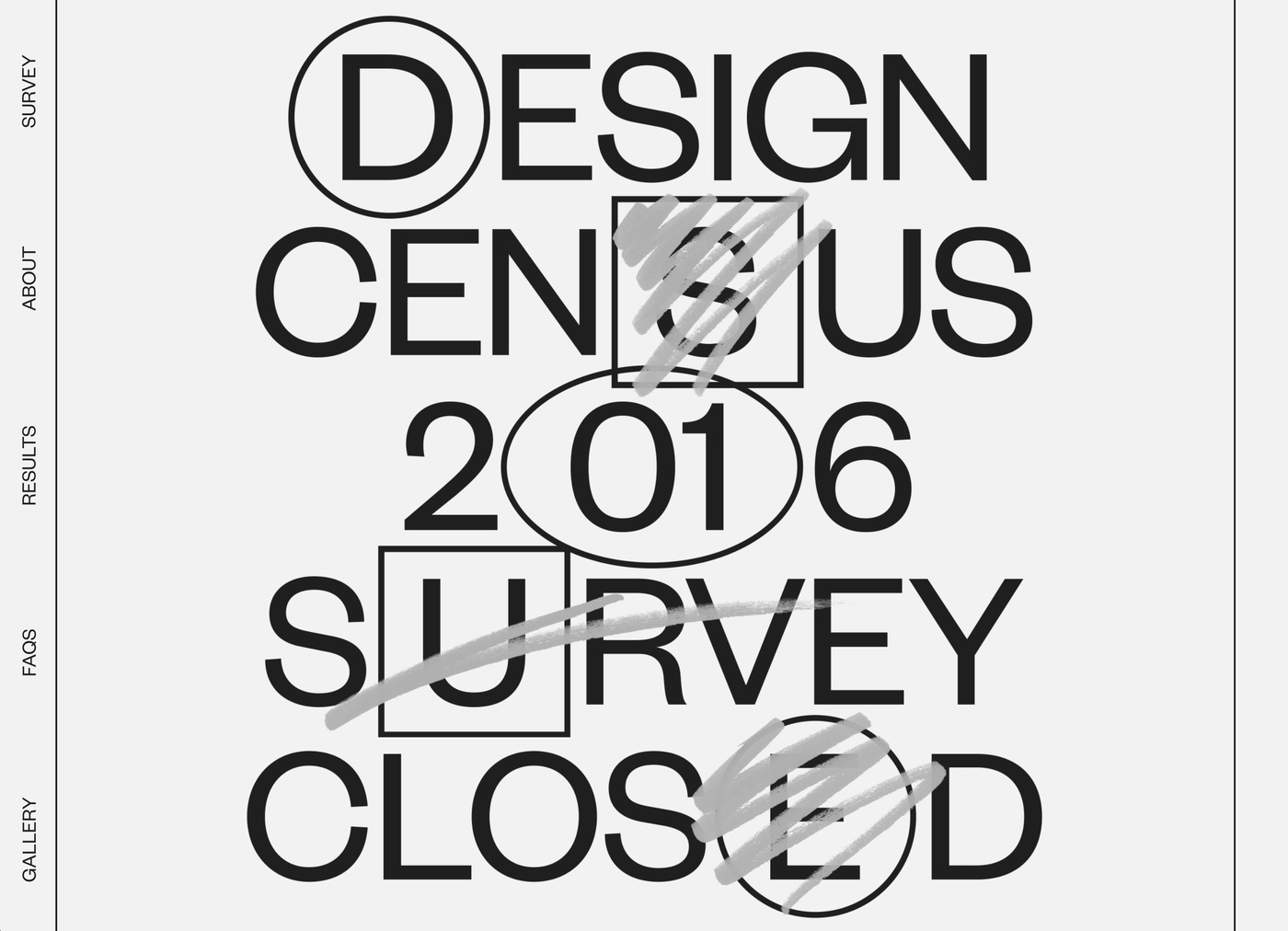
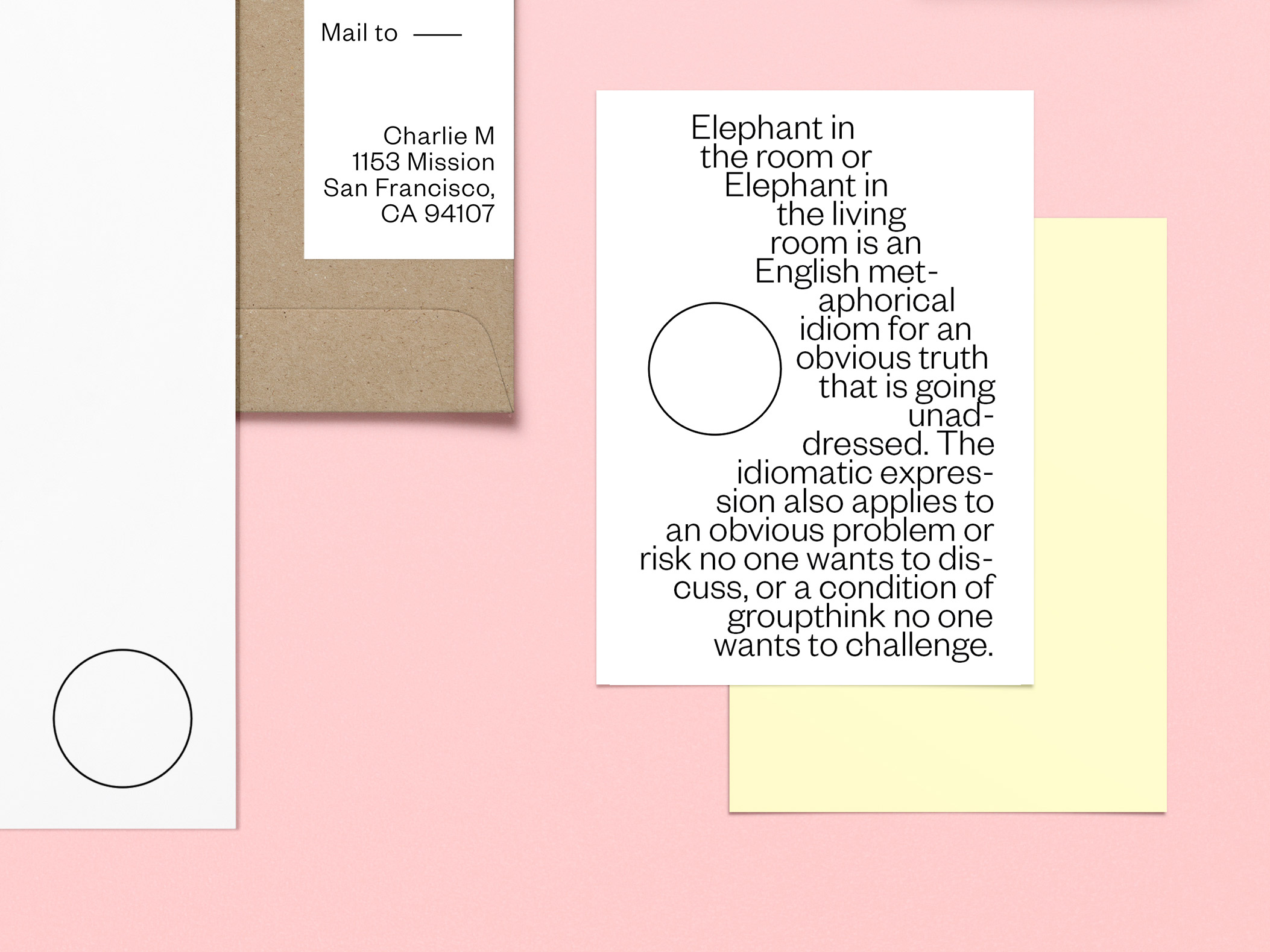
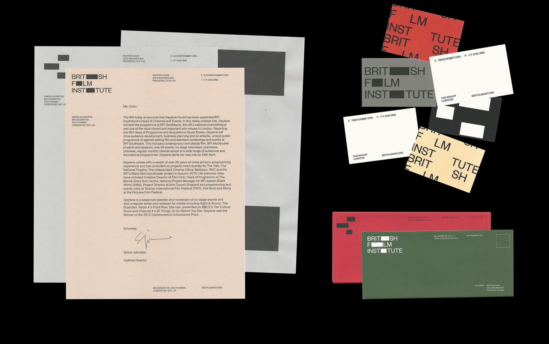
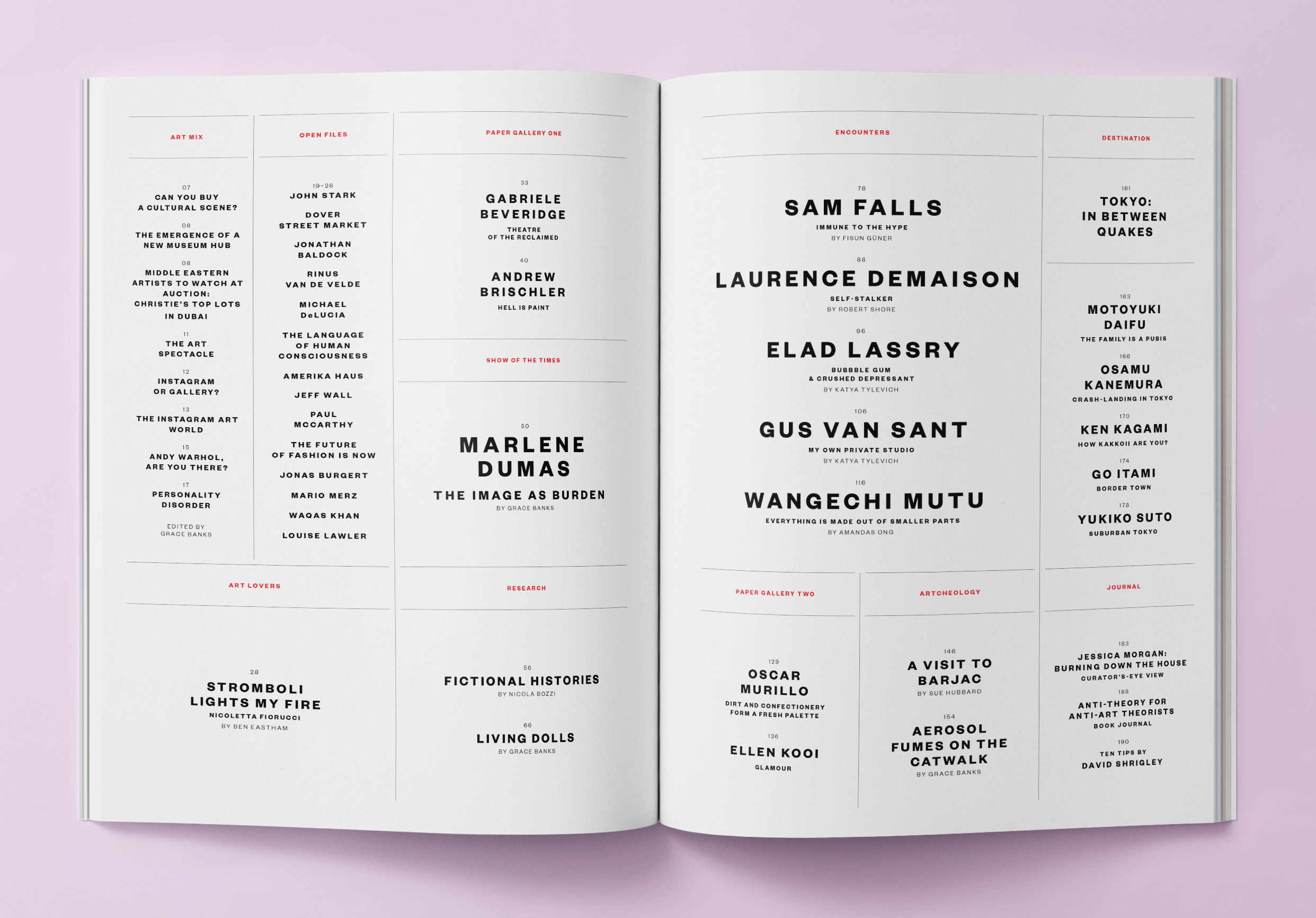
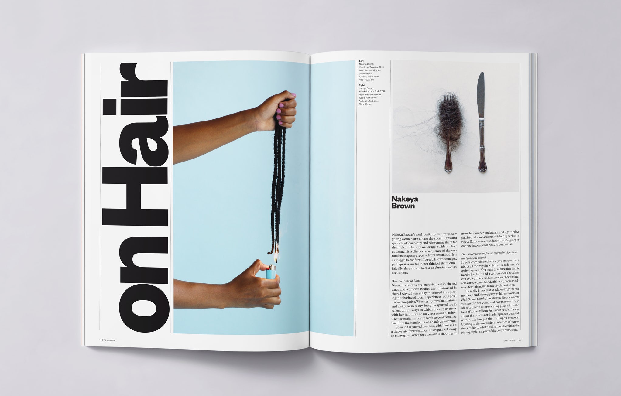
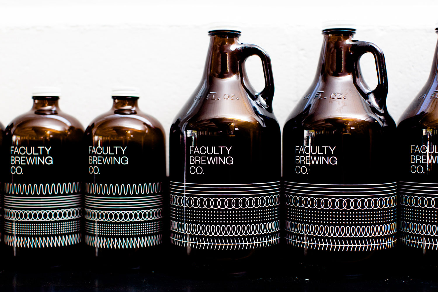
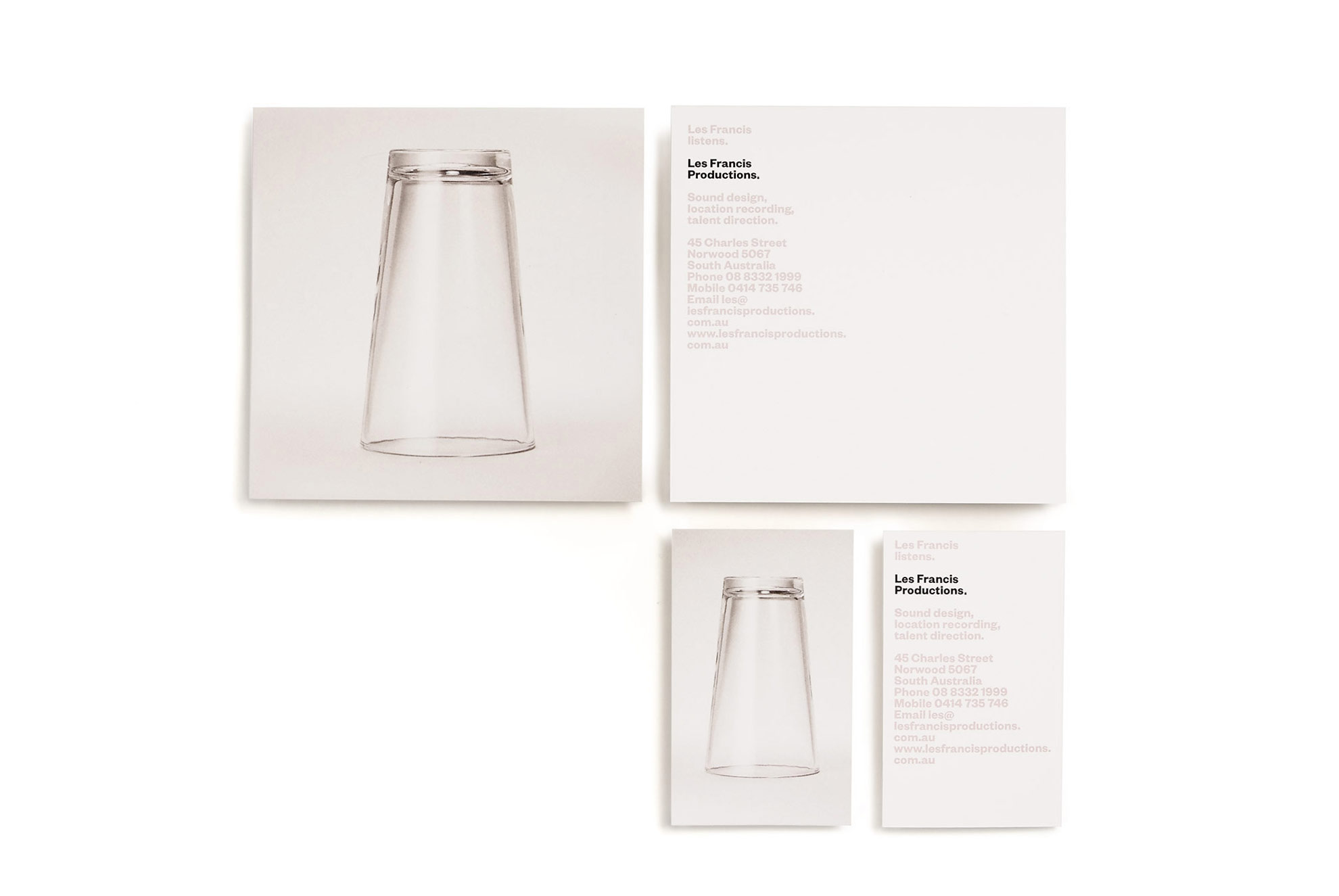
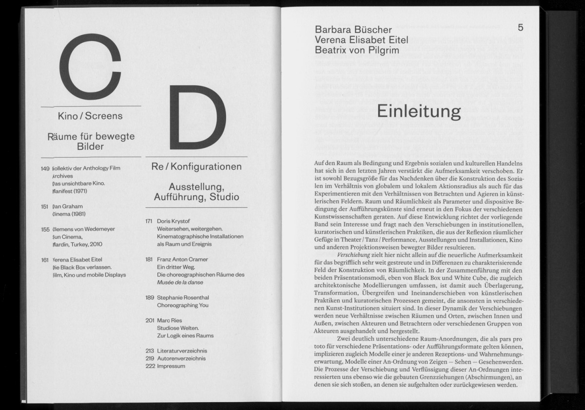
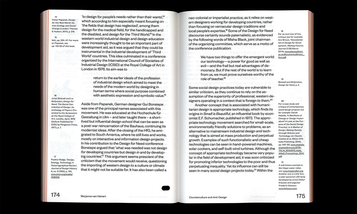
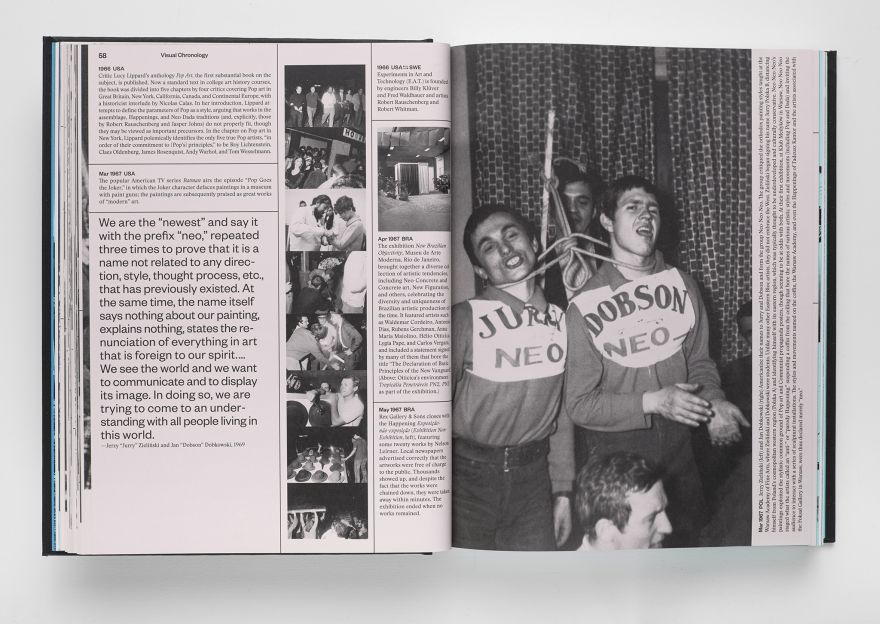
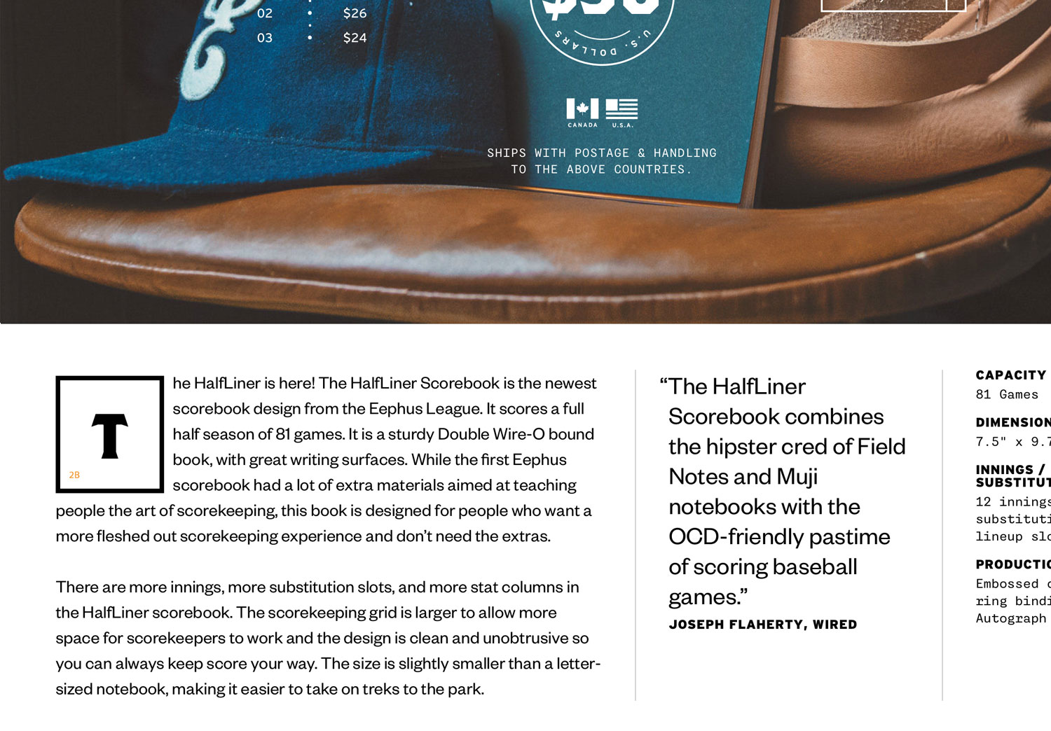
If I were to write some asinine “10 ways to get better at typography!” post, I would probably have “use Founders Grotesk” as one of the list items. It was a monumental task to select the artwork to accompany this review because there are so many stellar uses of the font in the wild. Good designers are drawn to this typeface and it’s been used on hundreds of occasions to create stunning work. Rare is the font that is used this often, and this well.

designbyatlas.com — The table of contents spread from an issue of Elephant Magazine, designed by Atlas.
Nº02 designbyatlas.com — The table of contents spread from an issue of Elephant Magazine, designed by Atlas.
Nº03 klim.co.nz — Miller & Richard’s Grotesque Nº 7, an all-caps design from 1912 and one of the inspirations for Founders Grotesk.

Historic Influences

The capital set from Miller & Richard’s № 7 release from 1912 was a key influencer on Founders Grotesk’s capital set[3]. The tight apertures on the “C”, “G”, and the serpentine “S” from Grotesque № 7 remain, and are some of the most defining features of Founders. Sowersby corrected for the leg of the “R”, which in the original design is a bit narrowly set and makes the letter feel top-heavy and unstable, though as the Founders “R” goes up in weight this quirk starts to return (check out the Notable Glyphs section to the left to see that in action and read more). Many of the lowercase details in Founders can be traced back to other Miller & Richard designs, like the long spur on the “a” and the wide loop and prominent ear on the “g”[4].

Nº04 flickr.com — Miller & Richard’s Grotesque Nº 1

Historic revival fonts reference their source materials in different ways. Strict revivals hem closely to their source materials and retain as much of the character of the original as possible, even when some elements might have fallen out of favor over time as the practice of type design has evolved along with technology. Others use designs from the past as springboards for new ideas, or try to bring in key characteristics from the original while smoothing over eccentricities that centuries of typeface development can now correct. Sowersby is frequently in the latter category with his designs.

While he often draws from historic works—as in the case of Founders, which is based on a handful of early 20th century designs—Sowersby’s designs are never simply rote recreations. His refined hand is behind every detail, and in working on Founders he made tough decisions like losing the endearing pudge at the top of the “5” in Miller & Richard’s Grotesque № 4 in favor of a more streamlined design[6] and unified the overall proportions of the figures. Note how the Grotesque № 4 “3” feels overly wide, and the “6” and “8” feel small because they aren’t optically corrected to peek just above the height of the flat-topped numerals like they should. Founders Grotesk corrects these issues, and it is to Sowersby’s credit that he has the skill to ensure his designs are still oozing with charisma and feel evocative the era even when these quirks are minimized.

pentagram.com — Founders Grotesk’s numerals were put to good use for the NYC Beach designs system, designed by Paula Scher.
Nº05 pentagram.com — Founders Grotesk’s numerals were put to good use for the NYC Beach designs system, designed by Paula Scher.
Nº06 klim.co.nz — The Grotesque Nº 4 Numerals from Miller & Richard, with the quirky 5 (top) compared to Founders Grotesk (bottom).

These numerals are a great showcase of how Founders strikes a balance between homage and modern design sensibilities. It’s easy to see the influences but Founders is not slavish to its source material. The ideas remain the same, but details that are out of place are cut ,and the proportions of the numerals are narrower to help with text-fitting. These refinements were shown off by Paula Scher of Pentagram in her design system for NYC Beaches[5] which makes heavy use of Founders’ distinctive but controlled numerals.

One of my favorite little details about the design of this typeface is how Sowersby very subtly closes the apertures as the font goes up in weight[7]. This allows you to feel the tension of that narrow opening even when the stroke gets wider and has more surface area. The subtle tightening is needed to let the bolder weights keep that aggressive stance, and optical corrections like these are what set great type designers apart from their contemporaries.

Nº07 Founder’s apertures close even tighter as it goes up in weight to maintain the tension that comes from the feeling the shape is about to close in on itself.
lamm-kirch.com — Raumverschiebung: White Cube, Black Box catalog designed by Lamm & Kirch, 2013.
Nº08 lamm-kirch.comRaumverschiebung: White Cube, Black Box catalog designed by Lamm & Kirch, 2013.

Founders Grotesk strengths

Founders so skillfully walks the line between simplicity and individual character that it is often used in stark monochromatic designs where it’s asked to create a tasteful amount of drama while remaining clean and legible. The lighter weights of Founders are unique in their ability to have this assertive presence without needing to be bold or heavy. I am naturally adverse to using weights on the lighter end of the type weight spectrum, but Founders has a nice Light that’s hard to resist. There are several structural details in the typeface—like the almost closed apertures—that are amplified as the typeface is stripped of its fat. With Founder’s tall cap-height and tight apertures, the letters are imposing and without the added warmth of the supple curves the bolder weights provide, Founders Grotesk Light resembles a spindly skeleton of a typeface that can give it a neutral, detached voice that’s well suited for specific aesthetics.

Nº09 designcensus.org — Founders capitals put to use in a “brutalist” design for the 2016 AIGA designer census.
behance.net — Elephant branding using Founder Grotesk Light by Leesh Adamerovich, 2017.
Nº10 behance.net — Elephant branding using Founder Grotesk Light by Leesh Adamerovich, 2017.

These stripped-down designs really showcase the old-school design aspects of Founders, and the bit of irregularity plays a role in why the designs don’t feel dull or sterile. A geometric typeface might have made these pieces feel too cold and machine-like, but the hand-crafted touches in Founders—like the subtle flaring and uneven cuts in the terminals—keep the designs feeling approachable and just slightly off-kilter.

Nº11 behance.net — British Film Institute student branding project by Isaac Matthew Ruiz while at the ArtCenter College of Design.
bpando.org — Packaging design for Room Essentials by Collins.
Nº12 bpando.org — Packaging design for Room Essentials by Collins.

The consistency of the shoulder shapes and proportions in the lowercase characters create truly stunning lines of text and play a large role in why Founders is such a joy to read. Go set any word in all lowercase Founders, I’ll wait. Do you see the gentle waves created at the top of the letterforms? The lowercase set is vertically compact and the characters at bolder weights often feel as if they are growing inward and straining against an invisible field that keeps them tucked in as they threaten to burst out. This tight, succinct feeling has made the lowercase set of Founders a staple in branding projects.

Nº13 bpando.org — Bunch’s branding work for Capt making heavy use of Founders Grotesk
francescofranchi.com — Founders Grotesk Black in use on the cover of IL magazine, designed by the incredible Francesco Franchi.
Nº14 francescofranchi.com — Founders Grotesk Black in use on the cover of IL magazine, designed by the incredible Francesco Franchi.

Bunch puts this trend to good use in its branding work for Capt, a startup that aims to help video producers monetize their work. The stationery materials are all set with Founders Grotesk Bold in lowercase[13]. The agency is confident enough in Founders to let it carry the branding, and the bold letterforms are supple and warm. Founders is wider than many grotesques and when set in all lowercase the font feels grounded and stable.

Nº15 designbyatlas.com — The table of contents spread from an issue of Elephant Magazine, designed by Atlas.

A minimalist presentation helps Founders’ bolder weights project a humble voice that is succinct and approachable. Collins took a similar approach with their branding for Room Essentials[12], again setting the word-mark in Bold and all lowercase, but their supporting imagery and text is more robust and grid-based. I’ve found Founders to be a great typeface to use in these “Swiss-ish” designs. It has more of an old-fashioned flair than Akzidenz, Helvetica and their derivatives, but its proportions are close enough that it can play in that style while bringing in a different flavor that is a nice play off the expected.

designbyatlas.com — A spread from Elephant magazine showing Founders’ bolder, gentler weights.
Nº16 designbyatlas.com — A spread from Elephant magazine showing Founders’ bolder, gentler weights.
Nº17 bpando.org — Faculty Brewing Co. branding by Post Projects.

Post Projects made clever use of the Light weight’s near mono-line structure and geometric capitals in the branding Faculty Brewing Co. The word-mark is supported by simple mono-line patterns that mimic the weight of the typeface and reference its geometry. The aforementioned hand-drawn touches in the lighter weights of Founders help give it the subtle warmth it needs to avoid feeling overly mechanical and inapproachable.

mainstudio.com — A Japanese Constellation ehibition catalogue debossed cover, designed by mainstudio.
Nº18 mainstudio.comA Japanese Constellation ehibition catalogue debossed cover, designed by mainstudio.

I’ve also seen Founders be wildly successful when used in subtler applications. MoMA’s catalog for A Japanese Constellation uses Founders throughout, most uniquely on the cover[18], where the names of the artists are debossed into the surface. Sowersby’s eye for simplicity shines again, because if Founders had too much thick-to-thin contrast, irregular character details or uneven proportions, this technique would not be effective and the result would be messy. Instead, it’s a lovely detail that serves as a nice compliment to the thoughtful way Founders is used throughout the rest of the book[19].

Nº19 mainstudio.comA Japanese Constellation ehibition catalogue spread, designed by mainstudio.
parallaxdesign.com.au — Branding for Les Francis, Sound recordist, by Parralax.
Nº20 parallaxdesign.com.au — Branding for Les Francis, Sound recordist, by Parralax.
2xelliott.co.uk — Feeld branding by Two Times Elliott.
Nº21 2xelliott.co.uk — Feeld branding by Two Times Elliott.

Another trend I’ve spotted with Founders is using the tight apertures to convey a tactile sensibility or to build tension. When the edges of typefaces nearly touch one another it naturally plays into the idea of physical closeness, and the “C” in Founders very neatly resembles a physical embrace. Two Times Elliott cleverly played off that design detail in Founders in their branding work for Feeld, which pairs the self-embracing letterforms of Founders with closely cropped imagery of the human figure to reinforce the idea of contact and intimacy[21].

Nº22 lamm-kirch.comRaumverschiebung: White Cube, Black Box catalog designed by Lamm & Kirch, 2013, leveraging the iconic “C” in Founders.

Quirks and eccentricities

Sowersby made the choice to make the default letter-spacing of Founders quite tight (tighter than you would see in a historic example) in an effort to make Founders easier to use for display situations. The lasting impact of that choice is that as you get smaller in scale, Founders can look cramped and will likely need to be tracked out. The tight apertures will also cause problems at smaller sizes and cause characters like the “C” to close off and look like “O’s”.

Founders Grotesk Regular (top) and Founders Grotesk Text Regular (bottom) set with the same point size, tracking and leading.
Nº23 Founders Grotesk Regular (top) and Founders Grotesk Text Regular (bottom) set with the same point size, tracking and leading.
Nº24 valiz.nl — Founders Grotesk and Founders Grotesk Text used in The Responsible Object: A History of Design Ideology for the Future.

Founders Grotesk isn’t especially well-suited for body text, which lead to the creation of Founders Grotesk Text. Founders has a tall cap-height and wide characters, which give it the same effect as having a lower x-height. The capitals will leap out in the text and can be a distraction and hurt the flow of a line of text, and combined with the tight letter-spacing and apertures, it makes for a strained long-form reading experience. In The Responsible Object: A History of Design Ideology for the Future, Founders Grotesk Regular and Text are combined which gives us a helpful source of comparison for the two versions[24]. You can see how tight the characters lie against each other in the main copy (Founders Grotesk Regular) and how much airier and crisper the smaller margin text is (Founders Grotesk Text). Another example that saves Founders for larger longform text is the work of Andrea Hyde for the International Pop exhibition catalog[25], where Founders is used in larger pullquotes at a scale that better suits the typeface and smaller type is left to a typeface better suited for the job.

designawards.core77.com — A spread from the International Pop exhibition book, designed by Andrea Hyde
Nº25 designawards.core77.com — A spread from the International Pop exhibition book, designed by Andrea Hyde
Nº26 eephusleague.com — Founders Grotesk Regular in use as the body copy and pull quote font for the Eephus League website.

I’ve still managed to use the base version of Founders as body copy successfully, especially on the web, where imperfect printing processes aren’t a concern. Founders is the body copy on the Eephus League website[26] (though you can see the popping capitals by looking at the example) and serves as the connecting thread in a site that uses six different font families. I tested Founders Text as well, but found it to be too wide and too airy for what I needed. It is drastically different from the base font and I’d suggest testing both in long-form situations to see which you prefer[23].

- FRJ