Domaine
— Designed by Kris Sowersby

francescofranchi.com — Designing News by the incomprable Francesco Franchi, making use of multiple weights of Domaine.
Nº01 francescofranchi.comDesigning News by the incomprable Francesco Franchi, making use of multiple weights of Domaine.

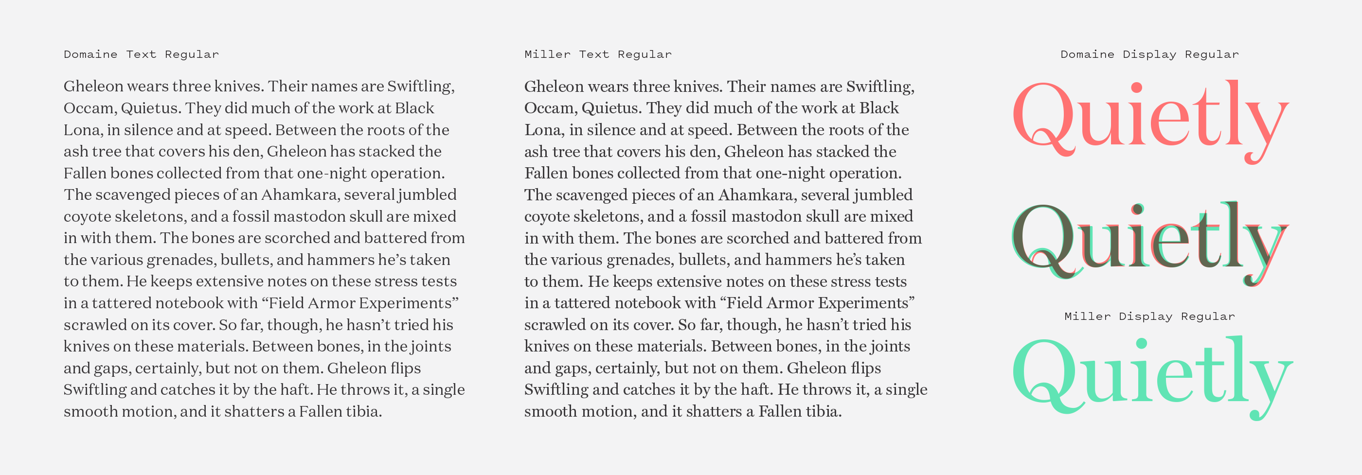
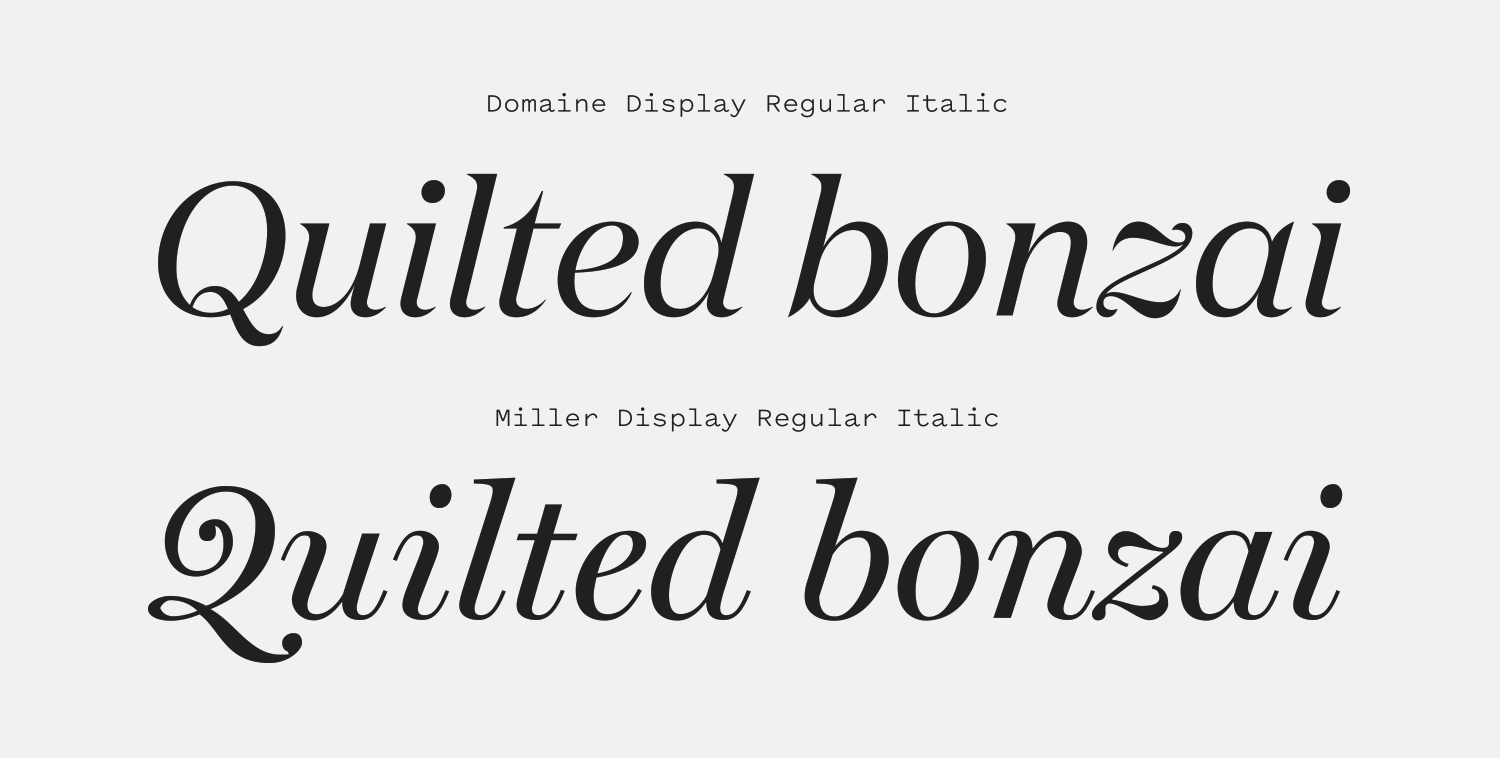
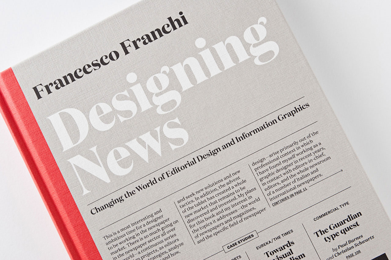
Sometimes you just need a font that can do the heavy lifting for you. Something that has a distinctive presence in a design no matter how you use it. A word that can make something as unappealing as the word “feces” look lovely. Domaine is that kind of typeface.

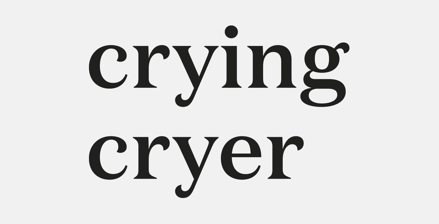
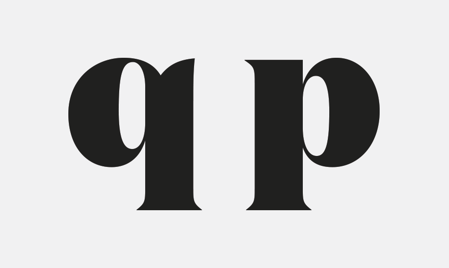
If you’re using Domaine, it’s probably because you want your type to look pretty. This is a pretty font. I don’t mean that in a gendered sense—that it appears feminine—but rather that reading a line of Domaine is comparable to strolling through a topiary garden. The forms are organic but meticulously controlled, and the jagged little serifs add to its naturalistic presence. Domaine has an elegant, editorial voice that demands attention. Its thicker weights have extreme stroke contrast and swooping lines that dominate the design, supplemented by tiny triangular serifs and swooping terminals that fan out before resting.

Domaine is a blend of Latin and Scotch serif typefaces. Latin and Scotch aren’t two genres I’d ever think to mix together, but that’s why Sowersby is the laser-eyed kiwi god of type design and I’m the dope writing the review. It’s a combintation that feels fresh and effortless. Despite its intricate details it never feels overworked or fussy and it successfully modernizes some of the most interesting aspects of older Latin designs for a new audience.

castirondesign.com — Huckle & Goose branding by Cast Iron Studio, 2014.
Nº02 castirondesign.com — Huckle & Goose branding by Cast Iron Studio, 2014.

Historic influences

The genesis of Domaine was a word-mark and typeface Sowersby created for Hardys, a wine company in Australia, and a specific piece of lettering from their archive was the main source of inspiration[4]. The original lettering is striated and has a complex double shadow, but Sowersby neatly distilled into a simpler logotype for the company, and after a period of time, he took the Hardys work and revamped it to create Domaine.

Nº03 babel.hathitrust.org — A “Celtic” Latin example from An abridged specimen of printing types, made at Bruce’s New York Type Foundry, 1874. This example shares the curling terminals and floral, softer tone of Domaine.

Latin typeface designs from the heyday of moveable type was often audacious, featuring gigantic triangular serifs that created a barbed look. They certainly aren’t always inviting and often look a bit dangerous, but many of them feature the lovely sweeping terminals that Domaine has retained. Miller and Richard’s “Antique № 12”[5] (welcome to the world of movable type, where none of the type classifications make sense. This is a Latin, not an Antique.) shows the dichotomy between the wide, sharp serifs most Latin typefaces featured as well as the softer details, like the curled terminal on the “c” and the slope connecting the stem and crossbar of the “t”. Those two details were carried over to Domaine, and you can see the in the specimen at the top of this review, left column, bottom row.

klim.co.nz — “Walter Reynell” lettering that insipired the work that became Domaine.
Nº04 klim.co.nz — “Walter Reynell” lettering that insipired the work that became Domaine.
Nº05 dailytypespecimen.com — Miller and Richard’s Antique Nº12, an excellent representation of the oddities in Latin designs.
goodiochocolate.com — In this packaging system, Domaine is paired against lush colors and geometric patterns that relate strongly to Domaine’s curled terminals.
Nº06 goodiochocolate.com — In this packaging system, Domaine is paired against lush colors and geometric patterns that relate strongly to Domaine’s curled terminals.

Instead of doggedly recreating this style, Sowersby consulted Scotch serifs to “normalize” the Latin characteristics and create a modern interpretation. Scotches lie between Old-Style and Modern designs and tend to have a lot of flair and flourish, making them a suitable reference for Domaine’s curled terminals and distinctive serifs. Domaine is wider than a Scotch—a carryover from the Latin genre—but Scotch designs informed the proportions and spacing for Domaine and give it a formal presence on the page.

We can use the lovely Miller by Matthew Carter as a point of comparison[7]. A Scotch has a lot of vertical emphasis in its strokes, which Domaine lacks. Without the thicker stems to contend with, the result is a more even tone when the font is used as body copy. Scotches have subtly bracketed serifs—one of the things that set them apart from Modern-style typefaces—and Domaine also has gentle brackets to its small, pointed serifs. Gone are the wide, monolithic serifs of older Latin designs; replaced by a compromise that keeps the spiny character of the genre while softening the thorns for mass consumption. When you look at the overlay of Domaine Display and Miller Display[7] you can see just how unique those curling, flared terminals are and how much they contribute to the flavor of the typeface, as well as how petite Domaine’s serifs are. Miller isn’t exactly a beefy typeface but it’s surprising how gentle and delicate Domaine appears when placed alongside it.

Domaine compared to Miller in both text and display weights.
Nº07 Domaine compared to Miller in both text and display weights.

Domaine strengths

Domaine comes in a few varieties: Display, Display Narrow, Display Condensed and Text which gives designers the ability to swap in the perfect version to suit their needs in any given design, a blessing for a typeface that often finds its way into editorial design. Olga Capdevila & Andrés Requena made use of Domaine Display in their work for Campaña de Sant Jordi 2017[9], which pairs Domaine with almost child-like illustrations, bringing out the font’s playful side.

klim.co.nz — A clever and stunning IL magazine cover by Francesco Franchi.
Nº08 klim.co.nz — A clever and stunning IL magazine cover by Francesco Franchi.
Nº09 bpando.org — Campaña de Sant Jordi branding, designed by Olga Capdevila & Andrés Requena

Domaine can come across as elegant and formal, as it does in IL Magazine when wielded by the incredible Francesco Franchi[8], but when placed with the bright, saturated colors in the Campaña de Sant Jordi branding it feels warm, inviting and personable. The organic qualities of the typeface can be emphasized in this way, or tamed by pairing Domaine with geometric shapes and muted colors.

werklig.com — Kyrö Distillery bottle packaging by Werklig, 2014.
Nº10 werklig.com — Kyrö Distillery bottle packaging by Werklig, 2014.
Nº11 heystudio.es — Branding for the agency Collective using Domaine as the wordmark and small text, 2014.
inhousedesign.co.nz — Domaine’s numerals paired with bright colors in work by Inhouse.
Nº12 inhousedesign.co.nz — Domaine’s numerals paired with bright colors in work by Inhouse.

Lest you worry that Domaine is so pretty that it might be limited in the tone of voice it can take on, I’ve found Domaine to be surprisingly adaptable to different kinds of aesthetics when used wisely. I love the way Hey Studio used it alongside a stark color palette of black, grey and yellow and a geometric sans like Brown in the branding for Collective[11]. It’s the refined component in a brash design, mellowing out the bold elements in the system and its jagged serifs give it enough of an edge that it doesn’t feel out of place. Hey was also smart to use the lower-contrast, lighter weight of the typeface. A bolder weight’s contrast would have possibly made it feel more frail despite the added girth, and it would have been too loud a voice with all the other bold type and colors used.

Nº13 content-object.com — Multiple weights and widths of Domaine used in Cock, Paper, Scissors, designed by Content Object.
kickstarter.com — Domaine used in 500 Years Later: An Oral History of Final Fantasy VII, design by Rachel Dalton.
Nº14 kickstarter.com — Domaine used in 500 Years Later: An Oral History of Final Fantasy VII, design by Rachel Dalton.

Domaine looks right at home alongside a rustic, custom typeface designed for packaging for the Kyrö Distillery in Finland[10], designed by Werklig. The custom sans was based off letters carved into a memorial near the distillery building, so the incised nature of a Latin typeface is a natural companion. It “classes up” the slightly off-kilter sans and the curled terminals bring some much needed warmth to the design. Domaine can also take a back seat in a design, as seen in the In Search Of The Present exhibition branding[16], also designed by Werklig. Futura is the star here, and Domaine’s geometric serifs play nicely against the classic sans face. The sterile presentation and bright, artificial blue lend Domaine a sharp presence and quiet the font’s organic nature.

Nº15 kickstarter.com — Domaine used in 500 Years Later: An Oral History of Final Fantasy VII, design by Rachel Dalton. Domaine is well-suited for tactile production techniques like embossing and foils.
bpando.org — Domaine used as a secondary typeface in Werklig’s In Search Of The Present branding.
Nº16 bpando.org — Domaine used as a secondary typeface in Werklig’s In Search Of The Present branding.

You might not think to pair Domaine with a subject like video games, but that is exactly what designer Rachel Dalton has done for 500 Years Later: An Oral History of Final Fantasy VII, published by the fantastic Read-Only Memory[15]. The special-edition box is dramatic, featuring a black-on-black treatment that takes advantage of Domaine’s delicate forms. I think the combination of thorns and gentle fans in Domaine give it a very tactile presence, which is well-serviced by production techniques like this, where fans will definitely be running their fingers over the surface of the edition when they get their hands on it.

Nº17 Domaine Display Regular Italic (top) compared to Miller Display Regular Italic (bottom).

Domaine has exceptional italics. Because the font is already so lush, the italics have been designed with quite a bit of restraint. It’s is a welcome design decision, especially when compared to Scotch and Modern style fonts, which can easily go too expressive with their italics. If we compare Domaine Display to Miller Display once again[17], you can see how controlled Domaine is by comparison. Domaine’s italics have large counters and have minimal extraneous swashes and extra details while still remaining intricate and beautiful. Cast Iron Design use the italics to stunning effect in their word-mark for online food service Huckle & Goose[2]. The soft nature of the italics is complimented by the blind emboss printing treatment on the stationery (there’s another tactile application for you), and it’s an effect that would be far less effective with a fussier design with more details that could get lost in production. Domaine is a wonderful example of a typeface that doesn’t need bells and whistles to impress.

pentagram.com — Domaine evoking a rather feline presence in The Book of the Cat, Pentagram, 2017.
Nº18 pentagram.com — Domaine evoking a rather feline presence in The Book of the Cat, Pentagram, 2017.
printedmatter.org — The cover for Earth Changes, a monograph of monochromatic landscape photographs by David Benjamin Sherry.
Nº19 printedmatter.org — The cover for Earth Changes, a monograph of monochromatic landscape photographs by David Benjamin Sherry.

Quirks and eccentricities

I’m not sure this counts as a quirk, but Domaine is difficult to use subtly. Even in a very simple presentation, like the cover for Earth Changes, Domaine stands out and is instantly recognizable. If you use Domaine, it’s going to get noticed, and if you want tips on how to tone it back you can reference some of the examples earlier in this review which use the lighter weights and bright, unnatural colors to take some of the prettiness off of it. While it might be tempting to set this font in a bold weight and let it do its thing, don’t sleep on those lighter weights. My favorite part of the specimen at the top of this review is at the top of the right column, using the Light weight in all caps.

Nº20 Domaine Text Medium, with one example of too little space after the “y” (top) and too much (bottom).
Domaine Display Black’s tension-filled “q” compared to the milder “p”.
Nº21 Domaine Display Black’s tension-filled “q” compared to the milder “p”.

Watch out for the right side “y” in the Text family. I’ve felt like I needed to kern it in on multiple occasions, either for being too cramped, or too airy (like when it’s followed by an “e”)[20]. It’s a matter of personal preference (and it’s not nearly as noticeable at typical text sizes) but since this is a well-made typeface, I have to hunt a bit for nits to pick. In Domaine Display, I find the bolder weights of the “q” to be a bit unsettling, especially when compared to the “p”[19]. The counter sits higher up in the bowl and threatens to bleed out into the open air, and the spurred terminal at the top of the stem adds to the tension.

With so many typefaces in the past few years equating “dramatic” to “JAGGED EDGES, EVERYWHERE”, it’s a real joy to see that Domaine chooses to be dramatic by being liquid nature instead. This typeface gets gendered fairly often and urge you not to shy away from it just because of its organic design. If you find the Display weights to be too svelte, remember the text weight is also very versatile and has more pointy edges if that’s what you value.

- FRJ