Detroit
— Designed by Alex Sheldon

kellianderson.com — experimental crystaline letters by Kelli Anderson show off Detroit’s dimensional capabilities.
Nº01 kellianderson.comexperimental crystaline letters by Kelli Anderson show off Detroit’s dimensional capabilities.

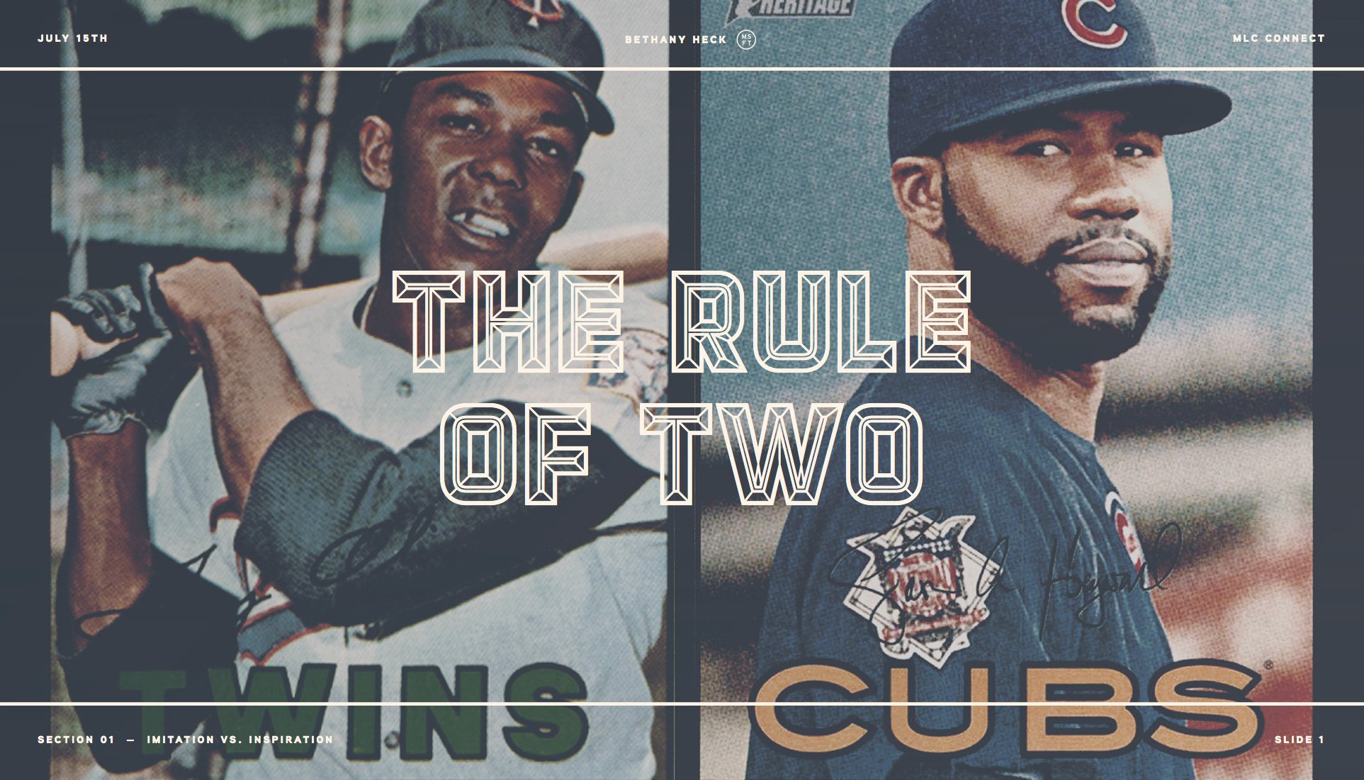
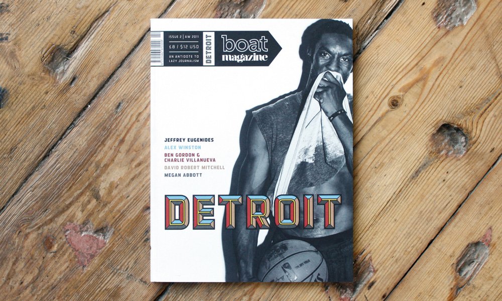
Detroit is a chromatic, all-caps, industrial sans display face designed by Alex Sheldon in 2011. It’s one of many chromatic fonts Sheldon has designed through his Match & Kerosene foundry, and one of the more versatile and robust chromatic fonts on the market today.

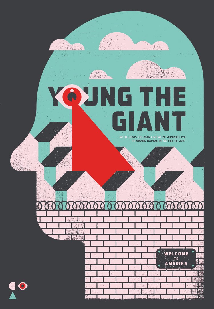
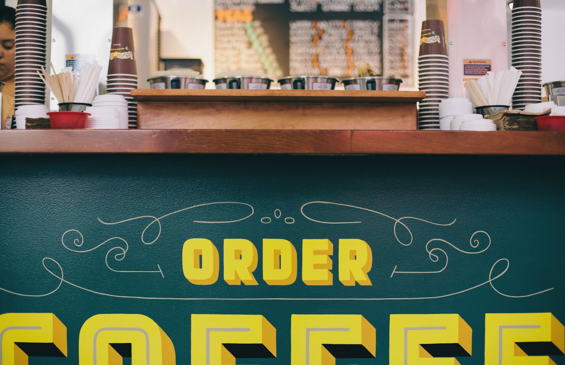
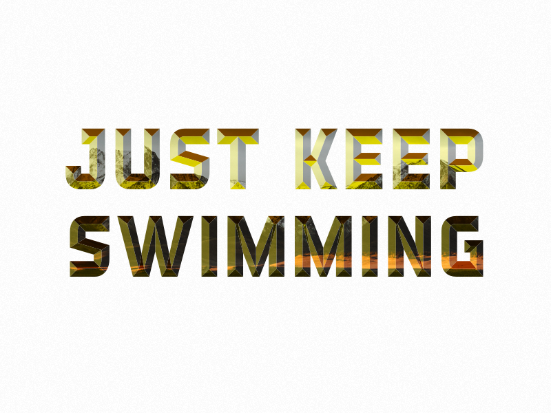
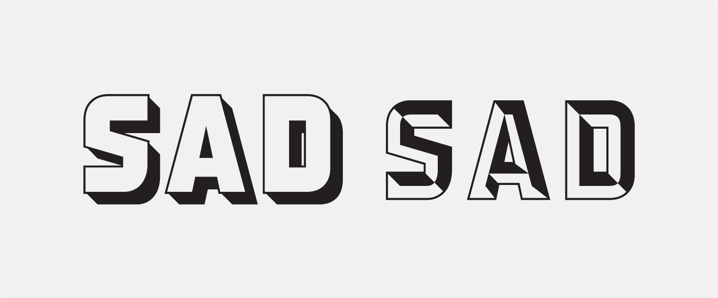
Many Chromatic typefaces feel prescriptive in how you are expected to layer the different elements, shadows and textures and end up feeling limited despite their ability to take on multiple colors. Detroit sidesteps that issue by presenting 12 different layer options to designers, many of which could stand on their own, and become exponentially more interesting the more you use in tandem.

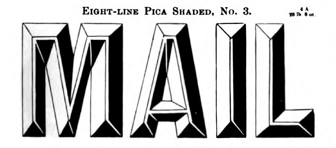
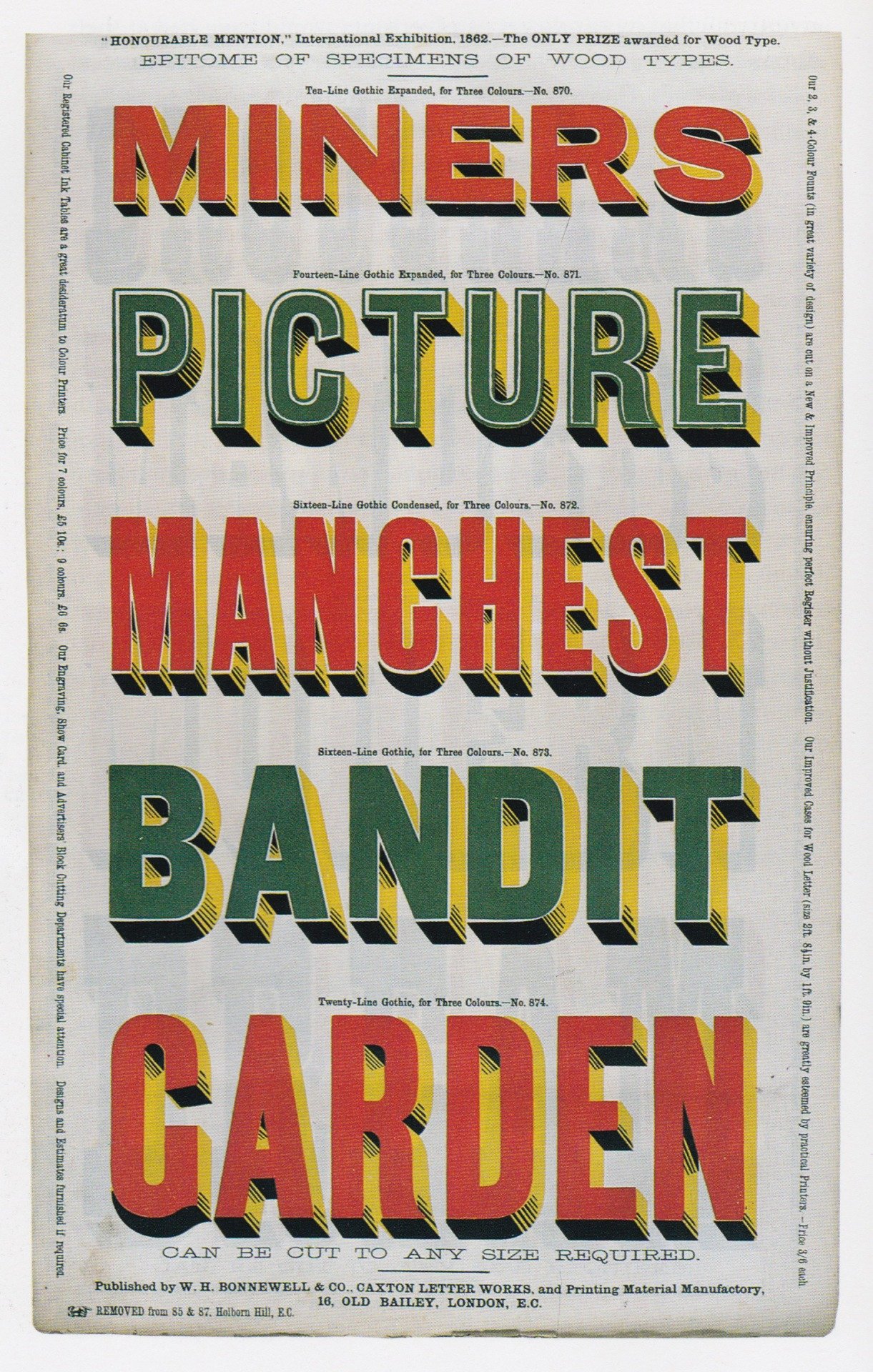
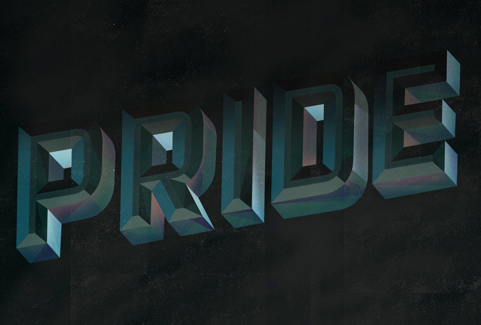
Sheldon has done an excellent job referencing a few specific historic influences in the font’s design while still lending it a clean and contemporary sensibility. It would be very easy for a typeface like this to feel cold and mechanical, or to swing too far in the retro direction and be kitschy and overly specific to one aesthetic niche. Alex has synthesized industrial gaspipe, no-nonsense designs with a hint 1960’s retro aesthetic and the batshit insanity of late 1800’s chromatic wood type and created something entirely new. Detroit is playful, rugged and experimental all at once. It’s the rare typeface that encourages you to play with it and try to stretch what you think it’s capable of just to see if you can make it work out. I’ve had a number of delightful epiphanies while working with the typeface, and who can put monetary value on that?

Detroit Bevel Two used on its own as a title face for my presentation on Imitation vs. Inspiration for MLC Connect 2016.
Nº02 Detroit Bevel Two used on its own as a title face for my presentation on Imitation vs. Inspiration for MLC Connect 2016.

Historic Influences

As previously mentioned, Detroit has a few obvious historic influences, chiefly signage typography from the 1960’s. Diners, groceries and movie theaters used a combination of scripts and tall, rounded and simple sans-serif lettering to draw customers in from the highway. These letterforms immediately evoke the arches of an airstream trailer or the chrome edge of a diner counter—it’s always a delight when the typography of an era matches its architecture and industrial design, and in this case it makes perfect sense for the typography to mimic those other disciplines. The type was forged in aluminum and fitted with lights and neon so it was just as sculptural as it was anything else. The friendly and easy to read characters promised a good time for patrons and helps shape our glossy view of the era decades later.

Nº03 roadsidenut.wordpress.comA Hershey’s Creamery grocery sign in upstate New York.
babel.hathitrust.org — An abridged specimen of printing types, made at Bruce’s New York type-foundry re-issue of 1874, page 87.
Nº04 babel.hathitrust.org An abridged specimen of printing types, made at Bruce’s New York type-foundry re-issue of 1874, page 87.

One signage example that serves as a clear example of Detroit’s 1960’s roots are the Hershey’s Creamery Company (no, not the chocolate company) signs that litter the North Eastern United States[3]. The lettering of their word-mark shares many characteristics that define Detroit’s default character set. The monumental letterforms have straight vertical angles softened by no-nonsense curves on the outer edges but with the inner counters squared off. The cumulative effect is a style of lettering that is at once mechanical yet approachable. Another subtle shared characteristic is the slight beveling of the letterforms on the sign. This dimensionality is a core component to Detroit’s layering aesthetics and harkens to the physical nature of its historic references. The secondary information below the word-mark is less stoic than the Hershey’s word-mark and displays more of the personality unique to that era. The rolling shoulder of the “R” in “GROCERIES” and the rounded peak of the “A” with its dropped crossbar are what we now define as “retro” design decisions, and Detroit has alternates that reference both.

It’s not a coincidence that in addition to the shadow and prismatic layers Detroit has an inline. The 1960’s style alternates, when overlaid with an inline layer, create an even more specific reference to the era and evoke neon signs with their metal letterforms cut through by thin blazing light (check out the “Unique Characters” section of the review to see them in use).

jacobrosenburg.com — Gig poster for Young the Giant, designed by Jacob Rosenburg.
Nº05 jacobrosenburg.com — Gig poster for Young the Giant, designed by Jacob Rosenburg.
Nº06 Flickr — Chromatic type specimen with bright colors from Specimens of Wood Type second edition 1870 by W.H. Bonnewell & Co
Nº02 A subtle treatment of Detroit’s layering styles.
Nº07 Nº02 A subtle treatment of Detroit’s layering styles.

The other clear historic influence on Detroit are the vibrant and colorful chromatic type specimens from the late 1800’s and early 1900’s[6]. While many of these specimens were based on more ornate type genres like Antiques and Tuscans, gothic letterforms still got some play in this genre. Chromatic type specimens were not attempting to mimic any sort of natural reality in regards to the physics of light and shadow; they were simply trying to match the best and brightest colors together to create the most eye-popping designs. So much of the history of wood type development is centered around the goal of “notice me goddamnit,” and boy, how could you not notice these typefaces? There are other typeface designs from the era that are not chromatic, merely ornamented, and you can see some of the reference for the beveling layers of Detroit in examples such as this Bruce’s New-York Type-Foundry ornamented sans from their 1874 specimen book[4].

Nº08 dribbble.com — Detroit painted as signage for a coffee shop on Facebook’s campus. Design by Danny Jones.

Detroit strengths

Before we get into the chromatic and layering options in Detroit, I want to speak to the strengths of the “05 Base” designs (used to wonderful effect by Jacob Rosenburg in a screen-printed band poster[5]), which are the foundation for all of the other ornamentation. If the foundational characters in Detroit were subpar, no amount of layering glitz would save them. But the bedrock of the family is a solid industrial display face all on its own, capable of adopting a playful retro look due to the aforementioned alternates. It can be used at relatively small sizes for a display face and its range of historic influences and clean design make it feel referential but modern. It is its own design, and stronger for it. It’s the strength of this foundation that sets Detroit apart from many other layering fonts strengths

Nº09 boat-mag.comBoat Magazine, Detroit issue, designed by Luke Tonge.
An example showing how Detroit can shine in simpler layering combinations.
Nº10 An example showing how Detroit can shine in simpler layering combinations.

When compared to other chromatic fonts, Detroit is remarkably diverse and robust in its layers options. The two bevel options could stand on their own as ornamental display faces (and I’ve used them to that effect on multiple occasions [2] and they can also be used to “knock out” or reverse layers beneath it to create entirely new letterforms (see the specimen at the beginning of this review right column, top row). There are lots of thoughtful decisions in the dimensional layers options, such as splitting the drop shadow into two parts to allow for additional shading for added realism and depth. The prismatic layers can be used to combine bright colors that jump off the page and serve as statement pieces or can be toned back, with subtle shifting in tints and colors hinting at the idea of a three-dimensional character[7].

Nº11 typographica.org — A gif demonstrating the multitude of possible layering combinations.
dribbble.com — Detroit used as an image mask with subtle prismatic effects by Matthew Smith.
Nº12 dribbble.com — Detroit used as an image mask with subtle prismatic effects by Matthew Smith.

The outline options are a nice surprise and give Detroit more flexibility, preventing it from being “merely” a prismatic dimensional display face. They can be used on their own—or layered on top of each other. When used in tandem with a drop shadow they create a clean aesthetic that adds yet another staple of late 1800’s ornamental type design into the realm of possibility for the typeface[10]. It’s a classic look that might be easy to forget about given all the flashy options the typeface affords, but unfortunately it’s not a combination that works out of the box, as you’ll learn in the last part of the review.

Quirks and eccentricities

One design decision about the outline mechanics that bothers me is that the two outline layers sit outside the bounds of the base layer, which is useful in some cases, but makes them more difficult to use in tandem with the drop shadow layers. To get around this issue, I’ve either added a stroke to the inside of the Base layer (not ideal, as it distorts the design of the characters) or converted the shadow layers to paths and scooted them around so they line up with the outline. Neither is a clean solution and it’s a shame, given how nice the combination looks if you do the manual labor to get there.

Nº13 Detroit’s outline layers are meant to work in harmony with layers that fit to the Base layer (right), but they don’t align to elements like the drop shadows (left) which fall outside those bounds.

Detroit had to be drawn with potential elements like drop shadows in mind so the spacing between the letterforms is ample. You might need to adjust the tracking depending on what layering elements you use in your design. You should also be aware that this is an uppercase-only typeface.

Layering Detroit requires discipline with file management. I cannot tell you how many times I’ve realized I’ve made a typo or spotting a kerning adjustment I want to make only after setting half a dozen layers of Detroit, leading to my putting my head down on the keyboard and letting out a wail because I had already outlined the type in an effort to make selecting the various pieces easier. I would suggest making a new layer in your file for each layer of the typeface you are working with to make edits and corrections simpler and avoiding this distress altogether. Every piece of design software has its own quirks when dealing with layered objects and it can be frustrating to try to select the layer of Detroit that you want to adjust if you haven’t been disciplined in setting the file up as you work. Please learn from my mistakes and avoid excessive alt+clicks in the future!

- FRJ