Harbour
— Designed by Gareth Hague

yelsha.com — Harbour used in a spread from a zine with implied cuts in the page echoing the angular, violent tone of Harbour. Designed by Ashley Sepulveda.
Nº01 yelsha.com — Harbour used in a spread from a zine with implied cuts in the page echoing the angular, violent tone of Harbour. Designed by Ashley Sepulveda.

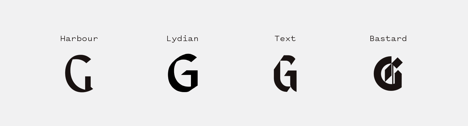
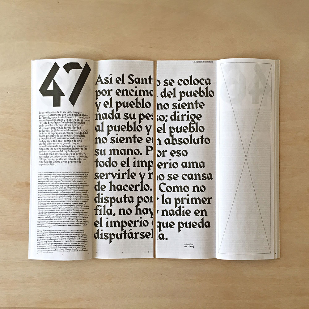
I have so much admiration for Gareth Hagues’ Blackletter interpretations. Often, when you see fonts that have a specific design system in place, they begin to crack around the edges, unable to accommodate the wide range of shapes and characters that typeface design demands. Hague, however, is masterful at setting up a distinct style for these designs and making it work over a stunning number of scenarios.

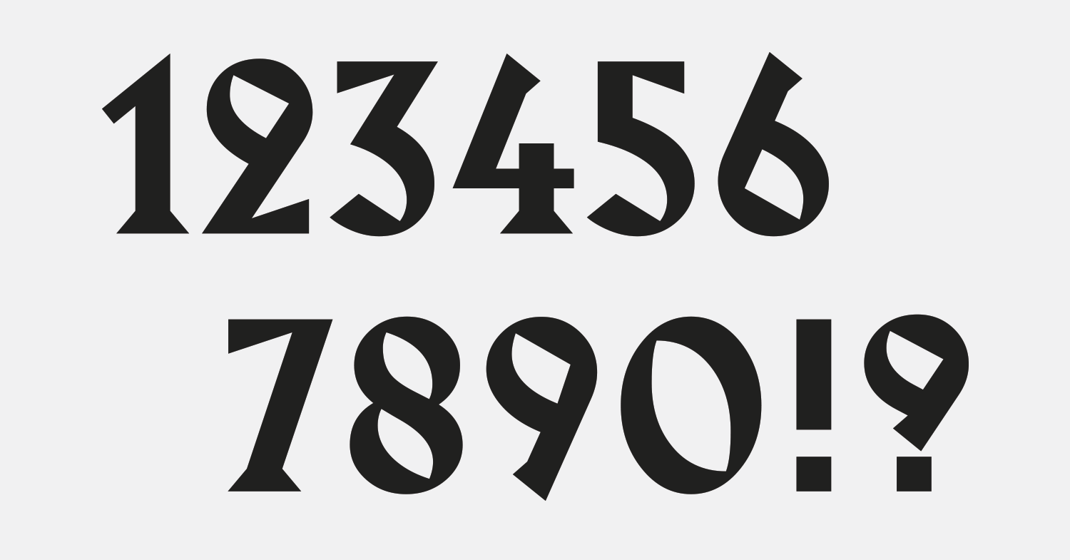
There’s nothing like Harbour, yet it feels like it’s always existed (it’s only been around since 1998). It’s both calligraphic and geometric, in a similar vein to Gareth Hague’s other works (like to previously reviewed Text). Like Text, Harbour is a combination of Germanic and Latin styles, drawing strongly from calligraphic design details from both genres. Its wide-open round characters give it an approachable nature yet the diagonal stress and sharp geometric serifs and angles warn you not to get too close, like some kind of deadly, exotic plant.

As I was writing this review, I was struck by the sentiment that there might not be a more versatile Blackletter-influenced design in existence. The capitals are strong and distinctive without being marred by over the top ornamentation, and the lowercase set is surprisingly usable even with it’s quirky characters and massive triangular serifs. Harbour provides designers with a take on a genre that can be overly prescriptive in how it should be deployed and gives it the flexibility to be used with many different tones of voice and across a range of media, all without losing any edge.

bpando.org — The cover of Don Alonso de Suquía by Bermudez, Porta & Casasus.
Nº02 bpando.orgThe cover of Don Alonso de Suquía by Bermudez, Porta & Casasus.
Nº03 luc.devroye.org — Alte Schwabacher specimen from C.F. Rühl foundry, 1912.

Harbour Design Details

Harbour’s defining characteristics can be boiled down to the extreme “pinch” diagonally from top left to lower right that makes the letterforms look like they are leaning back, and the triangular Latin serifs that adorn many of the letterforms. The design is full of interesting geometry, and even elements like the counter of the “e” are not safe from added pointy diagonal details. The typeface is brimming with personality and Hague finds little ways to make sure an angular emphasis is present in all the characters, even if he has to get creative to do it. The terminals on the “S” and the leg of the “K” share the same backwards cut and keep the backward drift intact on letters that are typically symmetrical and stable. One of the closest historic Blackletter sources I’ve found for Harbour is Alte Schwabacher[3] (a 1912 design by C.F. Rühl based on a lettering style from the 1400’s). You can see the diagonal emphasis and calligraphic flare to the strokes, as well at the angled terminals, and the play between harsh angles and curves in the counters. Details like the “kick” in the “K” also carry though.

flickr.com — A gorgeous book cover by Barbara Gillruth for Living in the Present, making good use of Lydian.
Nº04 flickr.com — A gorgeous book cover by Barbara Gillruth for Living in the Present, making good use of Lydian.
Nº05 dribbble.com — Jay Fletcher’s branding for Duck Duck Goose, which uses the geometry of Harbour to create ornate borders.

I think Jay Fletcher’s Duck Duck Goose branding does a really good job of exposing a lot of the geometric details in Harbour as he repeats many of the same shapes and angles to create this ornate border around the text[5]. Look closely and you’ll see the jagged shapes that cut out of the bottom of the “u” and emphasizes diagonal lines through the spine of the border. He contrasts arched lines with straight edges is the same way Harbour does, and achieves the same clean, sharp but warm aesthetic as the font.

I like to describe Harbour as “Blackletter Lydian”, referencing a classic calligraphic sans. They are based on the same calligraphic idea, just applied to two different genres of typeface, and the similarities are particularly evident in the Light weight. You could easily imagine a line like “THE SOUTHERN REACH TRILOGY” from the specimen at the top of the review working in the same way Lydian has on book covers for decades[4].

Nº06 Harbour Thin compared to Lydian, Text and Bastard. You can see the different calligraphic angles Lydian and Harbour use, and also see the simplified G design in other Blackletter revivals like Virus Type’s Bastard.

Harbour is clean and retro in a really lovely way, with the Blackletter “funk” to make it just odd and unsettling enough. The way the stroke narrows then flattens out along the lower left of bowl shapes is shared across both Harbour and Lydian[6], but Harbour’s is more extreme, and the diagonal “pinch” to the strokes gives it a unique feel. Harbour’s simple finish on the aperture of the “G” reminds me of Blackletter designs like Bastard, which have to be simpler than Latin designs because of all the intricate patterns and designs going on inside the counters of the capitals.

behance.net — Colorful, copy-driven personal branding for Joy Li.
Nº07 behance.net — Colorful, copy-driven personal branding for Joy Li.
Nº08 Comparing Harbour to Commercial Type’s Portrait, another Latin serif typeface. When viewing the designs side by side, the gothic and calligraphic influences in Harbour become more obvious.

Comparing it to another typeface with Latin serifs shows how weird Harbour is and how strong the blackletter presence remains. Portrait from Commercial Type has a lot of similarities to Harbour, but when you directly compare the two the Germanic roots of Harbour become even clearer. Portrait’s vertical stress is more subtle that Harbour’s diagonal one, softening the overall effect and reducing the impact of the serifs. Portrait’s serifs are smaller and the individual characters are more restrained—the lowercase letterforms in particular. Harbour more aggressively embraces geometry with its square dots and angled terminals, and the greater variation in the lowercase character designs sets Harbour apart as a quirky display face when contrasted with Portrait’s more restrained approach.

Nº09 twitter.com — An example of art-deco lettering from the Shreve, Crump & Low building, built in 1919 in Boston, MA. Photograph courtesy of the Typographica twitter account.

Seeing images from this year’s Typecon made aware of another typographic style that was perhaps an inspiration on Harbour: Art Deco lettering. The lettering on the facade of the Shreve, Crump & Low building in Boston is stunning, and I was struck by the similarities between it and Harbour. The deco lettering is more classically Roman in structure, as opposed to Harbour’s calligraphic tilt, but there are some fun parallels. The “R’s” share the “catseye” counter shape, the arms and legs on the “E’s” and “L’s” have the same aggressive geometry, and the “M’s” and “V’s” have the same tendency to emphasize serifs on the right half of the letterforms. I’m not sure if Hague was influenced by this style of lettering in the construction of Harbour, but it’s fascinating to see some of the same design details echo throughout typographic history.

fontsinuse.com — Habour used for Macklemore’s Glorious album cover with an added outline and long
Nº10 fontsinuse.com — Habour used for Macklemore’s Glorious album cover with an added outline and long
Nº11 studiofurious.com — Branding for Paria Studio by Furious which pairs all-caps Harbour with a bright highlighter yellow.
typewolf.com — Harbour used on the Krass Journal website.
Nº12 typewolf.com — Harbour used on the Krass Journal website.

Harbour strengths

Though it was designed in the late 90’s, Harbour has seen a resurgence in recent years, finding its way into both print and digital projects. It’s used often as the sole font, paired with bright colors and unconventional grid systems to create designs that are loud and a little unsettling. I’ve seen this aesthetic referred to as “Brutalist” design, but I find that to be a problematic term. If the definition of Brutalism is raw design without adornment, does using an ornate typeface defeat that mission? Regardless, this genre of design has embraced Harbour and put it to good use. The striking, jagged letterforms can stand up to punchy colors and simplistic layouts let the design of the typeface shine.

One of my favorite “bright color + centered Harbour = Success!” examples is the book cover by Carlos Bermudez, Albert Porta and Guillem Casasus for the limited edition of Don Alonso de Suquía, a novella by A. Lozano Rodríguez[2]. The yellow and red color combination, paired with Harbour’s angular design would be more than enough to catch the eye and enforce the Spanish origin and setting of the story. But the single slice cutting through the cover is when makes the design transcendent. It references the swordsman in the story while also echoing the angular nature of Harbour’s design. The fact that Harbour has these sharp elements while also flaunting ample curves prevents the design from feeling overly rigid. It’s the round shapes that make the slice effective as much as the pointed terminals and counters.

Nº13 vfmk.org — Harbour used alongside Calluna and Calluna Sans in Anatomy of a Fairy Tale by Andreas Greiner.

Despite the fact that Harbour is often used solo, Harbour is not a loner who can’t be seen with others. Despite its unique design I’ve seen several works that pair Harbour with a range of different type styles, and let it play a variety of roles within a type system. In the monograph of Andreas Greiner, Anatomy of a Fairy Tale designed by Sin-U-Ko[13], Harbour is used throughout, from the cover, to the table of contents, and even in the main text itself (be sure to check out the Fonts in Use post about this work to see all the examples). It’s set in the long-form sections against Calluna (German text) and Calluna Sans (English Text) and compliments them nicely. Calluna has sharp serifs and the humanist tone of Calluna Sans harkens to the calligraphic roots in Harbour.

pinterest.com — A poster advertising a lecture by Tony Brooks, designed by the students of HFG Offenbach University.
Nº14 pinterest.com — A poster advertising a lecture by Tony Brooks, designed by the students of HFG Offenbach University.
Nº15 vfmk.org — Harbour used in a grid composition in a spread for Museum Unplugged – eine Selbstbefragung, designed by Ingo Offermanns & Cyrill Kuhlmann.

Harbour’s capital forms have a strong presence without feeling overworked, a rarity with blackletter designs, which can often have highly ornamented details. In addition, unlike many Blacketter designs, the lowercase set of Harbour is remarkably legible and charming. It’s a shame you don’t see the lowercase set used more often out in the wild—most designers stick to all-caps when using Harbour. One interesting aspect of the uppercase set is the consistent width of the characters lends an almost monospace feel, and designers frequently take advantage of this “gridded” feel[15].

chrisbur.net — Harbour used in collages for Nike’s Gotta Shine campaign, design by Chris Burnett.
Nº16 chrisbur.net — Harbour used in collages for Nike’s Gotta Shine campaign, design by Chris Burnett.
Nº17 fontsinuse.com — Harbour with an artificial italic for a Slam Jam X Carhartt WIP campaign.

Though there is no italic version (naturally, given that it’s a blackletter face) there is at least one design that has digitally obliqued Harbour, and rather successfully. This ad series for Carhartt WIP[17] overlays a forced italicized version of the font over striking portrait imagery, and I think it adds a lot to the design. Quotes or statements are often set in italics, and the forward tilt emphasizes the “catseye” shape and draws you in. This type of technique should be avoided as a general rule, but the designers on this project executed on it well. This is also a great time to mention how freaking great the quotation marks are for this font. They are simple, but compared to the letterforms, which feel implanted to the baseline, the ease with which they float in the air and the more aggressive forward slant they have give them a real attitude. They have a sarcastic tone—like the most catty air quotes you can imagine—and I love them.

tinonyman.com — Branding for MI15, a student exhibition for Lahti Institute of Design by Tino Nyman.
Nº18 tinonyman.com — Branding for MI15, a student exhibition for Lahti Institute of Design by Tino Nyman.
fontsinuse.com — Two of Gareth Hague’s blackletter interpretations in the same design. Tiqqun – Introducción a la Guerra Civil, designed by Aazufre.
Nº19 fontsinuse.com — Two of Gareth Hague’s blackletter interpretations in the same design. Tiqqun – Introducción a la Guerra Civil, designed by Aazufre.

Quirks and eccentricities

Because of how prominent the Latin serifs are, particularly in the lowercase set, the default letterspacing on Harbour is very generous. You might need some negative tracking to tuck things in tighter, depending on the use case. When set in uppers and lowers, lines can have an inconsistent visual grey due to the harsh geometry in the design, from the square dots to the sharp angles like what you see on the bottom-side of the “a”. There are also some oddball character designs, like the “y” which give me a split-second of pause as I’m reading. Don’t expect this to be a comfortable text reading experience.

Nº20 instagram.com— Wheat-pasted posters for the UOKM8? campaign for LADBible’s mental health awareness campaign.

The emphasis towards the upper back of the characters can really jerk your eye around on stacked lines, which could cause fatigue for your viewer if not properly managed. A great illustration of this effect are these wheat-pasted posters for UOKM8?, a campaign to raise awareness of male mental-health issues by LADBible[20]. Notice how to “O” in the middle line draws you in from the “U” above it, and the angle on the triangular serif coming off the top of the “M” mirrors the curve of the outside of the “O”. The effect draws your eye in a zag across the entire poster rather aggressively. The “8” that follows is dense and has such a strong angular pull itself which serves as a great stop sign for the line. It should be noted that the question mark on this poster isn’t Harbour’s, which is a closed loop (inspired by the 2 in Albertus, another Latin serif design) and, to quote Tim Gunn, is “a lot of look.” The question mark for Portrait was substituted instead, and blends in nicely with the design, so if you find yourself in a situation where the Harbour version is too jarring, consider using the same trick!

Nº21 Harbour’s Numeral set and a few pieces of punctuation, including the closed question mark.

Compared to the delectable numerals in Text, Harbour’s numerals are a little more particular and not quite as easy to use[21]. The counters are a mix of sharp angles and curves, and some characters like the “6” and “9” feel on the verge of misshapen to my eye, which is unfortunate because those details feel so natural on lowercase letters like the “a” and “e”. The question mark, as mentioned above, has this same detail. The counters in the numerals feel smaller in the numbers compared to the open and generous capital set. The result of all of this is the numerals will be harder to use at smaller sizes and lack some of the punch of the letterforms. There are standouts, however. The numbers that don’t have counters, like the “1”, “3”, “4”, “5” and “7” have a lot of character and enough air in them to feel less constricted. The “3” is a favorite of mine, with its flat top and straight-lined details on the upper half which mirrors to curves on the bottom side. The “4” is stoic and the clever little spur at the top of the stroke gives it the diagonal stress of the rest of the typeface without being distracting or hurting legibility. Lastly, the “5” has the clear diagonal stress across it while still feeling stable. That pinch on the bottom curve could have easily made the figure feel unstable but it’s balanced by the flag at the top and keeps a lovely upright posture.

It’s always important to remember that even in fonts that are as visually unique and seemingly chaotic as Harbour that there is a lot of thought that goes behind implementing it. Don’t think you can slap a showcase font like this on any project and have the same success. Look for the trends showcased in this review and in the dozens of other excellent designs that are leveraging it and try to formally break down what about each design is working in service to the typeface, and vice-versa. This is an idiosyncratic yet thoughtfully designed typeface with a lot of unique typographic ties that you as a designer can play off of, so long as you’re paying attention.

- FRJ