Champion Gothic
— Designed by Jonathan Hoefler

juliaroig.com — Guide to craft beer in Bercelona, by Julià Roig, 2015.
Nº01 juliaroig.com — Guide to craft beer in Bercelona, by Julià Roig, 2015.

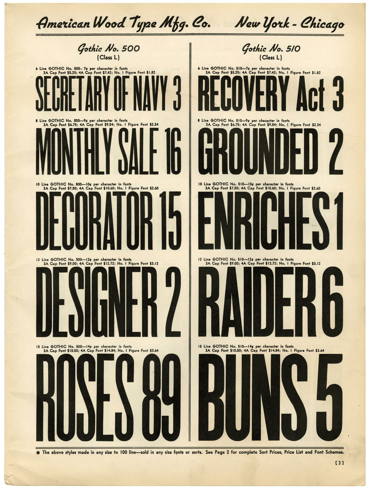
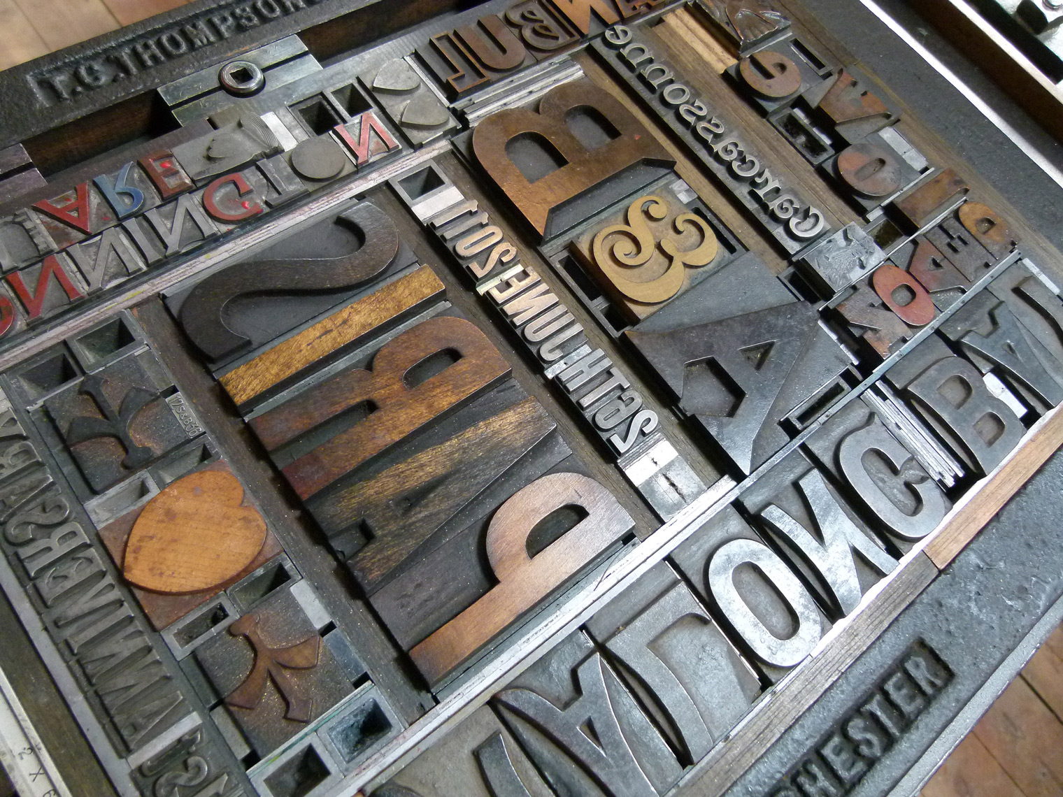
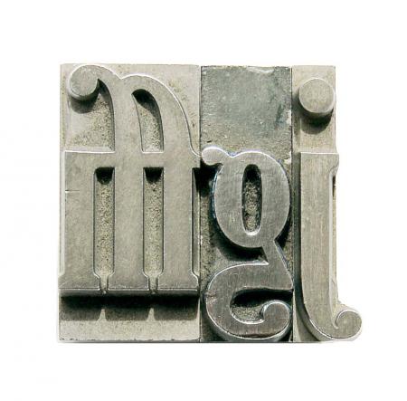
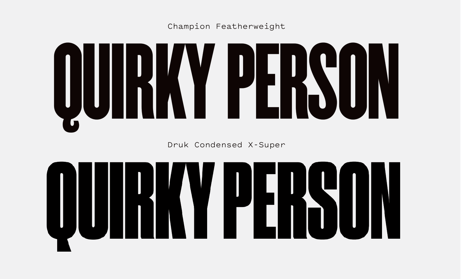
Champion Gothic is a love letter to wood type, and the early attempts type cutters made at interpolating a single style into a variety of widths. Wood type in the US was pioneered by mad scientists who strained good taste and legibility in an attempt to cover the broadest range of ornament, width and weight, and Champion carries that heart and passion through in its design.

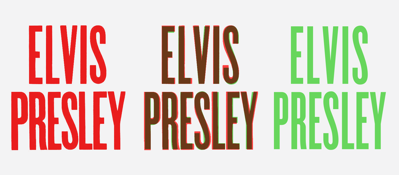
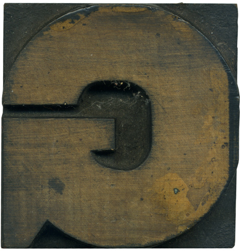
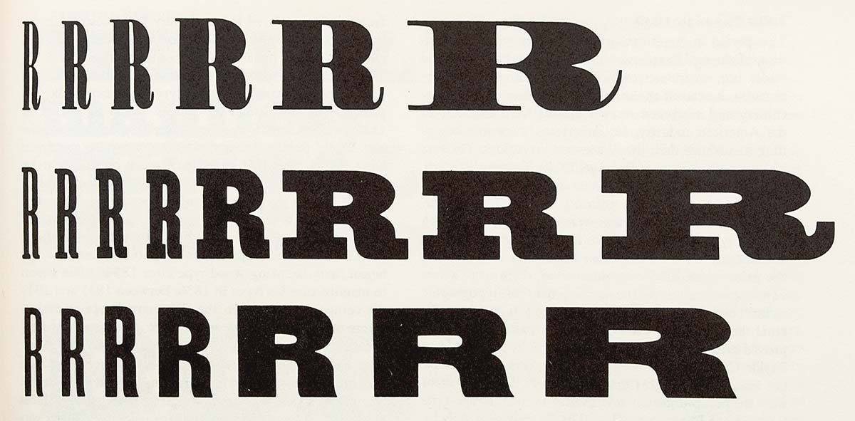
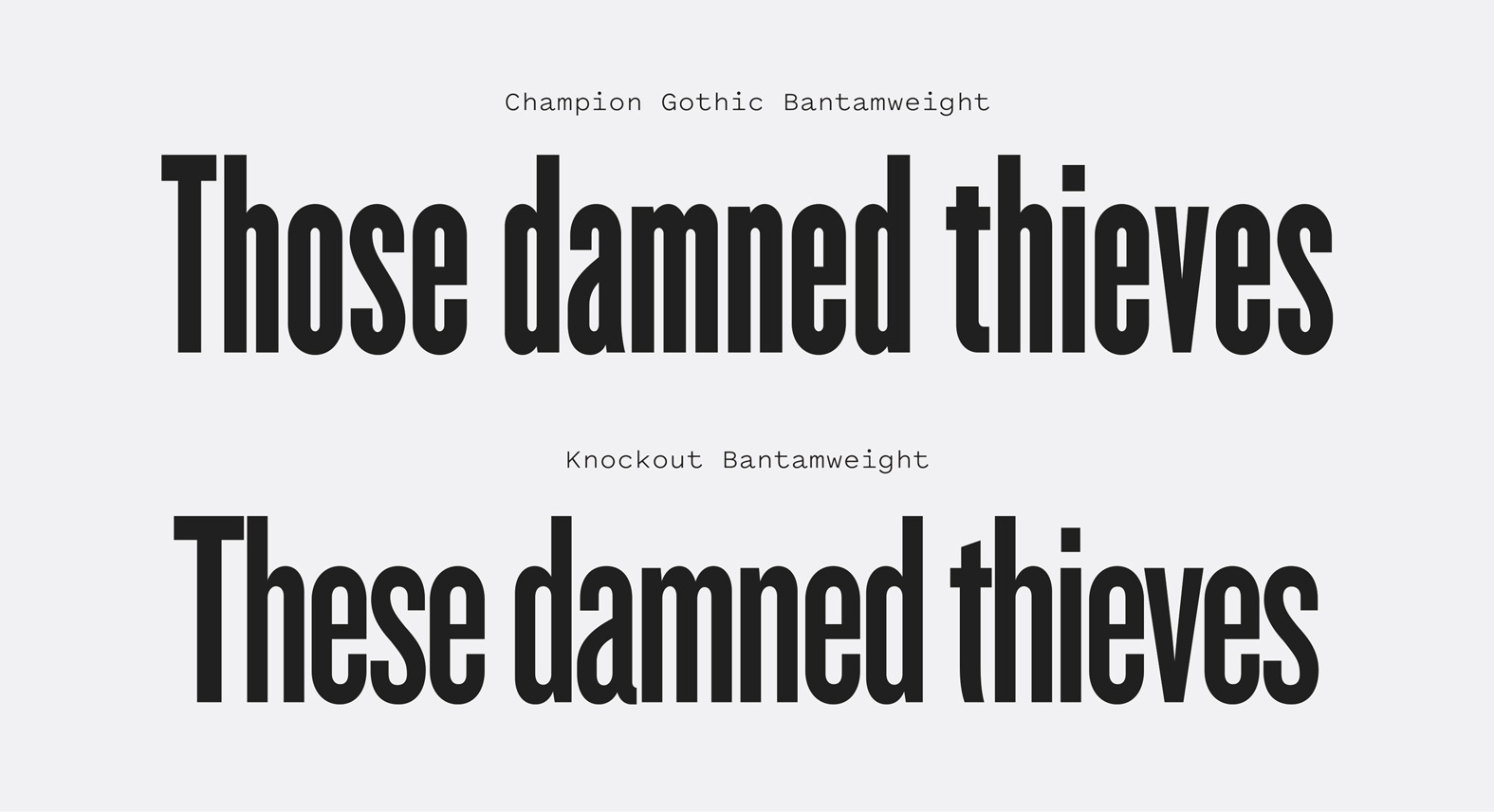
There are a lot of digital revivals of wood typefaces available, but I don’t think any of them combine the warmth of the original designs with the craft Hoefler brings to Champion. Many of Champion’s weights are close translations of classic wood typefaces, lending the family a slightly mismatched, eclectic quality. There are several details that carry through regardless of the weight: the incised spur on the “G”, the curved leg on the “R” and the luxurious curve on the flag of the “5.” These shared details lend the family just enough consistency while letting each weight stand confidently as its own design.

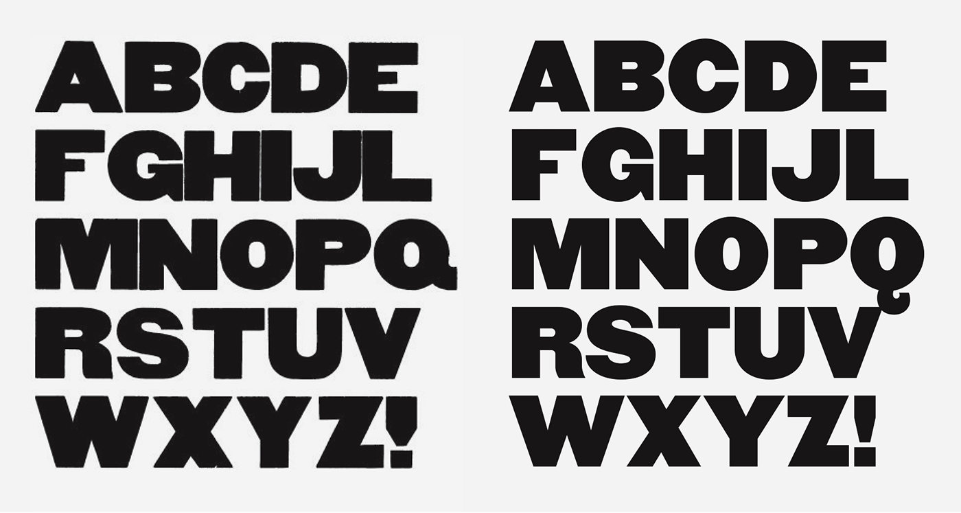
While the more interpolation-heavy design of its successor, Knockout, begets more weights, widths and overall consistency, each weight of Champion feels like its own person, optimized only for itself and no one else. There are no “forced” or awkward weights in Champion because none of them are particularly obliged to obey the rules set by each other. It’s just a bit awkward and mismatched in a way that suits the fast-paced, slap-dash nature of the job printing typefaces it emulates.

dumdum.mx — Champion’s Heavyweight and numerals used in Dumdum’s work for the ShortCup World Film Festival 2017.
Nº02 dumdum.mx — Champion’s Heavyweight and numerals used in Dumdum’s work for the ShortCup World Film Festival 2017.
Nº03 letterpress.dwolske.com — Gothic Nº 500 and 510 from American Wood Type Mfg. Co. Catalog No. 36, two influences on Champion Gothic. Note the rounded upper terminal on the “5” and the subtle bend in the leg of the “R”.
jagamart.com — This Elvis show poster is a great example of the ecelctic type choices found in many letterpressed broadsides from the early 20th century.
Nº04 jagamart.com — This Elvis show poster is a great example of the ecelctic type choices found in many letterpressed broadsides from the early 20th century.

Historic Inspiration

I have to stop to remind myself that not everyone has spent as much time nerding out over the history of wood type printing as I have, so here’s a one-paragraph primer. Wood type was locked up in a “chase” and then printed. Because most letterpress broadsides were type driven, the typefaces chosen had to drive the visual interest of the poster. You wanted to have some variety in the styles of typefaces used (slab serifs, gothics, tuscans, etc) as well as a range of widths, which you’d mingle to create hierarchy in the design, and to ensure you could fit long strings in one line, or stretch a shorter word to fill another[5].

Nº05 flickr.com — A complex type lockup that demonstrates the value in having different widths of type available to fit strings of different lengths.

I could spend this entire review sharing specimens of wood typefaces that inspired Champion Gothic, but I will try to restrain myself and only show either end of the width spectrum, starting with the narrowest width. Champion uses fighting weight classes to denote the weights, with Flyweight being the narrowest and Heavyweight the widest.

Nº06 Overlaying the Elvis condensed grotesque (left) with Champion Featherweight (right). Champion has more width consistency in its letterforms and a more controlled curve on the bottom of the “S”.
end-grain.net — A Gothic wood type block from my collection.
Nº07 end-grain.net — A Gothic wood type block from my collection.

This Elvis poster design[4] (originally from 1956) uses a thin condensed gothic that’s a likely ancestor to Champion. If we overlay the Flyweight of Champion Gothic over top of the text you can see how similar they are, and where Hoefler made his refinements[6]. The bottom half of the “S” is where the most alterations appear. Champion’s finishes quite a bit lower, and the bend in the spine is flattened out. The “R” is also narrower, though Hoefler retains the delightful “kick” in the curve on the leg, which is one of Champion’s defining characteristics. As a whole, Champion brings forward the distinctive elements of the older design while refining the inconsistencies.

Nº08 fontshop.com — The infamous width interpolation example from Rob Roy Kelly’s American Wood Type. These examples show how a foundry would create a range of widths based on one style to maximize the products they could sell and offer flexibility to printers.
fontsinuse.com — It’s fitting that the wood-type inspired Champion would be used in a typography chess set, taking it back to its physical, wood type roots.
Nº09 fontsinuse.com — It’s fitting that the wood-type inspired Champion would be used in a typography chess set, taking it back to its physical, wood type roots.

Finally, the weight that has the clearest ties to a historic wood type specimen is Heavyweight. Though it’s the widest weight, it’s not an extended version of any of the other weights in the way a design like Knockout would be crafted. Instead, it’s based on the generically named Gothic[10], a thick, blocky design that many type manufacturers in the US sold in the 19th century. It’s one of my favorite wood typefaces—a delightful and charmingly unrefined mess of a design.

Nº10 The glorious Gothic (left) compared to Champion Heavyweight (right). Champion adds more air in the apertures and counters and a descending tail, compared to its ancestor.
briarpress.org — An example of lead type with descender space built into the shoulder. Because of the extra space/material required to accommodate descenders, wood type uppercase letters were not often designed with them.
Nº11 briarpress.org — An example of lead type with descender space built into the shoulder. Because of the extra space/material required to accommodate descenders, wood type uppercase letters were not often designed with them.

I can’t look at Gothic and not smile, and Champion carries over most of the best aspects of it and smooths over a few of the quirks. Champion Gothic gives characters like the “W” and “Y” deeper incisions so they have more negative space and don’t “fill in” so much, helping them feel less bulky and stay legible at smaller sizes. The counters stay comically small for the most part, though the “A”, “P” and Q” have slightly taller counters in their bowls to prevent them from feeling swallowed up. The “S” is slightly less of an inconsistent slither than the original (I have to think the original typecutter got to designing the “S” and just gave up).

The biggest change is the tail of the “Q”, which juts to the side in Gothic and hangs below on Champion. This type of descender was avoided in wood type designs because it required the block to be taller than the other letters without a descender (you can see the problematic overlap in the example above), and made locking the type up significantly more difficult[11] . Another drawback was that it prevented “set solid” line-to-line lockups, which cram as much type as possible inside of the composition. Champion’s “Q” feels distinctively more serpentine and floral than the rest of the typeface, and I’ll have more thoughts on this detail throughout the review.

b-ceausescu.tumblr.com — Jazzbook Club poster by Bogdan Ceausescu, showing a wider range of Champion’s glyphs than most designers choose to.
Nº12 b-ceausescu.tumblr.com — Jazzbook Club poster by Bogdan Ceausescu, showing a wider range of Champion’s glyphs than most designers choose to.
Nº13 sva.design — Poster design by Jimin Lee, showcasing Champion’s numerals and mixing it with a slab serif to mimic broadside aesthetics.
dribbble.com — Though it’s a deviation from classic wood type designs, the “Q” in Champion is one of the details that draw people to the typeface.
Nº14 dribbble.com — Though it’s a deviation from classic wood type designs, the “Q” in Champion is one of the details that draw people to the typeface.

Champion Gothic’s strengths

It’s an interesting challenge to review a typeface that has been followed by a successor with many similarities and refinements, but Champion Gothic has a few key characteristics that still make it worth your time. The first is its numerals. Champion has lovely figures across all of its widths and you’ll sometimes see people use Champion for its numbers and not much else[16]. They are even used as substitutions for Knockout’s numerals in some designs, most often because Champion has a flag on it’s “1” and Knockout’s is flagless.

Nº15 moloobhoybrown.com Champion’s distinctive “Q” used in the logotype for Taqado Mexican Kitchen (and it especially charming on signage where it can hang low).
mattwilley.co.uk — Champion’s iconic numerals in use in Four Seasons magazine, design by Matt Wiley.
Nº16 mattwilley.co.uk — Champion’s iconic numerals in use in Four Seasons magazine, design by Matt Wiley.

Another unique character is the “Q,” which in the narrower weights dips straight down off the bowl before curling up on itself[15]. This type of outrageous descender wasn’t very common in wood type but it lends Champion a unique flair that sets it apart from more literal wood type revivals. It gives an organic flair to a design that breaks free of the family’s rudimentary movable-type roots.

Nº17 Champion compared to a flat-side sans, Druk. Champion has more movement in its design while still setting a tight, solid line.

Champion has some of the qualities of a flat-side sans like Druk[17], but there’s more air in the counters and more curves in details like the tail on the “Q” and the leg of the “R.” It does well when set nice and tight and walks the fine line between creating a “full” line of text without wasted negative space and still having some unique character in the letterforms. It’s hard for condensed sans to balance flat sides while still sneaking curves in, and Champion does it really well.

lamm-kirch.com — Champion used in a playful homage to classic broadside posters.
Nº18 lamm-kirch.com — Champion used in a playful homage to classic broadside posters.
Nº19 cargocollective — João Augusto makes beautiful work with Champion for Soul Skatista. The stark style and frantic mix of Champion’s weights is a great example of how many designers leverage these types of mixed weight/width wood typefaces.

The most obvious use for Champion Gothic is in designs that are purposefully referencing wood type broadsides[21], but the clean monumental nature of the letterforms make it well-suited for simpler presentations as well. On the eclectic side of the spectrum, Lamm & Kirch designed this really rad flyer for Jugendclub No Name in Großpösna, Germany[18]. The mix of simple illustrations, borders and the mix of typefaces pays homage to classic broadsides. I love when these types of posters use varying heights of typefaces to create form and space inside of the composition without having to resort to graphic elements.

Nº20 carlesmurillo.com — Champion’s monolithic letterforms blend well with the naturalistic imagery in YUCA magazine.

On the opposite end of the spectrum, Champion is used in the sparse aesthetic of YUCA magazine[20]. The font’s wood type origins have the secondary effect of making each letterform feel self-fulfilled and confident—some typefaces are explicitly designed to be most effective when used in strings of words, and some are designed with characters that stand on their own. The flat edges make them feel more rectangular and “complete.” Each glyph is simple and earthy without straying into feeling “grimy” or sloppy. Many condensed faces would feel too sterile to work alongside the naturalistic imagery in this design, but the balance between heritage, human craft and conciseness is where Champion excels.

themusiccityshop.com — Rolling Stone’s Nashville Now! issue imitates the famous Hatch Show Print letterpress posters that have defined the aesthetic of the area for decades.
Nº21 themusiccityshop.comRolling Stone’s Nashville Now! issue imitates the famous Hatch Show Print letterpress posters that have defined the aesthetic of the area for decades.
Nº22 typewolf.com — CIRQ’s website is a great example of how Champion can mimic wood type broadsides by mixing and matching widths within the family.

Champion was originally designed for Sports Illustrated, and it has seen a long life in editorial design since then. Champion really plays well with softer serifs that share its hand-touched, warm voice. Going back to YUCA magazine, you’ll find many weights of Champion used alongside Century Oldstyle[24]. Despite the disparity in weight between Champion’s Heavyweight and the slender Century Oldstyle, the two typefaces feel harmonious because of their shared movable type backgrounds. Even reversed out, they feel like they have been pressed into the page. The physicality of Champion’s letterforms plays so well against the softness of Century Oldstyle and the real-world spaces showcased in the magazine’s photography.

twitter.com — The Monumental Concrete Ghetto cover, designed by Tommy Spitters, shows off Champion, tightly set.
Nº23 twitter.com — The Monumental Concrete Ghetto cover, designed by Tommy Spitters, shows off Champion, tightly set.
Nº24 carlesmurillo.com — Even in its Heavyweight, Champion conveys warmth and plays well with the soft Century Oldstyle in YUCA magazine.
carlesmurillo.com — Carles Murillo’s The Future is Unwritten series showcases how well Champion handles being set with tight leading, so long as you don’t run into that “Q.”
Nº25 carlesmurillo.com — Carles Murillo’s The Future is Unwritten series showcases how well Champion handles being set with tight leading, so long as you don’t run into that “Q.”

Quirks and eccentricities

Champion has very tight counters, so it’s best saved for the headline use cases it was designed for. Another limitation of Champion when compared to Knockout is that all of the weights are fairly heavy, even in the thinnest weights. This limits the tones of voice Champion can take on, despite it’s range of widths. It’s always going to feel very “full” and thick on the page.

Nº26 When you compare Champion (top) to Knockout (bottom), you can see how much more air and counter-space Knockout allows for compared to its older sibling.

Champion really looks great set in all-caps with tight leading[23], but it’s those use cases where the plunging tail on the “Q” causes problems. Because it descends so far from the baseline it can force you to add leading, which creates a “striping” effect that isn’t optimal considering how dense each line of Champion feels. Knockout moved to a tail design that stayed along the baseline to avoid this issue, and it’s a shame it’s not present as an alternative here, because as you can see in the classic Gothic specimen earlier in the review[10], the simpler tail feels more familial with the rest of the design.

Champion is not a typeface you should use if you want something to feel slick or buttoned-up. True to its wood type origins, it feels naturalistic, has a physical presence and conveys brutish utilitarianism. Use it if you want your design to feel like it was crafted by hand, with all the little imperfections that come with it. Condensed faces so often feel cold and impersonal to me, but Champion is one of the first typefaces I come to when I absolutely need to use one due to its warmth and familiarity.

- FRJ