Windsor
— Designed by Eleisha Pechey

elisabethmcnair.com — Windsor’s soft line work and eclectic mix of shapes make it a perfect pairing for illustrative work. Design and illustration by Elizabeth McNair for Alvin Diec.
Nº01 elisabethmcnair.com — Windsor’s soft line work and eclectic mix of shapes make it a perfect pairing for illustrative work. Design and illustration by Elizabeth McNair for Alvin Diec.

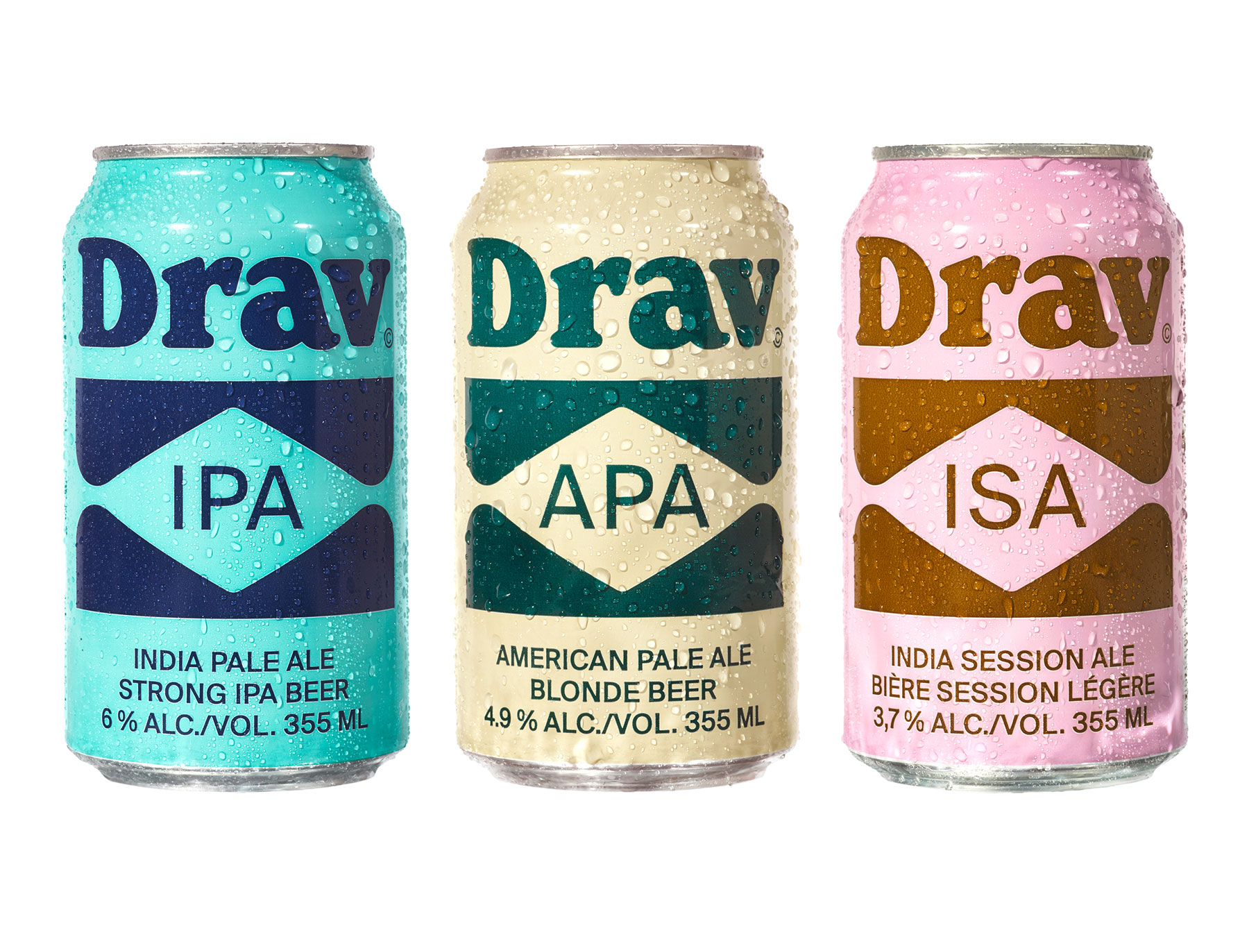
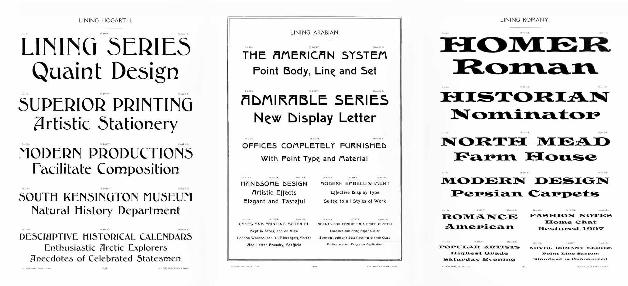
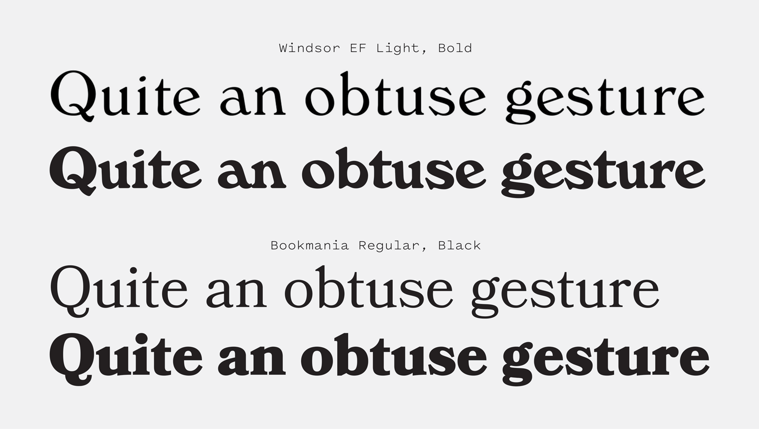
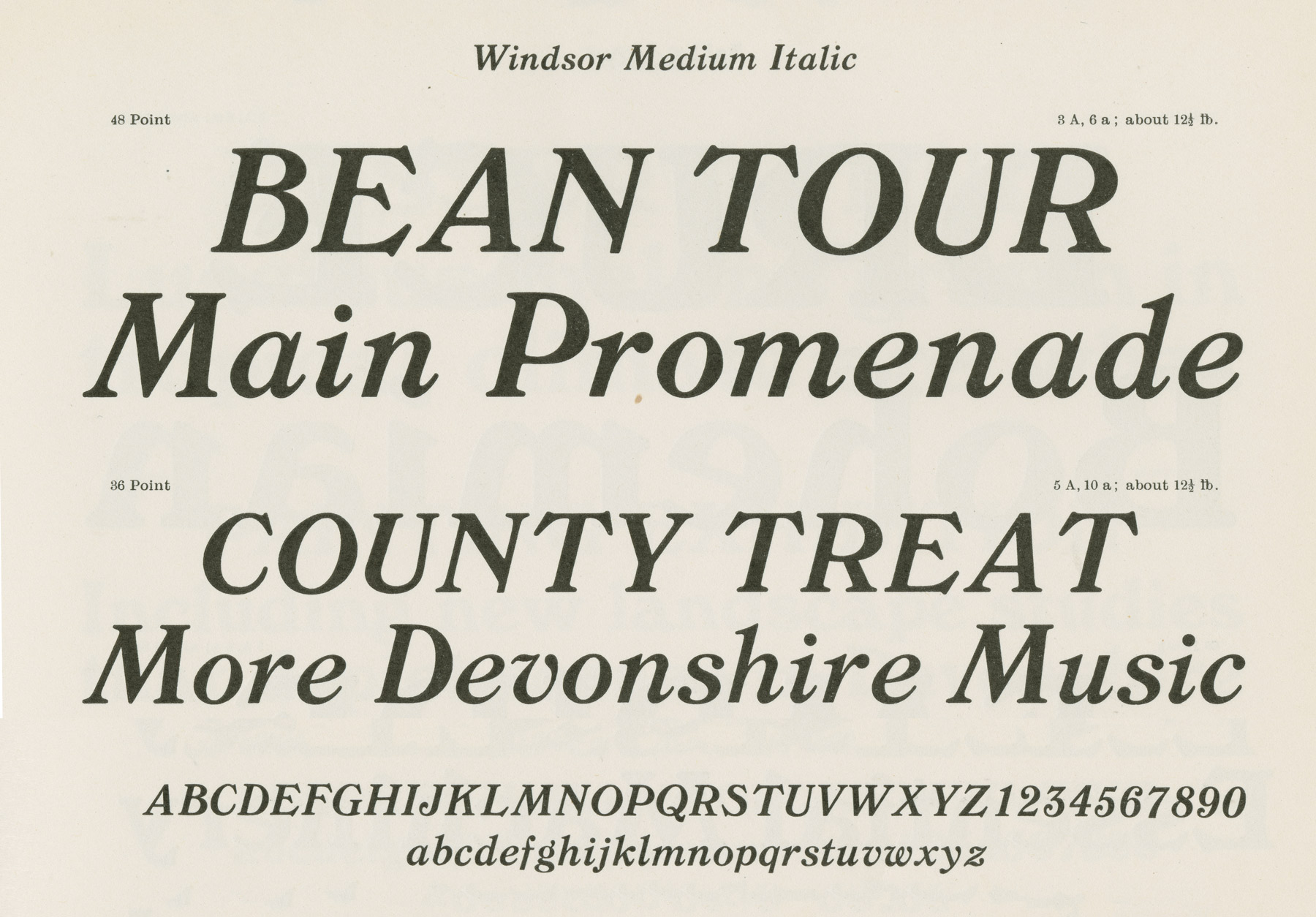
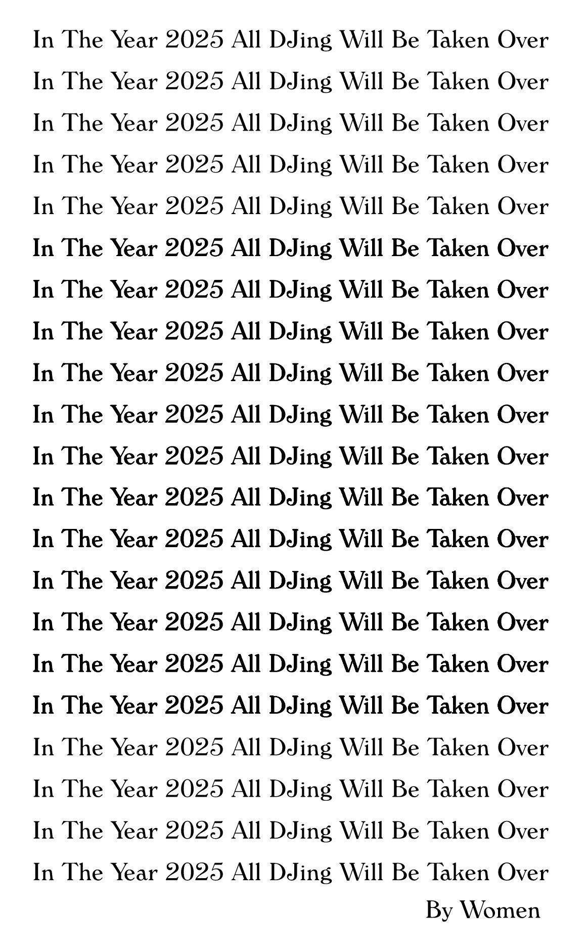
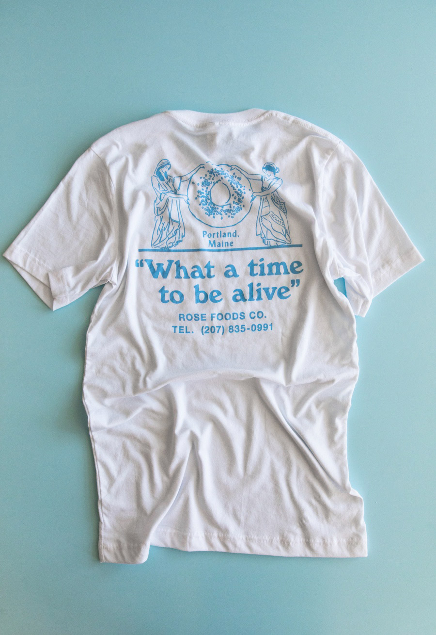
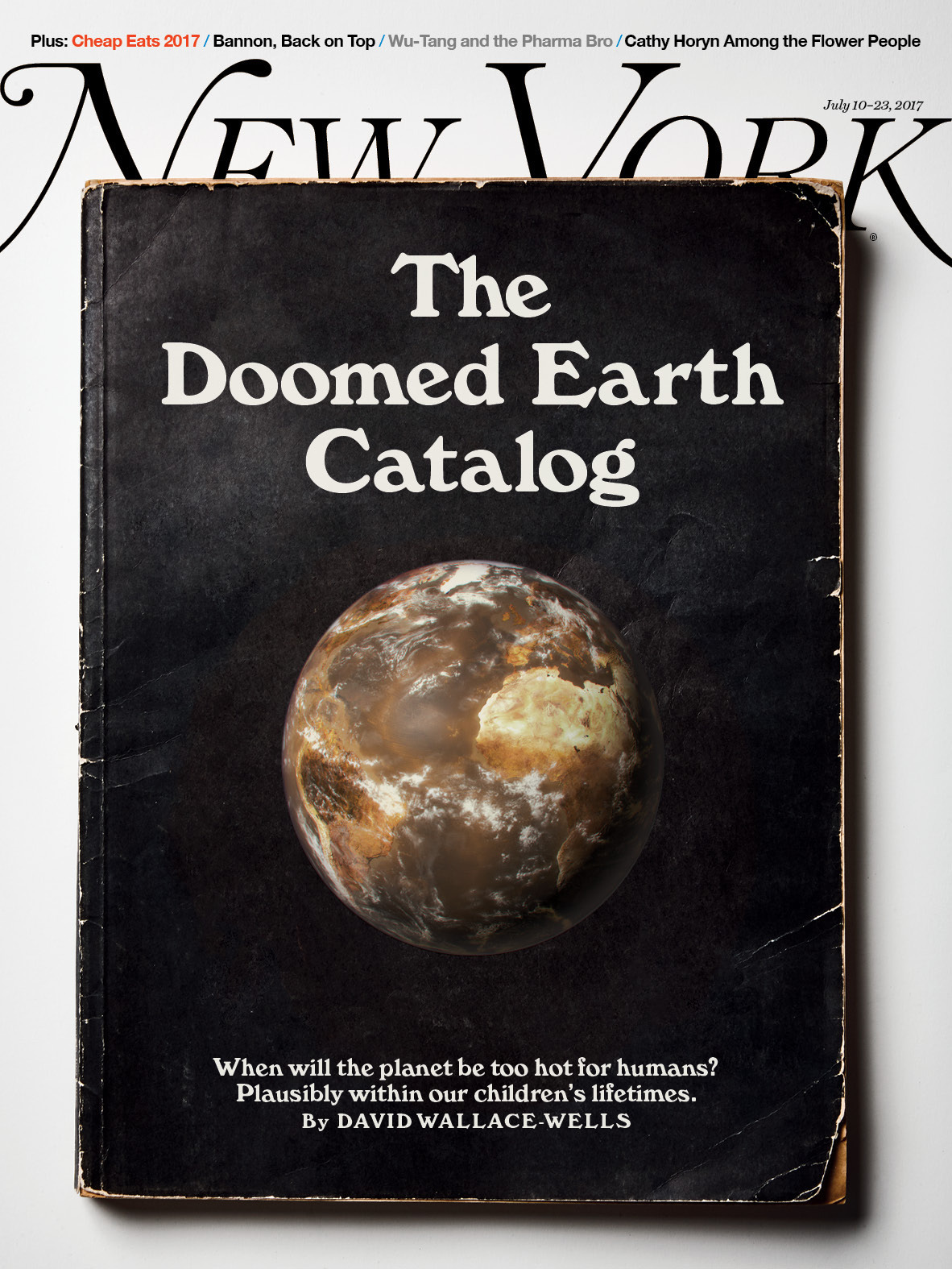
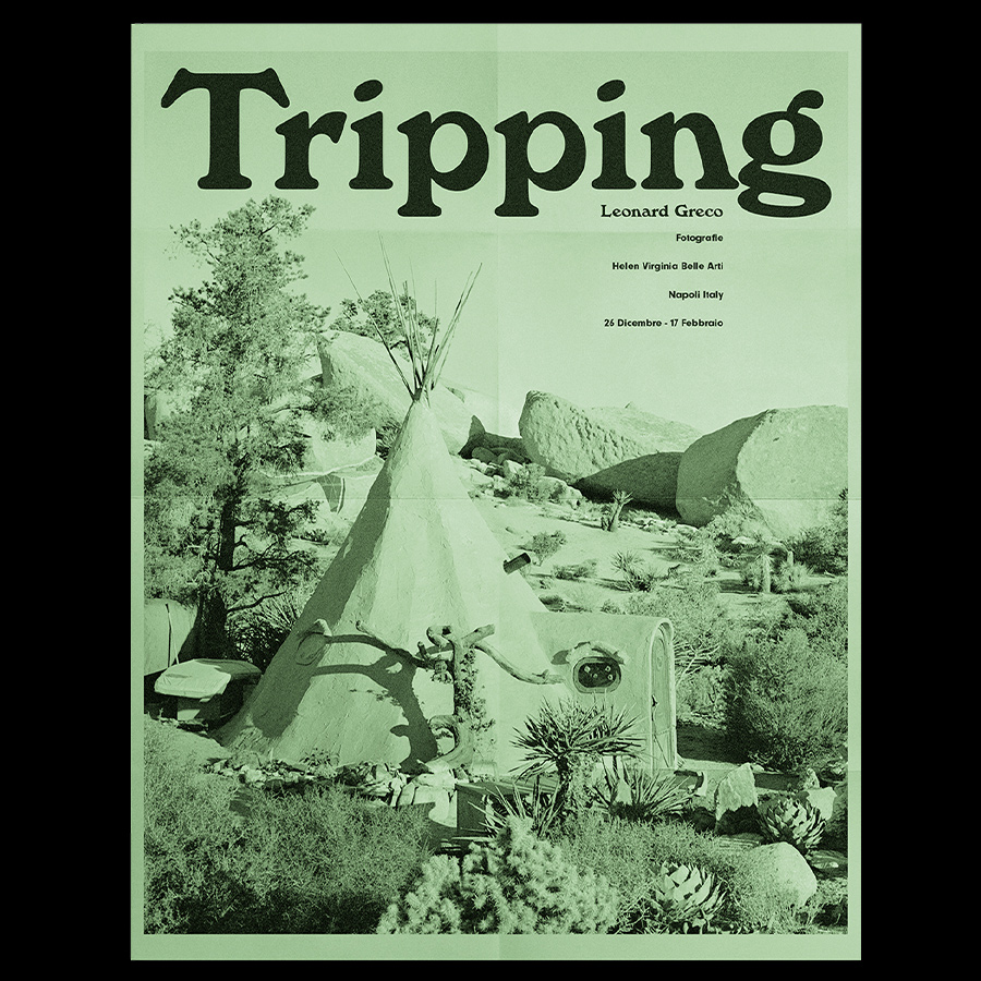
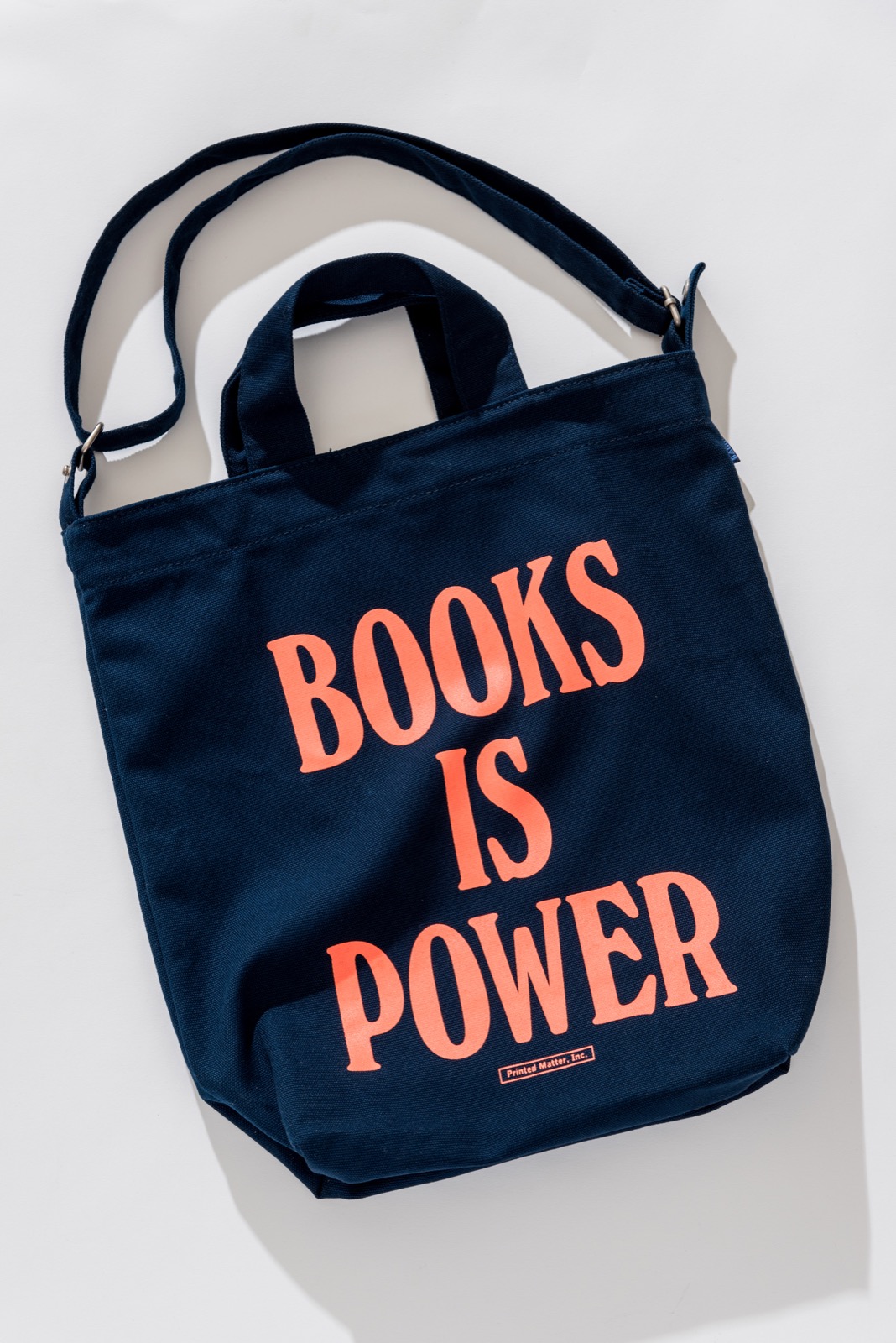
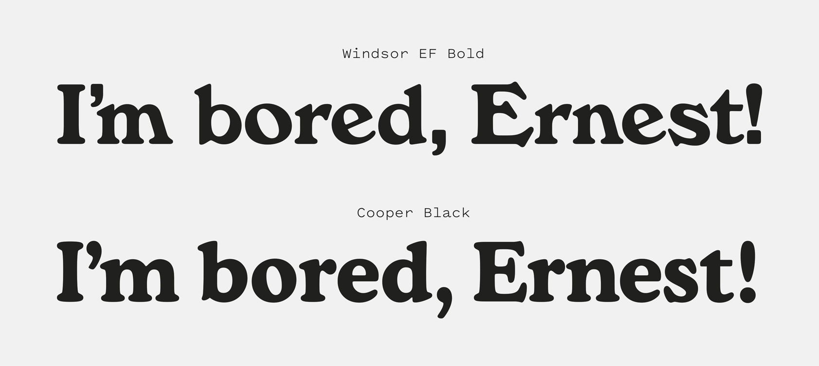
Windsor is a typeface of British origin that’s found its way into the “Ugly American” vernacular—a turn of fate that has given the design a longer shelf-life than I think anyone could have predicted. It’s as tortured (and torturous to use) as it is charming, yet here it is, as popular as it’s ever been. The first lesson type designers should take from this is that designers will put up with a lot of grief for a distinctive lowercase “a.”

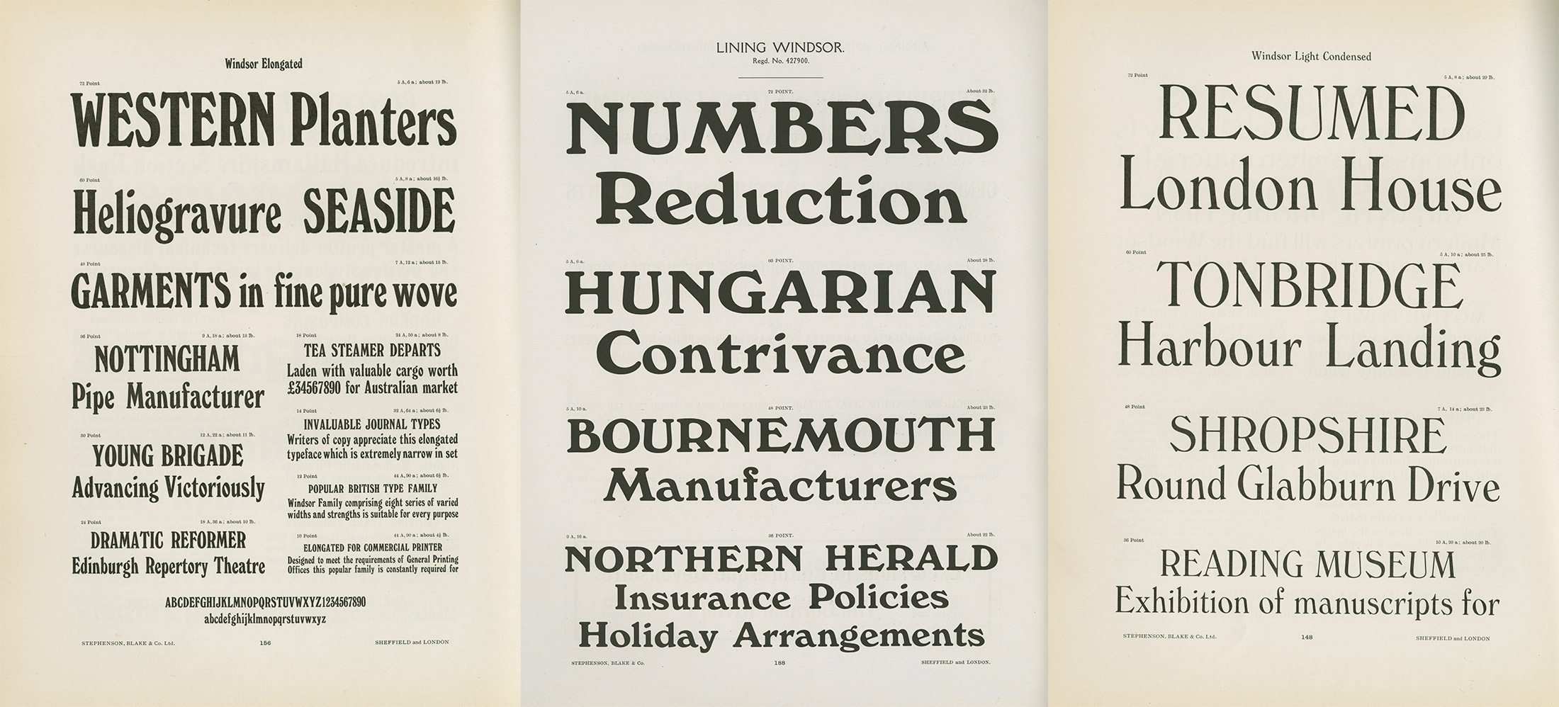
One of the things that has always surprised me about Windsor is how tangential each of its widths and weights feels. The family is more a series of cousins with certain predominant family traits than it is a spectrum of siblings. This allows Windsor to inhabit many different moods even within the same design, whether it’s the tubby, Cooper-esque bolder weights or the Victorian sensibilities of the lightest weight.

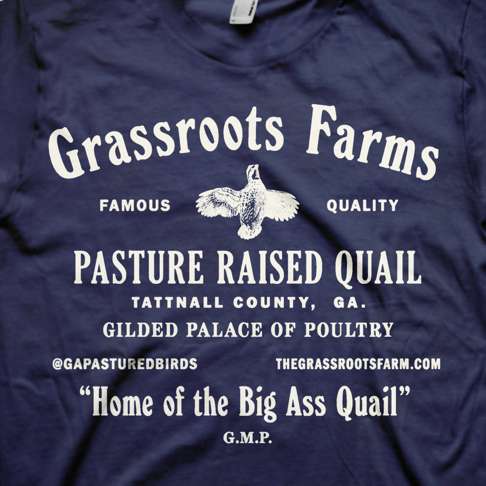
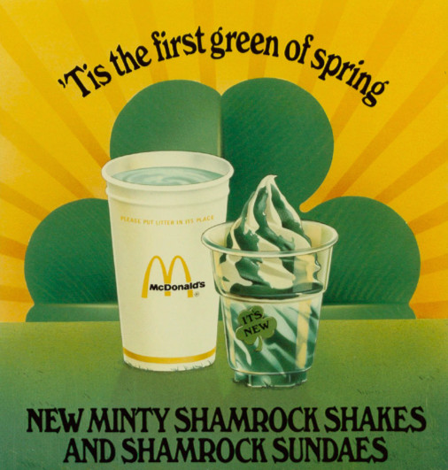
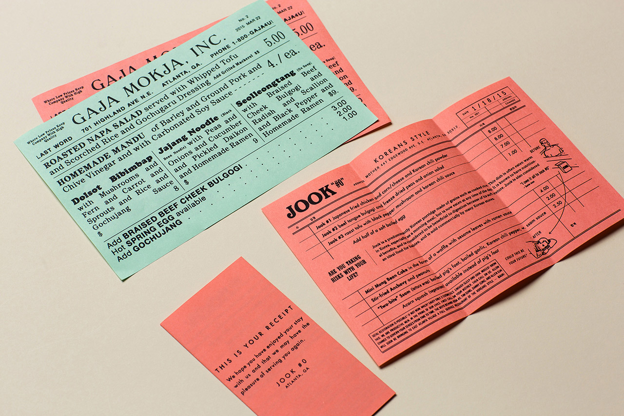
Windsor comes across as a design that thinks it is better suited for formal use than it actually is—this is a weird typeface. Much like its mulleted “a,” it’s the party that you notice, rather than the business. Using Windsor with an intent on elegance is a bit like putting an ostrich in a tux. But Windsor’s odd blend of refinement and whimsy have made it a go-to choice for designers seeking to tap into nostalgic undertones or to pair against playful illustration or colors.

Windsor is trying very hard—it’s a Smörgåsbord of ideas and stylistic influences and nearly all of its characters have some little tweak or detail attempting to set it apart. This isn’t a typeface that’s known for stylistic alternates, and that’s because all the weird stuff is already the default. At its worse, it’s the insufferable chap in the corner of the party with a handlebar mustache who hasn’t realized there’s toilet paper stuck to his two-tone oxfords. That doesn’t mean it’s not capable of results that feel earnest and authentic in the right hands.

wedge.work — Drav branding and packaging design by Wedge.
Nº02 wedge.work — Drav branding and packaging design by Wedge.

Historic Inspiration

Windsor was originally released in 1905 and designed by Eleisha Pechey, released through Stephenson Blake’s foundry. While I compared Windsor to Cooper in the introduction, it’s actually Windsor that predates the Cooper family by a couple of decades. History is written by the victors, I suppose. But before we get into what Windsor inspired, we should spend a bit of time on the typographic trends that influenced its own creation.

The most obvious stylistic influence on Windsor, in my opinion, is Art Nouveau, a French style that featured sinewy line work and was heavily informed by forms and patterns appearing in nature. You can see it in the organic shapes in details like the egg-shaped bowl of the “R,” the pronounced beak-like serifs on the “S,” the fanned terminal on the “2” and the unfurling tail of the “Q.” Similar to a typeface like Domaine, Windsor is taking some influence from floral motifs.

Nº03 archive.org — A series of Art Nouveau-era typefaces designs, published by the Stephenson Blake foundry. Windsor borrows many of the stylistic details in these designs, including the oversized bowls in letters like the “R” in Hogarth, and the ski-slope shoulders on the “m” and “a” in Romany. From Specimens of Point line Type, Stephenson Blake Foundry, 1908.
fontsinuse.com — The Patrie (a Montreal-based newspaper) from April 2, 1918. La Patrie is one of the most typographically delightful newspapers I’ve ever come across, and it’s worth doing some digging to see more examples of how they mixed typefaces.
Nº04 fontsinuse.com — The Patrie (a Montreal-based newspaper) from April 2, 1918. La Patrie is one of the most typographically delightful newspapers I’ve ever come across, and it’s worth doing some digging to see more examples of how they mixed typefaces.

Browse through one of Blake’s catalogs from the time around Windsor’s release[3] and you’ll see Art Nouveau typefaces with the same oversized bowls, diagonal stress in the “o,” hunched over “a’s,” sloped shoulders and even the peg leg of Windsor’s “N.” It’s easy to imagine Windsor as a sort of melting pot for these various influences. Lining Hogarth is a particularly useful point of comparison with its Art Nouveau-ish shifting midlines higher or lower to create dramatic proportions. Notice how the spine of the “S” is pulled so close to the cap-line, allowing the lower half to twist down underneath. This detail is shared by Windsor, and it’s a good example of Windsor’s attempt to translate these highly specific stylizations into a more utilitarian package.

Nº05 flickr.com — Miller & Richard Old Style Antique Nº 7. First seen in 1860, this specimen is from 1922.

Windsor is a bit of a grab-bag family, and its formal elements feel haphazardly pilfered from various trends from Art Nouveau as well as more conservative and versatile serifs from the era. Miller & Richard’s Old Style Antique Nº 7, for example, is a low-contrast serif with a light, airy presence and seems to be part of a genre of serif that influenced Windsor’s design[5]. It’s similarly wide-set, has pronounced diagonally jutting serifs, and the bowls on the “d” and “p” are bulbous and egg-shaped. It also had an alternate “e” that was rocked back, as Windsor’s is. It’s almost as if Windsor intended to blend the more expressive influences of Art Nouveau and these more traditional serifs.

fontsinuse.com — Windsor seen in an ad inside of The British Printer, from 1914.
Nº06 fontsinuse.com — Windsor seen in an ad inside of The British Printer, from 1914.
Nº07 Comparing Windsor (top) against Bookmania (bottom), you get a sense for the ways Windsor mixed different formal ideas into the Bookman-era serifs that were popular in the same time period.

Looking at Windsor side-by-side with Bookmania (a Mark Simonson Bookman Oldstyle revival, which itself is a close relative of Old Style Antique Nº 7) you can more easily see the oddities in Windsor[7]. The distinctive shoulders on the “n” make the line of text feel as if it’s a living thing, crawling across the page, and the “a” “e” “o” and “r” are all pulling in the aforementioned artistic quirks of Windsor’s predecessors. Pechey crafted Windsor with more angular serifs (eschewing ball terminals in the process) and rarely gave up an opportunity to pinch or tilt a letterform in some way. It’s in the bolder weights where Windsor really starts to differentiate itself from the Bookman-style designs, as the corners round off and serifs remain slender and jagged rather than bulking up as expected. The bowls on the letters like the “b” also pick up an odd diagonal stress which feels out of step with the “o” and “e” which emphasize backward, rather than forward.

bros.family — This t-shirt design mixes Windsor and other serifs with abandon, similar to the turn of the 20th century aesthetic Windsor was born into.
Nº08 bros.family — This t-shirt design mixes Windsor and other serifs with abandon, similar to the turn of the 20th century aesthetic Windsor was born into.
Nº09 A specimen spread that shows off many of the weights of Windsor (and it’s lovely numerals). From Printing Types, Stephenson Blake & Co., LTD, 1924. Reproduced with kind permission from the Letterform Archive.
are.na — A McDonald’s ad featuring Windsor. Perhaps they liked how the shoulders of Windsor mimic the golden arches? Note that this is using an “a” that doesn’t have the distinctive forward pitch you’d expect from the family.
Nº10 are.na — A McDonald’s ad featuring Windsor. Perhaps they liked how the shoulders of Windsor mimic the golden arches? Note that this is using an “a” that doesn’t have the distinctive forward pitch you’d expect from the family.

As I previously mentioned, Windsor is a unique family in that there’s a pretty dramatic spectrum of weights and widths available, and they don’t always feel directly familial to each other. It’s one of the least-cohesive serif families I can think of, but there are a few characteristics that will allow you to spot it across its disparate weights and styles. Those distinctive water-slide shoulders on the “n” and “m” will come through in any variant, as will the diagonal emphasis on the counter of the “o.” The “a” will always be leaning forward with its little tail poking out behind. The “E” and “F” are always a key giveaway for me as well—the raised middle arm with its aggressive downward-stabbing serif is not a detail you’ll see in other, milder serifs from the era.

Nº11 These three specimen pages let you see how Windsor’s most idiosyncratic features translate across the range of weights and widths available. Reproduced with kind permission from the Letterform Archive.
vox.com — Another McDonald’s ad, this time for the infamous Shamrock Shake. 1980.
Nº12 vox.com — Another McDonald’s ad, this time for the infamous Shamrock Shake. 1980.

The “U” pinches in at the top across most of the widths, and it’s one of my favorite details of the family, and the wide-stanced “M” evokes the popular-of-the-time De Vinne, a sleek Latin serif from the 1890’s. You’re likely bored of me listing off unique characteristics at this point, but I’d have an easier time listing off the non-idiosyncratic characters in Windsor than I am trying to spotlight what’s unique. If you’re wondering where the tilted “e” comes from, one possible source of inspiration is the work of Nicolas Jenson, a French type designer who used tilted “e’s” all the way back in the 15th century. Between that and the Art Nouveau influence, there’s an awful lot of France in Windsor.

Nº13 The Last Whole Earth Catalog, an eco-focused publication that started in 1968, with the “Last” issue coming in 1971. This is one of the most recognizable in-use cases of Windsor, and it has cemented our association with the typeface and this time period and cultural mindset.

One detail I want to call out about the in-use you’ll find of Windsor from the early 20th century is the willingness to mix different distinctive serifs together in the same design—something modern designers would be reluctant to do. Windsor was often placed alongside contemporaries like De Vinne and Cheltenham in the same design[14]. Perhaps the wealth of creative serif designs available in that time period led to the Frankensteins’s monster that is Windsor—you had to go big or go home.

Nº14 commons.wikimedia.org — This ad is using Windsor (or something quite similar to it), and what’s most notable about it is the use of an “n” as a “u” in the word “Amusement.” This ad is using several different serif families and it all becomes a bit of a wash, but it’s impossible to miss those unique shoulders.
Windsor’s ill-fated italic, from Printing Types, Stephenson Blake & Co., LTD 1937. Reproduced with kind permission from the Letterform Archive.
Nº15 Windsor’s ill-fated italic, from Printing Types, Stephenson Blake & Co., LTD 1937. Reproduced with kind permission from the Letterform Archive.

Interestingly, the original release of Windsor included an italic[15], which hasn’t yet made the move into the digitized versions of the family. If I had to guess why, it’s that the lowercase characters are dreadfully generic, and bear little resemblance to the more expressive romans. If you saw the “a,” or “m” of the italic in isolation and were told it was from Windsor, you’d certainly call bullshit. The capitals fare a bit better, but the forward pitch strips away the stable symmetry that makes characters like the “U” so delightful in the roman cuts.

Nº16 sainsburyarchive.org.uk — Windsor was used by the iconic Sainsbury supermarket, renowned for its unique packaging. Scotch eggs seem a suitable subject for Windsor, given its ovoid bowl shapes.
jbwarehouse.blogspot.com — A Ball Park Franks ad from a 1976 Detroit Tigers scorebook. When Windsor is tracked this tightly, the words begin to feel like illustrative masses, rather than typeset phrases.
Nº17 jbwarehouse.blogspot.com — A Ball Park Franks ad from a 1976 Detroit Tigers scorebook. When Windsor is tracked this tightly, the words begin to feel like illustrative masses, rather than typeset phrases.

Windsor’s strengths

Let’s start this section with some in-use from Windsor’s heyday in the 60, 70’s and 80’s. Its smooth edges and exaggerated shapes led designers throughout history to use it in designs that needed to come across as friendly or fantastical. Two popular genres for Windsor were toy and food packaging. I could have filled this entire review with board game and junk food imagery, but thankfully those genres are not where Windsor’s influence ended. Windsor’s egg-ish motifs and soft, tactical rendering made it a great option for foodstuffs (including actual eggs![16]) and McDonald’s was quite fond of it in the late 70’s and early 80’s[12].

Nº18 reaganray.com — Two toy line wordmarks from the 1980’s, both making good use of Windsor. Curated by Reagan Ray.

Of all of these historic examples, it’s the Dragonriders of the Styx logomark that brings me the most joy[18]. It wouldn’t have occurred to me to leverage Windsor’s ovoid bowl shapes and jagged serifs for work in the fantasy genre, but here it feels suitably ancient and imposing. One way to describe Windsor is playful, kiddish drama, which is perfect for this use case.

Nº19 hahahardcore.tumblr.com — Kevin McCaughey roughens up the typically crisp Light weight of Windsor to make it feel lived-in while still leveraging its theatrical proportions and jagged serifs to play up the tone of the content.
hahahardcore.tumblr.com — This design replaces Windsor’s egg-headed “R” with something more restrained, lending a little anonymity to the typeface. The tilt also plays nicely against the sloped angles on Windsor’s “n” and “a.” Designed by Kevin McCaughey.
Nº20 hahahardcore.tumblr.com — This design replaces Windsor’s egg-headed “R” with something more restrained, lending a little anonymity to the typeface. The tilt also plays nicely against the sloped angles on Windsor’s “n” and “a.” Designed by Kevin McCaughey.

Most of the present-day in-use you’ll see of Windsor falls into a few major buckets, with the first being the straightforward, brutalist-ish aesthetic that leverages the oddness of Windsor inside of otherwise stark design, often paired with punchy colors[21]. Its plunging shoulders and rolling “e’s” bramble alongside bland, rigid sans like Druk in contrast to its surroundings. This aesthetic values typefaces that are “bubbly,” “wrong” and familiar in a retro way. The fact that Windsor’s letterforms often feel at odds with each other amplifies the piecemeal tone in these pieces, and the softened edges lend some warmth against the high-contrast colors and sharp grotesques. Windsor comes “pre-wonky” and sometimes that is of value to a designer—those imperfections or tensions make it feel a bit bespoke even though usage of this typeface has been quite prevalent in the US for the past century.

Nº21 parks-perdue.tumblr.com – A fantastic example of Windsor paired alongside utilitarian Grotesques and a limited color scheme.
hahahardcore.tumblr.com — Another example of Kevin McCaughey using Windsor as a starting point and amplifying it with smart composition, concepts and subtle alterations (here he’s artificially bolding the middle section).
Nº22 hahahardcore.tumblr.com — Another example of Kevin McCaughey using Windsor as a starting point and amplifying it with smart composition, concepts and subtle alterations (here he’s artificially bolding the middle section).

Windsor pops up often in Kevin McCaughey’s work[20], and I really love how he’s able to present it in a way that makes it feel hand-crafted, almost like custom lettering—it always feels intentional and fresh, rather than someone who’s just relying on the familiarity of an old classic. He makes good use of Windsor’s expressive lowercase characters while avoiding the awkward interactions that can happen with this family, yet it never feels too pretty or perfect.

Nº23 felicitonlandrive.tumblr.com — Félicité Landrivon does the low-fi photocopied flyer aesthetic so well, and here Windsor’s beak-esque serifs and stately shoulders serve as a nice mirror to the griffon’s stature and design.
bros.family — These menus for Gaja Food & Drink mix multiple weights of Windsor (a rarity!) alongside Cooper Black and other faces with an abandon that few modern-day designers are willing to embrace.
Nº24 bros.family — These menus for Gaja Food & Drink mix multiple weights of Windsor (a rarity!) alongside Cooper Black and other faces with an abandon that few modern-day designers are willing to embrace.

While McCaughey favors Windsor’s lighter weights, French designer Félicité Landrivon makes wonderful use of the bolder range[23]. She does a wonderful job of making the typeface feel unfamiliar, and wrings a lot of variety out of it from piece to piece. Most often, she’s using it as an homage to grimy 70’s counterculture aesthetics, but I also love how she uses it in The Space Lady publication[25], where its slinking lines contrast the diagrams and other scientific imagery. Landrivon’s clearly having a blast through her work and that passion is contagious.

Nº25 felicitonlandrive.tumblr.com — Félicité Landrivon uses Windsor to immediately set a retro, DIY mood for The Space Lady publication.
bros.family — The cornucopia of vintage typefaces in this shirt makes it feel “un-designed” and utilitarian despite its typographic diversity.
Nº26 bros.family — The cornucopia of vintage typefaces in this shirt makes it feel “un-designed” and utilitarian despite its typographic diversity.

Windsor is often used in vintage-inspired work, in many of the same situations you would expect to see Cooper Black. Like Cooper, Windsor saw a resurgence of use in the 60’s and 70’s, so designers nowadays often use it to evoke that era’s aesthetic. Because Cooper and Windsor both experienced these mid-life revivals, our framing of the time period they “belong” to is a bit unmoored. Perhaps this is the reason why it’s so easy to use Cooper as the point of comparison to Windsor—because our perspective of their heritage is skewed, it’s easy to convince yourself that the more popular design of Cooper is the cornerstone that Windsor was built on.

One of my favorite agencies, Office of Brothers, Inc, uses Windsor often in their vintage-inspired branding projects[24]. They (and designers in the same genre) will sometimes use Windsor alongside other American vernacular typefaces to mimic low-brow, “un-designed” pieces of ephemera[26]. Cooper Black, Lydian, Windsor, Futura—they can all pop up in the same design. I admire the studio’s ability to take lessons from these “less-refined” design artifacts and combine them with modern sensibilities and a healthy sense of humor.

Nº27 bros.family — An example of Windsor feeling right at home in simple, single color printing applications.
nymag.com — New York Magazine’s July 10-23, 2017 issue cover. Illustration: Justin Metz. You can find archives of the Whole Earth Catalog here.
Nº28 nymag.com — New York Magazine’s July 10-23, 2017 issue cover. Illustration: Justin Metz. You can find archives of the Whole Earth Catalog here.

In addition to these “working class” retro designs, Windsor is frequently used as visual shorthand to signal “this is about the 70’s,” with the most infamous example being the New York Magazine’s Doomed New Earth issue cover[28]. The cover is referencing the Whole Earth Catalog[13], a counter-culture magazine from the 60’s and 70’s with a focus on DIY eco-friendliness. Justin Metz’s perversion of the original design satirizes the optimism of the era against the current state of environmental preservation. The fact that the Whole Earth Catalog cover is so iconic and that Windsor is so clearly identifiable to that time period makes the design feel painfully dated and out of touch, which is what makes Metz’s reference of it effective.

Nº29 behance.netFrances Ha poster, by Midnight Marauder, with an aesthetic referencing film posters from the 1970’s.
jamsayne.com — Tripping poster by Sam Jayne, using minimal color.
Nº30 jamsayne.com — Tripping poster by Sam Jayne, using minimal color.

Windsor can be a difficult typeface to typeset, given the wild variety in its letterforms, and the relatively poor quality of its digitizations. This has led to creative solutions from designers who want the character of the typeface while avoiding the pratfalls it can lead you into. For the cover of Leonard Greco’s Tripping[31], designer Sam Jayne scatters the title across the page, not only referencing the tone of the Greco’s photography, but allowing for the impact of Windsor’s expressive lowercase without having to fret over awkward fittings.

Nº31 jamsayne.com — Cover for Tripping, a book featuring the work of photographer Leonard Greco.
jamsayne.com — Another workaround for Windsor’s awkward shapes is to ram the glyphs together (even the dot on the “j” here is pulled in tight).
Nº32 jamsayne.com — Another workaround for Windsor’s awkward shapes is to ram the glyphs together (even the dot on the “j” here is pulled in tight).

Emergence Magazine’s logo gets around Windsor’s aggressive shoulders by setting it on an arch[33]. By placing the type on a path, the “e” and “c” can rest alongside the sloping lines, and the curve also plays into the angle on the serifs of the “r” and “c.” It’s a simple solution that turns the trickier elements of the typeface into strengths. Beyond the logo, I love how Windsor is used sparingly on their design language across the site. It provides levity and warmth to the designs without needing to drive the entire aesthetic. A little bit of Windsor goes a long way.

Nº33 emergencemagazine.org — Windsor is used in the branding for Emergence Magazine, and sparingly throughout the rest of the site.
wedge.work — The symmetrical design and the strict 2-color system contributes to a design that looks great en masse—there’s no superfluous or fine details to get lost in the wash.
Nº34 wedge.work — The symmetrical design and the strict 2-color system contributes to a design that looks great en masse—there’s no superfluous or fine details to get lost in the wash.

One of my favorite modern uses of Windsor (Windsor UltraHeavy, to be exact) is in the branding of Drav[2], a Canadian line of beers. Wedge Studio takes advantage of one of the few letters that can follow the “a” and not leave a giant wedge (hah) of negative space. The “v” is pulled in tightly alongside it, creating a compact wordmark that fits nicely along the diameter of the can[35]. Not only did they avoid the gulf of space often forced by the wide stance of the “a,” but they also make that aggressive slope along its back as a strength, because of the way it mirrors the angle of the “v.”

Nº35 wedge.work — The mirroring of the angles in the “a” and “v” is played up by the repetition-friendly design of the entire can.

Very few typefaces are drawn in a way where an “av” pairing could feel so tightly locked up. It’s rare that you can see a brand “own” a typeface this old and well-worn, but Wedge succeeded because they smartly paired a difficult-to-use typeface with the absolute perfect combination of letterforms to minimize its issues. It’s another excellent example of a designer making a difficult typeface work in their favor, and yet again we see Windsor sing in a minimalist, utilitarian design.

laurarichard.fr — Save the Date booklet, designed by Laura Richards. The organic shapes of Windsor are contrasted by the synthetic monospace it’s paired with.
Nº36 laurarichard.fr — Save the Date booklet, designed by Laura Richards. The organic shapes of Windsor are contrasted by the synthetic monospace it’s paired with.
occasionalpapers.org — Cover for Adrian Henri: Total Artist. Henri’s peak years were in the 60’s and 70’s, so Windsor is used to effortlessly pull the reader into that era in time.
Nº37 occasionalpapers.org — Cover for Adrian Henri: Total Artist. Henri’s peak years were in the 60’s and 70’s, so Windsor is used to effortlessly pull the reader into that era in time.

Something to note is that many of these examples are using limited color applications. Particularly when using Windsor’s heavier weights, designers often use brightly colored paper (or flood the page) and let the “extra-ness” of Windsor do the work for them. Windsor carries a lot of formal and historic baggage, so it’s more than capable of holding its own in simple production executions, and the low-fi production techniques evoke the punk, underground era that Windsor thrived in.

Designer Laura Richard used this technique in her doomsday-themed diploma project[36]. Windsor really sings here, and I particularly love the Invasive Alien Species booklet[38], which lists various wildlife and fauna via their Latin names. The unfamiliar words really showcase how strange Windsor is as a typeface, but it’s also still achingly familiar and approachable even with the foreign copy.

Nº38 laurarichard.fr — Invasive Alien Species booklet, designed by Laura Richards as a part of her diploma project at HEAR, Strasbourg. 2018.
This cover stacks the name “Amsterdam” so that the sloped shoulders on the “a” and “m” lead into one another. Part of the LOST iN travel guide series.
Nº39 This cover stacks the name “Amsterdam” so that the sloped shoulders on the “a” and “m” lead into one another. Part of the LOST iN travel guide series.

Windsor’s Light weight has found its way into editorial design on many occasions, and its more delicate disposition encourages a different style of use. You’ll see more variation in type scale and more care for negative space in these examples, as the lithe lighter weight lacks the brash charisma of its chunkier cousins. Windsor Light does perform well when given room to breathe, with its sprawling letterforms and oversized bowls. The floral details like the curl on the “2” or the fiddlehead “f” are definitively “pretty” and give the design a sense of refinement the other weights lack.

Nº40 electro-graphic.tumblr.com — Windsor is leaning into its delicate sensibilities in this cover design.
olivermunday.com — Oliver Munday uses Windsor Light for the cover of the Lesser Bohemians by Eimear McBride.
Nº41 olivermunday.com — Oliver Munday uses Windsor Light for the cover of the Lesser Bohemians by Eimear McBride.

It’s interesting that the bolder weights of Windsor that are injected at the bottom of this New York Magazine spread[42] feel almost out of place alongside the title of the story. “Wait, where did this Cooper Black wannabe come from all the sudden?” my lizard brain asks, even though I know it’s all the same family. That’s an interesting component of Windsor’s disparity as a family, and it means you don’t often see multiple weights of it used in the same design.

Nº42 instagram.com — Designer Aaron Garza felt the location for the photography in this feature evoked Victorian sensibilities, so he chose the ornamental decadence of Windsor Light.

Windsor Light can be impactful without sucking up the gravity of the page or hogging space or attention. There’s just enough contrast to give it a formal presence without being bound to the vertical-stress rigidity of a Didone or the relatively bland detailing on a Transitional serif. Ines Cox took advantage of Windsor Light’s width and large, open shapes to establish a restrained stateliness for the Confronting the Masters exhibition[43].

Nº43 inescox.com — Exhibition design for Confronting the Masters, by Ines Cox.
printedmatter.org — I’d just like to note how nice “POWER” looks in Windsor Elongated. Also, I want to note how weird it is to call a condensed weight “Elongated.”
Nº44 printedmatter.org — I’d just like to note how nice “POWER” looks in Windsor Elongated. Also, I want to note how weird it is to call a condensed weight “Elongated.”

Quirks and eccentricities

Windsor is an odd duckling in that it’s versatile in one way—that there are numerous widths and weights—yet extremely difficult to use in other ways because of the very aggressive design choices it is burdened with. Many of the things that make Windsor special are also nightmarish to use off-the-shelf—the “a” whose long tail creates a gulf between it and most other typefaces, the seemingly random diagonal stress in the “o’s” and those damn shoulders that push everything away. It’s difficult to set a line of Windsor and avoid friction between all the changes in stress (look at the difference between the “b” and the “o” below[44]) and the disparity in serif style and angles (look at how much is going on when you put the “r” and “n” next to each other). It’s all just too much.

Nº45 Even when compared to the eccentric Cooper Black, Windsor is wildly inconsistent and at odds with itself. Look at how much calmer the line of Cooper (bottom) feels compared to Windsor Bold (top).

I would urge you not to see this as a typeface you can use and let its vernacular past carry you through any awkwardness that happens during typesetting, in a “well that’s just how it is” kind of way. The truly exceptional uses of Windsor don’t treat this as a “set it and come what may” typeface. They carefully select it because their copy is suited to show off one or many of its unique features, and they also deploy tricks to mitigate any uncomfortable collisions, gaps and letter combinations. In that way, Windsor is actually a great teacher for the young typographer: What will you do when you can’t trust your typeface out of the box?

andren.tumblr.com — It’s difficult to tell if this poster is using the Bold Outline weight of Windsor, or if it’s an artificial outline. The tightness at the narrow regions on letters like the “o” make me suspect the designer went the latter route.
Nº46 andren.tumblr.com — It’s difficult to tell if this poster is using the Bold Outline weight of Windsor, or if it’s an artificial outline. The tightness at the narrow regions on letters like the “o” make me suspect the designer went the latter route.
Nº47 porterdog.com — Using Windsor on the web is a dangerous proposition, due to the finesse that’s needed to get the kerning right with many letter pairings.

Fans of this typeface are in a bit of a bind when it comes to digital interpretations. I don’t find any of the current options satisfactory—each has downsides, and many are remarkably poorly drawn. The Elsner+Flake version is one of the better drawn options, but the kern pairings are sometimes dreadful. The Monotype cut might be the best one all around, but it’s a low bar. Make sure you get in close on more delicate characters like the “f’s” on all the weights and study the line quality before purchasing any version. Also, make sure the family you purchase has all the variations of the family you want—not all versions include the UltraHeavy Weight or the outlined version.

This makes using Windsor on websites tricky, because your options for tszujing it to navigate the Tetris-esque finesse required to make it feel intentional become much more limited. Dog food brand Porter & Pals uses Windsor in its packaging and on its website, and it won’t take you long to encounter some kern pairings you could drive a truck through[47]. You’ll notice in the screenshot above that the “Ve” pairing in “Vegetable” is kerned in on the packaging, but the web type has an unfortunately large gap. Designer beware, use this on the web at your own risk.

In the process of researching this review I was stunned by the aesthetic range of the in-use that exists for Windsor. I’m not sure that it “works” as a typeface in the same way that Cooper feels comfortable and completely self-realized despite its oddities. Windsor feels unfinished—a deluge of half-realized ideas and inconsistent rules bundled together in a quite difficult to wrangle package. But these odd specificities are a siren’s song to designers who can’t seem to quit this jumbled mess of a type family. Many of the quirks of this typeface are also its strengths. Here we are, with hundreds of examples over the past century from designers brave or foolish enough to think they can tame the beast. Perhaps it’s the extremities of the typeface, and the limitations they force, that have brought out the best in these designers. Stay foolish.

- FRJ