Vulf Mono
— Designed by James T. Edmondson

vulfpeck.com — Vulf Mono used on Vulfpeck’s band website, giving a low-tech style like ascii art a great deal of warmth.
Nº01 vulfpeck.com — Vulf Mono used on Vulfpeck’s band website, giving a low-tech style like ascii art a great deal of warmth.

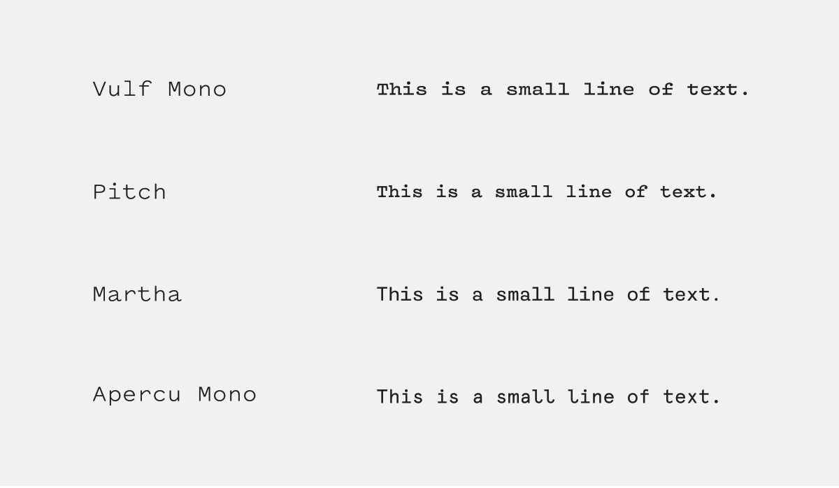
Monospace fonts aren’t usually known for their warmth or personality. Someone forgot to tell Vulf Mono that. Designer James Edmondson has drawn it with a playful exuberance that pushes against the limitations of its genre.

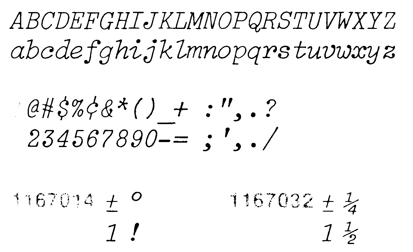
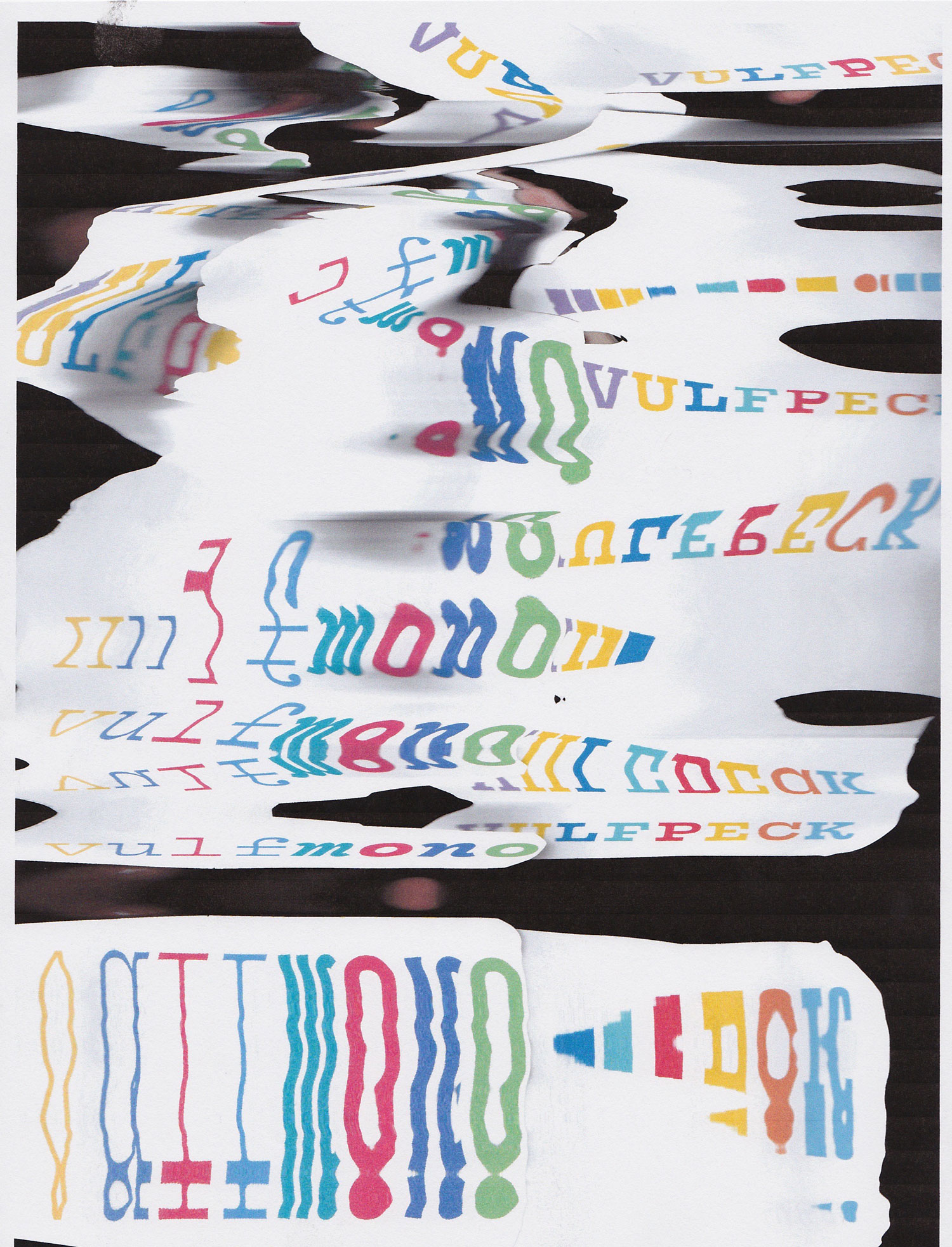
Vulf Mono has a colorful backstory that centers around Edmondson’s devotion to the band Vulfpeck, whose bandleader reached out to him to commission a typeface based on the Light Italic typeface available as an option on IBM Selectric Typewriters. The initial request was for a bolder interpretation of that font, but over time an entire family of weights, romans and italics were created. The result is a robust family with an extended glyph set that encourages the designer to play and have fun while typesetting.

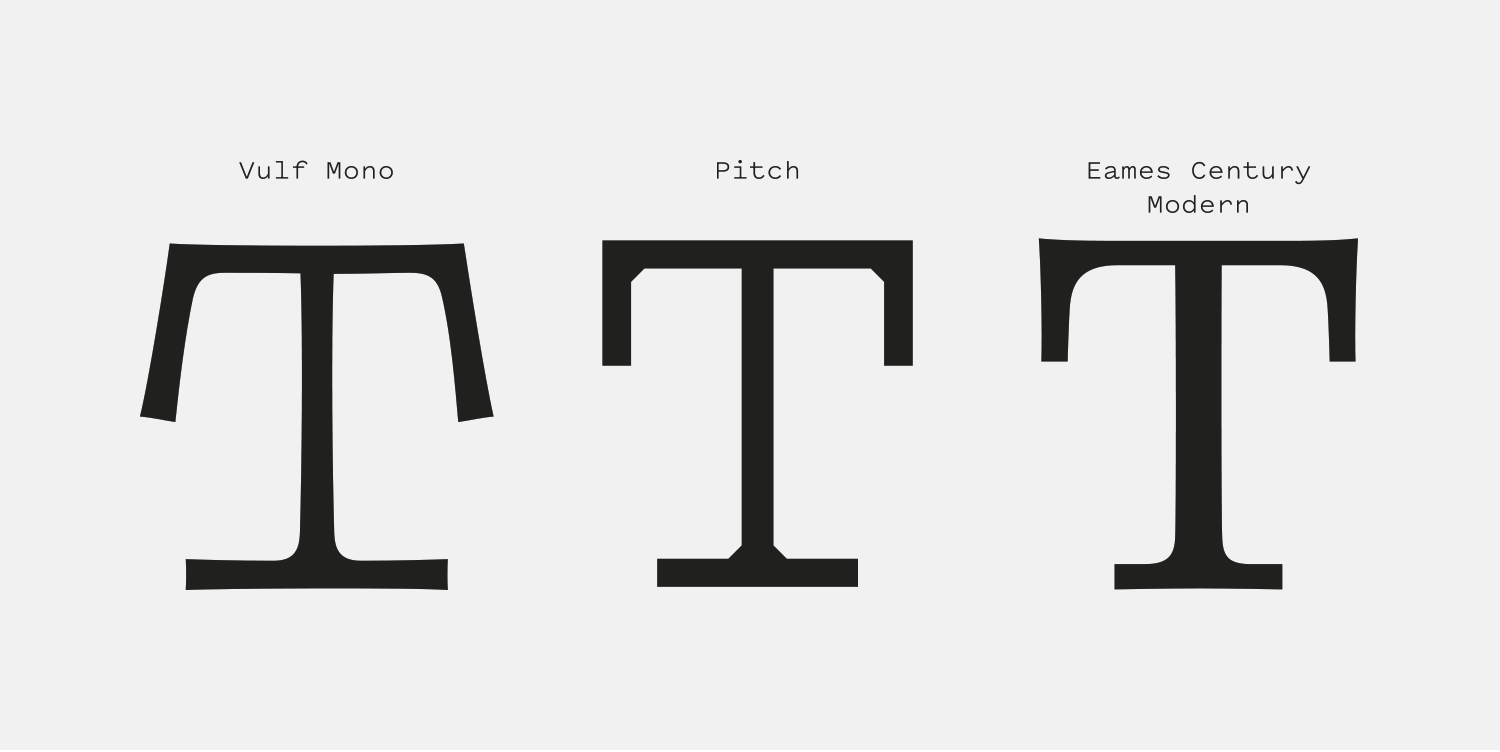
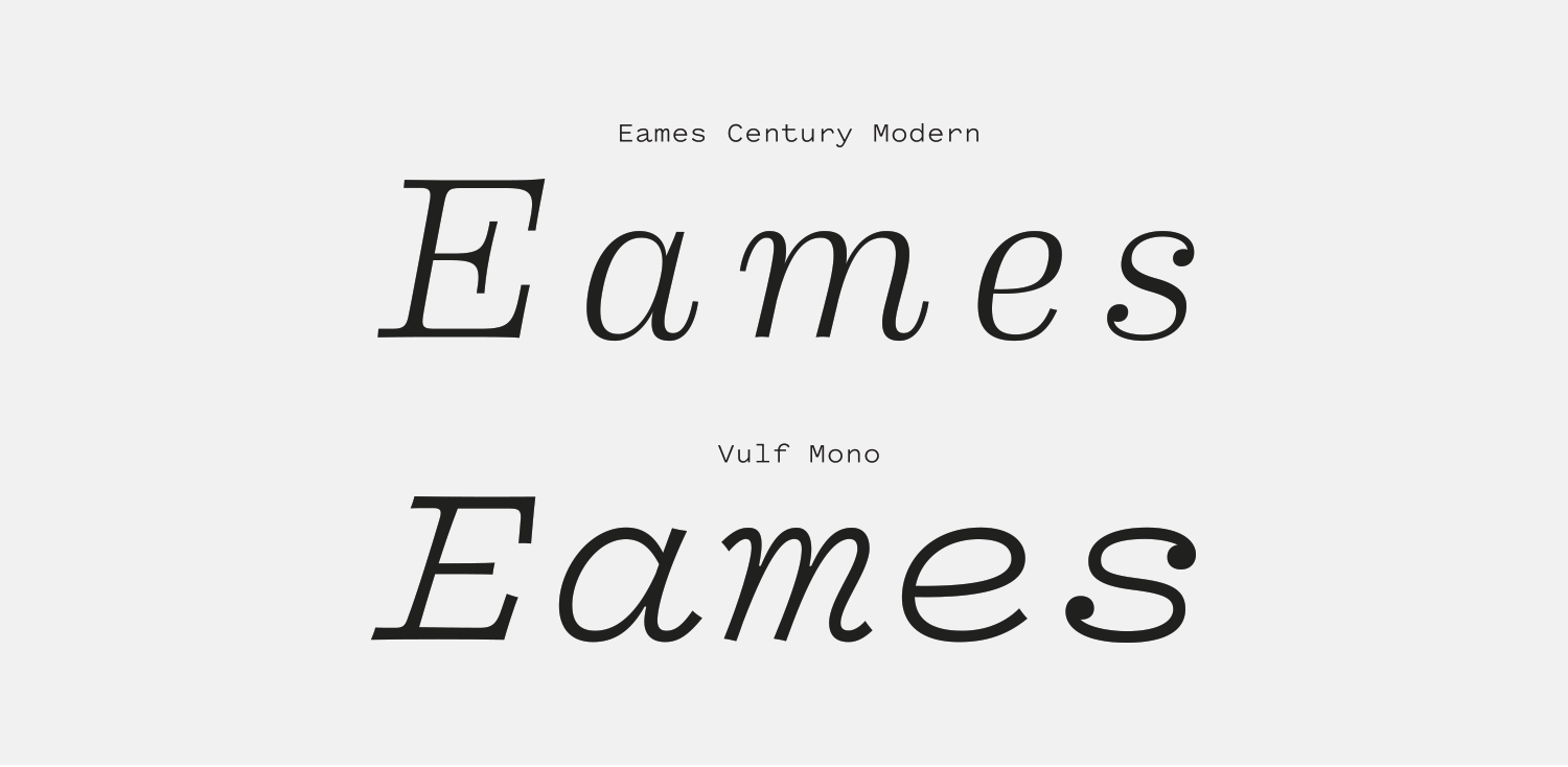
Vulf Mono fights against the rigidity that’s often expected of monospaced fonts. All of the edges are ever so slightly concave, giving a “flex” to the strokes that match the humanistic quality of the designs of the characters themselves. My first reaction to Vulf Mono was that it felt a bit like if Eames Century Modern had a monospace version. It shares the quirky character quality, flexed strokes and thick heartily-bracketed serifs. It’s charming, retro and playful—all unexpected qualities for a monospace font and making it worth celebrating.

Vulf Mono alongside Eames Century Modern, a proportionally designed slab serif with many shared characteristics.
Nº02 Vulf Mono alongside Eames Century Modern, a proportionally designed slab serif with many shared characteristics.

Historic Inspiration

Typewriter faces were monospaced so the carriage only needed to shift the same amount of space to the left each time a key was pressed. Monospace simply means each glyph occupies the same amount of space, as if they are all built on a foundational “slug” of the same size. Pitch Sans, which is used for captions on this site, is a monospace font. Monospace fonts present a tough challenge for typeface designers. Wider characters like “M” and “W” feel cramped and narrow ones like “i” and “j” either have empty space around them, or feel artificially wide. The different solutions type designers have come up with to deal with this limitation have resulted in a surprising amount of variety.

Nº03 luc.devroye.org — The glyph set for IBM Selectric Light Italic

For the unfamiliar, the aforementioned IBM Selectric used “type elements” (often referred to as “type balls”) which were spherical piece of plastic that were covered with raised letters and easily interchangeable[4]. As you typed, the Selectric would spin and shift the ball to the appropriate character then impress it into the ribbon and the paper. This self-contained method of imprinting type was revolutionary, and allowed a single typewriter to easily print with a variety of fonts. So long as the typist owned the type element, they could use it on the page singularly or in combination with other fonts.

youtube.com — Footage from an IBM Selectric Commercial, showing the ease with which someone could swap in a new type ball and change the typeface used.
Nº04 youtube.com — Footage from an IBM Selectric Commercial, showing the ease with which someone could swap in a new type ball and change the typeface used.
Nº05 munk.orgAn example of Light Italic in use. Notice how the ball serifs and punctuation jump out at you with their density compared to the rest of the text, as well as the curling strokes that give the font a sense of forward movement.

The Light Italic font is notable for its prominent ball terminals and slicing finishes to the vertical strokes that whip off to the side[5]. The forward tilt is mild for an italic, but it’s those sweeping finishes that give it the sense of forward movement more-so than the slant to the characters. It’s a charming design and Vulf Mono retains that charm and adds quite a bit of its character.

Nº06 Compare the “flex” in Vulf Mono’s upper and lower horizontal strokes (left) to the flat rigidity of Pitch (middle), and how Eames Century Modern has a similar flex in its own design (right).

Typewriter-inspired typefaces are often designed with details to try to impart the tactile qualities of their ancestors, and Vulf Mono’s technique is clever. Edmondson uses the previously mentioned bends in the typeface’s straight lines to impart a subtle feeling of imperfection, evoking the imprecision of typewriter printing, where the edges would often be ragged and letters could be over or under-inked. When compared to Pitch—another excellent typewriter typeface—the effect of the “flex” in the strokes of Vulf Mono become clearer. Vulf Mono feels “softer” and friendlier; certainly less serious. It’s a technique that is shared by Eames Century Modern, a retro-inspired slab serif design that also utilizes flexed lines to help convey a loose, approachable tone.

youtube.com — Monospace typefaces are well-suited to staccato motion graphics like this promo piece for Vulf Mono. The lack of any easing as the words simply appear out of thin air evokes the magic of words magically appearing on paper as fingers fly across a typewriter keyboard.
Nº07 youtube.com — Monospace typefaces are well-suited to staccato motion graphics like this promo piece for Vulf Mono. The lack of any easing as the words simply appear out of thin air evokes the magic of words magically appearing on paper as fingers fly across a typewriter keyboard.

Vulf Mono’s strengths

If you’ve seen the motion graphic video Edmondson created for the font’s release, you’ll see the joy in it that makes this design special[7]. The playful and boisterous letterforms are well-suited to be used in motion because of the flex in the lines and the sweeping strokes in the italics. Typewriters and music both rely on rhythm and this font does as well, whether it’s the staccato taps of the capitals or the jazzy swings of the lowercase italics.

Nº08 behance.net — Graham Weber’s experimental poster, created by moving a piece of paper as it was being scanned by a scanner. Vulf Mono’s inherent irregularity is well suited to the stretched, wavy lines this technique creates.
twitter.com — Poster for the RISD Unbound book fair, 2017.
Nº09 twitter.com — Poster for the RISD Unbound book fair, 2017.

Even in a static image a sense of motion can be captured, as seen in this poster design by Graham Weber. Vulf Mono was printed on a piece of paper in multiple colors then moved across the bed of a scanner while the image was in the process of being captured, creating a distorted result. Vulf Mono handles the distortion well precisely because it’s made with distortion in the first place, and the tugging and compression mimic both audio waves and represent movement.

Vulf Mono’s capitals have a very different presence than the lowercase characters. While my initial reaction to Vulf Mono was that the lowercase set was stronger, this RISD poster shows off the character in the capitals, and does a great job utilizing several of the weights as well as the italics[9]. In most other monospace fonts, this design would come off a lot colder and the red supplementary text would feel more like technical writeup instead of the exuberant additions they are now. With Vulf Mono at work, that text feel like an excited friend grabbing your shoulder and hopping up and down as they narrate the poster. “‘UNBOUND’, do you get it? Book pun! It’s a book fair! On Saturday!!!”

Nº10 Vulf Mono making coding a little less dreary.

Monospaced fonts are most commonly used in modern times inside of coding environments, where the consistent glyph width helps maintain legibility and uniformity in coding structure. If you’re the sort of person who wants a little more character in their code, Vulf Mono can be your companion while you do your scripting[10]. The basic family will serve you fine, but there’s also a code-optimized version you can request, with a slashed zero, alternate @ symbol and larger asterisk (thanks for the heads up, Frank!)

Nº11 tarynow.com — Taryn Oshiro-Wachi’s bright and colorful motion graphic video for Vulf Mono.

While Edmondson keeps most of the promo materials for OH no Type Co. limited to black and white, but Vulf Mono really embraces a retro vibe when it’s used with bright colors. Designer Taryn Oshiro-Wachi created her own motion video for Vulf Mono using a more 1950’s-leaning color palette and the big serifs, ball terminals and cartoonish shapes feel right at home with the more vibrant colors[11].

Vulf Mono can still be used at small sizes in its lighter weights. Notice how tall its x-height is compared to the other typefaces shown.
Nº12 Vulf Mono can still be used at small sizes in its lighter weights. Notice how tall its x-height is compared to the other typefaces shown.

Quirks and eccentricities

Because it is so expressive, it can be easy to forget that Vulf Mono is a monospaced font and therefore will have qualities that can make it feel awkward in situations where proportional type is expected. When comparing the italic to Eames Century Modern, you can see how cramped the “m” is, how wide the “e” seems, and how the “s” feels like it’s floating off on its own, and needs to be kerned in[13]. These slightly off-kilter interactions are a part of any monospace font and something you have to accept and use to your advantage as you use Vulf. Embrace the quirk and use it to your advantage instead of trying to make Vulf Mono something it isn’t.

Nº13 Even though Vulf Mono is an exuberant typeface, it will always have an inherent awkwardness because it is a monospaced font. Don’t try to make Vulf into something it’s not, and instead embrace what can come with the unique rhythm of monospace fonts.

The thicker Vulf Mono gets, the harder it is to use at small sizes. Vulf Mono can be used for micro copy even with its ball terminals and slab serifs because of its generous x-height. It’s wider than most comparable monospace fonts, and “bigger on the body”[12] (to compare Vulf Mono and these other fonts at an optically similar size I had to reduce Vulf Mono by a point size) which makes it a poor choice if horizontal space is at a premium. You’d want to choose something narrower and more compact.

There are dozens of music notation marks and other easter eggs hidden in Vulf Mono—Edmondson’s passion for the band and the project show through in the end result. Monospace fonts are having a bit of a resurgence at the moment, and I expect more designers will find ways to use Vulf Mono’s eccentricities to their advantage.

- FRJ