Rosart
— Designed by Katharina Köhler

twitter.com — Spread from I AM BUILT INSIDE YOU, designed by Studio Matthias Görlich.
Nº01 twitter.com — Spread from I AM BUILT INSIDE YOU, designed by Studio Matthias Görlich.

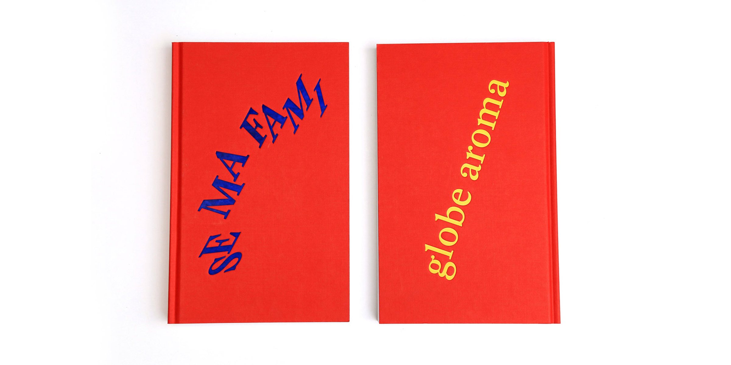
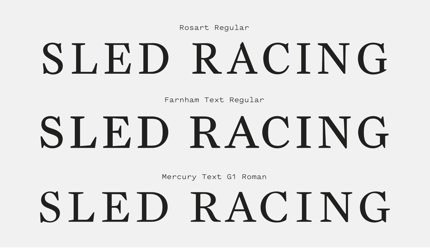
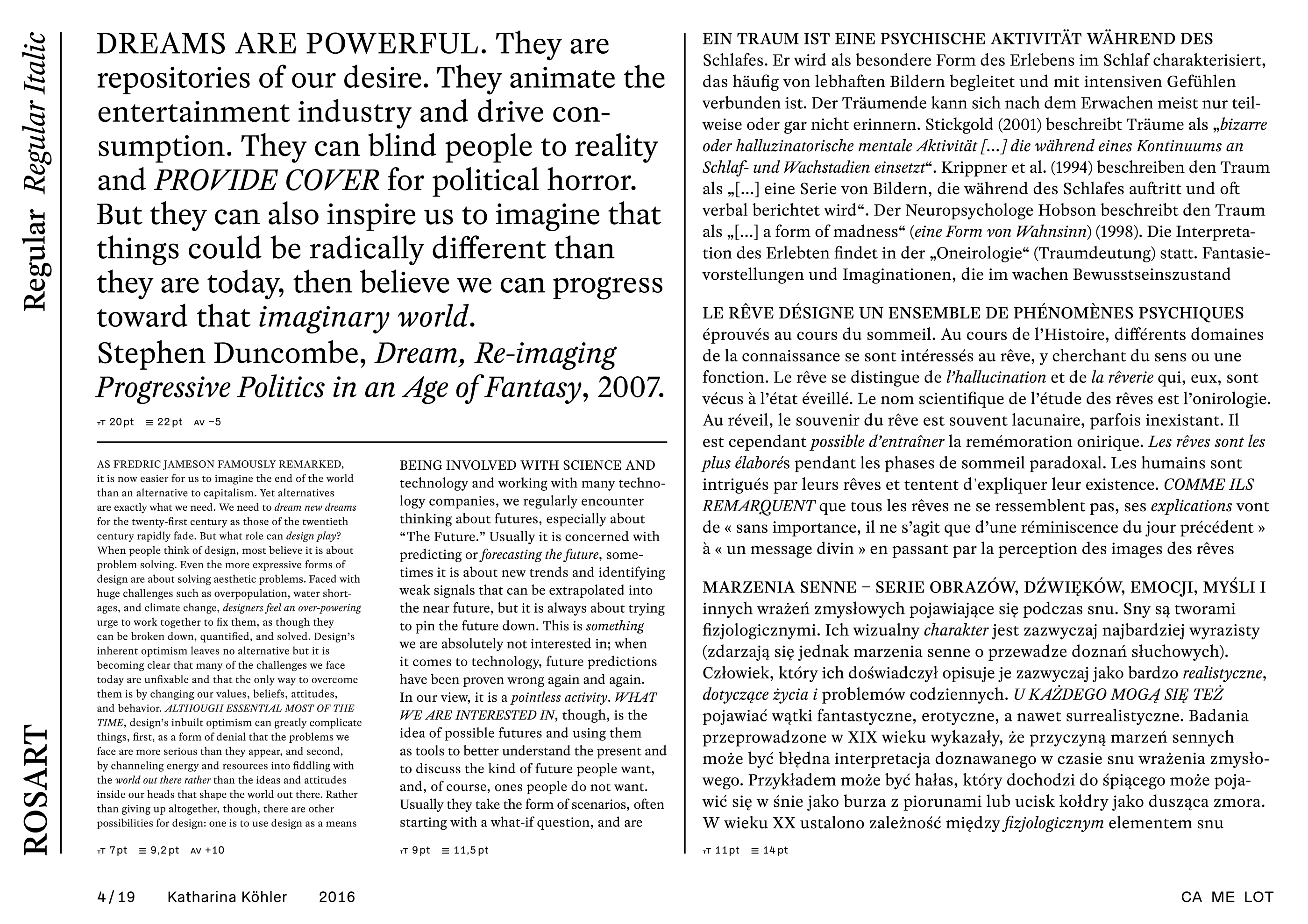
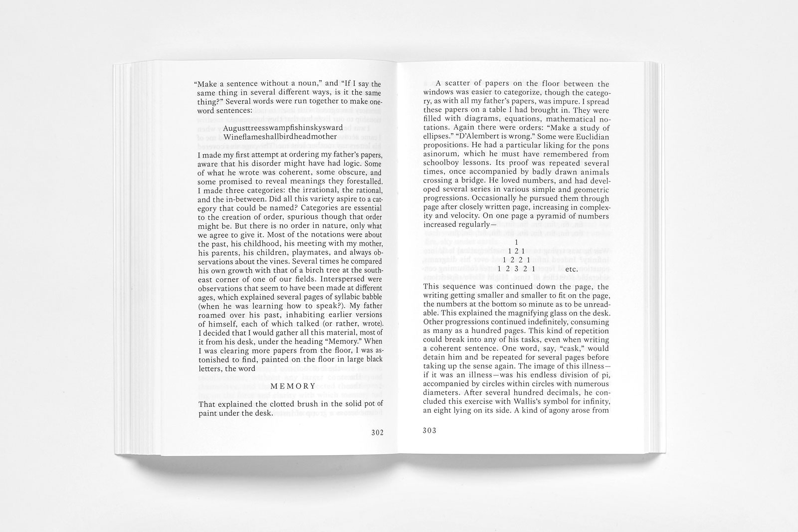
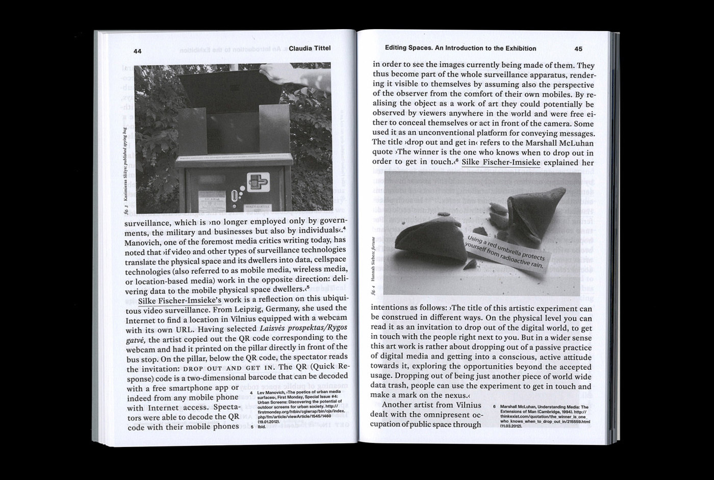
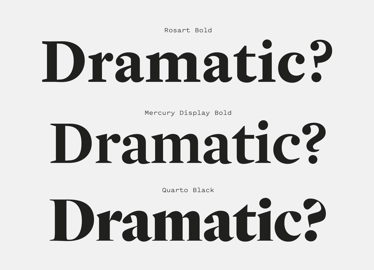
Rosart is a handsome Baroque serif that balances a stately upright posture, angular serifs and bulbous ball terminals that give the design a sense of playfulness and self-awareness about its old-fashioned roots.

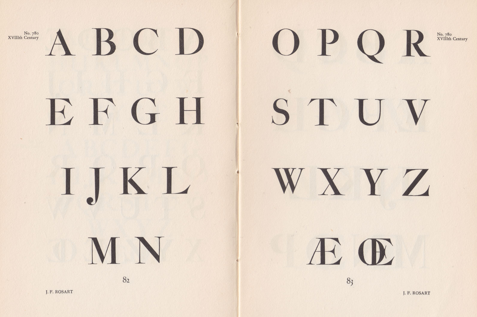
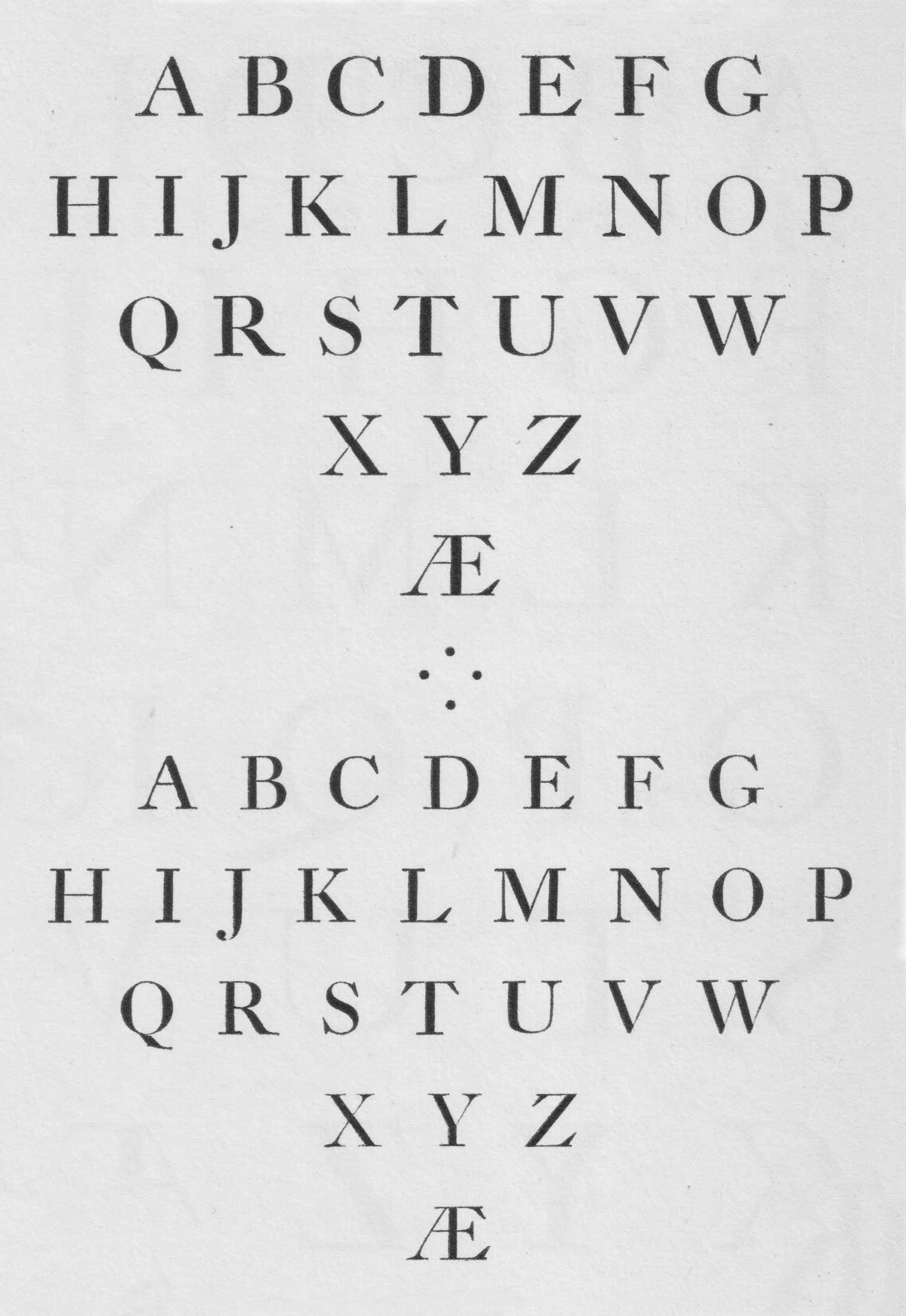
There are many typefaces on the market that are digitizations and translations of the work of Jacques-François Rosart and Johan Fleischman, and Rosart is one of my favorites. Many revivals of this genre stray avoid the more eccentric details of Baroque designs, like the “scalloped” serifs on the “E”, the pointy goatee on the chin of the “G” and the prominent ball terminals, but Rosart embraces them and gives them a striking, crisp modernity. Designer Katharina Köhler has done a marvelous job translating the character of these early designs without the end result feeling like a lifeless facsimile.

Rosart is a stunning text face that has a beautiful balance of weight, proportion and geometry to create bodies of text that feel sturdy and never fussy, despite the charming flourishes. That same economy is present in the italics, which are utilitarian and strike the right balance between legibility and sophistication. It’s precise without being cold, and robust without feeling inflexible. Rosart is the kind of typeface that makes me want to write a book about important things and spend a year laying it out and finessing its type. It’s hard to ask for more from a typeface than to have it inspire you to try new things.

dearreader.be — Front and back covers for Se Ma Fami, documenting the Globe Aroma organization.
Nº02 dearreader.be — Front and back covers for Se Ma Fami, documenting the Globe Aroma organization.

Historic Inspiration

Baroque serifs are a transitional genre between Old Style and Modern serifs. Two of the more prominent figures in shaping this aesthetic were Jacques-François Rosart (1714 – 1777) and Johann Fleischman (1707 – 1768). These designs were more ornate and sharper than the softer Old Style designs that came before, and paved the way for the vertical stress and high-contrast found in Modern designs that came afterwards. Rosart is a love letter to this genre, but with one important twist: it makes every effort to use straight lines whenever possible. It’s a clever detail that minimizes the fragility in the thin, sharp edges of J. F. Rosart’s work[3] and contrasts the prominent ball terminals present in Rosart’s designs.

Nº03 flickr.com J. F. Rosart, Enschede Nº 780, a display size that lost the scallops in favor of dramatic, sharp, reaching serifs. From Typefoundries in the Netherlands, 1978 edition. Courtesy of the Klim flickr account.
flickr.com — Enschede Nº 775 and 779, showing J. F. Rosart’s designs with scallops on the “E”, “F”, “L” and “T”. From Typefoundries in the Netherlands, 1978 edition. Courtesy of the Klim flickr account.
Nº04 flickr.com — Enschede Nº 775 and 779, showing J. F. Rosart’s designs with scallops on the “E”, “F”, “L” and “T”. From Typefoundries in the Netherlands, 1978 edition. Courtesy of the Klim flickr account.

My favorite calling cards for Baroque serifs are the “scalloped” double serifs that reach forward like hungry Venus flytraps on the “E”, “F” and “T”[4]. They feel very… Baroque in their organic theatricality. For once, a term from architecture cleanly transitions for use in graphic design! Some revivals in this genre leave out the scallop edges and simplify the serif design on these characters, but they are integral to the Baroque aesthetic for me. It reminds me of the architecture that inspired it and is such an interesting way to add drama to a typeface design. It is an imposing effect, and though Rosart has toned down how pronounced those double serifs are, the typeface retains a flair for the dramatic by thickening the serifs themselves and having them jutting towards the center of the letterforms aggressively.

Nº05 Rosart’s capitals (top) compared to Farnham Text (middle) and Mercury Text (bottom). Rosart’s subtle scallops and the forward spur on the “G” set it apart from other Baroque-inspired designs.
flickr.com — Kleine Dessendiaan Cursyf is a good example of J. F. Rosart’s work. From Typefoundries in the Netherlands, 1978 edition. Courtesy of the Klim flickr account.
Nº06 flickr.com — Kleine Dessendiaan Cursyf is a good example of J. F. Rosart’s work. From Typefoundries in the Netherlands, 1978 edition. Courtesy of the Klim flickr account.

If we place Rosart against other Baroque-inspired digital faces[5] you can start to see the elements it is reviving that other type designs chose to leave behind, as well and the creative ways Rosart modernizes these details. Rosart’s straight edges become evident in the straight leg of the “R” and the unique beaks on the “S”, “C” and “G.” It lends the design a clean, no-nonsense tone. The peak on the “A” and the aforementioned scalloped serifs have been smoothed out of Farnham and Mercury, and the “G” has been dramatically altered, with the cleft added to the baseline instead of the spur to the right of the bowl. Each of these translations have merit, but I admire how many of the original details from J. F. Rosart’s designs Köhler was able to bring into the present, all while working within the straight line restriction. Perhaps it’s that constraint that allows the design to be successful—the chiseled, crisp aesthetic that emerges is a fascinating interpretation of the Baroque style.

Nº07 Rosart’s italics (top) compared to Farnham (middle) and Mercury Text (bottom). Rosart is expressive but consistent, outside of the overly-italicized “A” and “W”, old standbys of the Baroque genre.

The italics of these three faces show a lot more variation than the Roman capitals do[7]. Rosart has a gentle forward slant on most of the characters, but the default “A,” “V” and “W” keep the aggressive forward tilt and “wind sheared” aesthetic of the original designs. There are more conventional alternates available (you can see them in use in the right column of the specimen at the beginning of the review), and the choice to make the old-fashioned style the default is an interesting one. I love how pronounced the ball terminal is in the “w” and how the ear on the “g” is lifted even more than the Roman version. Farnham nods towards the aggressively tilted “W” and features a lovely, swashing tail on the “Q” that Rosart also shares. Mercury’s italics have a wider stance and very generous counters, and it cuts out most of the flourishes present in the other two Baroques. Rosart balances some of the great qualities of J. F. Rosart’s work and the adaptations done by Christian Schwartz and Jonathan Hoefler to settle somewhere between nostalgia and practicality.

camelot-typefaces.com — Camelot’s specimen for Rosart is an effective showcase of the robust presence of the typeface, and how it can create a dense but easy to read visual grey.
Nº08 camelot-typefaces.com — Camelot’s specimen for Rosart is an effective showcase of the robust presence of the typeface, and how it can create a dense but easy to read visual grey.
studiostorz.ch — Rosart paired with Akzidenz Grotesk on the cover of Transposition.
Nº09 studiostorz.ch — Rosart paired with Akzidenz Grotesk on the cover of Transposition.

Rosart’s strengths

I first noticed Rosart in the book Transposition[10], written by Davide Cascio and Christian Kathriner and designed by Studio Storz. Rosart is paired with Akzidenz Grotesk, which lends the book a formal but workman-like voice. It’s respectful without being dull, which is a hard line to draw, especially with a serif. I find Rosart has a sort of aspirational effect on the text, which suits the subject matter here. It handles itself well on the cover[9], but where it really shines is in the body of the book. Few typefaces can create drama in body copy without being distracting, but the Baroque genre excels at this, and Rosart is no exception.

Nº10 fontsinuse.com — Rosart is used in a very classical, formal way inside of Transposition, but has enough softness to draw the reader in. Designed by Pascal Storz, Fabian Bremer, Christian Hofer.
fontsinuse.com — Rosart’s Roman and italics at play inside of Transposition. If that doesn’t make you want to lay out some type, I’m not sure what will.
Nº11 fontsinuse.com — Rosart’s Roman and italics at play inside of Transposition. If that doesn’t make you want to lay out some type, I’m not sure what will.

Transposition is a typographic delight, and the controlled way it shows off Rosart is rapturous for a type-lover. Rosart’s stable and balanced uppercase set is showcased in the drop caps and subheadings within the text, which also embrace the old-fashioned quirks in the italic capitals. It is stunning that they were able to set the body copy at full justification and have it come out so smooth, which I attribute to Rosart’s balanced design. The angles and geometry in the design combined with the low thick-to-thin contrast keep the visual grey even and stunning. Rosart plays a number of roles in this design at a number of scales and excels in all of them.

When you directly compare a paragraph of Rosart to other serif genres[12], its geometry and structural presence become easier to spot. The tall x-height prevents the capitals from “popping” and disrupting the reading of each line. The result is each line feels “full”, robust and structurally sound, and the squared serifs and brackets subtly reinforce a rectilinear tone. All of the straight lines are softened by the ball terminals scattered throughout the design, which lends some much needed visual interest and levity to the design and prevents it from feeling cold and imposing. By comparison, Harriet Text feels delicate and ornately organic, and Hoefler Text’s delicate lowercase feel petite next to the capital forms to create a more dramatic voice.

Rosart (left) compared to Harriet Text (middle) and Hoefler Text (right) in body-copy scale. Rosart balances square shapes with circular details to create text that toes the line of feeling flowery while remaining sturdy and clean.
Nº12 Rosart (left) compared to Harriet Text (middle) and Hoefler Text (right) in body-copy scale. Rosart balances square shapes with circular details to create text that toes the line of feeling flowery while remaining sturdy and clean.

All convey a sense of stature and authority, but they go about it in different ways. The degrees of subtlety typography provides are nearly endless, and having an opinion on exactly how you want to convey a broader tone in your type setting is crucial to being effective at the practice. While any of these three typefaces could emphasize certain aspects of the subject matter in Transposition, by choosing Rosart, Studio Storz chose to emphasize the architectural elements of both the content and the scaffolding of the multi-column page layouts, rather than the other more artistic, spiritual or ritualistic subject matters the book is addressing.

Nº13 lamm-kirch.com — Spread from Editing Spaces. Reconsidering the Public which uses Rosart in a light, refined way, pairing it well against the bolder sans-serif.
twitter.com — Rosart used in a catalogue for Schönste Deutsche Bücher, in tandem with Transpositions.
Nº14 twitter.com — Rosart used in a catalogue for Schönste Deutsche Bücher, in tandem with Transpositions.

Angular serifs play well against sans-serif faces because of their more robust nature, and Rosart is no exception. I love this table of contents inside of Editing Spaces. Reconsidering the Public[14], designed by Lamm & Kirch, which features a simple grotesque as the headline and uses indentation of the text to set off the titles of each work. These classic typographic details really let you appreciate how beautiful Rosart looks and how well it works even with simple treatments.

Nº15 camelot-typefaces.com — Rosart used inside of The Crossdresser’s Secret, designed by OK RM.
lamm-kirch.com — Rosart is very well-suited for use in classical type treatments. It loves em-dashes and indentation! From Editing Spaces. Reconsidering the Public.
Nº16 lamm-kirch.com — Rosart is very well-suited for use in classical type treatments. It loves em-dashes and indentation! From Editing Spaces. Reconsidering the Public.

Quirks and eccentricities

Rosart’s bolder weights have a heavy, chiseled presence on the page and feel even more formal and stately than the lighter weights. They creep towards a Modern aesthetic with an increased thick-to-thin contrast, but in some aspects feel softer than the lighter weights. With the added girth, the little eccentricities that stand out in the lighter weights get overpowered and become harder to appreciate. While most serifs become more dramatic and distinctive as they get bolder, Rosart in some ways becomes more tame.

Nº17 lamm-kirch.com — Rosart’s heavier weight used unconventionally as body copy in the text sections of Editing Spaces. Reconsidering the Public.

The aforementioned heavily-slanted “A,” “V” and “W” in the italics are potentially distracting and I think most people will want to swap in the alternates which match the slant of the rest of the italics. The shoulders on the italic “m” and “n” also roll into “tucked in” legs that disrupt the vertical rhythm of the italics and lack the absolute consistency in a design like Mercury[7]. It gives the typeface a more human touch, but when viewed at large sizes I always squint a bit at them, unsure how to feel about the detail.

Nº18 Rosart (top) compared to Mercury Display (middle) and Quarto (bottom). Rosart’s function as a longform-first typeface is obvious when compared to the higher contrast and sharper details present in the other designs.

A note should be included here about Baroques as headline typefaces. Most designers want bang for their buck when you use a serif in a headline situation—Distinctive serif details, svelte lines and lunging swashes. That isn’t the speciality of Baroque faces, though some, like Mercury, have Display cuts which lend some of the finer details many designers desire for large-scale type. Rosart does not have a display cut, and is intended to sing at smaller sizes, rather than large headlines. While being a well-drawn and beautiful typeface, it isn’t going to give you the high-contrast, editorial flair of many other serif genres, if that’s what you are looking for. Compared to the display cut of the fellow-Baroque Mercury, and the luxurious details of Quarto (itself inspired by Hendrik van den Keere’s designs, a predecessor of the Baroque style), Rosart feels a bit lacking in fine details, but again, that’s not what this typeface was designed for. Don’t try to stretch a typeface into a scenario it doesn’t excel at, and never be afraid to tag in a supporting player that can shine in those moments instead.

Because of the vestigial details that Rosart carries over from classic Baroque designs, I’m surprised I haven’t found more quirks while using it. The scalloped serifs are rarely noticeable, much less distracting, and the straight edges lend the design a cleanliness that translates well in large and small scale. If you aren’t familiar with Baroque serifs and are looking for an entry point, Rosart is the perfect place to start. It’s both a great representation of an often sanitized genre and a gorgeous text face that’s going to elevate the writing you work with and will play very well with any old-fashioned type compositional treatments you throw at it.

- FRJ