Agipo
— Designed by Radim Peško

manystuff.org — Agipo seen on the cover of Graphic #30. Agipo’s tall x-height and extremely short descenders give it an outsized presence that holds up to the bold, razor-sharp geometry in the masthead.
Nº01 manystuff.org — Agipo seen on the cover of Graphic #30. Agipo’s tall x-height and extremely short descenders give it an outsized presence that holds up to the bold, razor-sharp geometry in the masthead.

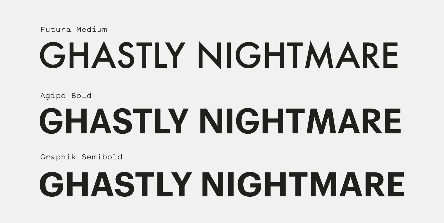
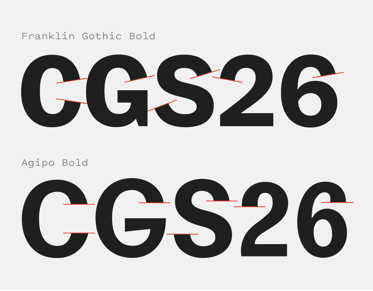
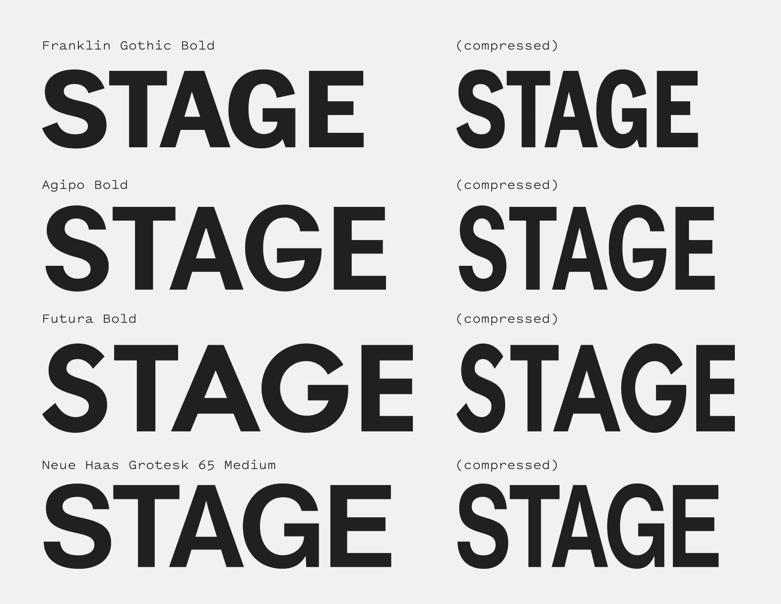
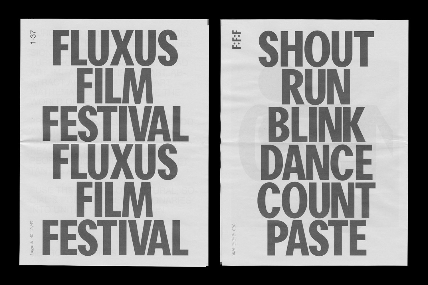
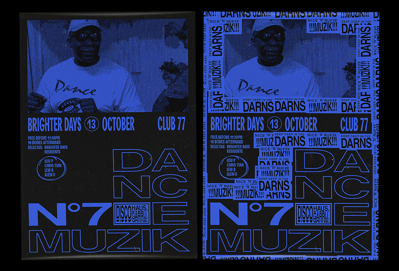
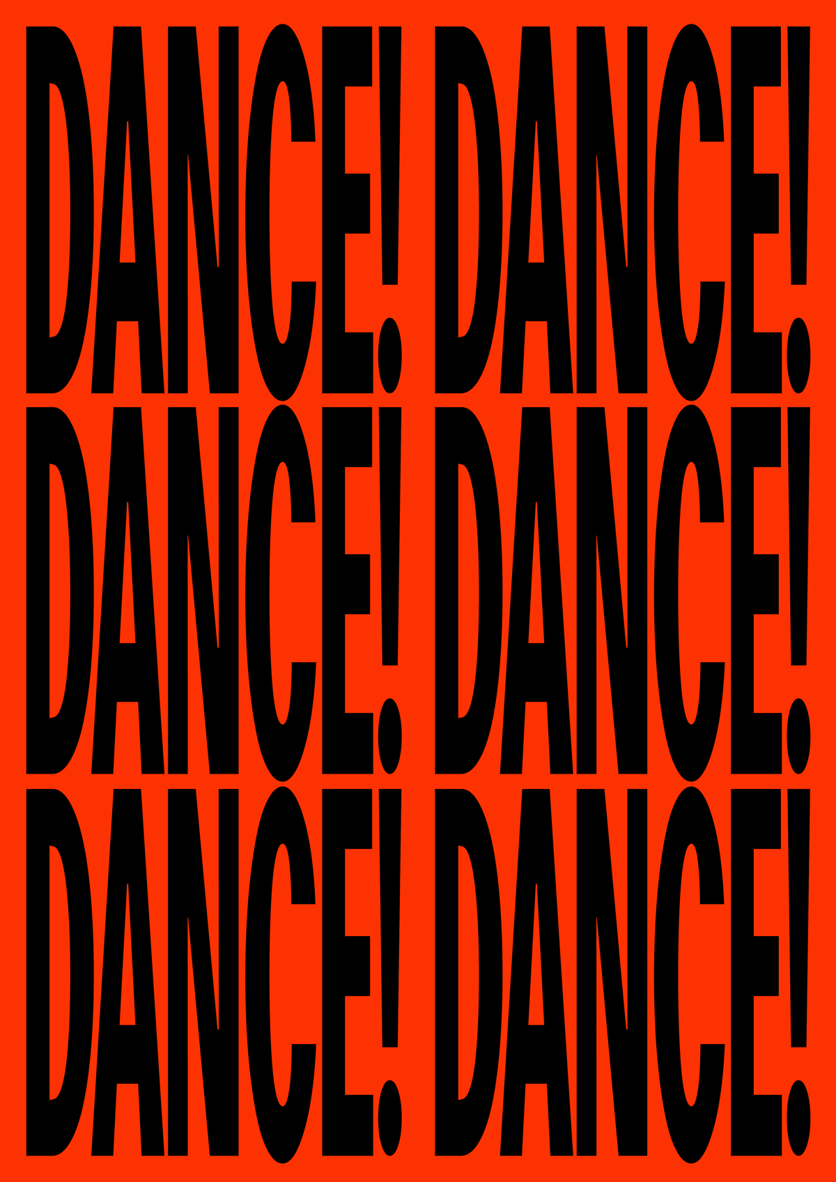
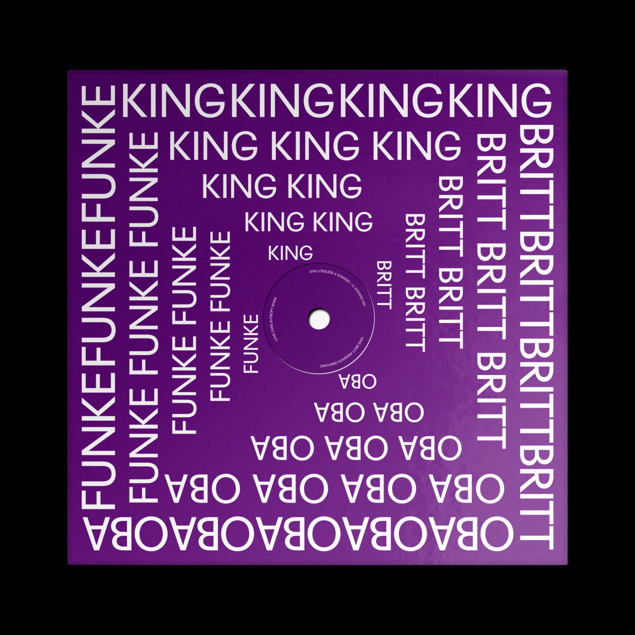
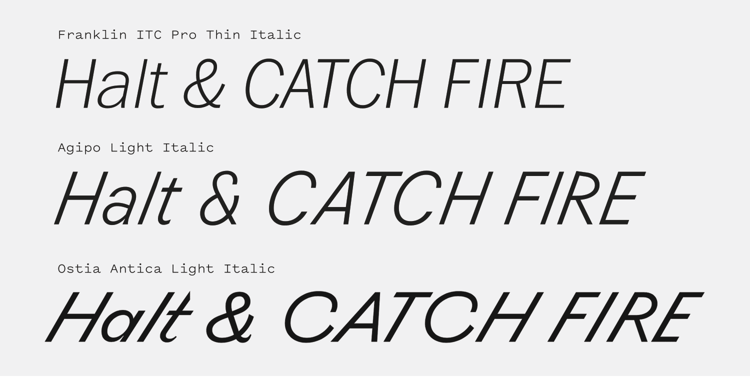
Agipo belongs to a genre of typefaces that I’d categorize as “familiar with a twist.” If it’s set one particular way, Agipo can feel like a cousin of Franklin Gothic—a workmanlike, slightly rigid grotesque with a vertical stress. But Agipo’s more expressive sensibilities make themselves known rather quickly, and by the time you see the tongue-depressor-esque serif on the “G” it becomes clear that you’ve stumbled upon something more than a homage to the more orderly half of the grotesque canon.

Agipo follows a growing trend I’ve seen from type designers, which involves taking a familiar genre, picking a handful of characters, and making those characters blindingly distinct. Designers are drawn to this approach like moths to the flame. It allows them to assume how they can use a typeface very comfortably—due it its familiar heritage—while giving them something special to show off. “This ain’t your mother’s Helvetica!” shouts the designer who proudly uses Favorit in their portfolio, and so it is with Agipo and its relationship to Franklin Gothic.

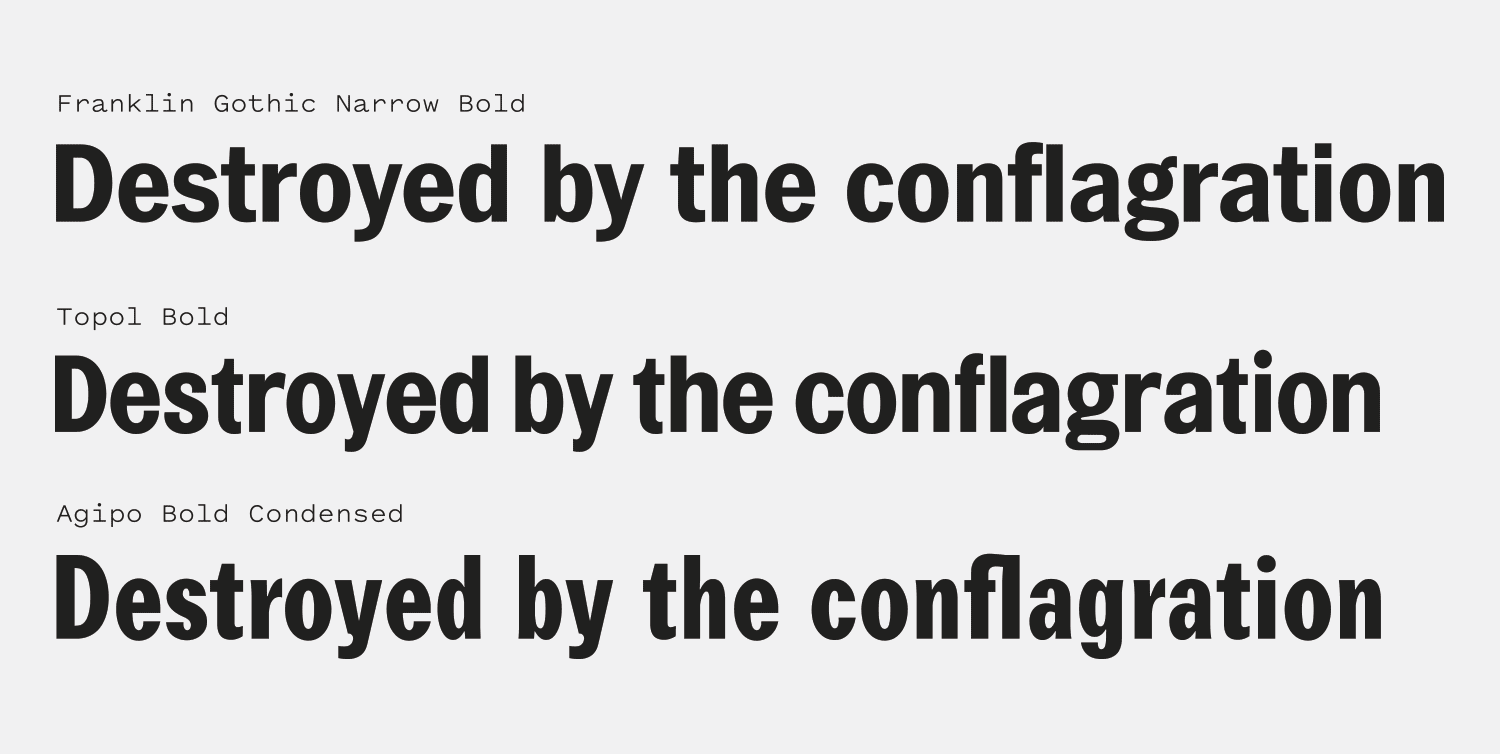
Agipo brings more to the table than its unique handful of characters, however. It’s an odd mix of grotesque and geometric sensibilities. The 90° terminals play nicely with the emphasis the typeface has on straight lines but clash against the flared strokes you’ll find on the “G,” “r,” and “a.” This tension has the overall effect of making the typeface feel much less workman-like than its historic counterparts while still being simple enough to plug and play in a design (barring you aren’t expecting to use the italics. Hoo-boy, the italics.) It’s ample x-height and short descenders allow designers to densely pack the composition with the typeface and let it soak up ink and attention.

behance.net — Karlo Fuertes Francisco makes dramatic use of Agipo Regular Extended in his Rebel Yell project.
Nº02 behance.net — Karlo Fuertes Francisco makes dramatic use of Agipo Regular Extended in his Rebel Yell project.

Historic Inspiration

Agipo sits on a spectrum between geometric designs like Futura and the aforementioned Franklin Gothic, a compact, no-nonsense grotesque that first appeared in 1902 and has remained a staple in newspaper and editorial design in the century since. Let’s start by discussing the capitals, and therefore the geometric half of Agipo’s heritage.

Nº03 A spectrum of geometric-influenced sans, from the most extreme (Futura, top) to Graphik (bottom), a geometric, grotesque hybrid.

Agipo is quite the chameleon—if you encountered it in the right scenario you’d be baffled that a geometric sans comparison would ever be made. But, set it in all-caps in its default width, and you’ll see the influences. The “M” spreads out with sloped sides and the “G” is tidy and spurless (by default—there’s an alternate with a spur if you so desire). The leg of the “R” juts right out from the stem, creating a heavily stylized effect that even the sleekest grotesques, like Graphik, don’t often recreate.

itsnicethat.com — Agipo’s character shines through in either all-caps or mixed case typesetting, which is a testament to the design. Design by Gemma Mahoney for her Everyday project.
Nº04 itsnicethat.com — Agipo’s character shines through in either all-caps or mixed case typesetting, which is a testament to the design. Design by Gemma Mahoney for her Everyday project.
Nº05 In contrast to the uppercase glyphs, Agipo’s (bottom) presence in lowercase resembles classic, utilitarian grotesques like Franklin Gothic (top).

On the other hand, if you use the condensed width and toss a little meat on Agipo’s bones, the Franklin comes out. Above, you can see Franklin Gothic alongside Topol, another modern design that feels familial to both typefaces, and finally Agipo. Franklin is more compressed than many grotesques, and has high contrast for something that’s also utilitarian. The elements that make Agipo feel so familiar to Franklin are pieces like the thick vertical strokes and the “c” and “e,” which seem to be squished inside an invisible oval. The “y” also jumps out—the gentle curl off the baseline is an old grotesque stylization that has been snuffed out in many designs, and Agipo remixes that detail by scooping out part of the tail and making the tail and the “v” shape it clings to feel spliced together. Toss in the similarity in the construction of the “f” and the top-hatted “t” and you’ve got plenty of evidence for the relationship between the two typefaces.

jamescullen.tumblr.com — Agipo in use for branding for Provo-based publisher, brand and shop, Actual Source.
Nº06 jamescullen.tumblr.com — Agipo in use for branding for Provo-based publisher, brand and shop, Actual Source.
Nº07 metropolism.com — Agipo’s blend of distinct characters and familiar construction make it a great choice for wordmarks, publication covers and posters, where it feels just special enough without feeling so strange as to get tired with exposure. Seen here on the cover of Metropolis M.

These design touches are one of the many things that make Agipo unique in-use—the end effect is something that feels form-based and makes the typeface a vehicle for graphic expression in addition to a means for representing language. By sliding these odd details into a framework that’s familiar, we can more easily accept these oddities as part of the framework of the typeface, and not as distractions that pull the design too far into the arena of abstraction, as we might interpret a heavily-stylized or “othered” genres like reverse-sans or Blackletter.

We will dig into this a little more in the in-use section, but I want to address what I think is one of the core factors in Agipo’s popularity amongst Brutalist/punk/otherwise-aggressive-and-expressive genres of design—its 90° terminals. Why is this detail significant? Because in these design subcultures, typefaces themselves are just a starting point, an ingredient in the wash of elements on the page, and are not treated as sacred. Designers are not nearly as precious about avoiding distorting or modifying typefaces in service of a composition or aesthetic, and Agipo’s commitment to 90° angles allows it to withstand a great deal more abuse than most typefaces.

A comparison of Franklin Gothic (top) and its angled terminals with Agipo’s (bottom) flat terminals. The result tends to lend a more mechanical feel compared to the more naturalistic strokes of angled terminals.
Nº08 A comparison of Franklin Gothic (top) and its angled terminals with Agipo’s (bottom) flat terminals. The result tends to lend a more mechanical feel compared to the more naturalistic strokes of angled terminals.
Nº09 A range of low-contrast serifs at default widths (left), and artificially compressed inward (right). The typefaces with 90° terminals (Agipo, Neue Haas Grotesk) retain their character to a larger degree than the typefaces with angled terminals (Franklin Gothic, Futura).

Looking above[9], we’ve got a spectrum of low-contrast sans, two with angled terminals (Franklin, Futura) and two with 90° terminals (Agipo, Neue Haas Grotesk). Looking at how each responds to being compressed inward, it becomes obvious that the designs with angled terminals show the effects of the distortion to a much greater degree, and are severely compromised. The strokes start to feel like they are flaring towards the ends, and the integrity of the construction of each letter starts to fail. On the other hand, Agipo and Neue Haas Grotesk have terminals that always end on one of two planes (straight horizontal and vertical), creating consistent planes for the eye to follow and a framework for the rest of the curves and angles to anchor to. This doesn’t change, even if you horizontally extend or squish the typeface. So, if you’ve ever wondered why some typefaces tend to get pushed and pulled around in this way more often than others, now you know one reason why.

studiokaplan.be — One of the few instances you’ll see Agipo in a reserved presentation. Design by Studio Kaplan, 2016.
Nº10 studiokaplan.be — One of the few instances you’ll see Agipo in a reserved presentation. Design by Studio Kaplan, 2016.
Nº11 Agipo’s lighter weights carry through some of the character of the more common bold weights, but the “G” is going to be your guidepost to identifying it in these cases.

This family is a bit more complicated to discuss than many because of the wide variance between the styles, which were developed over the course of a few years, and feel a bit pastiche as a collection. Some details carry through: the forward pitch of the “g’s” ear, the shoulder on the “n” which feels like it’s being tugged up and to the right, and the subtle flare-out above the crossbar of the “t”. I would say that these weights feel more self-referential to the “core” weights of Agipo, rather than pulling from the outside influences that the meatier weights derive from. As Agipo gets thinner, the design strains against its flat terminals to a more serious degree. The perpendicular angles feel overly rigid against the frail line-work, and as a result I’m not sure these extensions to the family are as successful as the beefier siblings.

Agipo’s Strengths

Agipo’s clean, graphic shapes, compact presence and flat terminals make it well-suited for stark, straightforward applications. The most common usage of it involves setting it very large with little else crowding it. Agipo’s short descenders allow it to “fill the page” in uppers and lowers, and the geometry in its uppercase sings in simple designs. Agipo can dominate a page without the need for supporting characters, and having a typeface you can “set solid” is always a useful thing to have in the typographer’s toolbox.

patrickslack.info — I love how the top and bottom curves of the “S” slink around and end so abruptly, lending some needed levity amongst the tightly-tracked lines and angles of the rest of the letters on display. Designed by Patrick Slack for the Fluxus Film Festival.
Nº12 patrickslack.info — I love how the top and bottom curves of the “S” slink around and end so abruptly, lending some needed levity amongst the tightly-tracked lines and angles of the rest of the letters on display. Designed by Patrick Slack for the Fluxus Film Festival.
Nº13 bench.li — Designer Kasper Florio sets Agipo with so little leading even its microscopic descenders are colliding with the lines below for this publication for Club 68. Also not the use of the alternate, spurred “G” and upright “M” 2015.
itsnicethat.com — Agipo’s lighter weight on top of a more muted color (though not quite metallic). Design by Büro 146.
Nº14 itsnicethat.com — Agipo’s lighter weight on top of a more muted color (though not quite metallic). Design by Büro 146.

Building Paris’s usage of Agipo throughout EuropaCity[15] is what initially drew me to the typeface. The bulbous shapes created in the bowls felt so refreshing in the otherwise sharply drawn and narrowly-stanced typeface, and any time a typeface can sing so well with so few supporting elements it deserves a closer look. This isn’t the only project that uses Agipo reversed out of a metallic color (see the cover of Graphic[1]), and I wonder if there’s something about the metal tones that softens the sharper tendencies of the family and pulls it back from feeling mechanical.

Nº15 buildingparis.fr — As seen in EuropaCity, Agipo’s sharp lines are softened by the light dispersal from metallic inks, giving it a gentler presence on the page.
itsnicethat.com — This Fine Line Gallery booklet once again shows how Agipo fights against neon colors in a way that lets it hold its own and not be overpowered. Design by Ben Schwartz.
Nº16 itsnicethat.com — This Fine Line Gallery booklet once again shows how Agipo fights against neon colors in a way that lets it hold its own and not be overpowered. Design by Ben Schwartz.

When you compare the metallic colorways against uses that rely on neon colors, you can see the difference in Agipo’s presence. Elizabeth Goodspeed used Agipo in an issue of No Man’s Land[17], and my favorite spread has it laid on top of a bright orange flood. The inline images and playful illustrations jive with Agipo’s quirkiness really well, but the typeface almost feels like it’s clashing against the paper. Reversed out of softer colors, Agipo feels integrated into the surface, but laid against bright tones it vibrates and creates a really interesting tension.

Nº17 elizabethgoodspeed.com — Agipo plays alongside playful line-work in this spread from No Man’s Land. Designed by Elizabeth Goodspeed, Christina Hogan and Joey Petrillo.
electro-graphic.tumblr.com — Agipo’s heavier weights are meaty enough that designers often fake outlines with it. Some of the pointed counters are squaring off with this example, unfortunately.
Nº18 electro-graphic.tumblr.com — Agipo’s heavier weights are meaty enough that designers often fake outlines with it. Some of the pointed counters are squaring off with this example, unfortunately.

The typeface’s clean lines have also enticed designers to do horrifying things to it, like stretching, skewing, and *gasp* outlining[18]. Agipo actually handles these deformations quite well, and it’s still relatively easy to identify even in its mutated state due to the unique details like the “G” and the prominently flagged “1.” Not all grotesques can handle being outlined as well as Agipo does, but its no-fuss capitals and their clean lines allow for outlining with low risk of awkward interactions where its thinner strokes could get swallowed up, or the curves ballooning and becoming clumsy if you outset the stroke. It’s the combination of the typeface’s meaty but not bulky construction, perpendicular terminals and idiosyncratic details that make this a great prospect for distortion.

Nº19 axelpelletanche.com — Graduation exhibition invite at École Estienne, featuring a slightly compressed “6” from Agipo. Designed by Axel Pelletanche-Thévenart.

I don’t have facts to back this up, but I have to think Agipo gets stretched and deformed more than any other typeface as a total percentage of its in-use. Designer Clayton Ciolac uses Agipo often in his work for the party collective Brighter Days, and he’s almost always skewing it (or using the italics, which feel as forced as the vice-gripe he’s imposing on the condensed weight). In one poster series[20], he uses it along with another skewed, lower contrast sans. This emphasizes the stroke variations in Agipo and give it a messier appearance while remaining controlled and legible.

Nº20 ccccccitizon.com — Agipo is skewed in various ways throughout Clayton Ciolac’s work for Brighter Days.
ccccccitizon.com — Agipo’s 90° terminals are a big reason why the typeface handles being mishandled so aggressively. Design by Clayton Ciolac.
Nº21 ccccccitizon.com — Agipo’s 90° terminals are a big reason why the typeface handles being mishandled so aggressively. Design by Clayton Ciolac.

Agipo shines chaotic compositions for the same reasons as it holds its own in transformations. Its geometry and slightly odd design details made it a great pairing for the bright colors and trapezoidal shapes in the branding work Collins executed for the 2017 PopTech conference[22]. A typeface with more contrast in its line-work would likely feel messy here, or it would feel imposed or separated from the shattered appearance of the colors. Agipo’s sharp lines and joints let it feel right at home in the fractures without getting swallowed up by all the colors competing for your eye.

Nº22 bpando.org — Agipo is comfortable in the kinetic color-ways and compositions of the 2017 PopTech conference branding, designed by Collins.

Agipo lives in the space between messy and sharp, and that encourages play and rule-breaking—which is why I think it’s become so popular with the current explosion of punk-adjacent design. Weird or unique details in typefaces encourage designers to experiment with those details. In a way I think it might help them understand what it is that draws them to those special characteristics. I would suspect if you asked a designer why they used Franklin Gothic in a design, followed by why they chose Agipo in another, you’d get a more specific answer about Agipo. For instance, it is difficult to overstate the drama the flag in Agipo’s “1” brings to a design—how could you blame someone for seeking out an opportunity to use it?

This mindset can be dangerous to both designer and typeface—if the only reason you are choosing a typeface is one glyph, it’s certain that others have had the same thought and will use it in the same way. It’s smart marketing for the typeface designer and provides an invitation for play to the designer, but can lead to monotony in the legacy of the typeface and can fail to teach the designer to push for their own point of view in how to use it.

Nº23 fontsinuse.com — Agipo’s “R” and its jutting leg are given special treatment in the Skjaldborg 15 branding alongside the unmistakable “G.” Designed by Studio-Studio, 2015.
ccccccitizon.com — Agipo’s oddball italics make a good match for illustration. Design by Clayton Ciolac.
Nº24 ccccccitizon.com — Agipo’s oddball italics make a good match for illustration. Design by Clayton Ciolac.

Agipo’s bolder weights are its most popular, perhaps because the lighter weights lose the contrast that gives the typeface many of its unique characteristics. Several of the details that make the family special are diluted in these weights, and it relies even more on its handful of unique characters to have an impact. Daniel Seemayer makes good use of Agipo’s “hero characters” like the “G” in his King Britt vinyl concept[25], and the lack of contrast in the Regular weight serves the repeated, abutted phrases well. There’s enough tension in the dramatic angles of the “G,” “R.” “B,” and “K” to spice up each edge without needing the heft or contrast of the bold weight.

Nº25 danielseemayer.tumblr.com — A concept for King Britt’s Oba Funke, designed by Daniel Seemayer, 2016.

My favorite use of Agipo’s lighter weights has to be the identity for Genet Gernay[26], an architecture firm. Designer Jérémy Glâtre smartly uses the “square” alternate for the second “G,” which gives it a lower spur and creates a subtle contrast between the two names. The spindly letterforms and blend of triangles and ovals feel like scaffolding, and the flaring of the letters gives just a little bit of warmth to the simple execution.

jeremy-glatre.com — Designer Jérémy Glâtre makes wonderful use of Agipo’s alternate “G,” creating variety without distracting or confusing the audience.
Nº26 jeremy-glatre.com — Designer Jérémy Glâtre makes wonderful use of Agipo’s alternate “G,” creating variety without distracting or confusing the audience.
Nº27 b-ceausescu.tumblr.com — Unused poster sketch by Bogdan Ceausescu, making use of Agipo’s Regular Extended and italic weights. Agipo’s lighter weights can often come across as unsettled, with the subtle inconsistencies in line weight or curve construction suddenly feeling at odds with the crisp, 90° terminals.
republique.studio — Agipo is set so large here that the rounding of the crotches of the “R” and “W” become noticeable, and the bit of “sway” in the stem of the “n” distracts compared to the crispness the typeface is trying to project.
Nº28 republique.studio — Agipo is set so large here that the rounding of the crotches of the “R” and “W” become noticeable, and the bit of “sway” in the stem of the “n” distracts compared to the crispness the typeface is trying to project.

Quirks & Eccentricities

I’m going to start with the italics. The italics are… aggressive. The slant is extreme—a trend seen in other recent releases like Ostia Antica. The letterforms are sheared forward to the point of discomfort, and the bowls pitch downward (look at the “R” in “FIRE” in the example below[35]) and create an inconsistent linear trajectory along the cap line. It dramatically reduces the types of situations you can use the italics without them feeling like a parody. Out of the box, they feel right in line with the punk-ish distortions designers often put the Romans through, but one might have wanted something a little less specific as a default.

Nº29 A range of grotesque italic pitches, from Franklin’s mild tilt (top) to Ostia Antica’s severe shear (bottom). Agipo’s pitch is more exaggerated than most.

There are tiny details in the way Agipo is drawn that cause some concern. There’s subtle flaring on some of the rigid terminals, and bits of rounding or filling in joints that muddy the otherwise crisp design. These details soften the letterforms, but they will prevent you from using the letterforms at monumental scale. There is such a thing as setting Agipo too large[28]. I also have to point out the crotch of the “M,” which dips below the baseline for reasons I don’t understand and can muddy up crisp all-caps typesetting.

When you compare Agipo’s (left) lowercase set to Franklin Gothic (right), you start to see that its construction is oftentimes more complicated, and not always for the better.
Nº30 When you compare Agipo’s (left) lowercase set to Franklin Gothic (right), you start to see that its construction is oftentimes more complicated, and not always for the better.
b-ceausescu.tumblr.com — You don’t often see multiple weights of Agipo used together, but this poster is using the Regular and Regular Extended weights. Design by Bogdan Ceausescu, 2017.
Nº31 b-ceausescu.tumblr.com — You don’t often see multiple weights of Agipo used together, but this poster is using the Regular and Regular Extended weights. Design by Bogdan Ceausescu, 2017.

You’ll see less of the Light, Extended, and Mono in use, and I think it’s because without the heft of the bolder weights, the line-work doesn’t always hold up (they feels a bit unsure of themselves, don’t they?[27]), which I’d attribute to all those little bits of flaring and “just off” curves in the design (take a look at the mono “e” as an example—the curve isn’t symmetrical across the vertical axis[32]). Many of the details like the scooped “y” diminish or vanish, so unless you are seeing one of the tell-tale glyphs like the “G,” you’re likely to have a difficult time identifying it or finding a strong reason to use it.

Nº32 behance.net — Das Alte Kraftwerk branding by Kenan Kabil, 2017. Agipo Mono doesn’t carry the same instant impact of the more popular weights.

Agipo is an interesting example of a combination of design decisions and historic ties that resulted in an easy to learn yet wholly unique typeface that’s found a welcoming home amongst large swaths of the design community. It’s both tolerant of expressive disfiguring and, in the right weights, capable of calm confidence with little supportive fanfare.

In general, I’d argue that typefaces that become notable due to a few distinct glyphs ultimately have a shorter shelf life—everyone is playing the same 3 songs, rather than enjoying the entire album. But with Agipo I’m less certain this is the case, because foundational formal details like the flat terminals give it a set of capabilities that are useful regardless of the character of the typeface. I do think that some of the overworked and inconsistent details in the way it is drawn prevent it from reaching the heights it could, but there’s still a lot to enjoy here. Writing about typefaces like Agipo, which are so closely associated with certain techniques, is always a great learning experience for me. I hope the review provides some context and ideas for new avenues to explore for future designers (of typefaces and of everything else).

- FRJ